Tuesday, September 30, 2008

'COMP' = COMPREHENSIVE

Mr. Webster defines comprehensive as....."dealing with all or many of the relevant details; including much; inclusive." In ad illustration, right on!


As one of the old school, and digitally disadvantaged, I have no idea if the word 'comp' is used in today's advertising and media world. In my thirty or more years illustrating, 'comp' or 'comped' were everyday terms for a sketch in B&W or color shown to an agency or client for approval before finished art was begun. 'Storyboards', or comps before TV commercials are produced, were around back in the 70's. I did a few, and Leif tells me they're still in demand....only in computer form instead of markers.


This week's CAWS will show some random comps with a general date.....and more will follow in the weeks to come. Illustrators agreed that their comps were often better, and certainly had more vigor, than a more precise, tightened up, finish. The client would probably not agree! Oddly, in my work, the more important jobs....billboards, most Chevvy ads, Kaiser Aluminum ads, a few others....were comped by the art director, and client approved, before coming over to me. On many 'lesser ' ads, the artist had to provide comps before a finish was ordered.

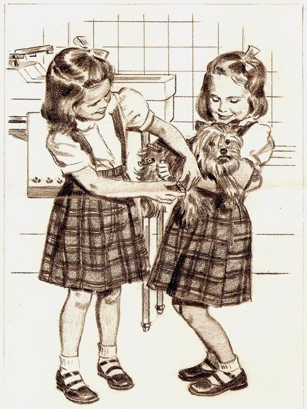
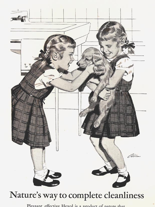
Below, a 2B pencil comp on bond pad for Hexol, a home and bath disinfectant....in the early 50's.


A finished ad, done in ink wash, follows. For some reason the Hexol folks were hooked on the twins idea. No problem....it still just required one model, my daughter, or maybe one of her friends!


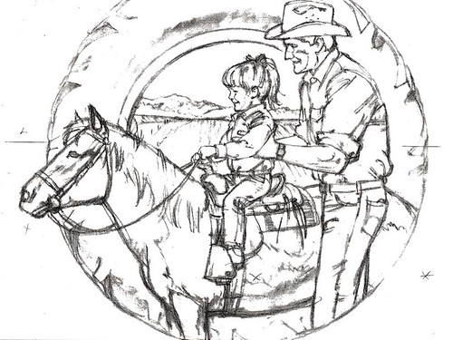
Next, the charcoal pencil sketch of pony, tyke, and dad, for State Fund done in the 70's. Why the tractor tire? I have no idea....and can't recall if it became a finished ad.


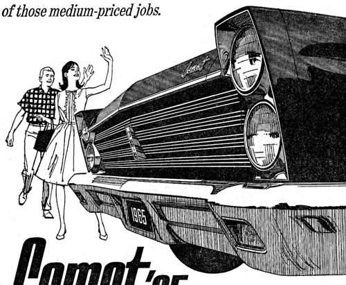
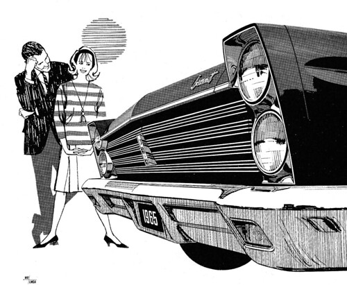
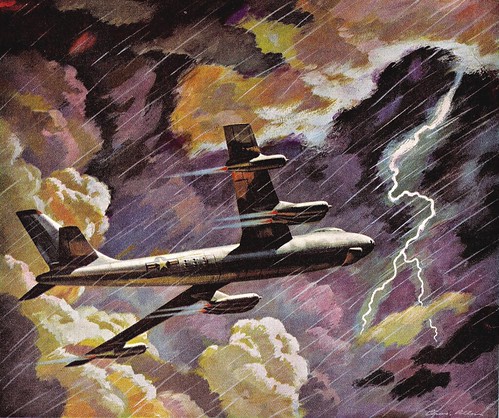
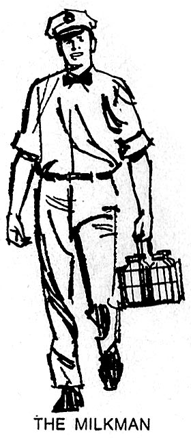
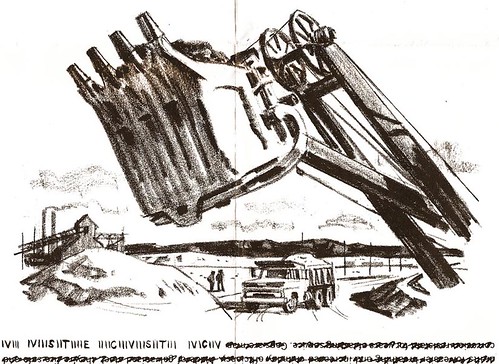
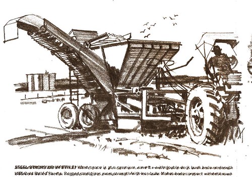
Then two more charcoal pencil comps for US Steel B&W ads. As with the two at the top of this post... 1960's vintage.


Finally, a charcoal pencil montage, a popular fad in the 70's. It was for a State Fund Ag insurance ad, usually published in farm journals.


Some of those, which we'll see later on, were cleaned up and used as finished art.

* See these images at full size in Charlie Allen's Flickr set.

Tuesday, September 23, 2008

Times Are A-Changin'!

"What this country needs is change!" The ancient rhetoric of politicians... heard once again in the current political season. My theme and experience has been... "Change is the constant!"


From the long distance of time and today, ten or fifteen years way back can seem compressed... not all that long. However, the early 1950's to the mid-1960's was a very long time in the advertising and illustration environment.


In a decade, the nation had changed from a print media and a reading public to a television viewing culture. News and entertainment were quickly moving from newspapers and magazines into television... and of course advertising budgets both led - and followed - all the way.


In my specialized world, the traditional literal illustration and ad assignments were changing into more designed, simpler images... and thanks to eastern artist like Briggs, Fuchs, Peak and others, more action figures were in demand.


Per usual, it was adapt... or else!


This week's CAWS shows a Mercury-Comet B&W series, done in the mid-60's. Kenyon-Eckhardt in S.F. was the ad agency for the Mercury account for the states west of the Mississippi, a frequent division in sales and advertising. I can't recall the art director, but he was good. The method usually was a line film positive over a halftone rendering of the car.


This last example is a grey marker comp, typical of the comps I sent over for AD and client approval. Not sure if this one went to 'finish'... don't have a clip or proof of it.

These were enjoyable assignments... and again, a change from the usual car ads.

* Charlie Allen's Flickr set.

Monday, September 15, 2008

To paraphrase the old 1940's Harold Arlen torch song....

"Can't go on.....
Since my credit line is gone.....
Stormy weather!..."


In keeping with the current stormy economic times and climate, the CAWS will post a 1955 Kaiser Aluminum ad depicting a B-47 in stormy night skies.


At the time, I wasn't that happy with the stormy sky illustration. Felt it was over-dramatized and not well designed. Now, for some reason and in hindsight, I like it better.

Also, in keeping with the times (and our beleaguered banks), a second Kaiser ad, circa 1956, showing a bank with flawless aluminum door frames. Hopefully, this bank's loan portfolio was as pristine and flawless as its' doors!


How do you show the outside and inside of a bank at the same time? The ever present illustrative problems. For what it's worth, Haines Hall (P&H) posed for the bank officer on the left and the customer on the right. I was the customer with the striped sport coat on the right. Wish I still had that sport-coat!


Both were difficult assignments for a young artist...and presented a real challenge. Both had additional 'spot' illustrations, and, of course....a deadline.

The small illustrations appeared on the right of a double page spread in the Saturday Evening Post, Time, etc.


Another workout, but more fun to do!

* Be sure to check these small spots out at full size in Charlie Allen's Flickr set.

Tuesday, September 9, 2008

'The dog days of summer.....and winter!'

With due appreciation, CAWS 11 will lead with a Ted Key 'Hazel'* cartoon.


Dogs, cats, kids and babies, not necessarily in that order, have long been favorite subjects for advertisers....a universal appeal. Who doesn't know the current TV pup's tune....'there may be bugs on some of you mugs, but there ain't any bugs on me!' And most of us are old enough to remember the haughty and effete 'Morris' the cat!


Scrolling back, once again, to the early 1950's and the PG&E consumer B&W ads....BBD&O and I often portrayed kids and dogs to help extol the joys of new washers, driers, refrigerators, and the use of inexpensive energy. So different from today's 'green' emphasis on conservation of power and the pocketbook!


I think the CAWS will do another on this PG&E series next week....then we'll move on to other things.


*Ted Key's 'Hazel' cartoon was a weekly feature in the Saturday Evening Post back in the old days...always found near the back of the issue. 'Hazel' never failed to have a pithy comment....just nailing the mark with her employer 'family'. At that time we had a lovely Japanese lady that helped clean and iron two or three times a month. We called her our Japanese 'Hazel'. A few examples: On her arrival she announced, 'I'll do anything, but I won't baby-sit!' Another, to my wife....'Whose dress are you wearing? It's too small for you!'

When I was considering...and test-driving on the dealer lot....a Honda 55cc motorcycle, she said, 'Mr. Allen doesn't need a motorcycle. What he needs is a ten-speed bike!' Her name was Helen......close enough!

Wednesday, September 3, 2008

'...the Butcher, the Baker, the Candlestick Maker.'

In the early 1960's a comp/layout came in from a young art director, Hal Riney*, at BBD&O. A Pac Tel B&W full page newspaper ad, the comp indicated spaces, no figures, with occupation titles.


Five rows, seven standing figures in each row, 35 in all. Deadline....one week, including a film pos over board with grey haltones where needed. I planned at least 7 figures or more per day, plus a half day for the film pos and halftone.
(To see the full size version of this sheet click here)


Main dilemma....how to depict all those occupations in small standing figures? As it turned out, not as boring or as difficult as feared....


a sort of cartoon/illustration approach. The scans are from a newspaper clip....so...in three parts, at roughly the drawing size, about 5 inches high.

For speed, I used a nylon or fiber tipped marker pen....Pentel or Scripto, as I recall. They were difficult to retouch with white....markers do bleed....but not a big problem. Easier to start a new figure than repair large goofs!

Also, two more ads using the same pens. The first a Calaveras Cement B&W,


... and the second, a promotion for Northface, an eastbay outdoor clothing and equipment maker.


The request was to have it look like an on site sketch....so, pretty loose.

* Thanks for kind help from Tom Watson, who has a better recall of the 60's and 70's than I.... just a brief review of Hal Riney's career. He was an inventive AD at BBD&O when I did several jobs for him....and later became the agency's creative director. In the 1970's he started his own ad agency, and, adapting to the changing times and media, created a series of outstanding TV and radio commercials for major national clients. Some were General Motors Saturn division, Lipton Teas, the 'Morning in America' commercials for Ronald Reagan's re-election campaign, E & J Brandy, Bartles and Jaymes Wine Coolers, and many others. He often performed his own 'voice-overs' on commercials....with a quiet, folksy, nostalgic style that was in complete contrast to the hard sell voices usually heard in advertising. Riney died this year...but his amusing, kinder-gentler Americana themes and style will be missed greatly.