Tuesday, March 31, 2009

FUN WITH GALLO....

No....not using their product....at least, not in this case. In the late 60's I received a call from Julius Spector, head of the Point of Sale department at Gallo Wineries in Modesto. His group was in charge of design and production of store displays, posters, banners, box displays, etc., nationally. He needed an illustrator....a 'Norman Rockwell' type (!). I think he had received a reference from a San Francisco agency. I drove over to Modesto, about 75 miles into the central valley, where the Gallo plant and headquarters are located, to meet Julius and to pick up a POS job. We got along well from the start....and over the years I illustrated dozens of posters and ads for Gallo. Julius Spector was a short, cigar chomping, take charge type, from New York, with an accent to match. And a plus....a sense of humor. I was known as 'Cholly' over there.

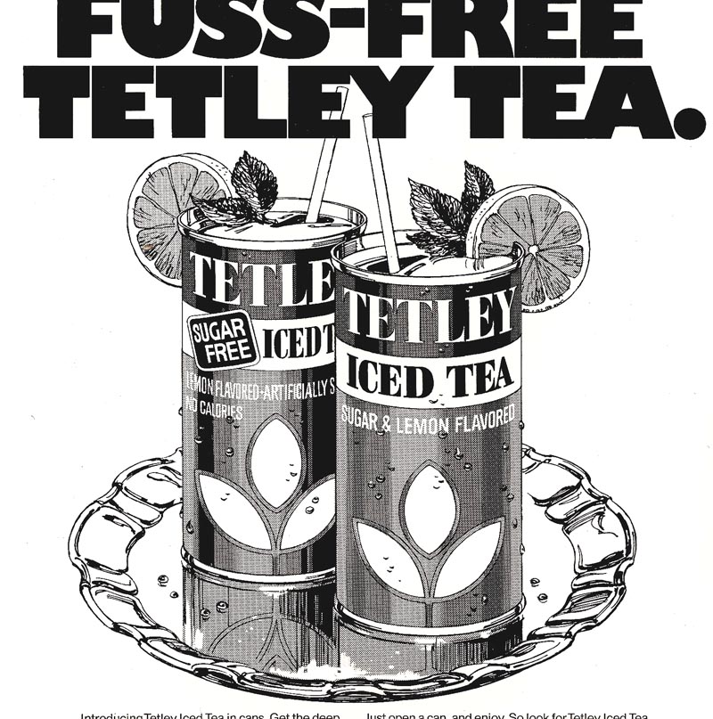
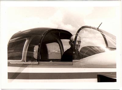
The above heading, 'fun', meant two things. The ads were mostly for Gallo's 'jug' wines, popular in stores in the 70's, and aimed at a young mass audience. Maybe a better description for the ads would be 'seventies silly'. Little of it serious....except to sell the product. It pretty well matched the turbulent 70's times. The second part of the 'fun' was that in good weather, I would fly over to Modesto from Buchanan Field in Concord, not too far away. Below, a couple of shots of the plane and driver in those Gallo days.


The 'aim' was to save time....the flight in a small plane was half that of driving. However, by the time I rented the little Grumman Trainer, kicked the tires, wiped the windshield, preflighted the plane, fuel valves drained, oil and fuel levels checked, bugs wiped from the leading edges of the wing, the flight made....no time was saved! But it was fun getting there and back.


Modesto's airport was less than a mile from Gallo, and I was picked up by Julius or his secretary.

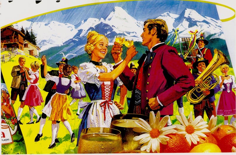
Diversity was the name of the game on subjects, and photographs of bottles, glasses, etc. were often combined with the art. The department had several ad and display designers, two of them former P&H artists, who comped some of the ad layouts seen here. First, a 'Tyrolean' scene, our middle daughter and a boy friend the models toasting each other.


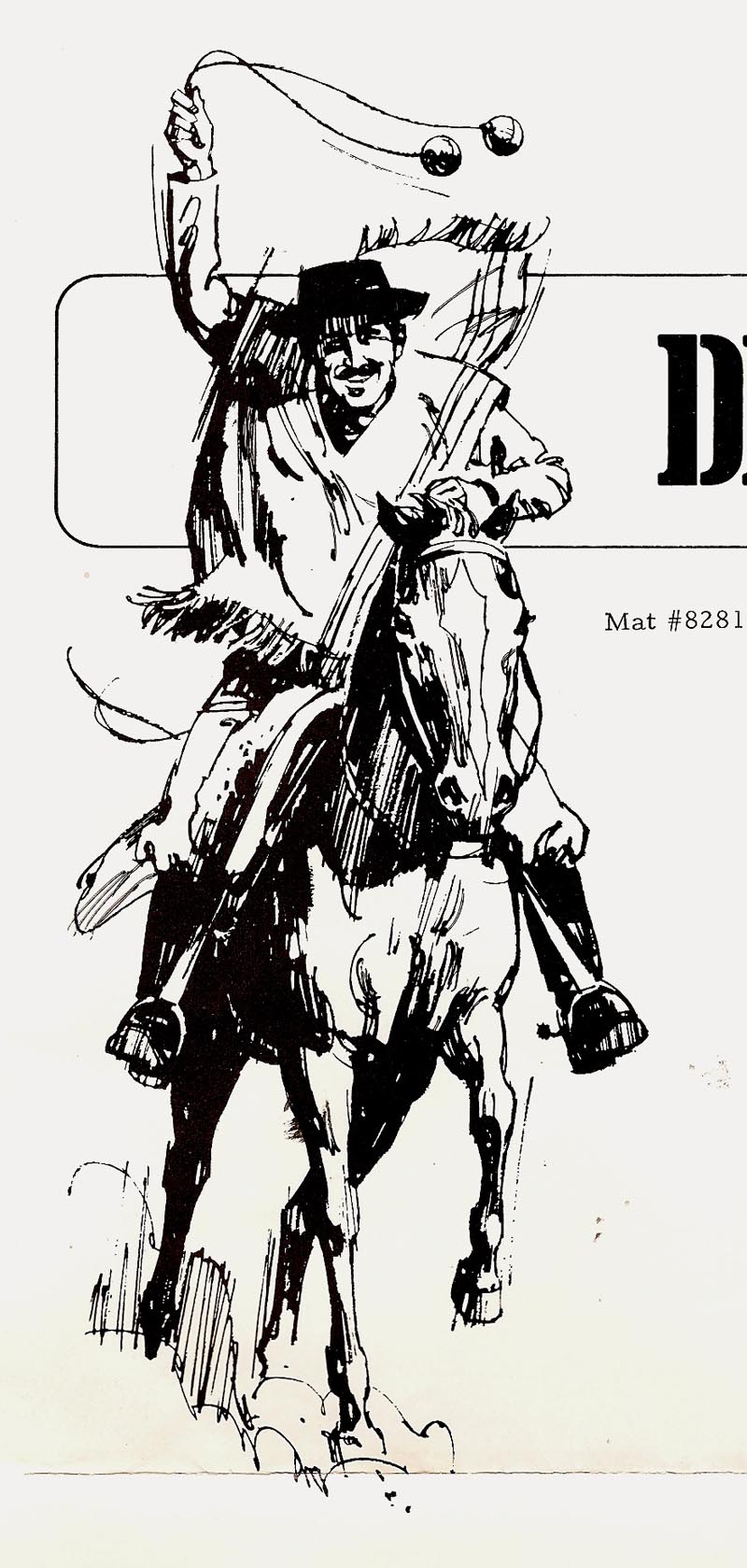
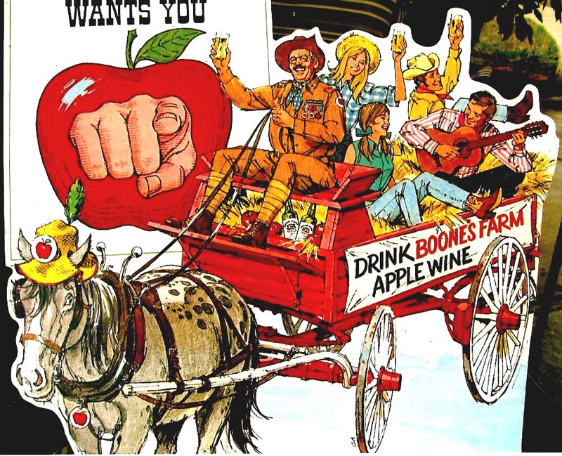
Next, one of several 'General Boone' posters....one of the sillier series. I think a tie-in with a TV ad character.


Another General Boone follows...


...and then a Hay Wagon illustration....done in markers to speed things up for a tight deadline.


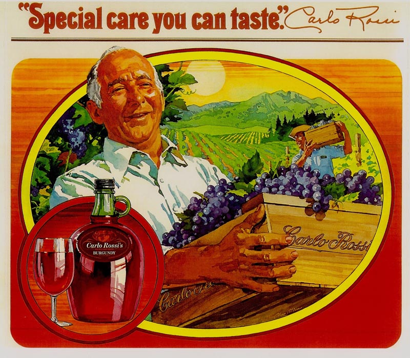
A Carlo Rossi ad follows. Carlo was a brother in law of Ernest or Julio Gallo, and had a line of jug wines in his name. On the illustrations shown, Carlo and I would meet on the lawn in front of the large headquarters building, where I would take reference shots for the posters. I recall a cheerful Italian vintner, his lacquered nails and hand tailored shirts!


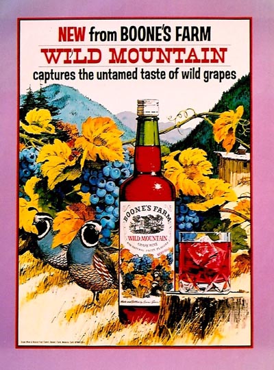
The next scan was for a line of wines called 'Boone's Farm'....this one called Wild Mountain. Another short deadline large poster....done in gouache and black line technique.


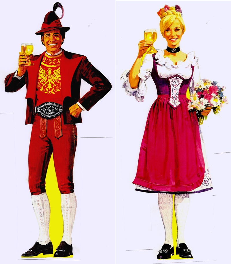
Finally, a pair of nearly life sized die-cut Tyrolean figures, displayed in more spacious stores with Gallo's wines.


* Charlie Allen's Flickr set.

Tuesday, March 24, 2009

'SEEMS LIKE OLD TIMES

HAVING YOU TO WALK WITH....
SEEMS LIKE OLD TIMES
HAVING YOU TO TALK WITH....'

A 'sedimental' old ballad composed by Carmen Lombardo and played by brother, Guy Lombardo, the well known hotel band leader and orchestra back in the 30's, 40's and 50's. He was famous for slow dance music and fast racing boats. Also for ushering in the New Year each year from a posh NYC hotel, back when dance orchestras were broadcast nationally over network radio. Ah yes....gentler times. And....times to match some very early B&W ads, 1950 or '51. The CAWS is all about old, of course....but there is old and older. Trying to clear the decks, anyway, of most of these....historical or hysterical....viewers choice.

First, four B&W PG&E ads from the consumer series in the early 50's. These were to promote the low power rates in Northern California....now, some of the highest rates in the nation! Monterey Bay, the location of the first illustration. Fishing boats often carried female names on the bow....I used my wife's name on the foreground boat


Then, central valley cotton fields and hills the scene on the next...


...followed by San Jose with the palm trees.


A new Richmond city hall building follows. The interior scene, both pen and brush and ink, presented a challenge, as I recall.


A B&W Chevron service station illustration follows....back when credit card use was just beginning....this one showing a new imprinter. As I remember, this was my third 'important' Chevron assignment from BBD&O....very tight and very dated.


Two smaller B&W spots next, a professor lectured by a student and Chevron attendant.


A Marathon Oil ad after that, minus the halftone background that went with the film pos. This came from an eastern ad agency.


Finally, three small tuna ads from very early on, I think 1950.


Two of them lamenting the sad plight of the young hostess not choosing the 'right' tuna! Tres tragique!


And very last....two scans revisiting our intrepid 'Lady of Steel' once again.


Merely 'au revoir'....I'm sure we'll see her again!

* Charlie Allen's Flickr set.

Tuesday, March 17, 2009

'HOLA, AMIGOS....FIESTA!'

Most people know Mexico had missions and settlements up and down California long before our eastern gold seekers and pioneers headed west across the plains. When I was young in the 30's, I worked summer shifts in my dad's country general merchandise store a few miles south of Fresno. At least half of our customers were Mexicans who worked there in the orchards, vineyards, fields and railroads. Then, as now, they provided most of the agricultural labor and a large part of the construction work force in California. The current tensions of illegal immigration and of drug cartels did not exist back in the 60's when these point of sale posters were done for McCann Erickson and Del Monte. Then we could portray the happy cliches and symbols of 'Old Mexico' in advertising. I doubt if this campaign would fly today.


As I focus on these old proofs, memories come back. I recall being tired when these came in.


I preferred jobs that came along singly....one at a time, please! It was easier to concentrate on the problems of one illustration. When a series came in....six or eight in this case....the pressure level increased.


The solution had to be fitting the illustration style and technique to the deadline....and to the Del Monte budget requirements....always on the low side. I opted for a loose line technique on rough illustration board and film positives over bright colors


The choice would both save time and compliment the Mexican theme and attention value needed on store posters. Also it lessened dependance on good, specific, reference or models. These were charcoal pencil on cold press Whatman board for the line....gouache behind the film positives.


Most of these scans are from a printed promotion piece for grocers showing the posters installed in a store. Hence the red edged backgrounds.


One of the B&W's, minus color, is included as an example.


A couple of B&W ink renditions of Mexican and American cowboys follow that were used in newspaper 'Viva Fiesta' promotions.


Two more scans....unrelated to 'Fiesta'.... but horse related. These were B&W illustrations, part of the Elanco/Graslan ads shown much earlier on CAWS. The first is from a brochure and the second, a film pos B&W minus the color background. Missing is a finished proof....as are many ads done over the years.


For now, adios amigos!

* Charlie Allen's Flickr set.

Tuesday, March 10, 2009

RANDOM ACTS OF BLACK AND WHITE....

No title tunes this week....but if there were, it would probably be an old depression era ditty. For better or worse, though, the songmeister will return!

The general theme on CAWS has been to show somewhat related ads and series. However, in my time, jobs and assignments never came in that way. In any given week or month work could involve B&W line art, ink wash, gouache in color or in greys, marker or charcoal pencil comps... almost back to back. Also it would include a variety of subjects from a variety of agencies and clients. All in all, it kept things interesting. On this, we'll show a variety of B&W's, some including halftone.

The first two are from a full page newspaper ad by the Port of San Francisco, done about 1970. Line film positives plus halftone.


Then, again in the early 70's, a B&W line illustration for the Bank of California....'entering California, Oregon, and Washington'.


Another for Bank of California showing off their new building in Portland, Oregon.


Following that, a change up....food B&W's. The first, an ad for Farrell's, a restaurant chain in northern California. B&W line technique presents a real challenge....trying to make food look appetizing. Hopefully a bit later, will show a color menu cover done for Farrell's.


Then a Tetley Tea B&W...film pos with halftone. Almost as much a lettering exercise as line illustration.


Finally, a fanciful B&W for the Four Seasons Hotel....from a large newspaper advertisement. Both Tahoe and Reno were and are major resort and hotel locations....and on occasion were good clients. A lot of promotion in California cities was needed to keep them busy year around.


Very last....two catalog poster illustrations of six items for sale....there were dozens on the poster. When times were slow....and it seemed to happen more often in the 70's....it was 'this brush for hire'....even catalog work!


These were done with charcoal pencil on smooth hot press illustration board....or small brush and ink....or possibly both.


Hard to remember!

* Charlie Allen's Flickr set.

Wednesday, March 4, 2009

'ARTY SMARTY'

The origin of the heading, for CAWS at least, is explained below. My attempts at 'arty smarty' came along during the turbulent 70's....when everything had to have a 'new look'.


Most men grew long sideburns and longer hair. Most wore hip hugging, polyester bell bottom pants. Young women (my daughters included) wore mini skirts that nearly achieved the unachievable. Vietnam, major demonstrations, Watergate, long gas lines, closed gas stations, stagflation....a rebellious time. In my world, montages and busy acrylic textures became the style in illustration.


One of the most loyal clients for P&H, and for me, was the California State Insurance Fund, the big provider of workman's comp, required for every worker in the state. Over the years, I illustrated dozens of brochures and pamphlets....and on some, got adventurous. We'll start with a two color brochure....four scans


The line work was done with a fiber tip pen on newsprint....hence the 'blotter' look. Again, enjoyed the changes....although art prices were not keeping up with inflation. Come to think....have they ever?


In the late 40's and during the 50's, P&H was at 425 Bush St. in San Francisco, near the financial, corporate, and advertising center of town. Pat Patterson and Haines Hall owned the five story building. P&H occupied the so called 'penthouse', a one-half sixth floor addition. A small but modern elevator serviced the floors up to the fifth floor. The single sliding door held a 9x12 inch framed plexiglass panel....and P&H artists were 'encouraged' to take weekly turns to promote the P&H art service. On this occasion it held a colorful abstract, I think of food, by one of our bunch. One noon on the fifth floor, the elevator filled with three or four from P&H, a couple of secretaries and two or three from the architectural firm on the fifth. Last on, facing the door and the panel, was a tall black bike delivery courier....frequent visitors to 425 Bush St. Elevator etiquette prevailed....conversations stopped, people looked ahead or at the ceiling...a bit too close for personal contact. Just before the door opened at the first floor, the delivery guy broke the silence. In a deep voice he announced, 'AHTY SMAHTY!'. Needless to say, he got a big laugh. Our family has used the expression ever since.

Another State Fund brochure follows....four scans...

One of the most loyal clients for P&H, and for me, was the California State Insurance Fund, the big provider of workman's comp, required for every worker in the state. Over the years, I illustrated dozens of brochures and pamphlets....and on some, got adventurous. We'll start with a two color brochure....four scans...


...and a definite style departure for me.


Line art, film positives over the second color....which on these was done in greys mixed with acrylic medium.


The system seemed to work. I felt out of my 'comfort zone' on these...but as usual, had fun trying something new.


Another medical montage in the same style, this one in red ink, came from a separate pamphlet.


* Charlie Allen's Flickr set.