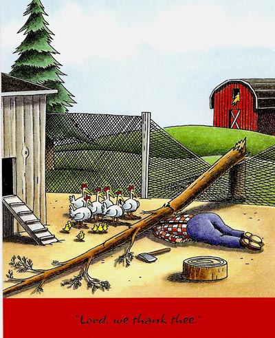
This week, on Thursday, 27th November, the USA celebrates it's traditional Thanksgiving. We'll open the CAWS with a classic Gary Larson cartoon....and offer many thanks to Mr. Larson for a million laughs over the years....way out there on the 'far side'!
Today....in spite of the current global and domestic financial meltdown....and not to mention the normal pitfalls of our human existence on this somewhat weary planet....most of us have much to be thankful about. Not least, as I write, I'm grateful for 'Today's Inspiration', and for Leif's untiring efforts to inform and entertain with historic artists and illustration. This week he informed me of the Google Analytics chart showing the number of visitors to TI and the CAWS from around the world. To this old timer, just mind boggling....and I'm thankful for the chance to share some of my efforts and interests, over a lot of years, with generations from the digital age'.
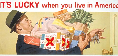
A 'Lucky Lager' billboard (above) to start, from a poster, again photographed propped up on a patio chair. Not the greatest fidelity. The turkey, still in plastic wrap, and the laden 'Lucky' shopper, are the only Thanksgiving illustration I recall doing. I illustrated many Christmas themes...and have done a bunch of 'turkeys'....but those are of a different definition!
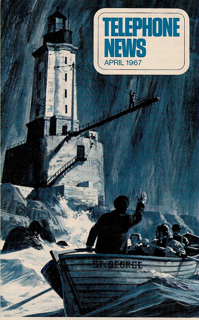
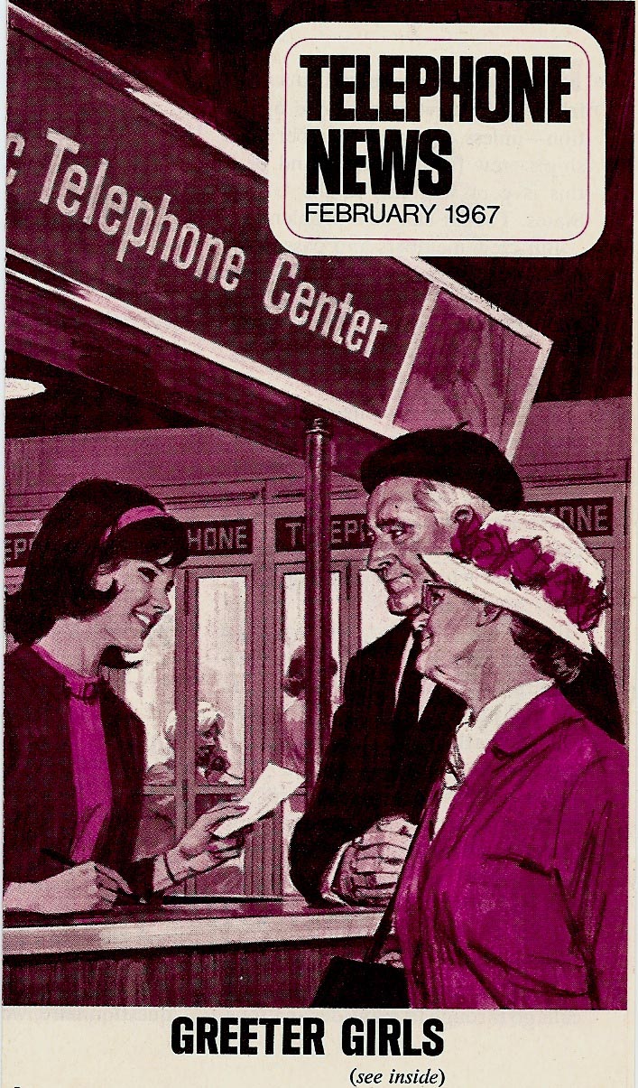
We'll return this week to many of the rest of the 'Telephone News' mailers from the 60's. I enjoyed the variety of subjects.
Most of the technical reference was provided by BBD&O, and the rest, including most figures, by the illustrator.
All were done in a gouache technique....using Windsor Newton Designers Gouache, Perma Greys Gouache, often with Liquitex acrylic matte medium mixed in.
* Charlie Allen's Flickr set
* Gary Larson cartoon © 1992 FarWorks Inc. All Rights Reserved.
Tuesday, November 25, 2008
Tuesday, November 18, 2008
¿Habla usted español?
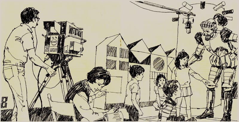
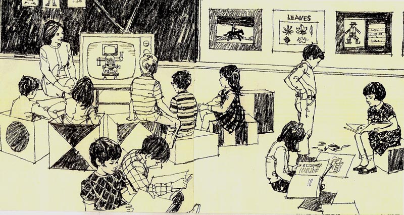
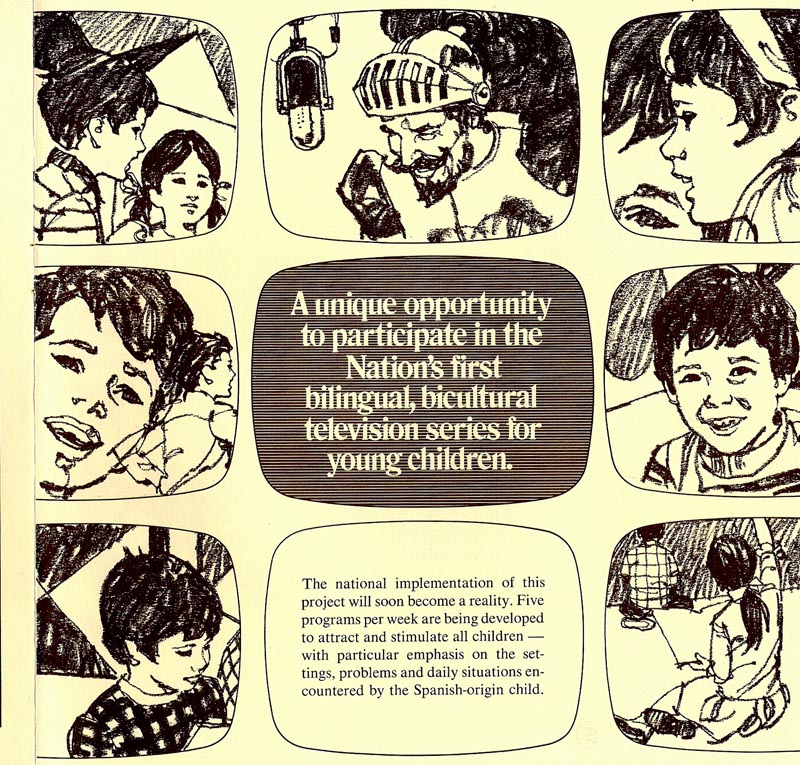
A few phrases are remembered from high school Spanish... and I'll assume this one is correct. Scrolling forward to the 70's, Here are some brochure illustrations for a language TV program for Spanish speaking youngsters... no doubt through PBS stations in the S.F. Bay area and So. California.
That time frame may sound odd now... 'forward to the 70's'... but it was my third decade of illustration in San Francisco. As previously mentioned, work had changed drastically over those years. I was kept busy... more brochures, trade ads, 'point of sale' assignments, new and different agencies and accounts. Billboards - with the exception of the occasional highway painted bulletin and big magazine ads - had disappeared... and most of the 'big budgets' to boot! TV had become the '600 lb. gorilla' in the ad world. But other things... and a lot of variety... filled in.
More one and two color ads were the norm. The Spanish language brochure was essentially black on toned paper stock....and I used my weapon of choice in those days, a General charcoal pencil on cold pressed illustration board.
I'd like to add (and I haven't mentioned this) I worked with some great and talented guys and girls at P&H... and at the advertising agencies. There were creative ad designers and lettering designers, well before the age of instant computer generated fonts and designs... cartoonists, production experts, et al. We worked as a team... and I credit much of my stuff to those talented people. It was a pleasure working with professionals of that caliber!
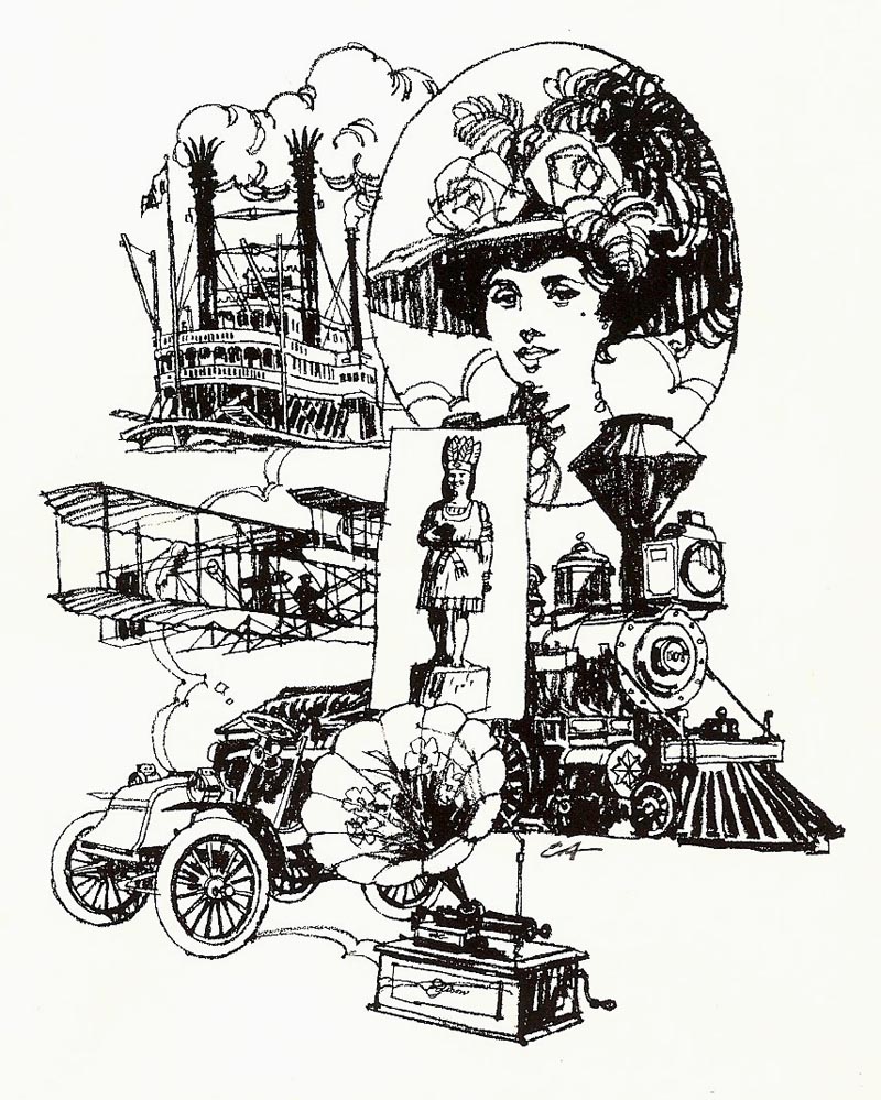
Following the brochure, a couple of illustrations using the same method. Although legitimate jobs, I can't recall where the 'historical' montage was used...
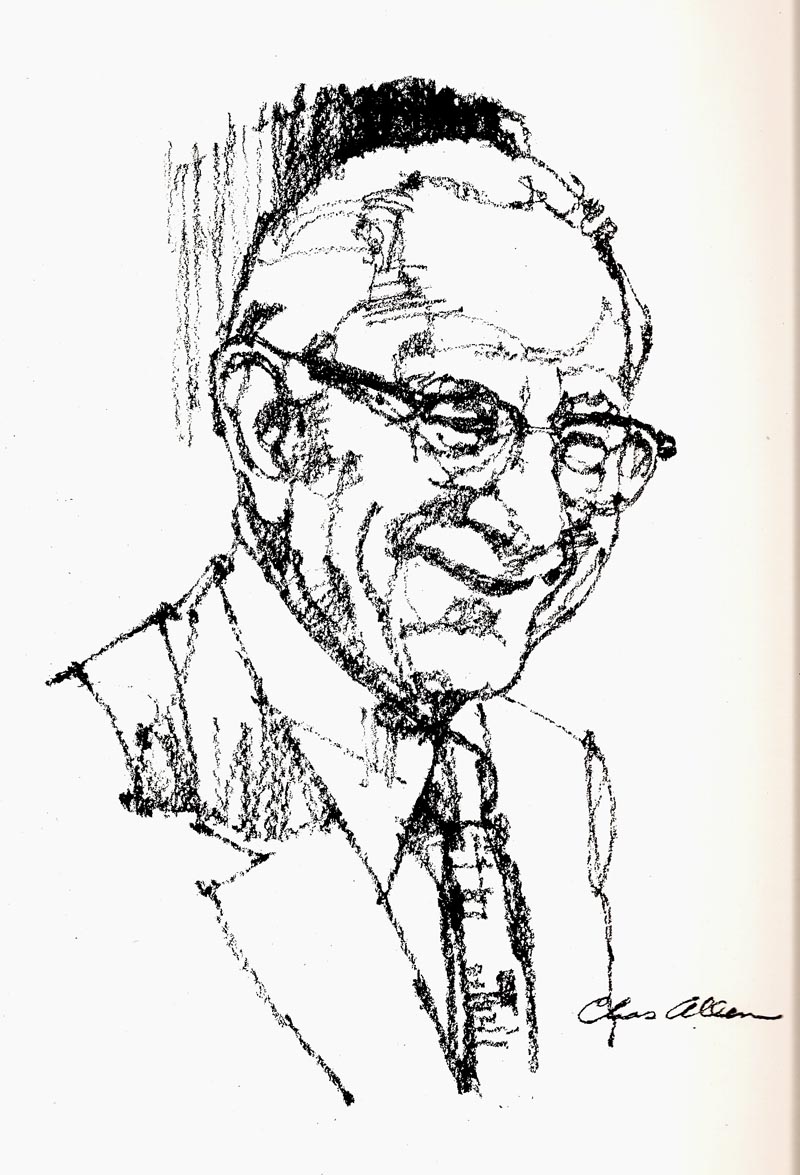
...and I'm drawing a blank on the 'pencil on rough board' portrait. I think a local S.F. journalist...
...but just too many years!
Will try one more... ¿Habla usted inglés?
Charlie Allen's Flickr set.
Wednesday, November 12, 2008
"Whenever you're watching a hula girl dance..."
"Whenever you're watching a hula girl dance...
Be careful, you're tempting romance...
Don't keep your eyes on her hips
Her naughty hula hips...
Keep your eyes on the hands!"
[Alfred Apaka, back in the 50's, from the Hawaiian Village, in Honolulu. Think coconut palms, soft trade winds, ukuleles, Hawaiian guitars, grass skirts swaying....maybe a tall Mai-Tai! ]
Two things I share with the 'Singing Detective', from the British PBS TV series, years ago. An obscure auto-immune skin disorder, mostly controlled these days with Prednisone. And....a tendency to associate pop songs from our era with subjects or events of today. So....the above Hawaiian tune!
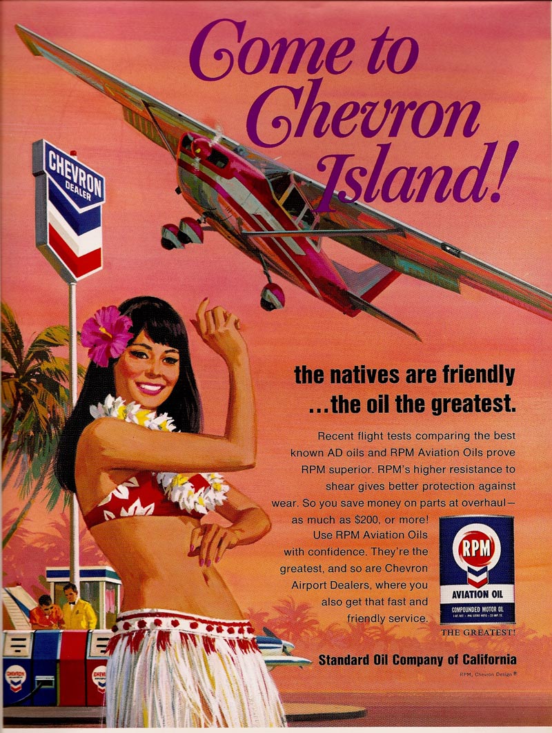
A travel and Hawaiian theme on this week's CAWS. First, the 'Chevron Island' hula dancer. In color, an aviation magazine ad...
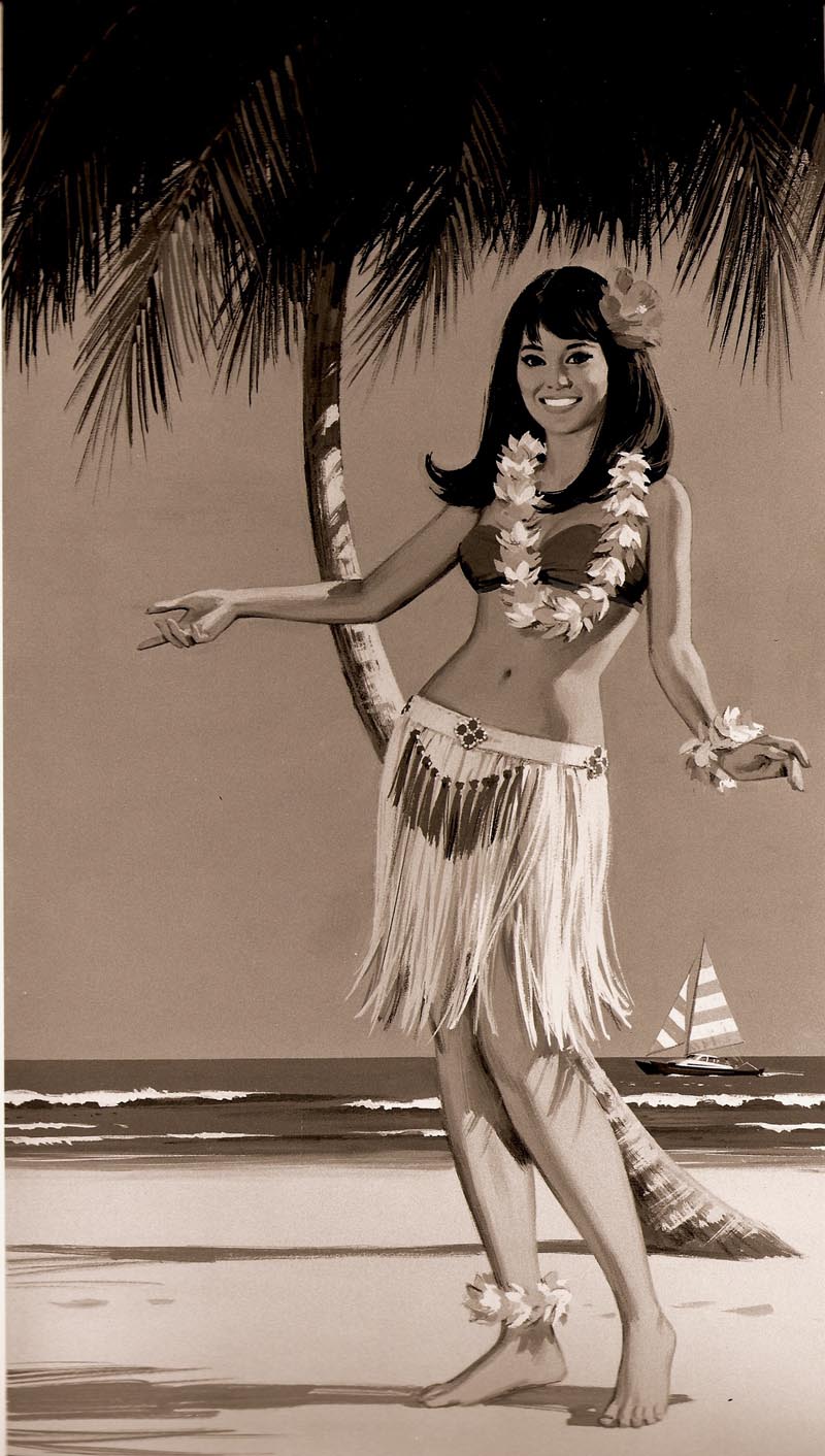
...and in B&W (from color), a Chevron ad minus the copy above and on the left.
Both the Cessna Co. and the FAA might have had fits seeing that unacceptably low turn on final approach! But, hey....it's a fantasy world! Hula girls and gas pumps aren't normally found on runway thresholds!
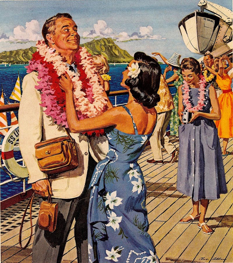
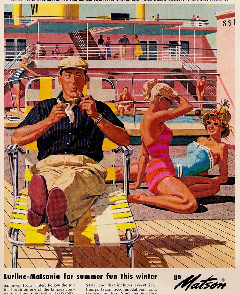
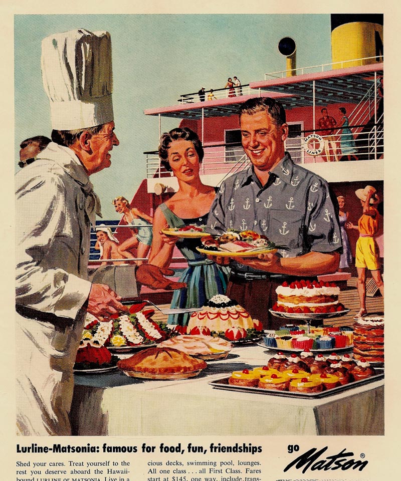
Next, three Matson travel ads...around 1958. Matson was still promoting passenger ship tours to Hawaii on the 'Monterey' and the 'Lurline', both ships back from WWII service.
Competition at that time was from flights on DC 6's and Boeing Stratocruisers, both great prop engined planes. However...a ten or more hour flight to Hawaii in the usual bumpy, turbulent weather. Shortly after the 50's, jet travel took over....with a mere five hour flight to Hawaii...normally in smooth air.
Matson and American President Lines turned to freight and container ships. These three illustrations were done in the usual Windsor-Newton designers gouache.
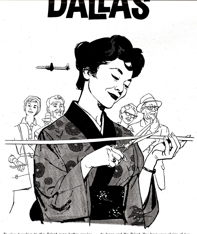
Then, a Japan Airlines B&W news ad from the same era. It was a line film pos over ink wash halftone.
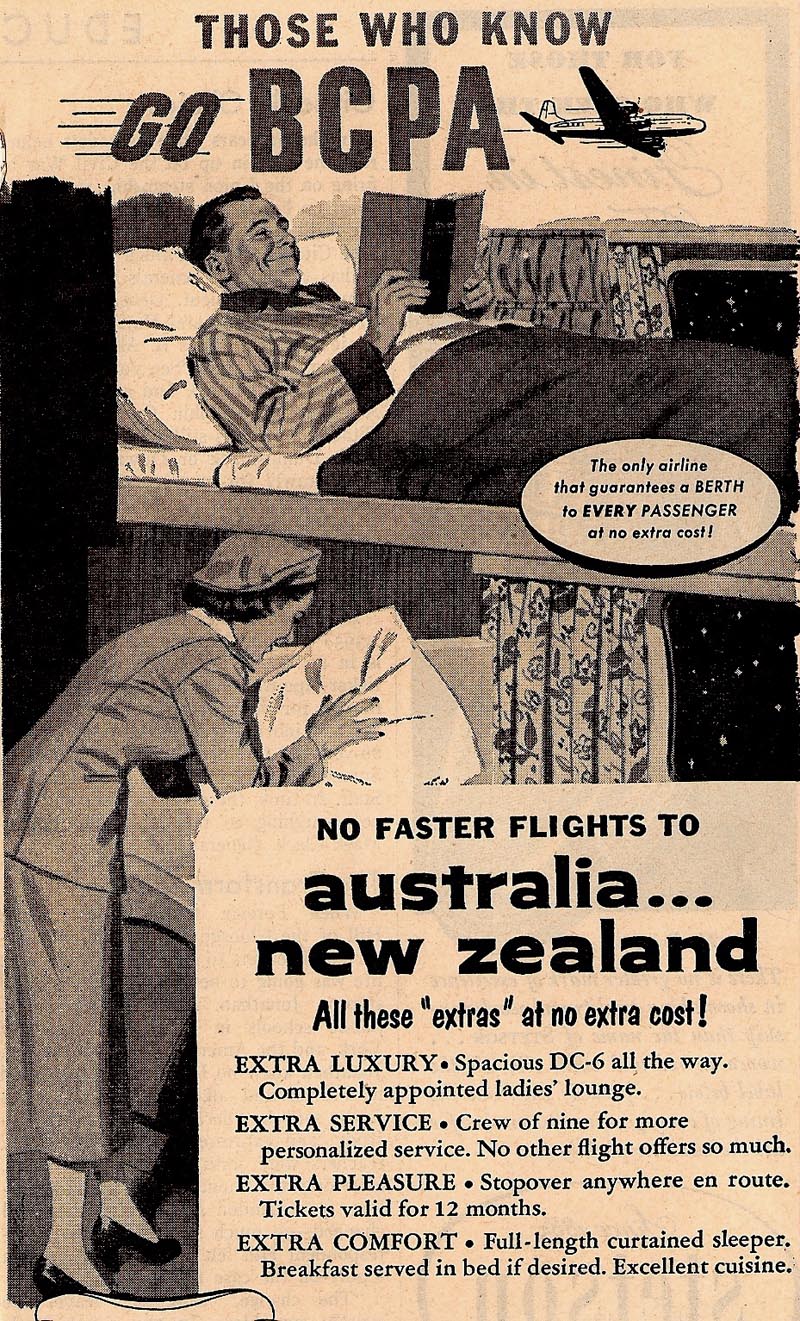
Last, an early 50's ink wash illustration for BCPA....air travel to New Zealand and Australia. Early days, indeed!
Another verse? Why not!
"Remember, she's telling a story to you...
Her opu is swaying, but don't watch the view...
Don't concentrate on her swing
It doesn't mean a thing....
Keep your eyes on the hands...they tell the sto-ry
K-e-e-e-p your eyes on the hands!"
Tuesday, November 4, 2008
It's a workaday world...and, life is work!
When I was a kid (a couple of hundred years ago!), boys grew up with pocket knives, cap pistols, even BB guns. Most commercial toys were made of cast metal or formed metal. Decades before plastic toys were the norm, we carved and created most of our play items. From pine box wood....we made airplanes, boats, race cars. Paper provided airplanes and boats. From bamboo....submarines, blow guns, and orange peel shooters! Forks of branches gave us sling shots....rubber inner tube strips tied on. At one young stage, and from our encyclopedia, a friend and I were fascinated by mummies, catacombs, and Egyptian tombs. We carved small figures, wrapped them in strips of cotton, then burned them at the stake. I know....warped from the start!
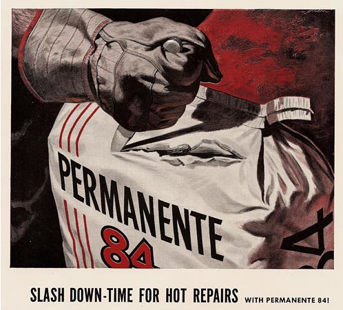
Back to pocket knives, one of my two original knives is shown in this Kaiser Refractories duo-tone ad, opening an industrial bag.
Mat knives were around in the 50's, but box cutters had not come into common use. I still have the pocket knife, and a similar pair of work gloves.
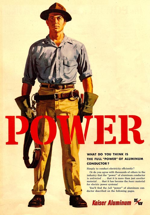
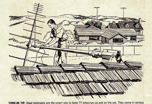
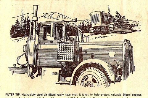
Western industry and agricultural corporations, though smaller in numbers than in the mid-west and east coast, still provided a lot of ads and illustration subjects back in the 50's and 60's. This week's CAWS will post a few assignments from Kaiser Corporation and US Steel.
Kaiser had multiple divisions....Kaiser Aluminum, Kaiser Steel, Kaiser Refractories, Kaiser Automotive, which produced cars for several years, and, of course, one of the first and most successful HMO's in the country.
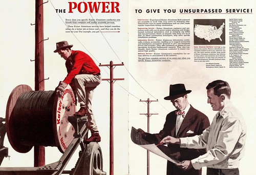
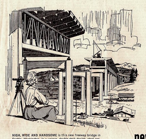
Above are two scans from an early Kaiser Aluminum wire cable brochure. Below, three US Steel B&W spots....all working subjects...
...one including our 'lady of steel'!
Finally, a 1960's Kaiser Aluminas ad, four engineer portraits, done at the height of the acrylic 'swish' era.
* See these (and many more) images at full size in Charlie Allen's Flickr set.
Subscribe to:
Posts (Atom)