Monday, May 25, 2009

'BURGIE AND FRIENDS....'

I'm not sure about the 'friends' part....just a title....and the fact that these scans have been close neighbors on my desktop for months now. Burgermeister, based in San Francisco, was a BBD&O account, and through AD Nick Carter, was a good client in the 50's and early 60's. I recall illustrating at least three full page ads that appeared in the Saturday Evening Post as well as other magazines, and many billboards over those years. Viewers have already seen the Burgie 'beach scene' ad and at least two Burgie billboards in past months on the CAWS. We'll present a few more....and a few point of sale display cards for another good client, Olympia Beer, based in Olympia, Washington.

First, a Burgie SE Post ad, I believe in the spring of 1960.


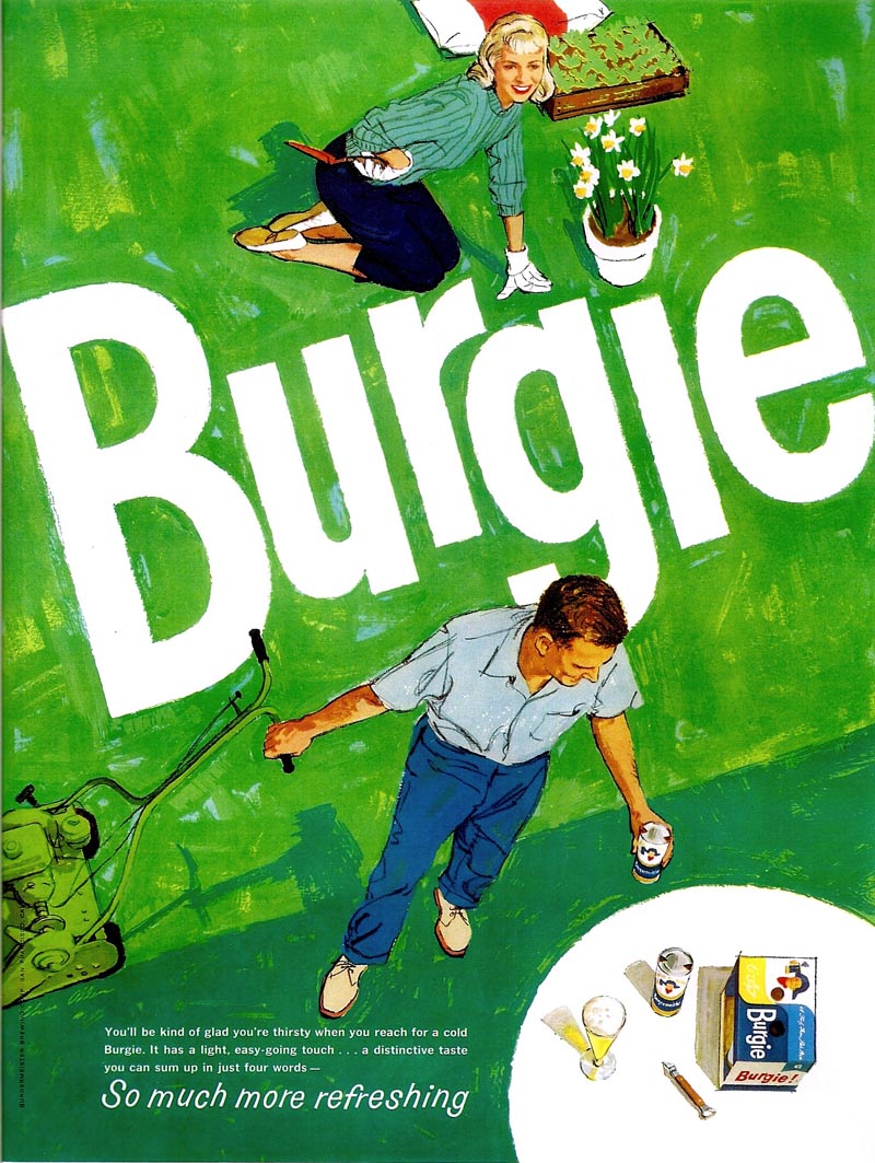
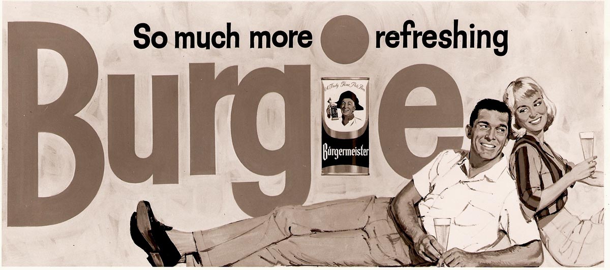
I had a lot of freedom on these and on the Burgie billboards. The agency and client wanted what was thought of then as a 'new look'. The instructions were, 'don't come up with the fully painted figures and compositions popular in the 50's.'


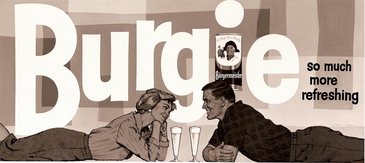
For better or worse, except for given subjects and the large Burgie logo theme, these were my concepts. I tried to keep them colorful and the figures flat in the rendering. Following the magazine 'gardening ad' at top, these three billboards were scanned from B&W photos taken at P&H, and now my only records.


A bit hard to visualize in bright colors, but the client seemed to like them.


Next, totally unrelated, and to display probably the last billboard scan on my desktop, a Bank of America poster.


Again, a colorful poster....the lady's shoe a bright teal blue. And again, another BBD&O account.

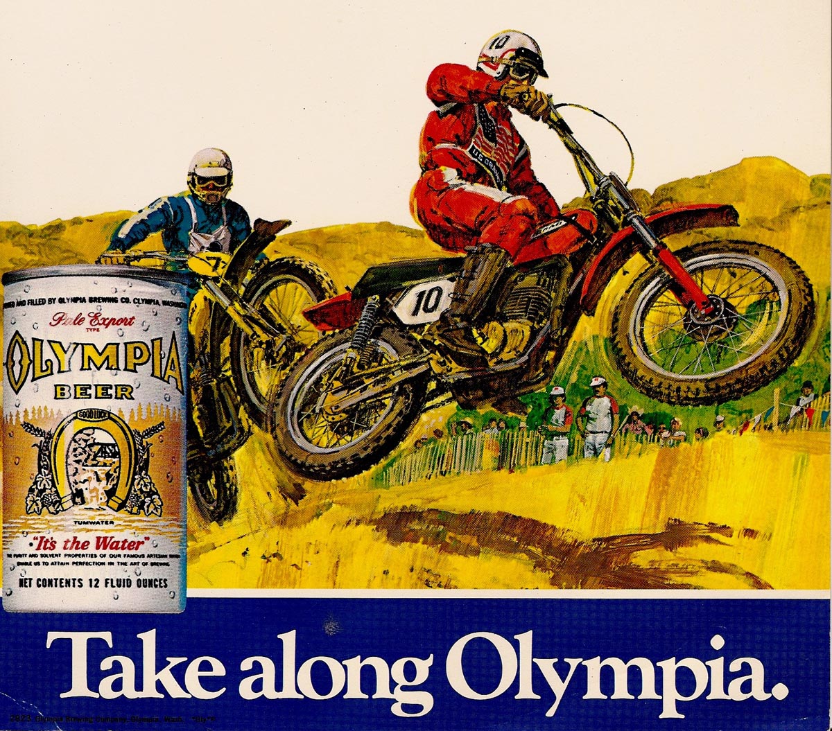
Three Olympia Beer POS small signs follow....I think they were designed to fit on a beer case.


My college age daughter, attending a Canadian school at the time, and a Canadian boy friend, posed for two of these ads. And like many POS ads, silly stuff.


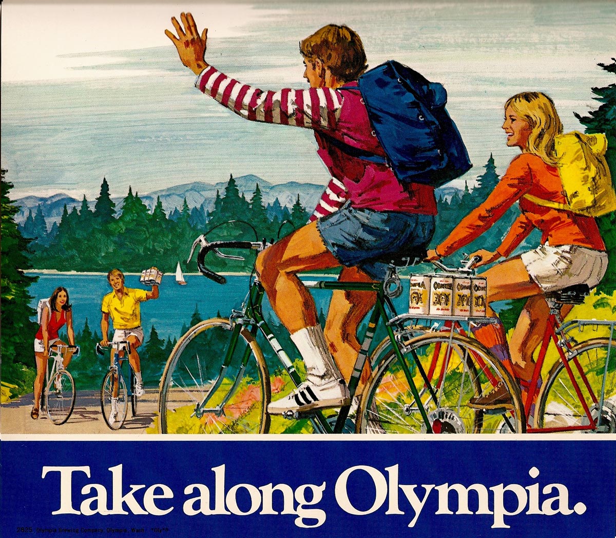
Advertising was not rocket science!


Finally, gradually clearing images from the desktop, a die-cut poster using a fine young model and former neighbor. He would be in his 50's nowadays!


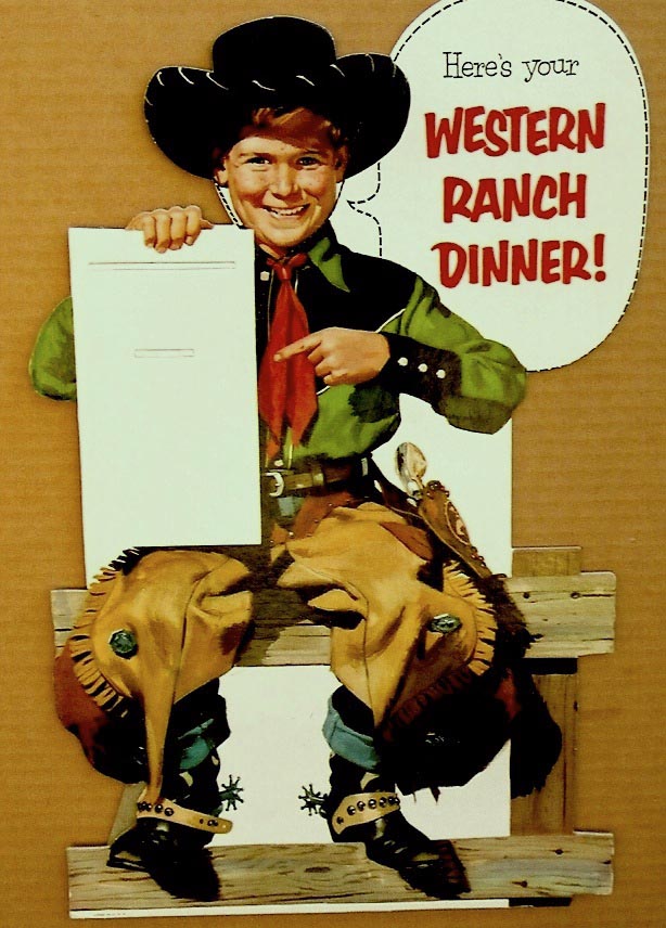
The product, other than 'western ranch dinner', a mystery.

* Charlie Allen's Flickr set

Wednesday, May 20, 2009

'SCHOOL DAZE....'

'Reading 'an writing 'an 'rithmatic....taught to the tune of a hickory stick!' I wonder how many today remember that old-timer? I was educated well after the one room school house and the hickory stick. But in elementary school we had outside wooden building girls and boys bathrooms and drinking fountains. I don't recall any indoor plumbing. And 'capital punishment' did rule at times. The teacher's and principal's word was law....no quibbles from parents, PTA's, or school unions. We sat in long rows of fixed desks, kept quiet (for the most part), and did our repetitive lessons. I remember practicing endless pages and rows of capital and lower case letters in script, both in pencil and ink-dipped pen. If nothing else, it may have helped develop eye-hand coordination and a later discipline to draw and letter accurately. I'll show a halftone ad, I believe for Hexol, done in the early 50's that depicts pretty closely my experience in those young years...


...including the hole in the desk for ink (ours were fitted with ink wells) and the steam radiator. I took photo reference for this at a nearby San Francisco French Catholic school. The rows of cast iron desks were identical to those in my youth!

The CAWS will again post a US Steel brochure cover, early or mid 60's....the 'little red schoolhouse'. The inside illustrations have not been shown. First, though, two small comps from a former BBD&O art director friend from those days....very fuzzy photos that he sent recently.


At least viewers can get an idea of the thinking before beginning.


As always, it was a push to get the cover, inside illustrations, and back cover work done in the time allowed. A loose technique (always OK with me), and no figures included, were part of the decisions when job approval came in....just show the steel buildings, please! These were done in gouache on gessoed illustration board.


Not in regard to schools, but more building subjects follow.


Architectural rendering was not a field I sought.


A couple of those for architects were done, and I hated the time and the effort to translate from plans, and relatively low reward compared to advertising.


There were enough building subjects from advertisers as it was. I'll post a few examples.


From a State Fund brochure, a two color drawing in charcoal pencil.


Then a typical attempt to make the hum-drum look presentable....from a property management company, Terok (bottom line, paying client)...


... four of a bunch of ad mailers.


Then, for State Fund again, two of many brochure covers showing branch offices around the state.


Dull stuff!


Finally a couple of early US Steel B&W line newspaper line spots, before the 'lady of steel' arrived on the scene. Again, buildings were featured.


* Charlie Allen's Flickr set.

Tuesday, May 12, 2009

'FLYING OBJECTS....'

IFO's in this case....not UFO's! As were many kids back in the 1920's and 30's, my older brother and I were fascinated by airplanes. To further fuel the interest, Fresno's first municipal airport was constructed almost across the street from our home. We could hardly believe our 'good luck'! In a few years we moved, but for a long time we built model airplanes....he more seriously than I. My brother went on to become an engineer, and later spent a large part of his career in wind tunnel design on NASA projects. I enlisted in the AAF in WWll and became a pilot....mainly flying air-sea rescue in PBY's in the Pacific theatre of operations. Following the war I returned to school, a newspaper job, and my first interest and love....illustration.

The San Francisco Bay area was not a home for aircraft industries, as were Los Angeles and Seattle on the west coast. In advertising illustration, however, there were aviation subjects, and the CAWS has already posted a few airline ads. The first scan is from a newspaper B&W halftone ad for Chevron done in the 50's....I believe showing a Douglas DC-6, the popular airliner of the day.


Next, a Kaiser Aluminum two color trade magazine ad showing missile fins formed by Kaiser.


I think the fighter shown was called the Sabre-Jet, built by North American Aviation....operational in the 50's when the ad was done


Following, for a travel brochure for UTA Airlines, a French vacation carrier in the South Pacific, two DC-10 renditions.


I liked the color scheme on their planes.


Two Trans International Airline brochure illustrations follow, in a flat color outlined technique....partly the design of the comp....but also due to the large size.


The side view of the DC-10 (above) was on a three page foldout....34 inches nose to tail.


Speaking of airlines....figures, not planes.... we'll include a B&W halftone ad for Pan Am back in the mid 50's. This may have been shown earlier on a CAWS....not sure.


Then a scan of a small comp done in my first year at P&H, just to keep busy. Just two years after military service, the scene was fresh in mind. Our PBY missions often orbited a Navy sub sharing rescue duty, a few miles offshore the targets on Formosa (Taiwan). This shows a TBF instead of a PBY, but the sub was accurate.


Of personal interest and history I'll include a plastic model of my plane....'taking off' over nearby Mt. Diablo. Please excuse the hasty and shabby retouch of the photo-lamp stand holding it up!


Then the real thing....a photo taken from my plane of a squadron mate on a low level search over the trackless miles of the South China Sea in 1945.


His tail and call number 015, just a digit from mine at 016.

* Charlie Allen's Flickr set.

Wednesday, May 6, 2009

'COME AWAY WITH ME, LUCILLE...

... IN MY MERRY OLDSMOBILE....'

Over the years an oft performed tune in shows, vaudeville, and in Oldsmobile commercials, I believe....written by Gus Edwards way back in 1905. I've never illustrated an Oldsmobile ad, but happen to have illustrated a 1905 'Franklin Gentleman's Roadster'....pretty much the vintage looks of those very early automobiles. This scan is from one of the several antique auto prints that I completed and produced back in the very busy 1970's.


We'll post the others on a later blog. This week, however, the subject will be car ads....for clients other than Chevrolet. In the west and San Francisco, most auto advertising clients represented the western U.S., or northern California dealership organizations, plus a few for overseas ad distribution.

We'll begin with a couple of bright two color newspaper ads for Dodge, done in the 60's.


Film positives, plus halftone, plus a color plate. Viewers can't help but notice the $3500 price tag for a full size 1968 Dodge Charger....a glaring example of what real inflation is all about!


Next, a Mercury B&W line illustration. A rather 'odd duck', as I recall, with the auto art done in Detroit and stripped in with my figure art. I did several of those....with results that always seemed 'out of sync'.


Following....a B&W photo of a color Simca illustration....including the agency's favorite symbol for the French made car, a grey poodle. Tom Hall, the second partner in Patterson and Hall, was the male model.


Then three small Simca B&W ads in line and halftone for newspapers.


A Mercury Comet B&W, minus the halftone on the car, follows those.


Finally, two ads involving the American Motors Pacer...


...the first a joint promotion with Shasta soft drinks, and the second, a Pacer ad for distribution in the Netherlands. As I recall, the Pacer didn't last long in the market...


...one more misguided effort in auto manufacturing history. Both ads were combos of a film pos and gouache halftone.

* Charlie Allen's Flickr set.