Wednesday, December 9, 2009

I'M LATE....I'M LATE.... FOR A VERY IMPORTANT DATE NO TIME TO SAY HELLO, GOODBYE, I'M LATE, I'M LATE, I'M LATE !

This is CAWS 75....a good round number on which to end. At the beginning, I had no idea the scans (or I) would last for 75 weeks. The many ads posted in a year and a half are probably 2/3 of the total done in my career. Many have been lost, proofs sent to clients and AD's that were never returned. Many were not worth saving or showing....but, enough have to get an idea how one western illustrator survived, supported a family, enjoyed his work, and enjoyed the many friends, events, and contacts made over the years.

Back to the title, the words are engraved on my memory. I think a quote by the 'White Rabbit' in Lewis Carroll's 'Alice in Wonderland'. When our girls were very young, housebound by winter weather, they played 45 RPM children's records on a small record player. There were narrated and sung children's book stories, played over and over....and over! No 'Sesame Street' or digital toys in the early 50's. Books, dolls and doll furniture, toys and games, comprised the indoor entertainment in those days.

Regarding the quote....the CAWS is quite late and long of tooth. Much of it has been work I'd never planned to show. Much of it would bore the socks off a centipede....so it's high time to say, 'Adios Amigos!' One more thing....and surely the most important. I have been surprised and humbled by the number, the knowledge, and the geographical distribution of viewers over the past year and a half. I'm amazed at their kind, appreciative, and too complimentary comments....something not often received back in the working days! Can't thank you folks enough....it's made the weekly blog an adventure and a pleasure. Also super grateful for Leif's never failing weekly efforts putting this thing together. As a card carrying computer klutz, none would have happened without TI, Leif's hard work, historical knowledge and interest in mid-century illustration.

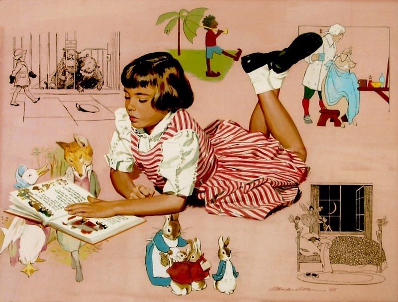
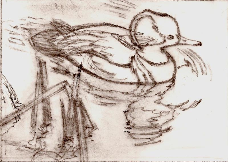
A long, garrulous start, but important to say. Now....we'll get on with the scans. First a gouache portrait of our oldest at age seven....still the 'home cooking' theme. Framed and on our bedroom wall for many years. She is surrounded by renditions of some of the story book illustrations of her time. Clockwise from the upper left, an Ernest Shepherd from the Milne books. A 'Little Black Sambo' illustration follows....politically incorrect these days, author unknown. Next, from 'The Real Mother Goose'....'Barber, barber, shave a pig....' Published in 1916, the great art deco illustrations by Blanche Fisher Wright. Our copy, worn and marked, was one of our favorite children's books. From 'Silver Pennies', another old timer, a poem about fairies. The illustrator, and fine deco drawings, are by Winifred Bromhall. Then, Peter Rabbit and last, 'Jemima Puddleduck with the 'Foxy Gentleman'....both illustrated by Beatrice Potter.


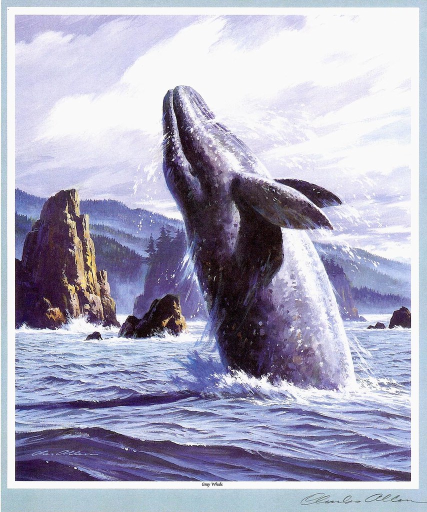
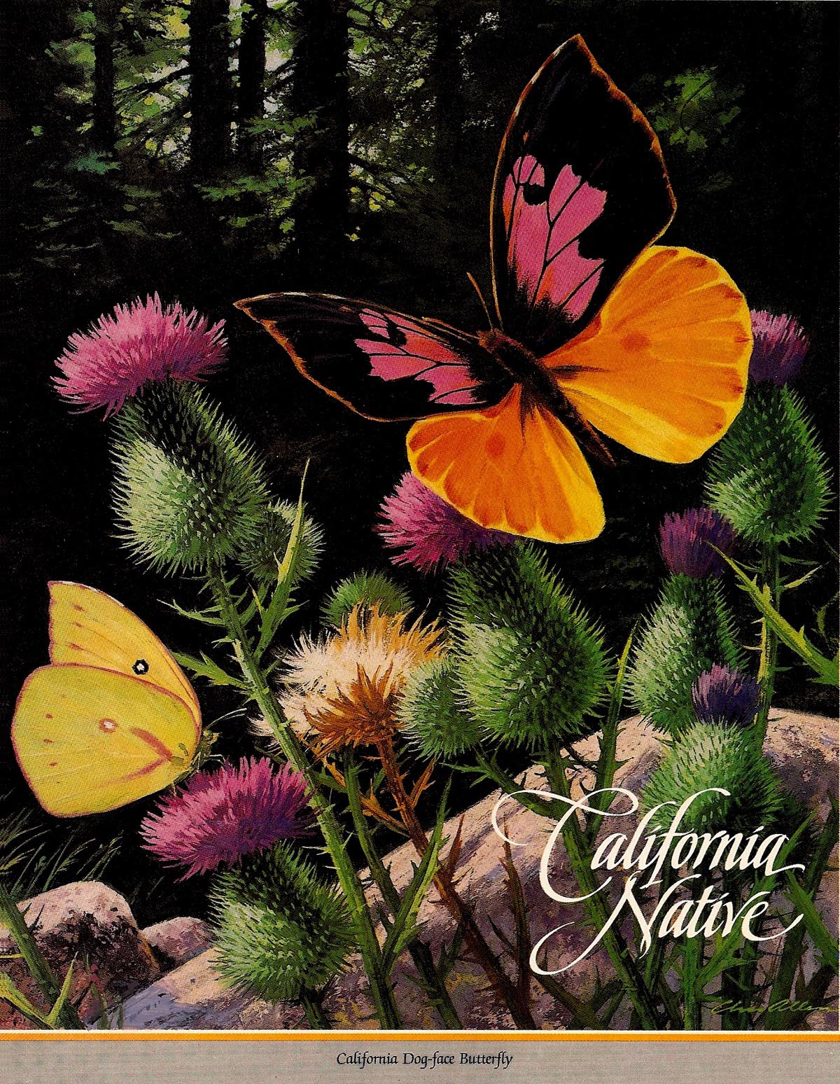
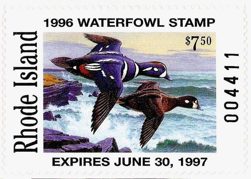
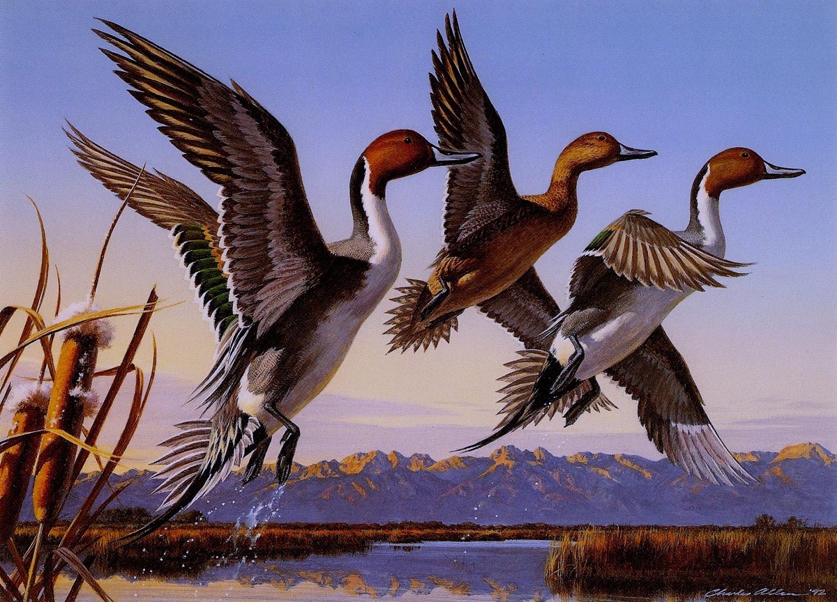
The rest of the scans are from the last business magazine ads that I illustrated....in the early 90's, at age 70, plus or minus. For State Fund, a long and faithful client. This was a series called 'California Natives'....subjects, the California State plant, animal, bird, and various other designated 'natives' of the state. As an old salt by then, the illustrations were intentionally strong on value and color. My attitude was, 'go for broke!' Print media and illustrations were largely gone....why not leave with a statement? State Fund received a lot of letters on these, and ended up making prints to fill requests. First, the California grey whale. It migrates from far north down to Mexico, but is the state marine mammal. Thought about an underwater scene....but wanted to show north coastal California. A breaching grey, with 'sea stacks' jutting from the ocean, to repeat the illustrative theme.


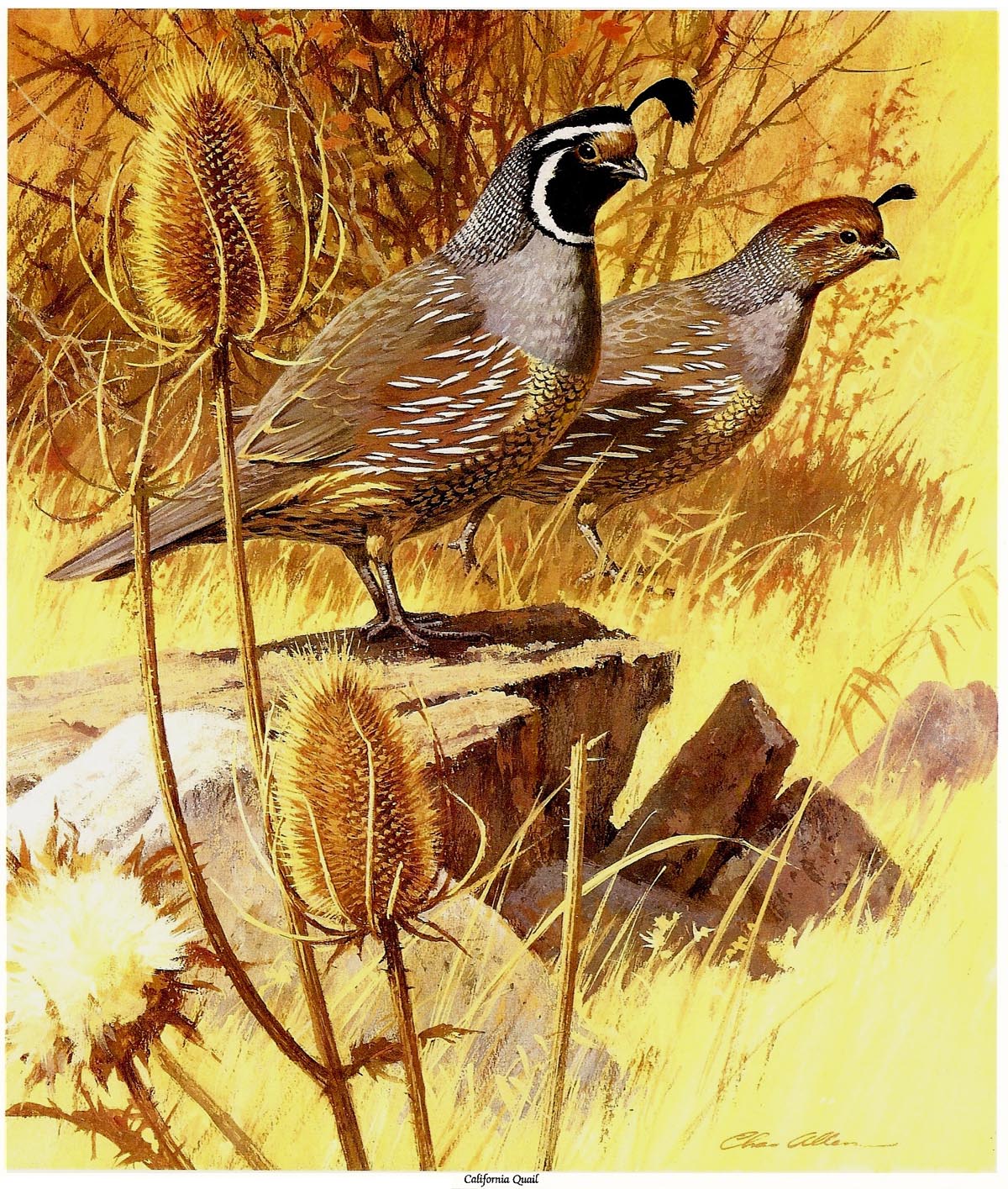
Next, the state bird, the California Quail. A popular, charming, friendly resident....mostly crowded out in suburbia these days by too much development.


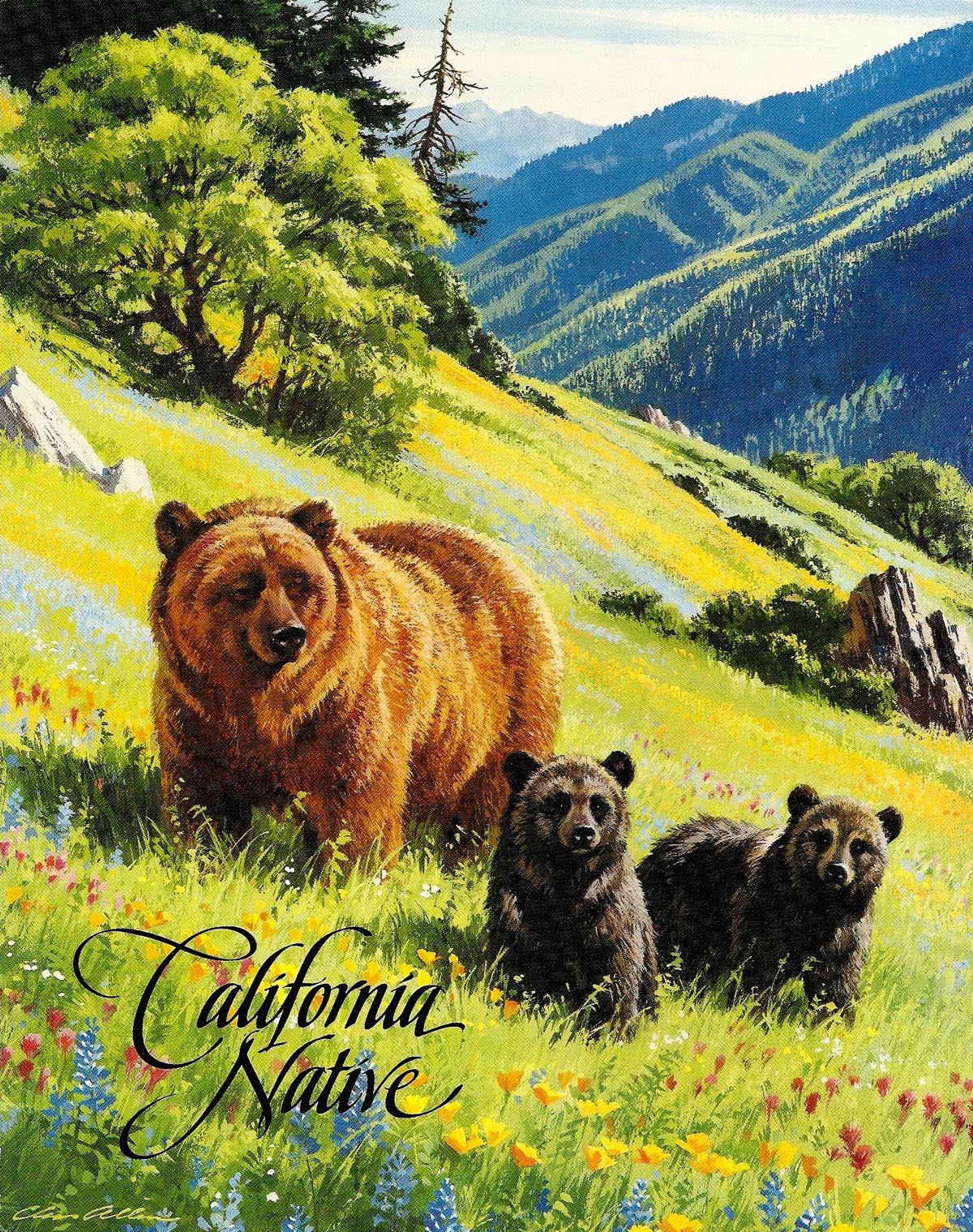
This is getting long....anyone awake? Following, is the state animal, the Grizzly Bear. Bays, valleys, streams, and more are named 'Grizzly Island', 'Grizzly Bay', and so on. Today, the nearest Grizzly is found in northern Montana, the Canadian Rockies, or in Alaska. The illustration shows a mother Grizzly and cubs....spring time in the Sierras in the early days.


The California Golden Trout, the state fish, is next....found in streams and small lakes in the very high Sierras.


Finally, the state butterfly, the California Dog Face butterfly, named for the colorful design on the wings. These were done in gouache....a fun series to illustrate....thanks to State Fund, Chet Patterson, near retirement at that time, and to Bruce Hettema at PHCreative in Santa Rosa.


That should do it....and thanks again to all. Mel Blanc was the amazing 'voice' of such famous cartoon characters as 'Bugs Bunny', 'Donald' and 'Daffy Duck', 'Porky Pig', and a host of others. I'll piggyback (pun intended) using the old 'Loony Tunes' sign-off by Porky Pig....'uppitty yuppity yup....that's all folks!'

* Charlie Allen's Flickr set, which contains nearly 700 images, encompassing fifty years of professional and personal work!

Thursday, December 3, 2009

'HOME COOKIN TOO'....

This week's Caws will continue the non-commercial theme....I think a change on the next one. Getting back to family projects....the first scan for our middle daughter, a silk screen label for an organic deer repellent she had conjured up....and it worked! She lived in Colorado at the time and had all kinds of deer and wildlife that made gardening difficult. The usual problems a product....distribution, advertising, and competition that developed a better mouse trap. The winning repellent, I believe, uses an extract of wolf urine....which lasts longer and works better. The 'O-DEER' title and label idea was hers.


Next, a letterhead, a request from a daughter who was a legal secretary for an L.A. law firm at the time. The attorney who headed the firm was Italian and very active in heading up a charitable foundation called the Heritage Center.


Following that, a small self adhesive sticker that was used in my wife's vacation bible class sessions for a couple of summers. The subject, 'one world' studies depicting kids from around the world.


The remaining posts are of paintings done over the years on a variety of subjects. Most are framed and on our walls....never have been able to afford other artist's originals! Prints at times....mostly 'Impressionists'. The first of these, a fairly large acrylic on canvas of California native sycamore trees. Gnarly, twisted trees that grow in riparian areas along the coastal hills and mountains. These, about mid-state, were a familiar sight on our trips south. A western Magpie included, beautifully marked and sporting long tail feathers....a slow flying rural resident.


Then, a painting of a Montana ghost town inspired by a small B&W photo. Added were the old car, desert plants, the warm colors, etc. It was done on gessoed board.


Two watercolors follow, both painted while at the Art Center School in 1947. The class was weekly, an 'all day' outdoor watercolor effort....actual working time about 4 hours. The first was painted from a pedestrian overpass of a large rail yard in the industrial section of Pasadena...


The second near the ocean pier at Venice, California. Our instructor, Ed Reep, a fine watercolorist, would assign the following week's location at each session. It could be anywhere in the large Los Angeles area. When he assigned the night location....we groaned....'You can't paint a watercolor at night!' 'Oh yes you can'....was his reply....'you'll find a way!' At the beach town location, many of us found a way....under a large bar and pool hall marque. To top it off, it was raining! Instead of looking out on the lights and pier, I chose this view across a wet parking lot. It seemed to work out fairly well.


The last, a fishing boat watercolor at the colorful Fisherman's Wharf district on the San Francisco water front....painted in the 50's.


* Charlie Allen's Flickr set.

Thursday, November 26, 2009

HOME COOKIN'....

Retirement in my case was not a sudden thing....as in a nine to five occupation. It happened gradually over many years. Still expect to do the yearly 'Olympian' cover portrait....so maybe I'm not retired after all. The scans on this week's CAWS were done in the 80's and 90's....and represent volunteer efforts where needed by family or friends. Every doctor, lawyer, merchant, thief....oops, chief....(must be thinking politicians)....is approached by friends and family for 'advice'....free of course. Artists are, as well, and mostly it was a pleasure to be of help. I've had to turn down a few. Very early on, a neighbor said she'd love to have a painting of parrots over her mantel....and that she would pay 25 or 30 dollars for the painting. I tactfully said I didn't do parrots....and refrained from mentioning the monetary offer.

The first scan, 'New Kids in the Cases', was a loose line cartoon used by the Natural Sciences department at the Oakland Museum.


After retirement from her school teaching job, my wife volunteered as a docent in that department. This was a 'wifely' request....can't turn those down! Next, a couple of wine label comps for my brother....planned in one color to hold down costs.


Retiring from an engineering career in Southern California, he and his wife moved up to Sonoma County, a well known wine growing and making area. He 'engineered' a marvelous wine cellar, outfitted and cooled to a constant temperature needed for storage and the production process. Making good wines is both a science and an art....and a bit of luck for good measure. Amateurs can make, bottle and distribute wines....but not sell them. He won many awards at fairs and competitions....and of course, we benefitted. He chose a third label, not shown here....I think I like these better.

A comp for 'Moxie's' follows.


In the 80's a daughter's friend opened a restaurant in Chico, catering to college students. The name was in honor of his much loved Australian Shepherd. My daughter, a community college art instructor, was the gallery art 'promoter'. Friends and students work....and a bit far out for my tastes. This logo, for some reason, was not used....may have been concern about rights or legalities....whatever. Then another request, influenced by my wife's participation for years in the Lafayette Garden Club. The line cover, front and back, was for their yearly membership directory. The gazebo plantings are maintained by the club.


Finally, two designs produced in silk screen, the first, magnetized boxes for fishing lures.


Small travel items on the second box.


Last, and I may need to 'duck' incoming here. Unrelated to the above examples....one was a small comp prep for the Tejon Ranch painting...


...the other for a remarque.


Reason....I found this breed fascinating to draw. The strong color pattern, the thick neck, and uniquely faired head and bill shape.

* Charlie Allen's Flickr set.

Wednesday, November 18, 2009

'LADY OF STEEL, I ADORE YOU RIGHT FROM THE TIME I FIRST SAW YOU....'

Improvising on the old tune, 'Lady of Spain'. I believe Eddie Fisher had a popular rendition of that in the 50's. A song often performed, for some reason, by accordion musicians....and wow, how dated this blog must seem each week! But, that's what it's about. The point is, we'll pay a last visit with the intrepid 'lady of steel'...


... as well as a last look at a few early 50's and 60's black and white illustrations and spots.

We'll begin with a '49 small B&W for American President Lines, an early attempt at the 'S.F. style' of line illustration established by Ludekins, Galli, Bomberger, Haines Hall, Jim Hastings, Willard Cox, and others.


A Chevron (or still Standard Oil) newspaper B&W follows, another early 50's effort, and an attempt to 'paint' with line tones. Not good on this, a complicated subject. I was then, and am still, an admirer of Charles Dana Gibson....one of the truly great line illustrators way back at the turn of the century. He 'painted' halftones with pen and ink....remarkable. That gave way in our time to cleaner, simpler, line techniques...


...as seen on the 'Yogurt' illustration that follows.


From this point on, US Steel B&W spots, many in the series seen earlier.


The first two were before the 'hostess' group...


... the rest featuring our indomitable 'lady of steel'.


Turned out in ads that included four, dozens and dozens over the years...


...a long running ad series for me.


The last two or three show her 'bouffant' hair style, popular in the 60's.


I've kidded about her role in these ads....but you can't blame the advertiser's concept.


What better way to soften up and attract readers to 'cold' steel products?


The CAWS is nearing the end....and we've heard that song before! Next week a change of subjects, closer to....in fact in....the retirement stage.

* Charlie Allen's Flickr set

Thursday, November 12, 2009


'BLIND NONCENTS'

MR DUCKS
MR NOT DUCKS
OSARDUCKS CMWINGS?
LIBMR DUCKS
MWAS DUCKS

We'll deal with the above title at the end of this....nonsense indeed! Returning to last week's Colorado and Rhode Island duck stamp prints, coming along late in my illustration career. Those were published and sold by Steiner Prints in San Francisco. Bob Steiner is a good friend and a 'boomer' artist who, like many, arrived a bit too late for the advertising and editorial illustration world that was available when I started out. He was interested in the wildlife and duck stamp field....and with a lot of hard work and effort became a successful publisher as well as duck stamp and print artist.


As mentioned last week the business had changed since the early 80's. Almost all states by the 90's had issued revenue stamps required of hunters. Duck stamps and prints multiplied exponentially....multiple states issuing new stamps each year. Result, multiple prints for sale. Soon the collectible phenomenon of the early 80's was a thing of the past....and even sales of the vaunted Federal duck stamp and print, around since the 30's, were greatly reduced. Colorado was the last 'real' competition that I entered and won....over 150 entries, as I recall, judged by a Colorado Dept. of Wildlife sponsored jury. Then, several years later, Steiner Prints invited several artists to submit entries for the Rhode Island competition. Several more entries came from the state. At that time commissions or royalties were greatly reduced....as well as fewer print sales in a small state. Following those, with an obviously old career, and with the exception of a few more commissioned paintings, that was the end of my duck stamp adventures.


Before proceeding, the pencil sketches posted on these blogs were small comps done for two purposes....possible designs for duck stamp entries, or on most, an outline comp for remarques. Remarques were original color or pencil drawings done just below the print....ordered, for an added cost, by some collectors. Finally....we'll get to the color scans. First, two rough gouache comps, one of mallards...


... and the other of Canada geese, for duck stamp entries. I believe neither were finished or entered.


Then a full size entry for, as I recall, a South Carolina competition (it came in high, but no cigar), later framed and sold to a collector.


Then a color entry of redheads (ducks!) for a later Nevada competition....showing a typically chilly morning in the Fallon area.


Last, a commissioned painting, a large acrylic on canvas, of a collector's hunting area on the Tejon Ranch in the Southern California mountains. He specified and provided camera shots of the particular lake and hills....in late summer! Instructions....show canvasbacks on a windy, stormy, day with a light snowfall....in December....usually good for canvasback duck hunting.


Because it's on the desktop, we'll end the duck stamp era blogs with a pencil comp....portraying three mallards landing in a rice field in the Sacramento Valley. It was an outline comp for a commissioned painting....a large acrylic on canvas. It was completed and delivered....but for some reason, no record of it now in color.


Oh yes.... the 'Blind Noncents' code! Should any viewers have the time or interest in providing an 'English translation' under comments, he or she will receive the exalted title (in keeping with our present administration) of 'Czar of Commenters'. Clue....two 'good ol' country boy' duck hunters, standing for hours in a cold blind with little or no action....a mild argument.

* Charlie Allen's Flickr set.

Monday, November 2, 2009


THE HUNTER CROUCHES IN HIS BLIND
'NEATH CAMOUFLAGE OF EVERY KIND
AND CONJURES UP A QUACKING NOISE
TO LEND ALLURE TO HIS DECOYS....
THIS GROWN UP MAN, WITH LUCK AND PLUCK,
IS HOPING TO OUTWIT A DUCK.
OGDEN NASH

Thanks and credits to Ogden Nash for the poetic witticism. When I was young my parents had friends who were ardent duck hunters. An often used joke when they served a fancy duck dinner was that it was a hundred dollar a plate meal. Like many hobbies and sports, duck hunting was, and is, a pricey avocation.

On this second blog regarding duck stamps and art....one aside on an aspect of duck flight. The interest or allure of bird hunting is the timing and challenge of hitting a fast moving target in the air. Ducks are the 'fighter planes' of the bird world. Fast formation flying and maneuvering....exciting to witness. If it seems odd in a drawing to see a duck in a steep bank with its head in an upright position....it's an accurate portrayal. Their heads and eyes are constantly turning and looking.


California's Stamp competition was limited to California artists, being the more populous state. Nevada's competition was open to artists anywhere in the U.S. More collectors bought prints and stamps sold on the first year....consequently Nevada sold over 1800 prints in 1982. My print followed in 1983, and the state requested I publish the same number of prints so collectors could duplicate their '82 print number....considered valuable in a collection. We cooperated, and sold less than half the total. In California we published over 900 '83 prints, and sold about 3/4. Merely one of the many complications and vagaries of this 'new' business.


I had to sign and number in pencil under the image on all of the editions, whether sold or not. Sounds easy....but the process, including writer's cramp, went on for a couple of weeks. There were other duties connected....forms and print covers to number, packaging and shipping groups of prints to the publisher and some to individuals. Additionally, drawing and painting dozens of pencil and color remarques for the collectors requesting those, and lots of phone calls to the publisher and retail dealers in and out of state. Busy times! The whole process lasted well into the second year....and I was still illustrating one or two commercial jobs each month. As said, being in the thick of the Duck Stamp Print fad was a learning and a worthwhile venture.


The first two scans posted were pencil sketches reproduced on the cover jackets of the California and Nevada prints. This week another wordy CAWS....but it's a large subject to cover. Later on I won two more Duck Stamp competitions....the 1992 Colorado Duck Stamp,


and the 1996 Rhode Island stamp...


... at the age of 74! A bit more on those next week....but by then the business had changed drastically. Next week, we'll mention the differences and show a few collateral paintings and other examples of the duck stamp phase in this long lasting career. For now, we'll post the '92 Colorado print of Pintail ducks,


... and the Rhode Island print of a pair of Harlequin ducks over the New England coast.


With dogged determination,


... the CAWS will post one more blog of the duck stamp era including comps and commissioned examples.

* Charlie Allen's Flickr set.