Monday, August 31, 2009

THIS AND THAT....ODDS AND ENDS

Should be a relaxed CAWS this week, and maybe the next. No series, just cleaning house, as it were. No philosophical or geo-political meanderings....except, as an old friend used to quip when a discussion got off subject....'what's that got to do with the price of eggs in China?' Obviously, nothing, so we'll try to stay on the illustration subject.

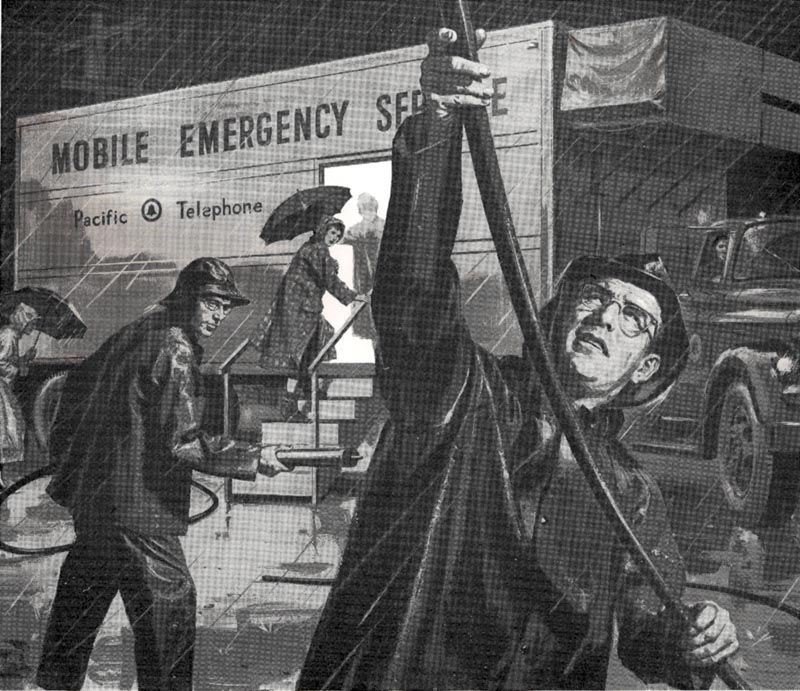
First, a 50's PG&E halftone for newspapers, a wintertime emergency crew illustration. BBD&O provided a photo of the trailer and rain gear in use at the time. I came up with the scene of downed power lines. Their biggest concern was....make sure both workers are wearing safety glasses!

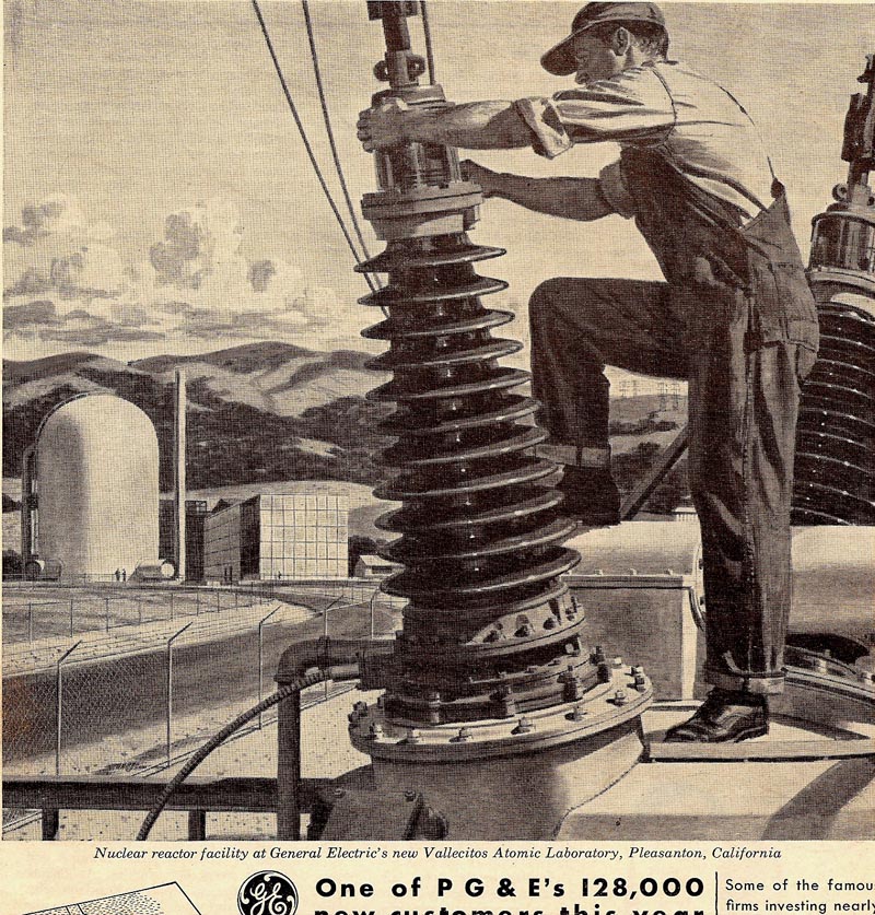
Next, an early PG&E ad promoting, or maybe acknowledging, the building of the Vallecitos nuclear plant in the east bay hills. If memory serves, it didn't last long, and was soon removed entirely. A similar nuclear generator in Eureka, CA, also had a fairly limited life.


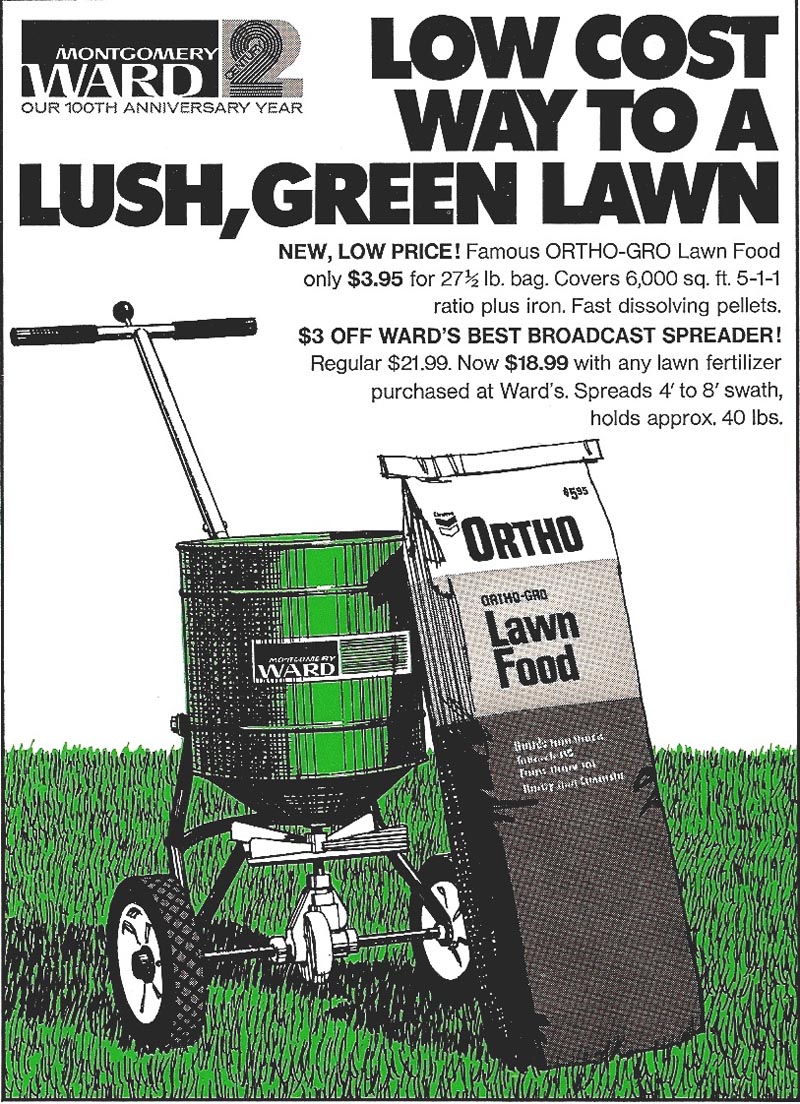
Then two line plus color illustrations, agency McCann Erickson, client Ortho Chemical.


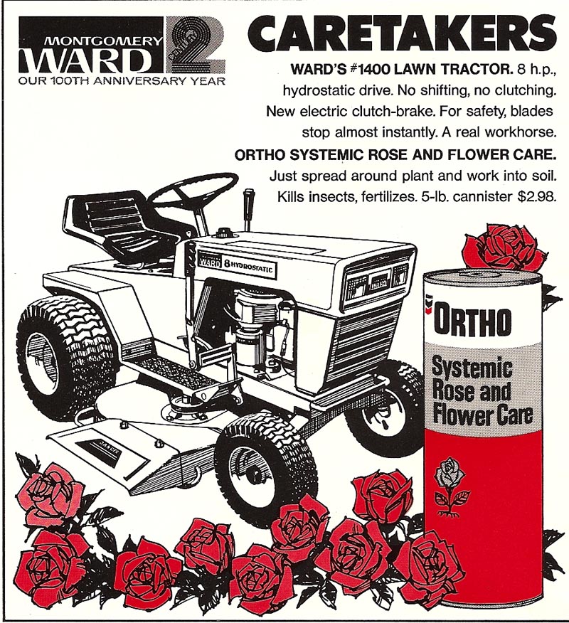
I think these were for gardening magazines such as 'Sunset' and possibly for trade ads.


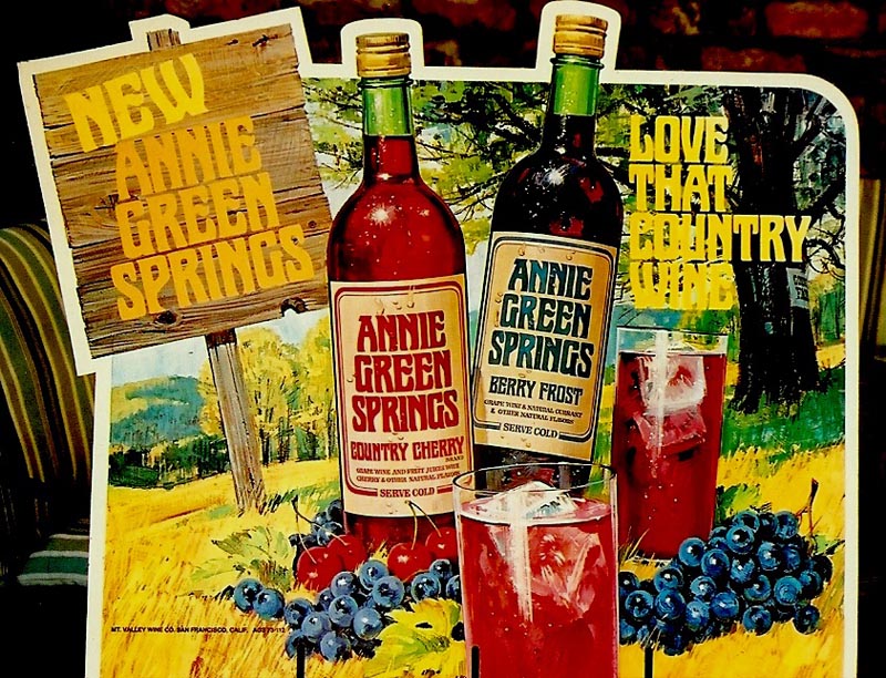
Following, a rather poor scan from a photo taken on the patio, a point of sale box poster for a wine called 'Annie Green Springs'. Very much like the Gallo POS ads which we've seen, but a product of another wine company. It came at about the same time, in the 60's, promoting the cheaper 'fad' wines of the those days


A large menu cover next....for Farrell's, a California chain of restaurants. Difficult to scan and Leif is piecing this together....good luck! The idea, a turn of the century or early 1900's painted sign board. It was a collaborative effort with artist/designer Jack Martin at P&H. He designed the comp and lettering styles, I did the finished art, including the lettering.


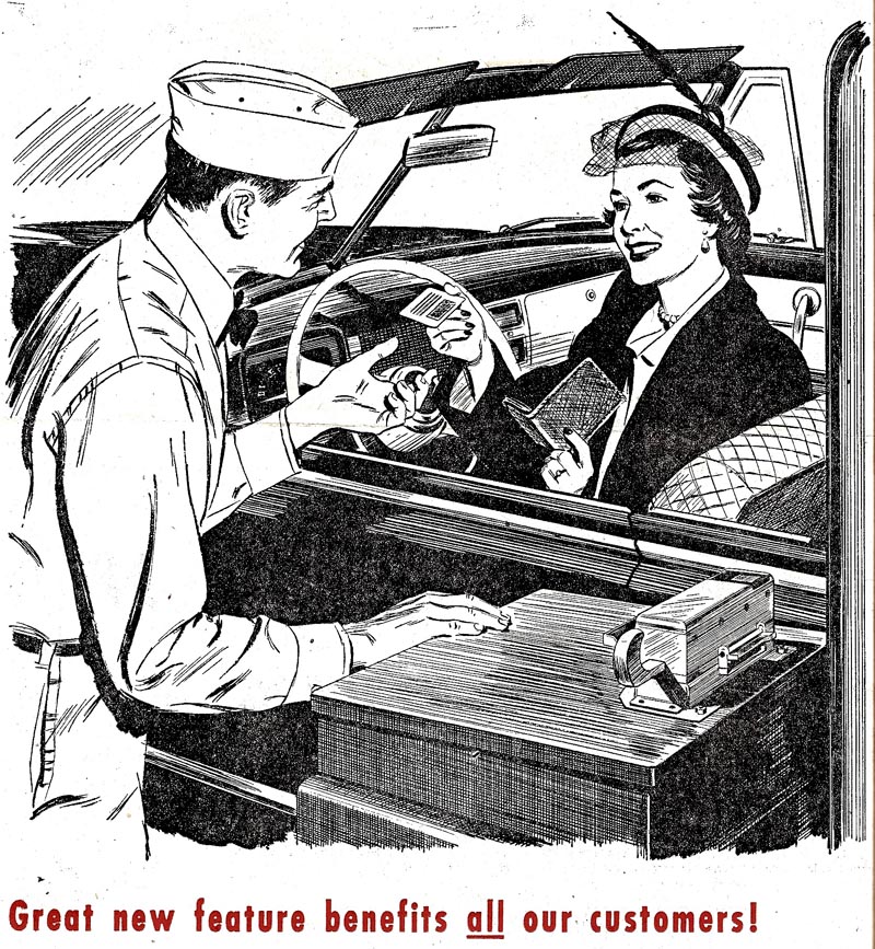
Still clearing, an early 50's B&W line illustration for Chevron. A similar ad has been posted before, with two car passengers.


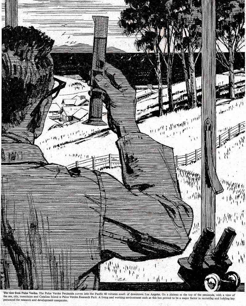
Then a B&W for newspapers, Southern California Edison, I think the client. A promotion for Palos Verdes Research Park, light industry in an expensive area. The agency wanted Catalina Island shown in the distance....visible just a few days a year. When seen, it does look 'perched' on the horizon. This again from the 50's.


Following, a close up color scan sent months ago by Bruce Hettema of P&H Creative in Santa Rosa. It was from a Chevron billboard showing a 'Senator Claghorn' (old radio character) type of politician. Sig Beartown of P&H posed....a frequent model in our ads. This shows my gouache painting technique pretty clearly.


Last, last....another visit from our brave 'Lady of Steel' (we may never run out of these spots)....


...still 'out standing in her field' in high heels and light clothing,


regardless of weather and rigorous conditions!


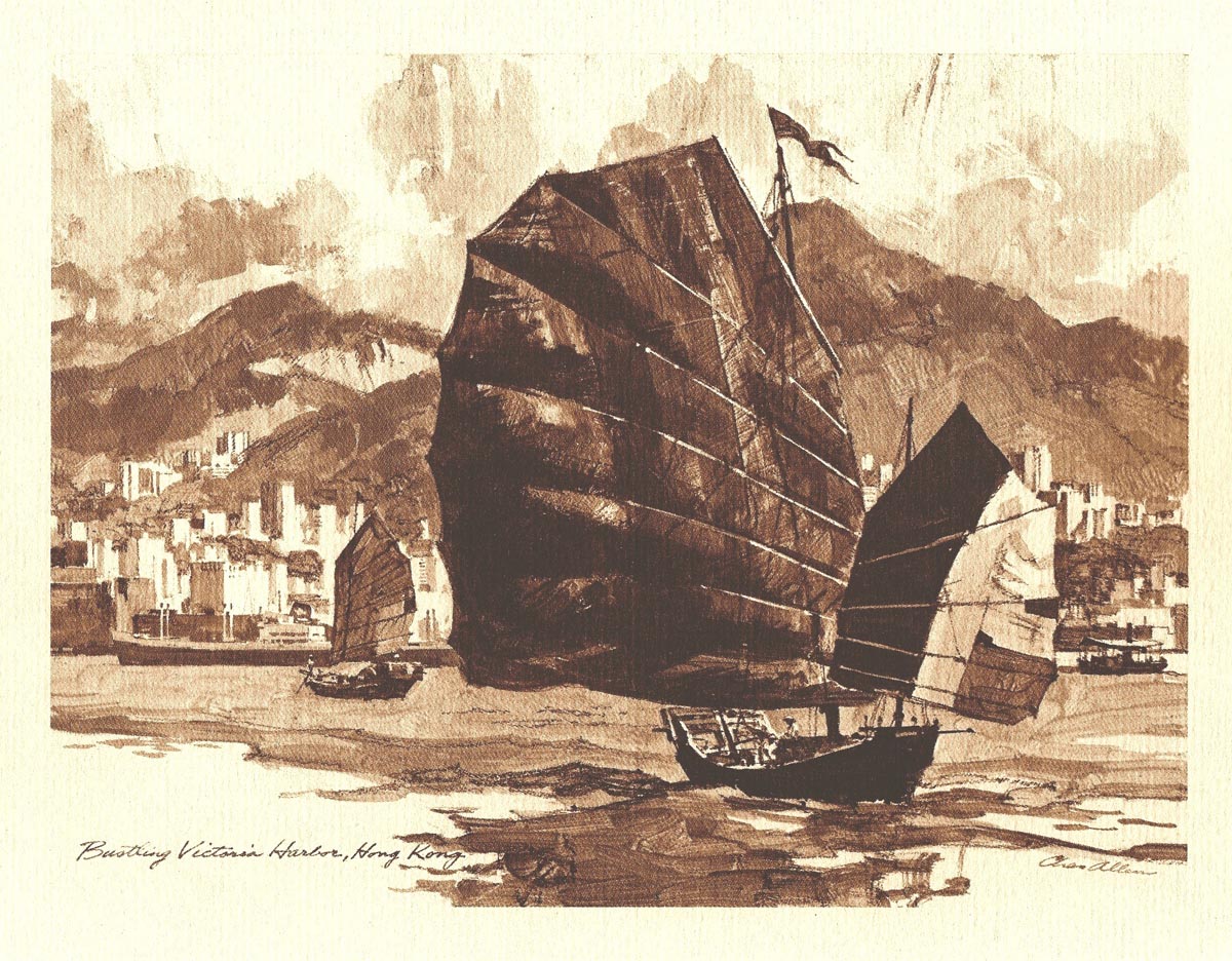
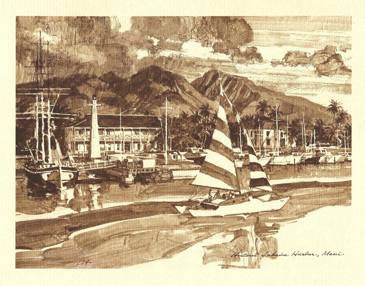
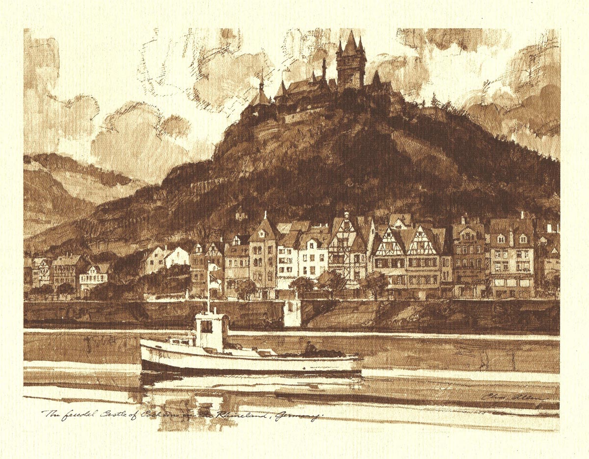
* Charlie Allen's Flickr set.

Monday, August 24, 2009

'....OF SHOES AND SHIPS AND SEALING WAX, OF CABBAGES AND KINGS!'

I believe a quote by the 'Walrus' in Frank Baum's great classic, 'The Wizard of Oz'. Meaning here....maybe 'trivial' in most of our lives.... the subjects and product promotions of the huge advertising world. A very necessary part of commerce, of course....and though generally banal....advertising was, and still is, an important venue for writers, performers, and artists who might otherwise wither away!

Had a brief discussion with Leif this week....in which I labeled (not libeled!) one of the old time ad and editorial illustrators as 'square as a bear'. I think I'm qualified (I believe called 'street creds' in today's parlance) to make the square critique, being a prototype model myself. My work didn't loosen up until the 60's and 70's. After that, I retreated back into 'squaredom', as we shall soon see. This week's CAWS will post some 50's ads that will surely verify these musings on 'squareness'.


First, from1953, four B&W newspaper ads for Lucky Lager Beer.


These were done in the Higgins ink wash technique that I preferred for halftones in those days.


Very square....but that was the era for it.


Then a B&W line illustration for 'Morris Plan', a good client in 1950 when the ad was done. Vintage clue....the black cradle phone. The illustration, square as it was, was another 'break through' B&W for a young illustrator....new and other clients were added from this.


Following that, one of the early 50's line PG&E consumer ads trumpeting low electrical rates in California. No more! Pen and brush and ink, this one of the college town of Chico was scanned from an old newspaper clip.


Next, one of the Potlatch Forests ads....a couple of those were posted earlier. This one on 'Presto Logs'....a very popular product in those days. The young model and her German short-haired pointer, and her parents, were good friends.


She's now a boomer mom of young adults.

Last....a change of pace....and not sure this fits the 'square' category! Again from a yellowed news clip, a B&W line plus green cartoon illustration for Acme Beer....a seasonal 'bock beer'. My Webster describes 'Bock' as a traditional Bavarian dark beer, drunk in the early spring. Can we assume that after a cold, snowy, Bavarian winter, the dark brew had them feeling a bit like big-horn rams?


Dunno....cheers!

* Charlie Allen's Flickr set

Tuesday, August 18, 2009

'WHEN OUT OF AN ORANGE COLORED SKY.... FLASH....BAM....ALA-KAZAM !....'

Obviously, we'll do anything to tie an old song into the weekly CAWS title. The lines were from a 1950's pop tune....Nat King Cole had a fine arrangement of it. Those two, maybe a bit off, are 'close enough for jazz', as the saying used to go. Probably due to working in my home studio from the late 50's on....and listening to radio talk shows and several DJ's playing 'top 40' tunes. Still remember parts and pieces of the era's music. A good live radio show then was Arthur Godfrey, who hosted different musicians including pianist Errol Garner, a favorite of mine. Again, I digress from illustration....maybe just as well!

The first three scans are from a 70's typical 4 x 9 inch pamphlet, this for AT&T....done in line, halftone and one color.


The orange color was actually a second grey halftone....it was cheaper that way....but a bit of a guessing game.


The ad was intended for rural land owners back when thousands of miles of fiber-optic cable were being laced through the land.


Following those, four small prints (roughly 6 x 9 inches) from a San Francisco Savings and Loan....goal, more savings and more loans.


It may have been S.F. Federal, where we had an account in a branch near us.


Done in the late 60's, printed in sepia ink on a toned paper....and offered to customers....it was illustrated at the height of the 'acrylic craze'.


The art director's instructions, in keeping with the era, were to 'keep them loose'.


The scans could be better....but loose they were.

Then, clearing decks, a P&H promo ad from the early 50's, a B&W ink wash of a cowboy. A couple of eastern AD's had me down as a 'western' illustrator from this.


Again, the scan could be better....as is the case on the last two. Done in the 50's, a full page newspaper ad promoting winter sports in and around Reno. From a news proof, I copied and pieced the 19 inch figure....a 50% reduction....hence not good fidelity. It depicts a lovely model and the 'latest' in ski fashions.


Also included, displaying some of Reno's amenities (not including their 'main sport'....gambling!), a few B&W spots from the right side of the ad.


* Charlie Allen's Flickr set

Wednesday, August 12, 2009

MONTAGE MANIA....

The CAWS has already posted scads of montages....and these should be the last of that genre. Genre....montage...collage....how many French words we use in the English language every day. Had an omelette for breakfast, a baguette for lunch, a croissant with coffee. Almost everything about an airplane is French....aviator to begin with....fuselage, empennage, aileron, canard (forward horizontal stabilizer as on my homebuilt). Enough wandering here! Montages were around when I produced illustrations for our high school year book in my junior year (they were not good!). Those yearly epic productions always included photo montages of students hamming it up at sports events, rallies, dances, or even posing for local ads. For some reason on the west coast, montages became a 60's and 70's fad once again....and I certainly contributed my share. I don't think eastern illustrators in the same years experienced the trend to the same degree.

First (and at great professional risk!), I'll post three high school year book illustrations. Montages, way back then, done in some kind of pencil technique on Strathmore drawing paper....at age 16.


I was art editor for the 1939 Owl that year.


The main purpose of these scans is to demonstrate to all young artists to hang in....there is hope!


Then a group of brochure illustrations for State Fund.


As said before, the type of services and business that State Fund represented led to brochures, and to portraying the diverse occupations covered by accident insurance.


These were done in Charcoal pencil, reproduced in one or two colors.


Following, three nibbed pen illustrations with added color, printed on colored stock. They were for Medi Fund, a medical equipment leasing company.


Montages again....that got a bit carried away, as I see them today. Done in the 70's, no doubt pushed for time and from trying to look mod or cool!


As said the restless late 60's and early 70's environment encouraged new styles and a new look in advertising. Not just advertising....it really affected the entire culture.


Finally, a pamphlet for a very small client....a rather simple montage.


For a historical cemetery being newly restored, plus buildings added, a couple of charcoal pencil drawings reproduced in two colors. Again I owe thanks to P&H design/layout guys for their essential roles in these.


Obviously, I used the Charcoal pencil technique often in those years....and still think it effective. This week should pretty much do it for montages.

* Charlie Allen's Flickr set

Wednesday, August 5, 2009

'OUT....OUT....DAMNED SPOT!'

If correct, a quote from Shakespeare's 'Macbeth'....Lady Macbeth's impassioned plea in that classic tragedy. From an old memory when I was young, my mother's occasional humorous quote when something spilled. To get to the point, a 'spot' in the 50's or 60's illustration world was any small illustration job, usually in B&W line. Our comments then might have been, 'In....in....more spots! The more the merrier. The reason, at least it was conjectured, you could earn more with frequent small spots than with bigger, more complicated jobs that required more time and effort to complete. I tended to agree....a small illustration was less of a challenge, a bit more fun to work on, and changed the pace. The CAWS will post some of those this week....maybe a repeat or two....having a short memory. Most are pretty boring....but hey, it was advertising!

First in line are five spots for Bank of California...


...don't recall the agency, but a good client.


Printed images were about two by three inches.


The last of these (below) was from a photostat, the method of reproduction quality copies in those days. They were used, but don't have ad proofs.


The next two were from the back of 'Telephone News' mailers....some of the cover illustrations were posted earlier on CAWS.


The 'Fort Point' spot needed some sea gulls, or something for action. Very static, and probably done in a hurry.


Following are four spots, again for Pac Tel, promoting the 'outstanding' job opportunities at the company.


As pointed out many times here, check the inflation rate since that time.


Hold your hats....it's going to happen again!


Then a B&W spot for Castle and Cooke bananas...


...and an Ortho Chemical job. I seem to recall the headline was done first and my illustration matched the perspective.


Finally, a scan from the original illustration, a line and wash B&W. I remember a couple more of these, done in the 70's...


...but haven't the foggiest notion who the client was. For now....enough spots!

* Charlie Allen's Flickr set