Tuesday, February 24, 2009

'MIS-TER CHRISTOPHER COLUMBUS

SAILED THE WORLD WITHOUT A COMPASS....'

From a dimly remembered big band swing tune. For some reason I keep relating old tunes and lyrics with today's events. Checked this one out on Google, and sure enough, heard an audio sample by Benny Goodman....good stuff! Actually, Columbus did use a compass. What he lacked was a method or instrument to track longitude....thereby not knowing how far they had traveled. The first scan is of Columbus's 'Nina', frustratingly out of focus, from a large Gallo point of sale poster done in the 70's. 'Tasteful' was never a big consideration with Gallo POS ads....just large, hard hitting, product advertising.
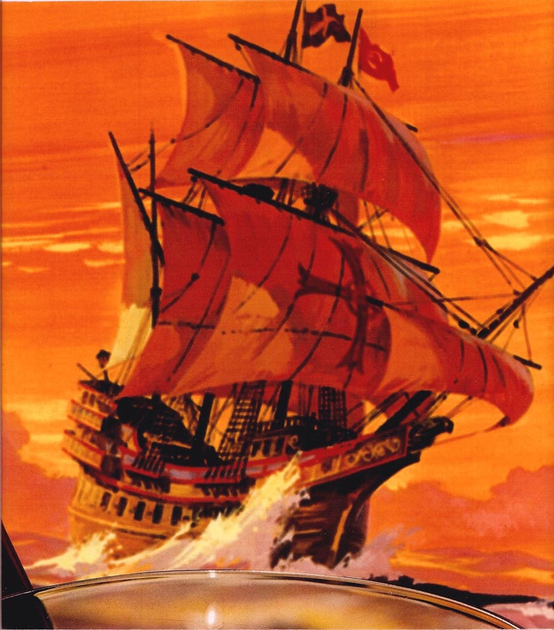

I did dozens over the years. They often used product photos with the art....the photos in the foreground. In this case, the illustration was set up behind the glass and bottle, so naturally suffered from camera focus. This art was for a red 'jug wine' named Spanada.

History, or illustration relating to history, is the CAWS idea this week....and there were not a lot of historical assignments in advertising....for me at least. Two 1970's comps follow, again for a client that I can't recall. It did not come through the normal agency channels. This fairly large illustration went to finish....but I never saw the poster. The comp request was for the Lincoln Memorial statue....painted in sepia tones....with the famous quotation from the Gettysburg address above it.
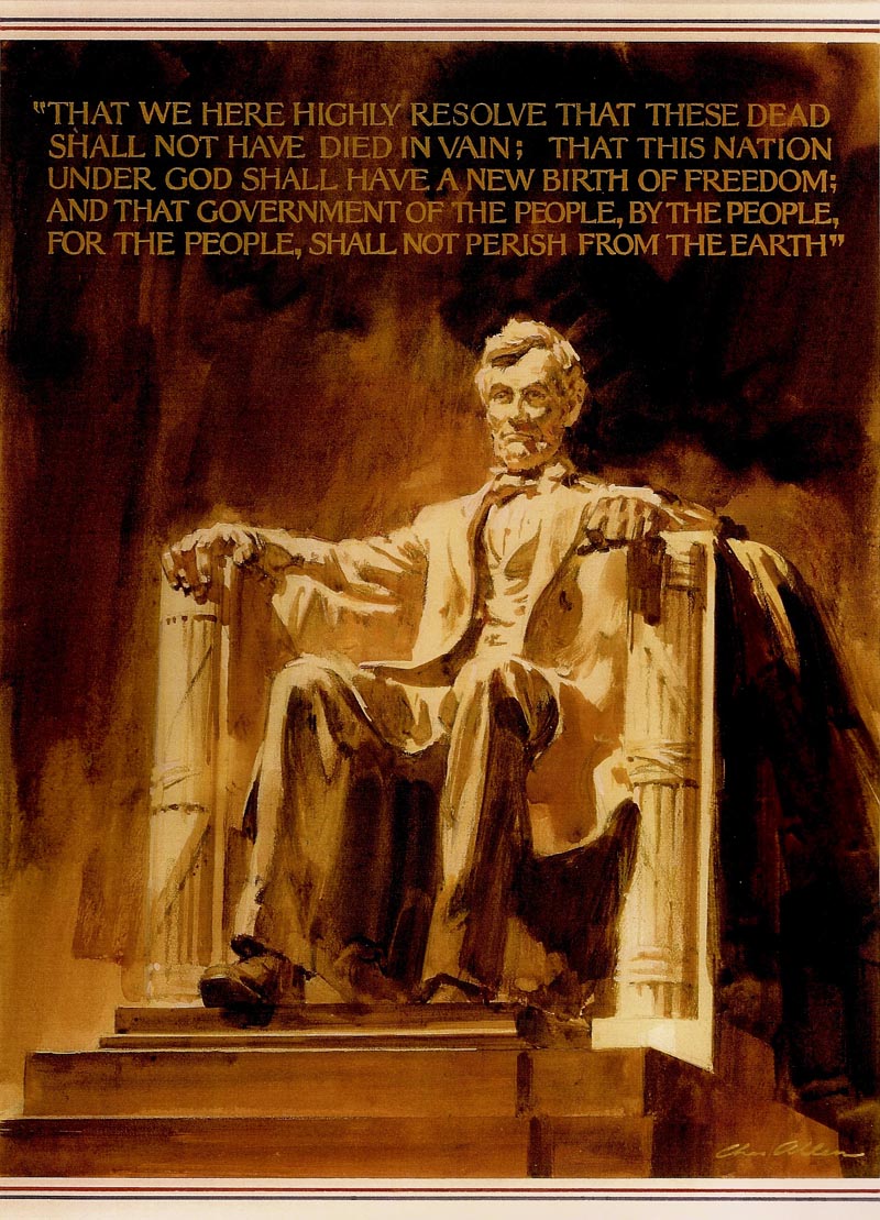

After seeing the sepia comp, the client requested the finish be done in the more natural colors of the marble statue, plus a flag theme behind with the quotation....and a panel below showing the well known exterior view of the Lincoln Memorial. The client didn't want the cost of another comp, as I recall. I created this hasty but necessary comp for myself....hence the lack of 'sharp' drawing. Wish I had followed through to see the finished result, and where it was used.


Next, three unique commissions from a 1970's San Francisco entrepreneur selling 'audio postcards'. These were plastic covered cards, a 33 1/3 record embossed on them, commemorating the bicentennial anniversary of the founding of our country. Four in all....I'm missing one....and yes, Virginia, people played music on turntables in those days! These scans, grooves and all, are from the cards....done at the height of the montage and 'acrylic swish' illustration period on the west coast.
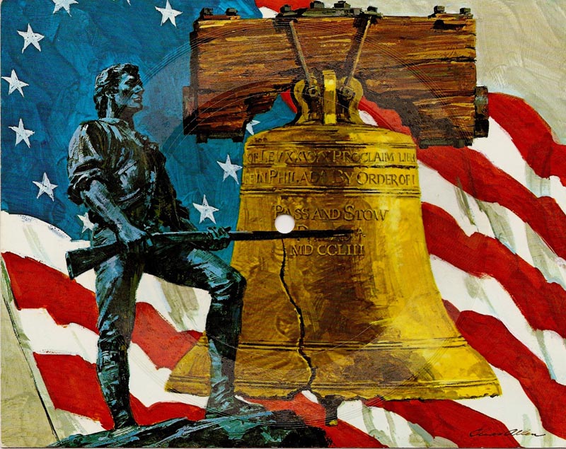
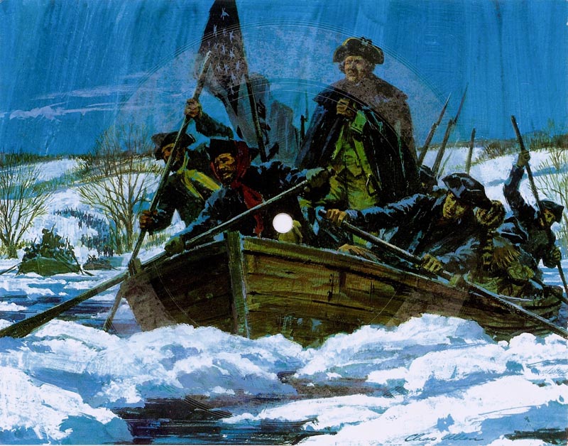
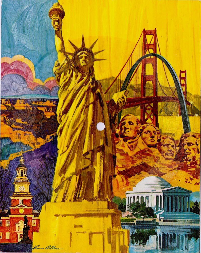

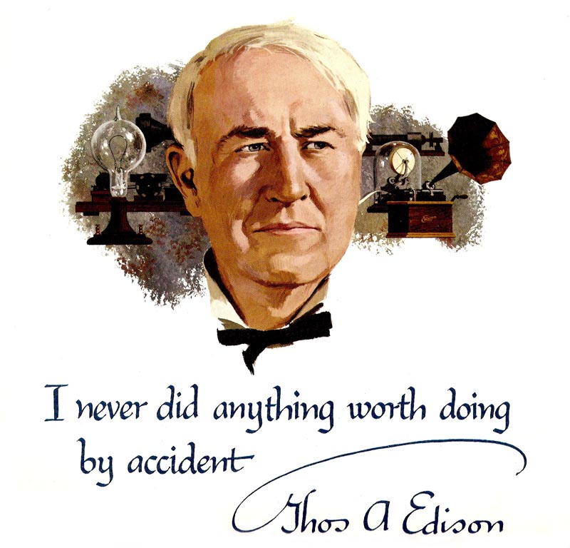
A bank savings poster follows....Thomas Edison the subject....a gouache done in the 50's.

Finally a marker and pencil color comp for a Wells Fargo billboard....this one for me, a more finished comp submitted. One day Tom Hall came in, said Wells Fargo, the very conservative San Francisco bank, wanted a 'new look' for their billboards....still using the traditional symbol, the red and yellow stage coach plus six horse team. My ad philosophy, especially on billboards, was to give the client the most bang for the buck. I think this could have been a strong, eye catching poster. As it turned out, too much of a 'new look' for the conservative bank.
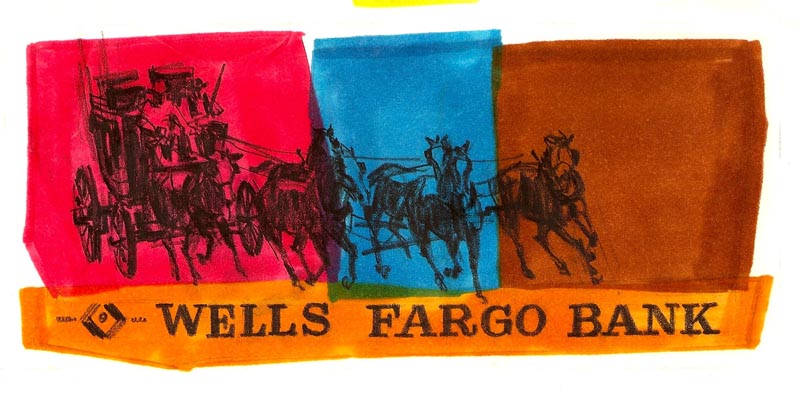

They went back to their traditional photographed posters of the Wells Fargo stage coach and team.

* Charlie Allen's Flickr set.
Wednesday, February 18, 2009

DO TEL....

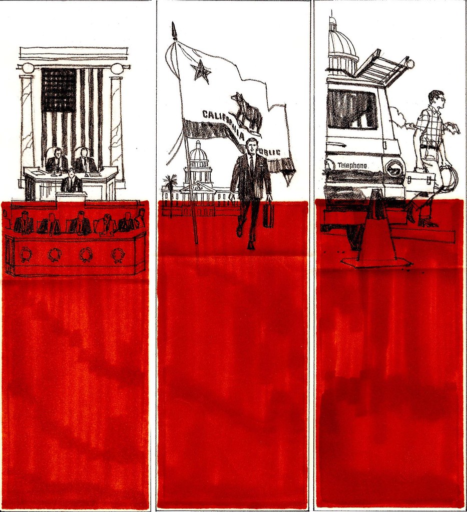
Odd title, but fits....from my notes made weeks ago. More telephone related jobs this week, and we'll start where we left off with the California 'lobby brochure'....for lack of a better description. These scans are from the printed pages, and I still think an eye catching concept. Again, my ad illustration career was kept interesting by the variety of assignments. Creating editorial illustration would have been more challenging, I'm sure. However, editors and art directors tended to categorize artists.....the romance boy/girl thing, or drama and mystery, or cartooned and humorous, maybe historical....or something else. One eastern art director had me down as a cowboy artist....from just one sample he had seen. On the west coast I had much more latitude.

First, the Pac Tel brochure cover, then an inside pair, and then the vertical half page examples seen in comps last week.


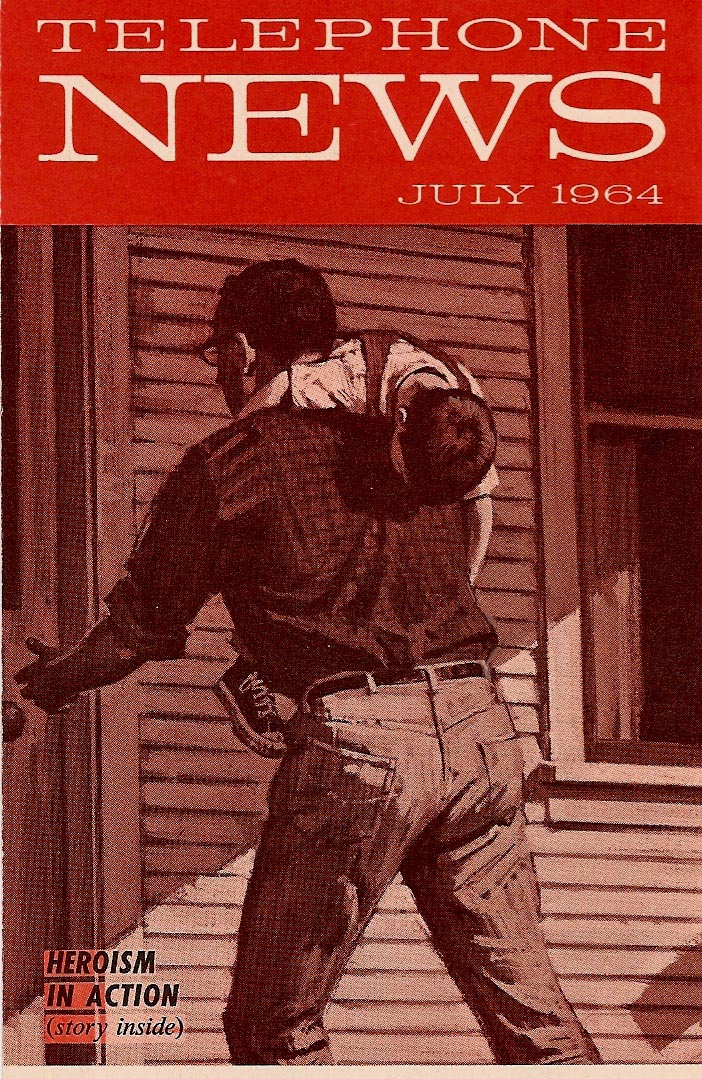
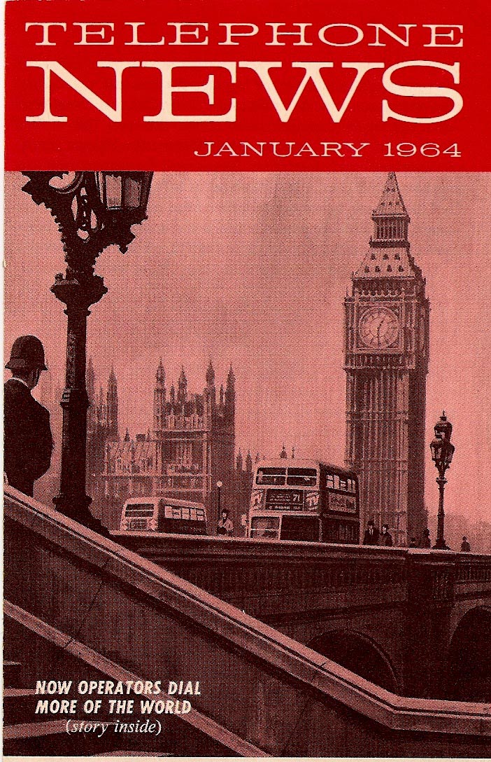
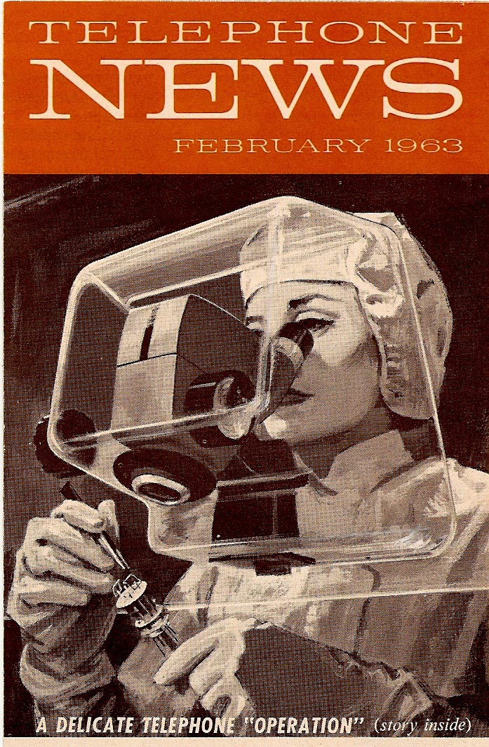
Following that...three of the 'Telephone News' mailers that haven't been shown on CAWS...that I recall. If it seems we're stuck in red inks this week....just coincidence....not my 'favorite color'. Which reminds me of an amusing and typically acerbic talk one evening in the 60's by Robert Fawcett before a group of San Francisco artists. His anecdote....when invited to lunch by an art director and the client, head of a large corporation, the client asked Fawcett to name his favorite color. Fawcett, irked by the banal question, replied, 'I play no favorites!'


The telephone mailers had a variety of subjects....always enjoyable for me.


They were done in gouache or Perma Greys, the second color added mechanically with a lighter screen of the original halftone illustration.


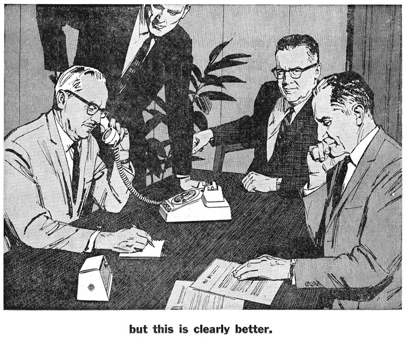
Finally, in the olden days before computer conferencing, a couple of newspaper B&W line plus halftone Pac Tel jobs from about 1960. The executive holding the phone was a church friend....and the other three gentlemen were my neighbors....all good sports.


Difficult to get them over at the same time, so they posed separately. For those days, and for newspapers, the line film pos and halftone underneath made for a good clear technique for an ad.


It would be again today....if illustrative figure ads were even used!

* Charlie Allen's Flickr set.

Tuesday, February 10, 2009

COMPS TOO....

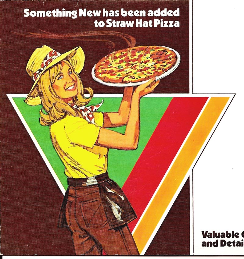
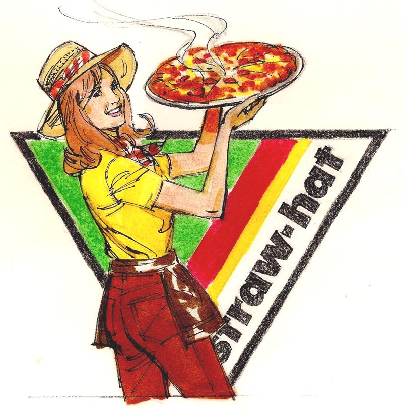
Back to comps again....and there will be several more on the subject. I'll include more color comps on this. In the late 60's and in the 70's the variety of jobs and clients never seemed to end. About two thirds came from P&H, and one third free lance clients. Each needed a recognizable example of what they were buying in print advertising. For some reason I saved a few....but certainly not all. We'll start with a bay area pizza chain, Straw Hat, some time back in the 70's.


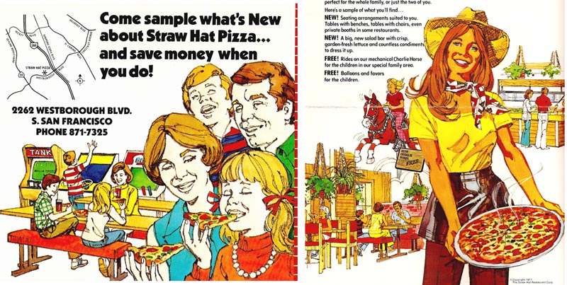
Brochures and peripheral kinds of advertising had largely replaced magazine ads, billboards, and large newspaper advertisemnts....all victims of TV and the rapidly changing times. Straw Hat was a typical example.


First (at top), a color comp, using markers, black fiber tipped pen, and charcoal pencil, followed by the printed ad....and, as long as we're at it, a couple more scans from the same brochure.


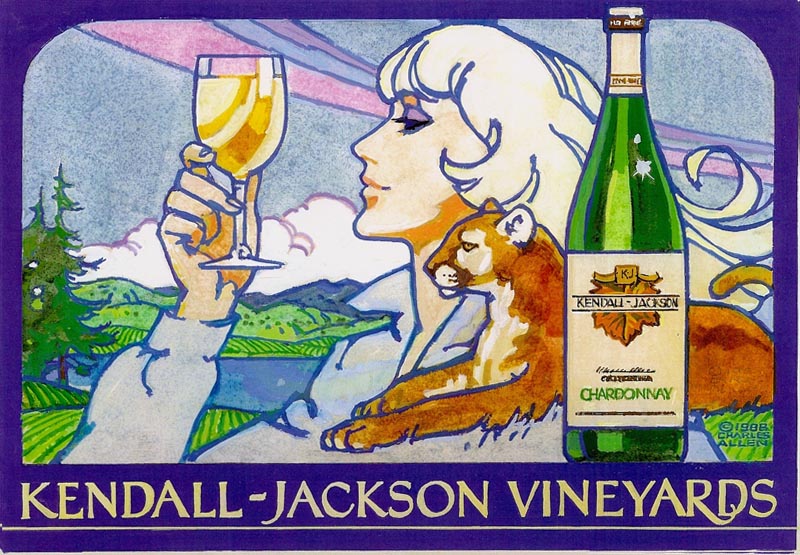
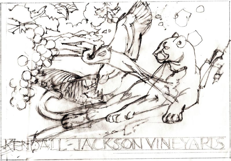
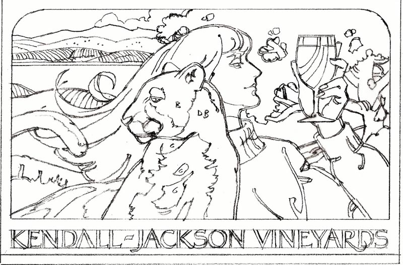
Then, 'fast forwarding' to the mid 80's, an unusual assignment from Pacific Lithograph in south San Francisco. The call came from an old friend and a favorite art director, Julius Spector, formerly head of the point of sale department at Gallo in Modesto. This was for the Kendall Jackson Winery in Sonoma County, still to this day a popular and successful California brand of wines. The request was for comps for a contemporary poster....or posters....incorporating the location and interests of the owner. These included rolling California hills and vineyards, the native redwood trees, a lake, white herons, a captive mountain lion (hopefully somewhat tamed!), and the owner's collection of medieval armor. Oh yes....an attractive blonde model sipping wine, and of course, the product! I recall doing a couple of color comps in markers and gouache.


A tracing of one here looking a bit like a 'paint by the numbers' example. Also several pencil comps.


The 'chain of command'....or chain of communication....from owner and staff, to the sales rep at Pacific Litho, to the art director, and then to me, was never good.


Stop and go, changing requests, lack of clarity, all raised doubts ....and I finally put a copyright sign on the one shown. The comps were paid for, but the poster and the ideas never materialized.


Following, still on wine, a B&W line comp on a picnic theme for Christian Brothers Wines....I believe for a decorative brochure. Don't recall it being finished, though it may have been used.


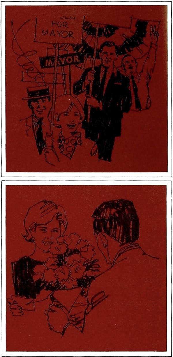
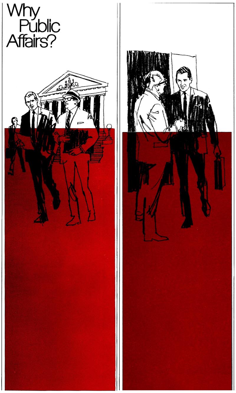
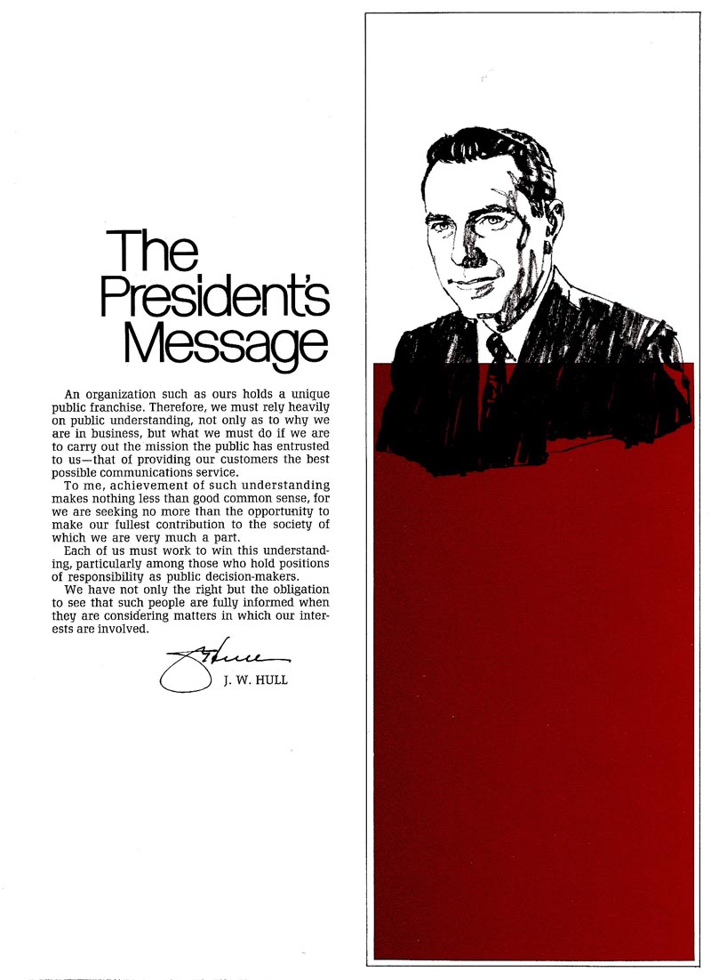
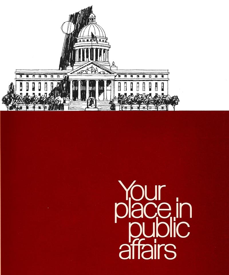
Finally, from a slick two color brochure for Pacific Telephone's many employees, here an introductory page. The message was about active participation in local government, civic groups, and advocacy to state representatives and to the press. Legitimate lobbying....and I think at the time when AT&T"s monopoly of long distance lines had been de-regulated and the 'Baby Bells' formed.


Three half page comps follow....and we'll show more finishes next week. Designed by Jack Martin....one of the fine ad designers at P&H....I liked the strong color panel use with B&W illustration throughout the brochure.


* Charlie Allen's Flickr set.
Tuesday, February 3, 2009

SPRING CLEANING

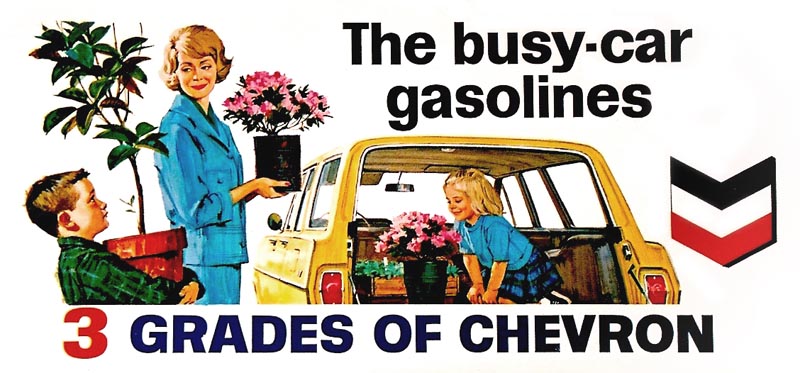
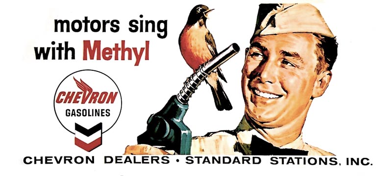
Certainly not the time for that in most of the country....one of the coldest, iciest winters in recent history. In total contrast, California has had one of the warmest and driest Januarys ever recorded....mid day into the 60's and 70's. We seem to be fulfilling the title of an excellent book on irrigated California and Arizona called 'Cadillac Desert'. The cleaning we're referring to are some desktop scans of the old Chevron 'taxiboards' and billboards from the 50's. Here, of course, 'old' is a relative term....the CAWS is all about old! 'Modern' in my career would be in the 70's and 80's. Changing the subject, I'm enjoying Leif's series on comps this week....and next week the CAWS will show a few odd color comps from my checkered past.

First, the last three Chevron taxi boards....some of that series shown earlier.


Nothing here too memorable...


...and typical subjects from Chevron and BBD&O.


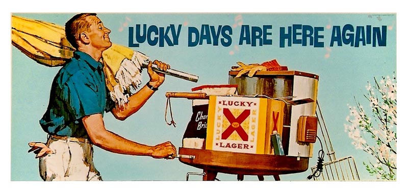
A Lucky Lager spring poster the next...


...and then a Bank of America vacation billboard.


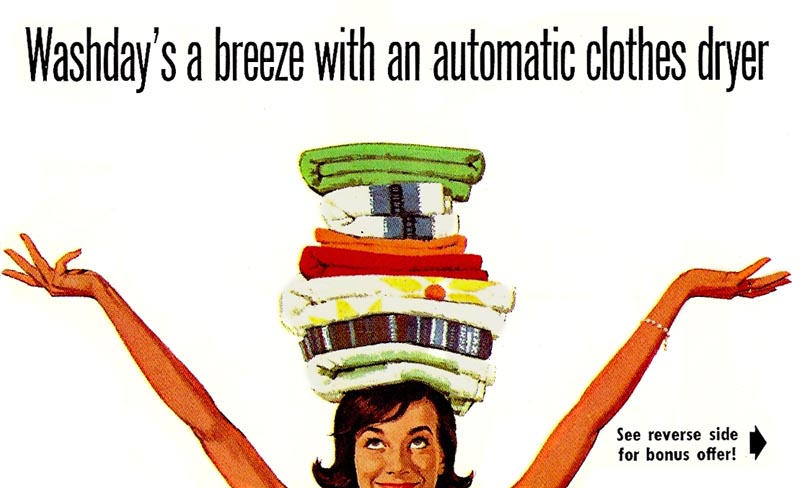
A PG&E 24 sheet poster follows, 'Washday's a breeze'. This scan is from a small flyer that was mailed with bills. All done in gouache, of course.


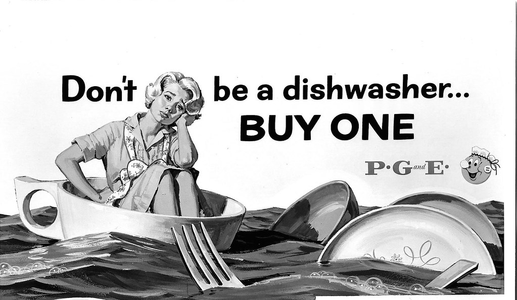
A B&W photo of a PG&E billboard, done way back in '52, and my first PG&E poster. This came from one of my favorite art directors, Nick Carter, at BBD&O. We had a friendly dispute about the muted values on the wagon team. I maintained the historical difference was enough, especially for a billboard. Let's make the color and values more equal. He insisted on the faded, muted look....and, as usual, the art director nearly always wins! PG&E trucks back then were a dark brown....but the difference in values on the billboard were a little less strong than on the scan.


Think I'll add, for the second time, the scan of probably my favorite PG&E poster, our distressed little housewife in a teacup!


* Charlie Allen's Flickr set.