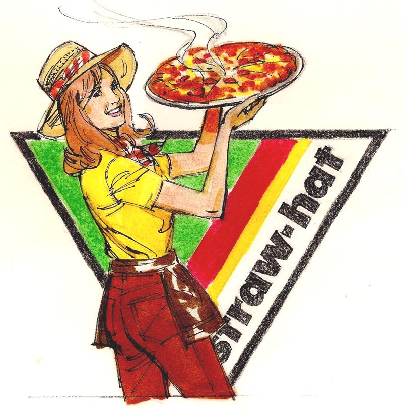
Brochures and peripheral kinds of advertising had largely replaced magazine ads, billboards, and large newspaper advertisemnts....all victims of TV and the rapidly changing times. Straw Hat was a typical example.
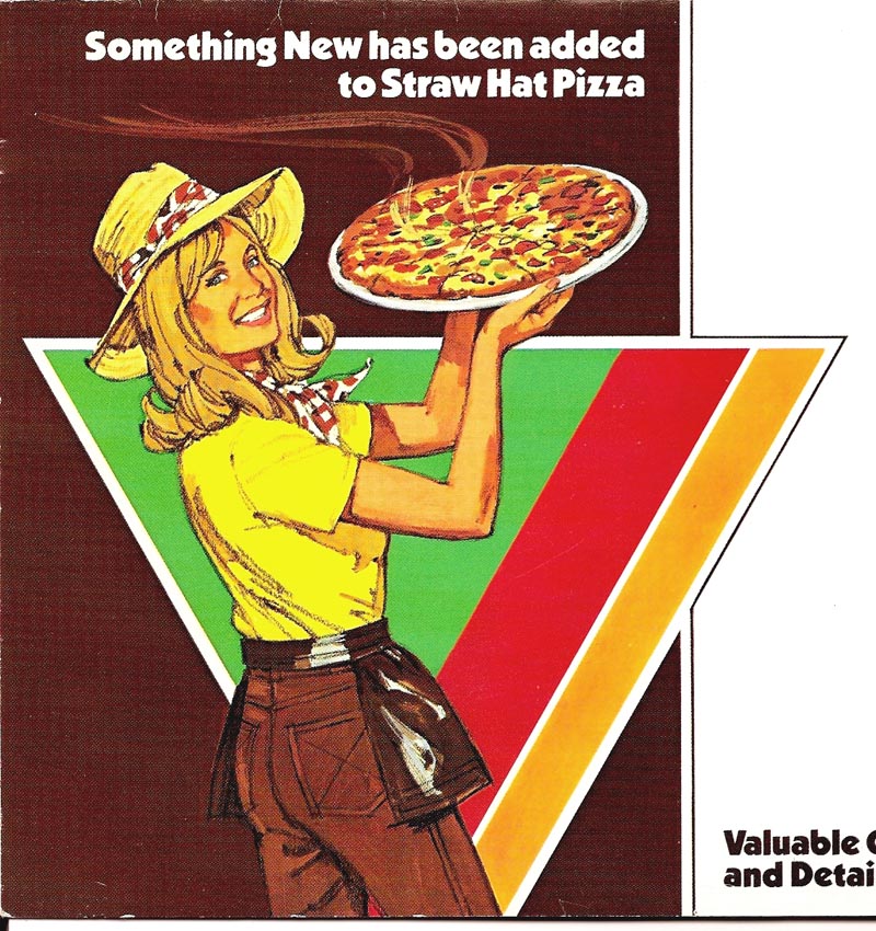
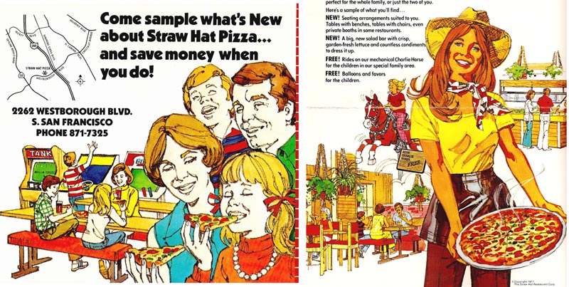
First (at top), a color comp, using markers, black fiber tipped pen, and charcoal pencil, followed by the printed ad....and, as long as we're at it, a couple more scans from the same brochure.
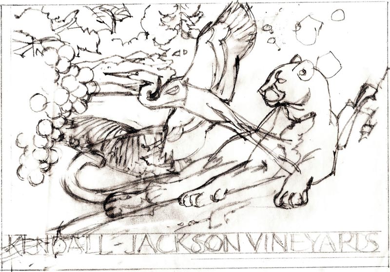
Then, 'fast forwarding' to the mid 80's, an unusual assignment from Pacific Lithograph in south San Francisco. The call came from an old friend and a favorite art director, Julius Spector, formerly head of the point of sale department at Gallo in Modesto. This was for the Kendall Jackson Winery in Sonoma County, still to this day a popular and successful California brand of wines. The request was for comps for a contemporary poster....or posters....incorporating the location and interests of the owner. These included rolling California hills and vineyards, the native redwood trees, a lake, white herons, a captive mountain lion (hopefully somewhat tamed!), and the owner's collection of medieval armor. Oh yes....an attractive blonde model sipping wine, and of course, the product! I recall doing a couple of color comps in markers and gouache.
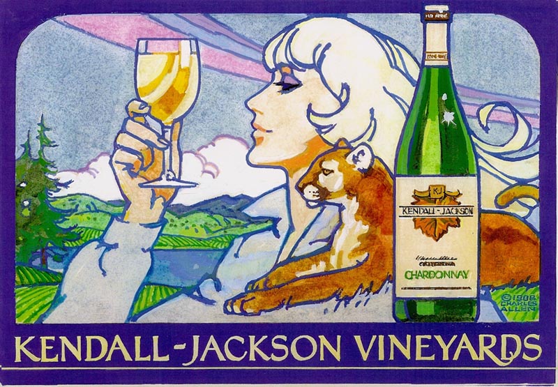
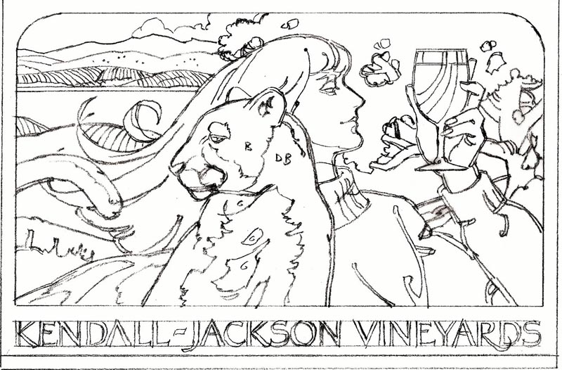
A tracing of one here looking a bit like a 'paint by the numbers' example. Also several pencil comps.

The 'chain of command'....or chain of communication....from owner and staff, to the sales rep at Pacific Litho, to the art director, and then to me, was never good.
Stop and go, changing requests, lack of clarity, all raised doubts ....and I finally put a copyright sign on the one shown. The comps were paid for, but the poster and the ideas never materialized.
Following, still on wine, a B&W line comp on a picnic theme for Christian Brothers Wines....I believe for a decorative brochure. Don't recall it being finished, though it may have been used.

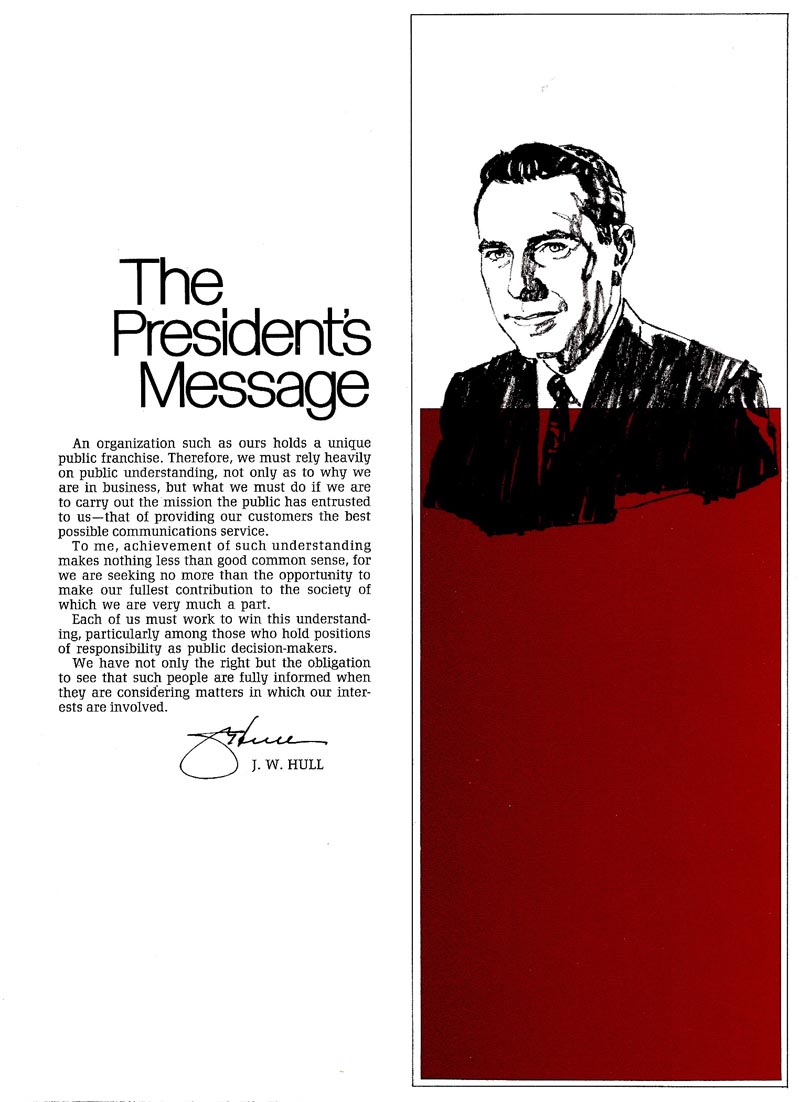
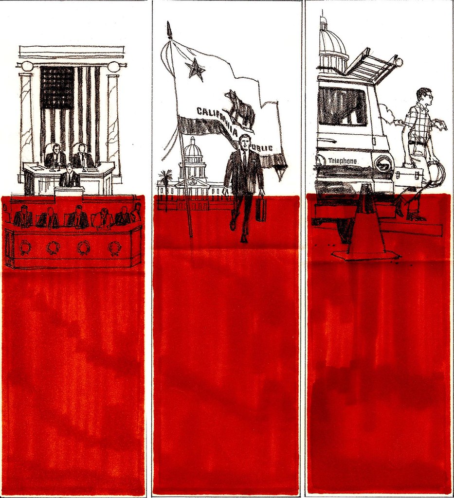
Finally, from a slick two color brochure for Pacific Telephone's many employees, here an introductory page. The message was about active participation in local government, civic groups, and advocacy to state representatives and to the press. Legitimate lobbying....and I think at the time when AT&T"s monopoly of long distance lines had been de-regulated and the 'Baby Bells' formed.
Three half page comps follow....and we'll show more finishes next week. Designed by Jack Martin....one of the fine ad designers at P&H....I liked the strong color panel use with B&W illustration throughout the brochure.
* Charlie Allen's Flickr set.

7 comments:
Very Nice.
What did you use on the finished pizza ad?
Lovely work Charlie,top quality.I wonder if it would be possible for you to talk us students through your design and rendering process for some of the brilliant images youve shown us over the weeks?
Leif and I have had a long discussion today about scan color and values. Both are faded on the Straw Hat examples....and I think they will be stronger from now on. Mark, in the 70's and on, I used gouache with Othello pastel pencils and with charcoal pencils for a lot of jobs....faster, and gave me a chance to draw and paint at the same time. And, times had changed from the full painted more literal figures to a faster (and cheaper) technique. Bandito....(think I'll borrow your name!)....don't know where to start. Sort of like starting a four year art course and finishing in a paragraph or two. I suppose to summarize, it took years to learn, to mature, to become professional, to reach a point where drawing, painting, design and composition came together. I would think like a juggling act. I've always thought it takes an instinct, or talent, along with a dedication to pursue your goal to the end. Maybe 50% talent, 50% hard work. Early on, I wanted to be a Norman Rockwell or a J.C. Leyendecker. Never got there, but in the process became my own person in the ad art world. Design and rendering come from trying stuff and practice, practice, etc. Wow...old guys do get garrulous! Thanks for the observations....much appreciated.
You just hit the nail on the head there Charlie."To reach a point where drawing, painting, design and composition came together"
That thought alone is worth the price of admission.
Garralous? Never. Pearls cast before the unworthy say I!
More thoughts always appreciated.
The Kendall Jackson Vineyard Sphinx...
Great insights into how those ads evolved.
Loved to compare the smiles between those two straw hat ladies - the comp and the final version.
I wish I had gotten to know you when I was at the Chevy Ad Agency. Jim Hastings hired me in Jan. 1958 and I did kind of get to know you through your art but not until later as I was in the sales promotion group at the beginning. We didn't get to do any of the advertising but as I progressed through the agency I became pretty good friends with Jim Hastings. When he retired he gave me lots of things he had collected over the years. With many of them I started a blog called--About Old Chevy Ads--and it has several of your illustrations in it. I haven't been able to get the quality reproduction on most of the ads that you have on your illustrations but the ads are still preserved. Your comments on the Chevy ads give me a real chuckle and I understand completely the problems you had. I spent 35 years working on Chevy stuff and was creative director for many years. I would like to communicate with you in some direct way.
JIM.....Good to hear from you. Remember your name from those days....but can't recall if you were the art director on some the Chevy ads that I did. Often, I was so busy with the illustration, I wasn't aware who sent it out. Usually let Chet Patterson do most of the communicating. Think I've seen your blog, but give the E-address again. I'd kind of like to know where the 'Yellow Corvair' original ended up....if you know. Thanks again for the comments.
Post a Comment