It happened in the 60's, if memory serves. Streets were cluttered with billboards on the sides of buildings, on top of buildings, behind service stations. Tall signs and logos of all kinds topped restaurants, service stations, and dozens of businesses. All of that changed in a very short space of time.

The nation seemed suddenly aware of visual and esthetic pollution. The rapid ascent of television and finally the computer....and the demise of most magazines (now even newspapers) including much of the print media....has been more culturally transforming, but over a longer period of time.
All, of course, in the times of my working life and career.
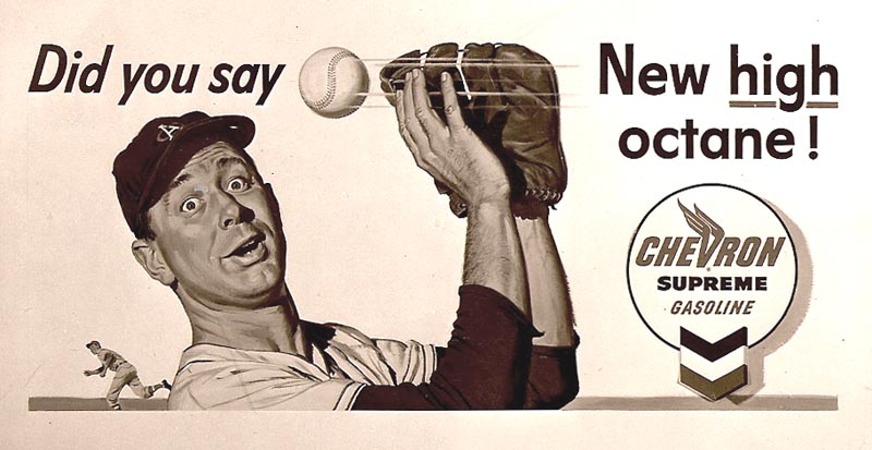
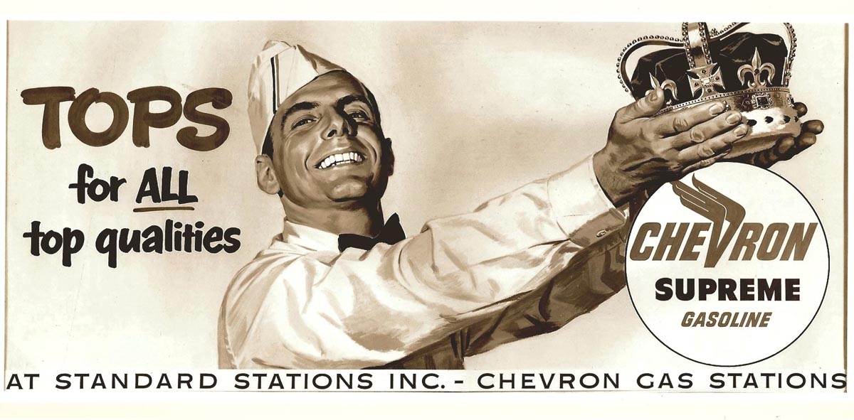
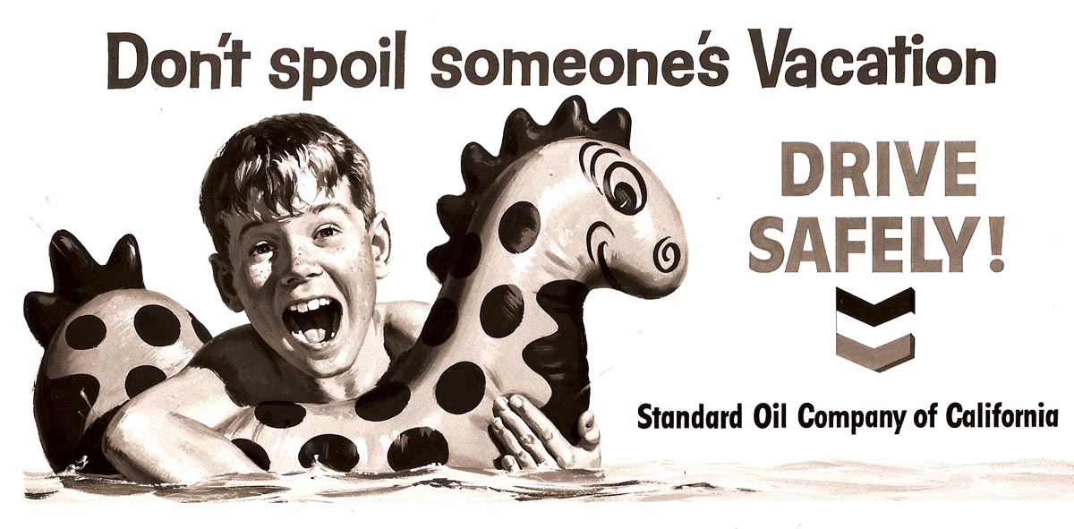
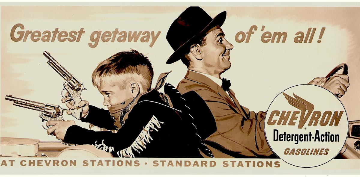
This week the CAWS will show Chevron posters from old files and not already posted here on taxi boards. Patterson and Hall photographed all of the outgoing billboards....I suppose knowing that ad proofs would not be available to keep on file and to show clients. These were black and white photos....color prints were not only expensive but not reliable.
Color copiers had not been invented. I have photo copies of most of the posters I illustrated....not all. There are a few more posters for other clients that we'll post later on CAWS.

As said before, here in the west billboards were a desirable job to receive....both the pay and the display value were better than on most ads.
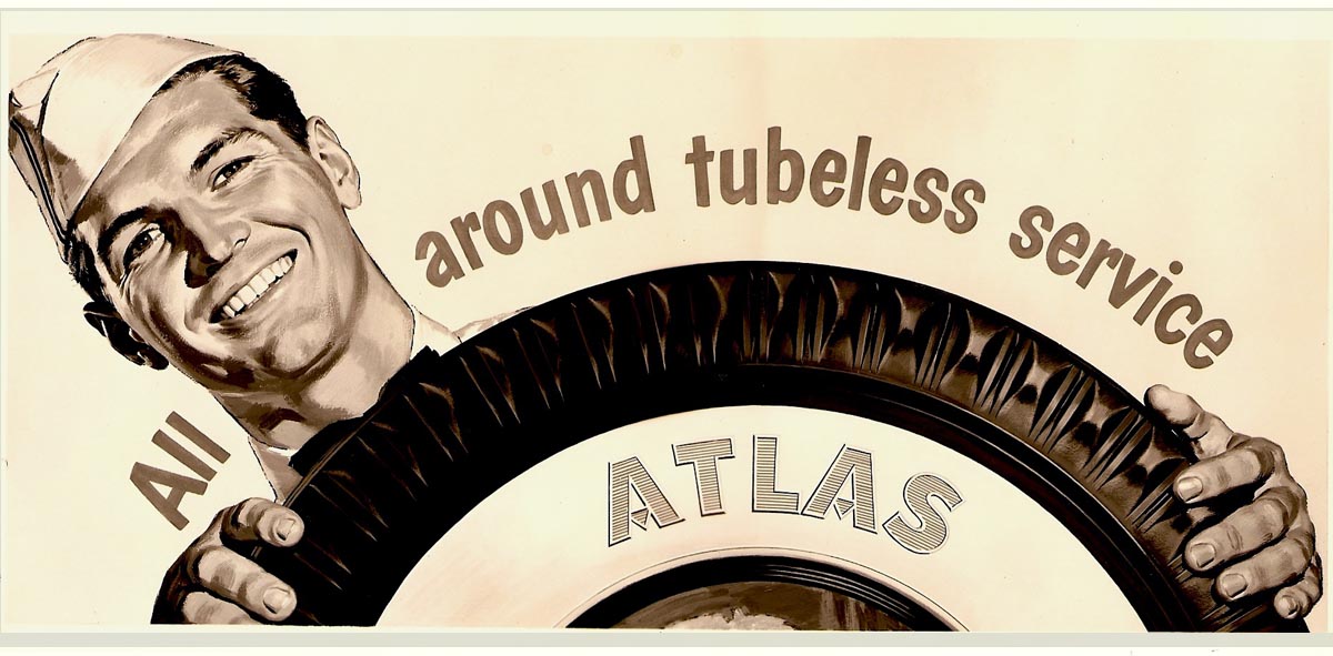
Another advantage, Chevron billboards were replaced at regular intervals...I believe at about one month. At the time, and resisting change, I hoped they would go on 'forever'. Even then, though, we had a sense that billboards were a threatened species!
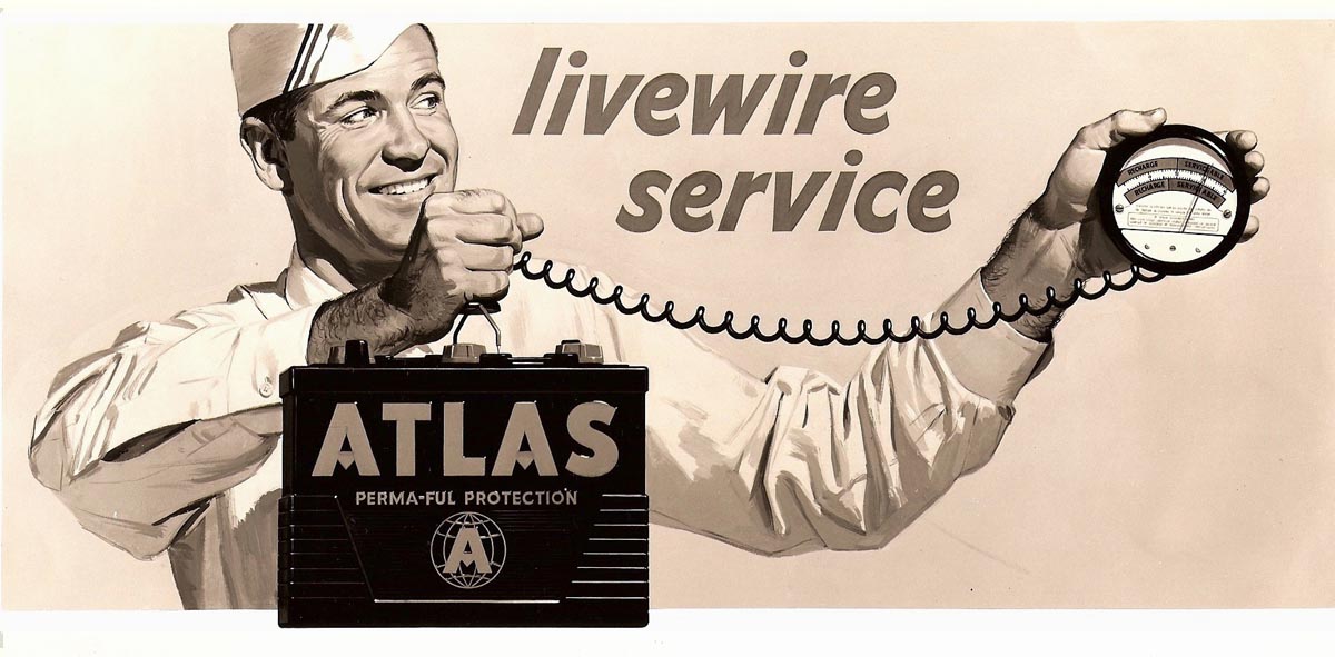
These posters don't need too much explanation....pretty typical billboard advertising of the day. On most, a rather tight gouache technique in keeping with 1950's illustration styles. The loose techniques of the 60's hadn't arrived.
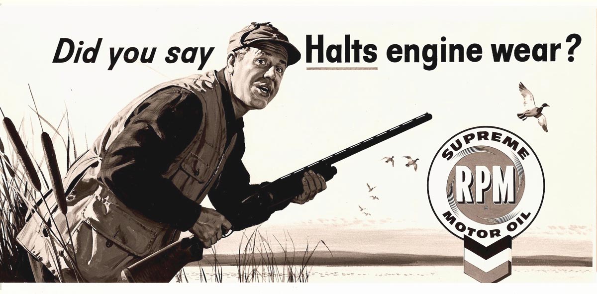
Modeling for these were a fellow P&H illustrator, a neighbor and young son, a friend in San Francisco, and professional models.
* Charlie Allen's Flickr set.

6 comments:
these are really great - really takes you back in time. it's amazing how the styles [of esp commercial work] really influences the perception of different eras - thus, the "tight" aesthetic really makes the 50s seem clean/sterile... but I suppose in many ways it was.
nice work, once again!
thanks for sharing!
Ahh Charlie, beautiful. Check out this link (I hope it works) to see a close up in color, and a look into the detail, brush strokes, and Charlie's wonderful ability to turn a plane.
http://phcreative.com/realretrosource/gallery/27.jpg
great stuff, charly!
@bruce:
the link that you given us, don´t run.
could you try it again please? thank you!
thanks for sharing + nice greets,
joe
I'll add a late comment to this....and it's something I forget to mention often enough on the blog. That is the skills and talents of the artists at P&H and other agencies and clients who were involved.. On the billboards seen here, all of the headlines on those ads were hand designed and lettered by mostly one guy....Jim Hasse. I would give him a tracing early on, and he'd work out his part. After I finished the illustration, he'd letter the headline, strip in a logo, whatever. A real team effort. I was very fortunate to work with him and the many other contributing artists in the business.
Some may feel squeamish about eating it, but rabbit has a fan base that grows as cooks discover how easy they are to raise — and how good the meat tastes.
Brilliant artwork, what talent.
Post a Comment