
I met the deadline....Julius Spector was relieved....the Gallo brothers were pleased....and they wanted the next poster depicting their wine chemists done in the same style.

Maybe a good time to describe the Gallo winery. Easy to spot from the air, it looked a bit like a small refinery. Dozens of tall tanks, controlled and insulated to keep wines cool in the 100+ degree summer temperatures. A huge headquarters building, large lawns with flocks of guinea hens, many separate outlying buildings. It included a large, modern lab building, with a staff of chemists researching wine varieties, blends, production, new wines, and other grape products. Gallo provided photo reference for the three wine chemists in scan # 2. I arranged the composition....wine bottles front and center, of course....and placed the figures, portraits actually, behind.
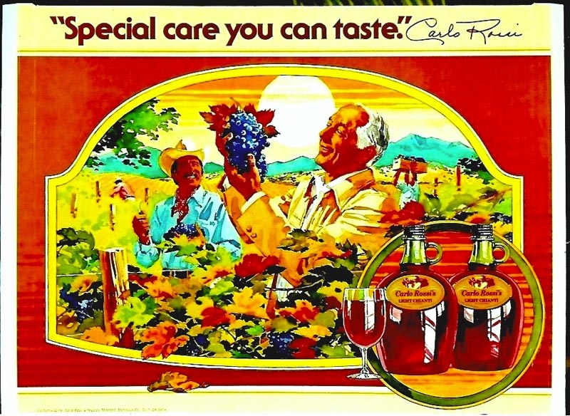
A colorful Carlo Rossi vineyard poster follows.
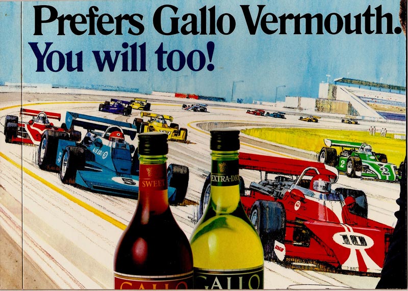
Then a race car illustration....a section of a large display poster featuring Mario Andretti with an endorsement for Gallo Vermouth wines.
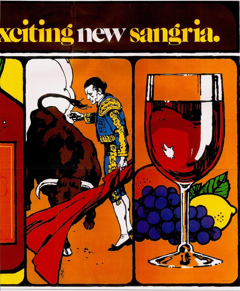
After that, another partial section of a Sangria Wine poster. I liked the simple, bold color and line technique. A litho reproduction, it looked a bit like a silk screen job.
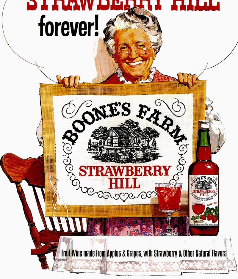
Then, with a tie-in with a TV commercial, the Boone's Farm grandma with her needlepoint creation of the label. Painting the needlepoint was an interesting challenge, as I recall.
The next three scans (there might have been a fourth) were small cocktail table cards designed to stand up.
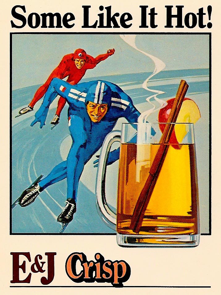
Featuring various drink concoctions using E&J Brandy.

Not outstanding, but I liked the renditions of the brandy drinks on these.

That's about it for Gallo....I did others, but too boring or banal! Next week, we'll head out to the farm.
* Charlie Allen's Flickr set.
4 comments:
Mr.Allen , you work is amazing . I'm a graduate illustration student from the academy of art university . I just wanted to tell you how amazing and inspiring your work is. I have learned so much from it . Thanks for posting your work and looking forward to seeing more .
Respectfully,
Raymond Bonilla
Yeah! Snapping one's fingers and then...One More Time!
I'm really happy for these works of art getting a new life and their overdue appreciation!
As there's always music in your entries:
Just fancied "Strawberry Fields Forever", the Beatles song, echoing in that needlepoint grandma Strawberry Hill. One more fine ad -and you surely were up to the task.
Everything just sparkles on the "VanGoghish" Champagne poster. Even your self portrait may have got some faint resemblance, well, probably Van Gogh himself would have handled the task somewhat differently. I don't recognize too much Gogh there, but still, the illustration just looks superb.
Aahh, and that lovely Carlo Rossi vineyard poster. What a fruitful, juicy autumnal feel; and the blue shirted fellow seems to be counting/snapping his fingers..."one more time"....
P.S: "Gallo Champagne" - how did they manage to get the rights?
There's a small village in Switzerland named Champagne. They tried to market their own wine products under that name. Very soon they were threatened with a lawsuit from France and had to stop it.
Thanks, Ray and Rich. That's why the first title was 'Fun with Gallo'. More than with any other client, you'd never know what subject to expect on the next assignment. Wine, glasses, bottles, etc....but Gallo always wanted colorful, strong concepts. Nothing shy about their point of sale store posters....so,interesting to work on.
Charlie-
I love your work. I used to work for Gallo (1978-1986) in sales and marketing positions. I remember your designs for cut case cards and other merchandising materials. In the "wine chemist" picture I recognize a couple of faces. One is Charlie Crawford, a family friend and former next door neighbor. Great memories. Wish you the best.
Take care,
John Recca
Post a Comment