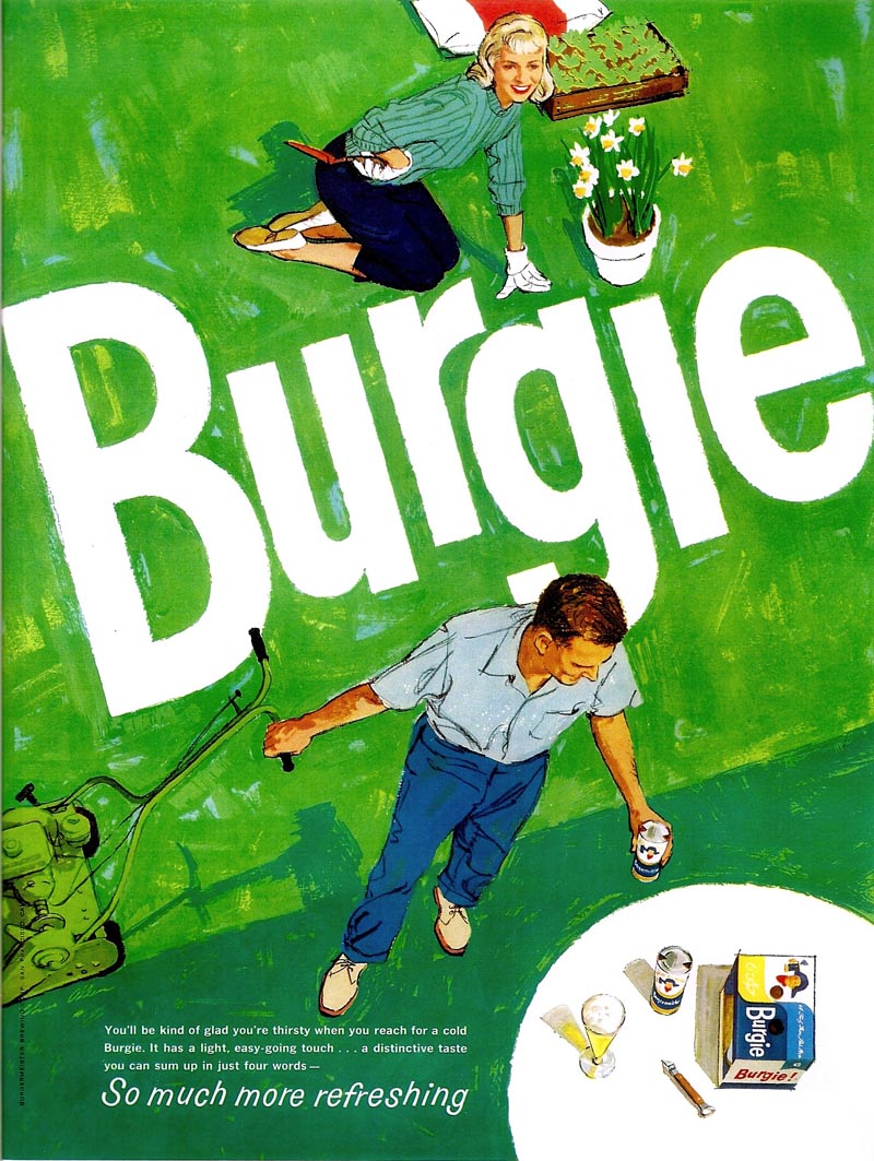
First, a Burgie SE Post ad, I believe in the spring of 1960.
I had a lot of freedom on these and on the Burgie billboards. The agency and client wanted what was thought of then as a 'new look'. The instructions were, 'don't come up with the fully painted figures and compositions popular in the 50's.'
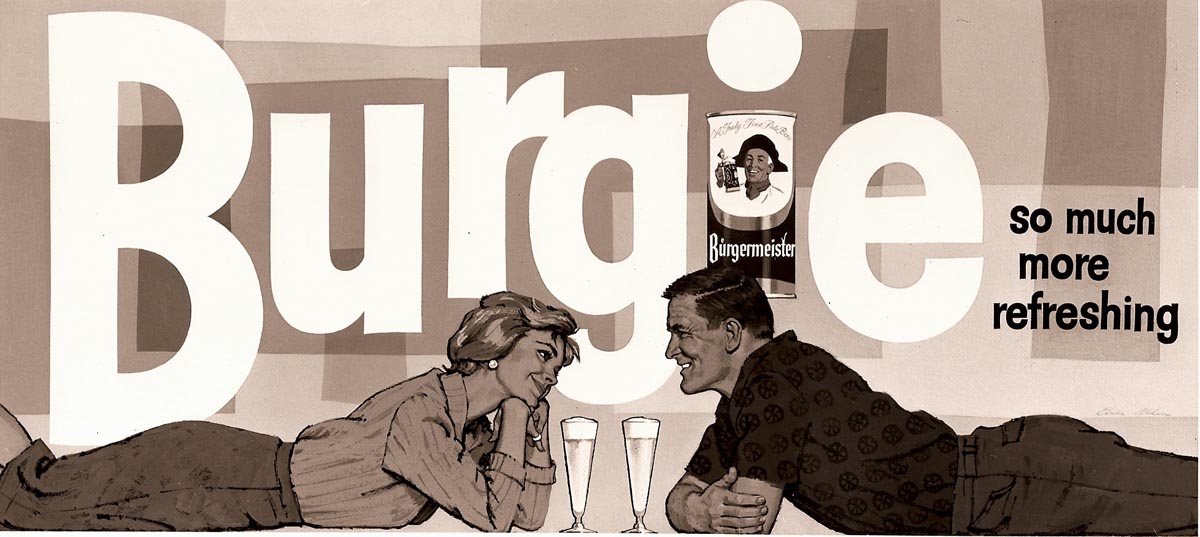
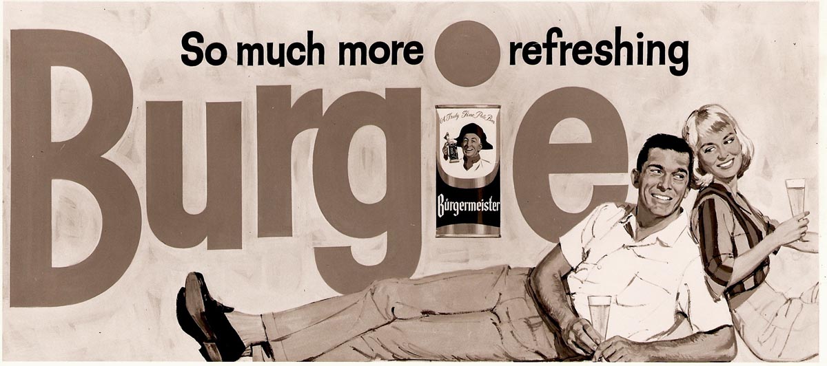
For better or worse, except for given subjects and the large Burgie logo theme, these were my concepts. I tried to keep them colorful and the figures flat in the rendering. Following the magazine 'gardening ad' at top, these three billboards were scanned from B&W photos taken at P&H, and now my only records.

A bit hard to visualize in bright colors, but the client seemed to like them.
Next, totally unrelated, and to display probably the last billboard scan on my desktop, a Bank of America poster.

Again, a colorful poster....the lady's shoe a bright teal blue. And again, another BBD&O account.
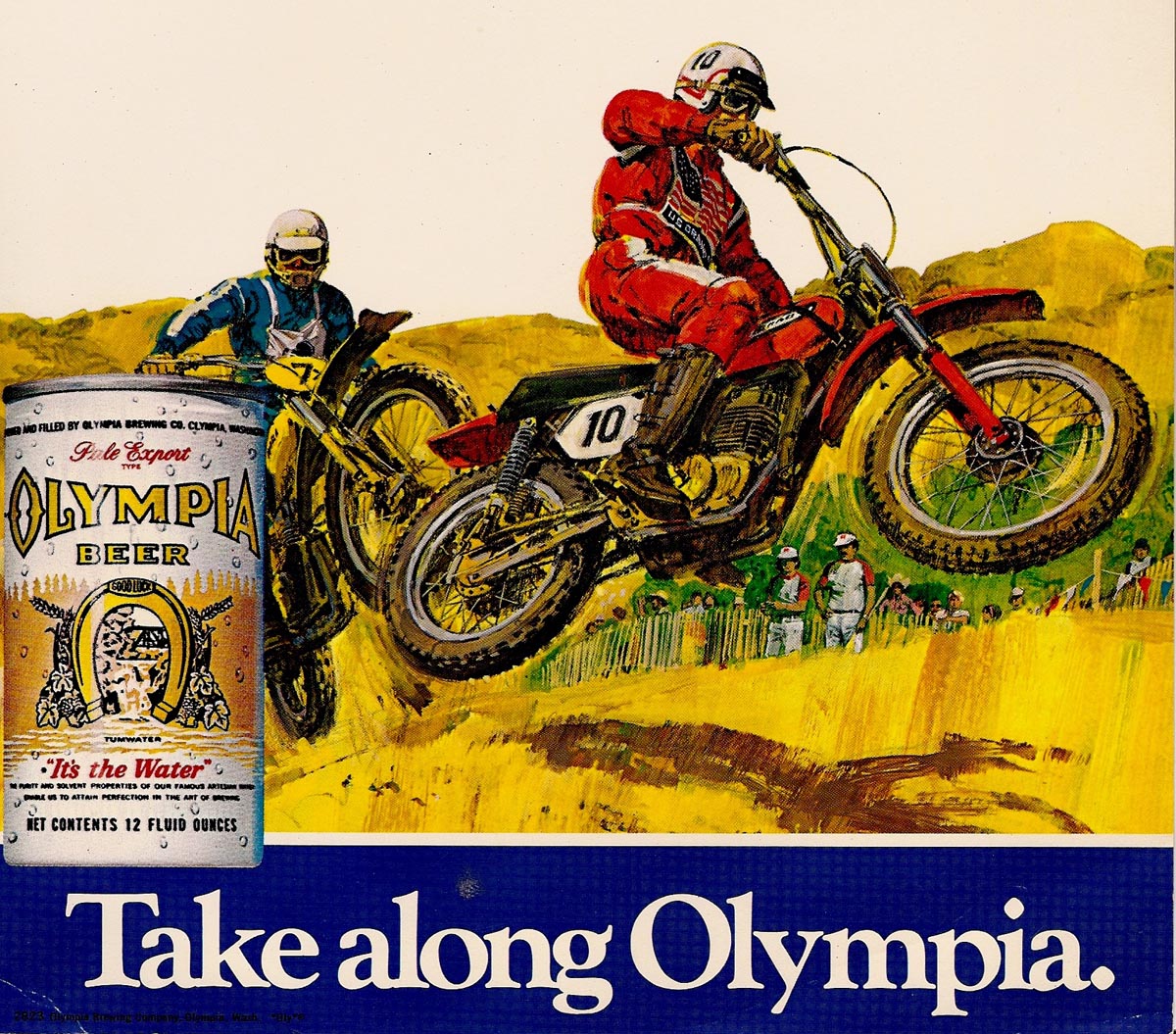
Three Olympia Beer POS small signs follow....I think they were designed to fit on a beer case.

My college age daughter, attending a Canadian school at the time, and a Canadian boy friend, posed for two of these ads. And like many POS ads, silly stuff.
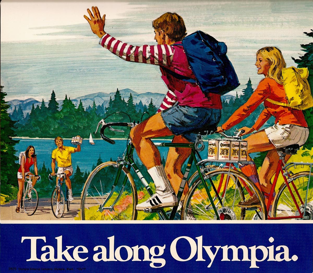
Advertising was not rocket science!
Finally, gradually clearing images from the desktop, a die-cut poster using a fine young model and former neighbor. He would be in his 50's nowadays!
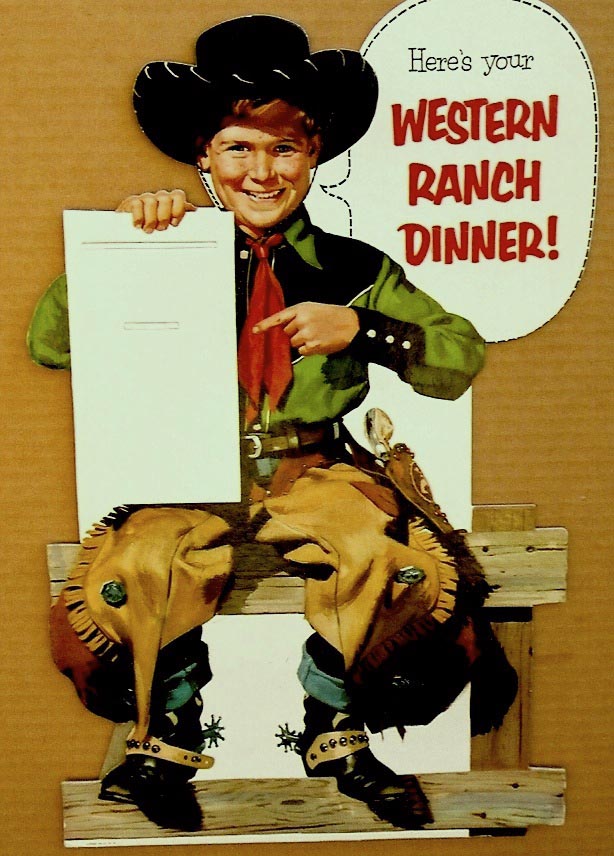
The product, other than 'western ranch dinner', a mystery.
* Charlie Allen's Flickr set

12 comments:
Nicely done Charlie.
Gouache?
Thanks Mark.... Early on, the Burgermeister ads and the Bank of America poster good examples, I used Windsor Newton designer's gouache, along with Rich Art poster tempera white. Never cared for WN white, or their greys....I think too much gum arabic in the paint....and many of the poster whites were the same. Later, the Oly POS jobs an example, I mixed acrylic medium with gouache....on backgrounds especially. Faster, and easy to paint figures and foreground stuff over it using just gouache.
lief was right, I had to pick my jaw up off the floor from that first one.
incredible work, once again.
Wonderful images , thanks for sharing.
On illustration board? Untreated? Or did you coat it with something?Acrylic gesso didn't come out until the mid-50s, if I recall correctly.
Good gouache work blows my mind; the stuff is so EVIL to work with. This is really masterful.
SENOR WEASEL....Love to talk shop. By the way, love the small portrait logo. We had the advantage of Whatman illustration board....made in England. None like it, before or since, and it's long gone now. Most gouache I did was on Whatman. Later that became scarce, and I gessoed a lot of Crescent, or other boards. Gouache and acrylic, or a mix, used on those. I grew into the biz with gouache....so it didn't seem evil. The transition to Acrylic....now that was evil. Gouache dried lighter, acrylic dried with deeper values...and it was not opaque. Robert Bateman compared it to painting with skin! Finally learned the technique....not without a lot of pain!
Senora Weasel, not that it much matters with weasels (except to other weasels).
I remember Whatman! Mostly for the delightfully named "Whatman's Not" -- which meant not pressed, as opposed to cold pressed or hot pressed. I was in art school in the late Seventies, and it was a general opinion among my peers that gouache was the worst booger of a medium we had to work in -- dried light and often uneven and swiftly turned to mudpie if you tried to rework it.
I bet anything I'm not the only lurker here who loves to hear you talk technique.
Blue in Green - a Miles Davis tune.
The bird's eye view on the first one - what an accomplishment. You really solved it.
And from the blue to all those greens. All in all it makes me completely forget it's just a lawn-mover ad.
A suds ad, Rich....suds! The mower was 'hi tech' back then....one of the first front loader basket models. Sorry, Senora...and on second look, are you sure the portrait is not a Senorita? I used three Whatman surfaces, all great. Hot pressed for pen and ink and line work. Cold pressed for looser color and line work....and my favorite, Surface No 1, especially for gouache rendering....as in the Burgie magazine ad.
I am interested in the Bank of America poster to frame & hang in my office. Is the artwork on your blog for sale?
If anything is for sale, I'd love that Burgie illustration.
there is a Charlie Allen Burgermeister painting on ebay right now--
Vintage Charlie Allen 50s Burgermeister BURGIE Beer Original Painting Ad Art
Post a Comment