Over the years an oft performed tune in shows, vaudeville, and in Oldsmobile commercials, I believe....written by Gus Edwards way back in 1905. I've never illustrated an Oldsmobile ad, but happen to have illustrated a 1905 'Franklin Gentleman's Roadster'....pretty much the vintage looks of those very early automobiles. This scan is from one of the several antique auto prints that I completed and produced back in the very busy 1970's.

We'll post the others on a later blog. This week, however, the subject will be car ads....for clients other than Chevrolet. In the west and San Francisco, most auto advertising clients represented the western U.S., or northern California dealership organizations, plus a few for overseas ad distribution.
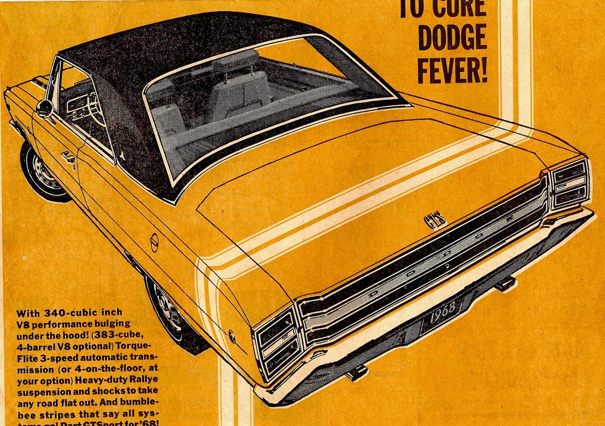
We'll begin with a couple of bright two color newspaper ads for Dodge, done in the 60's.

Film positives, plus halftone, plus a color plate. Viewers can't help but notice the $3500 price tag for a full size 1968 Dodge Charger....a glaring example of what real inflation is all about!
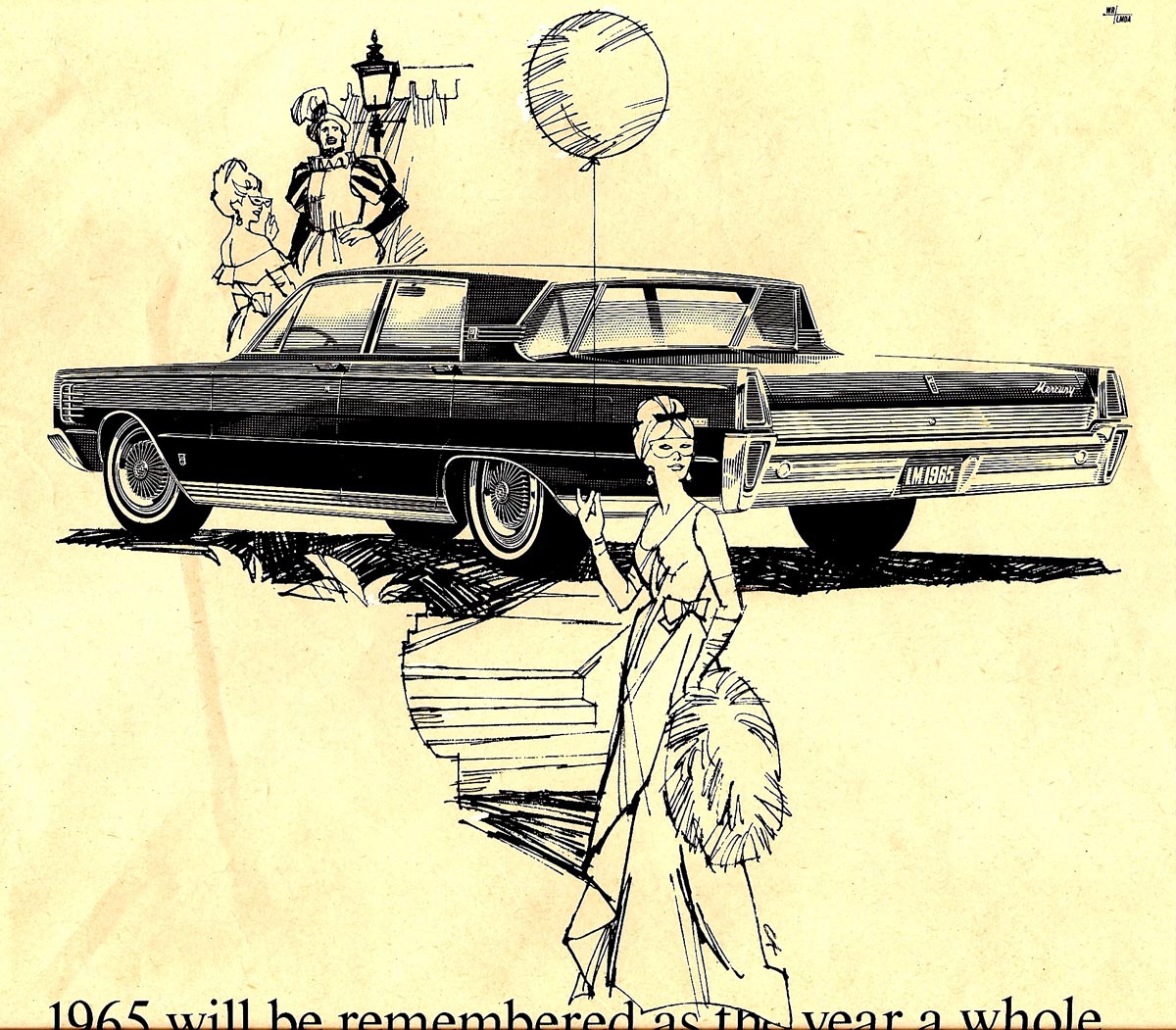
Next, a Mercury B&W line illustration. A rather 'odd duck', as I recall, with the auto art done in Detroit and stripped in with my figure art. I did several of those....with results that always seemed 'out of sync'.
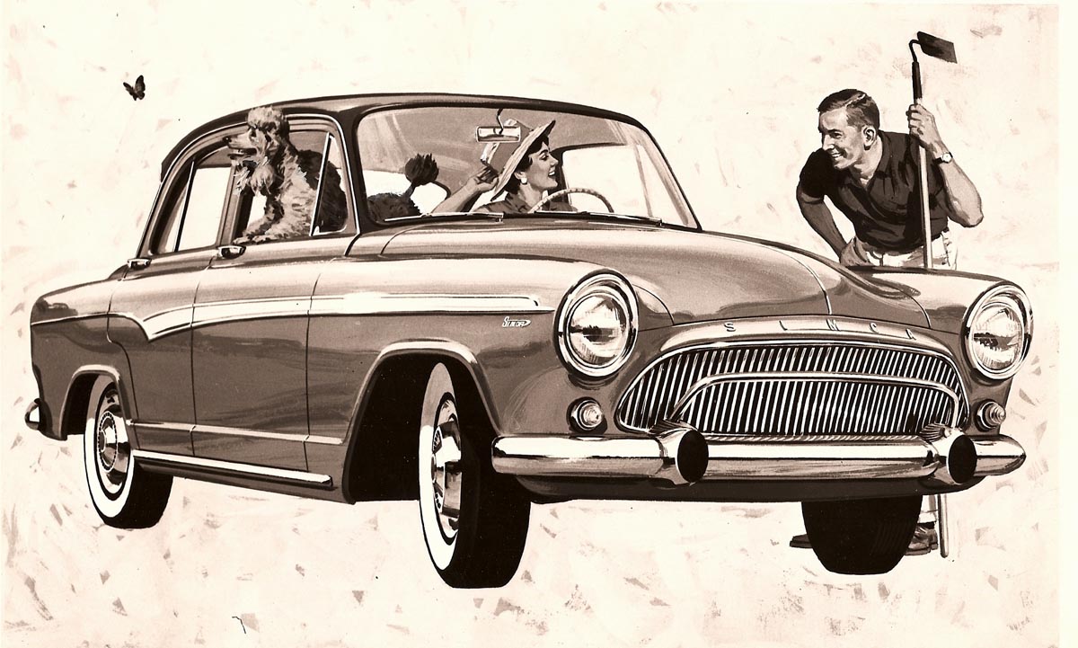
Following....a B&W photo of a color Simca illustration....including the agency's favorite symbol for the French made car, a grey poodle. Tom Hall, the second partner in Patterson and Hall, was the male model.
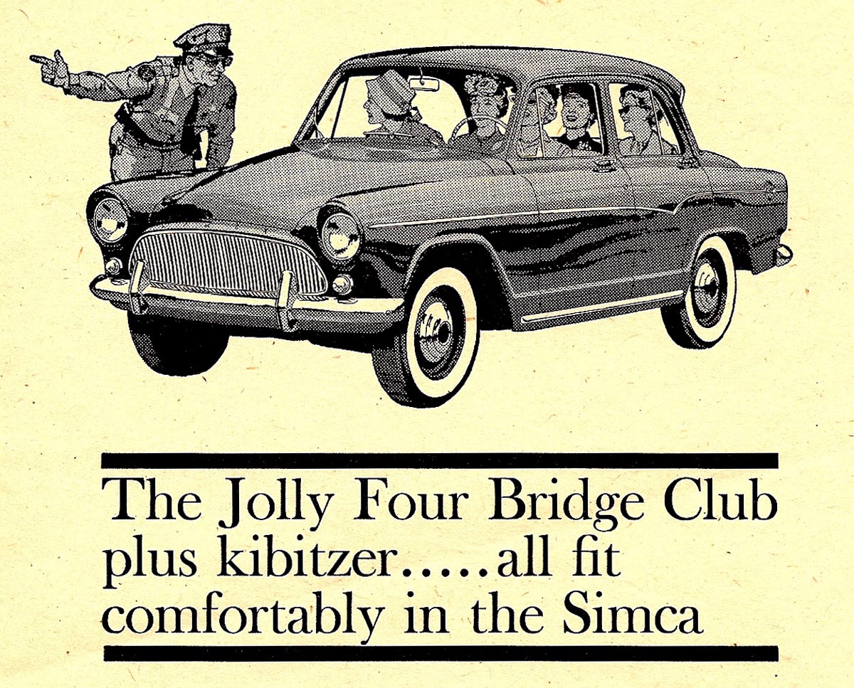
Then three small Simca B&W ads in line and halftone for newspapers.
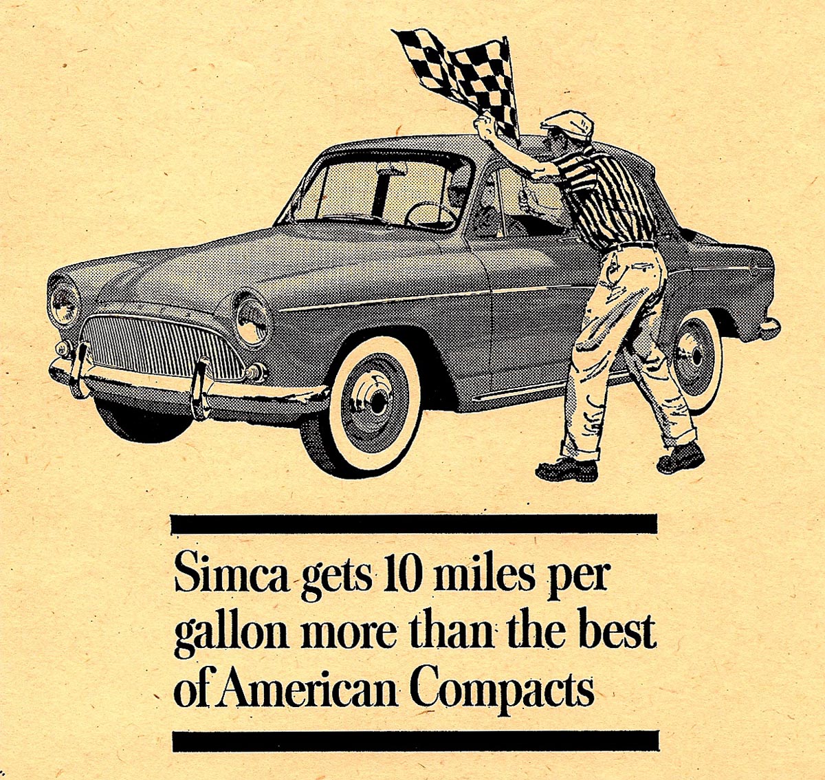
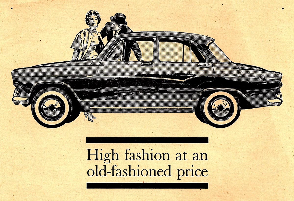
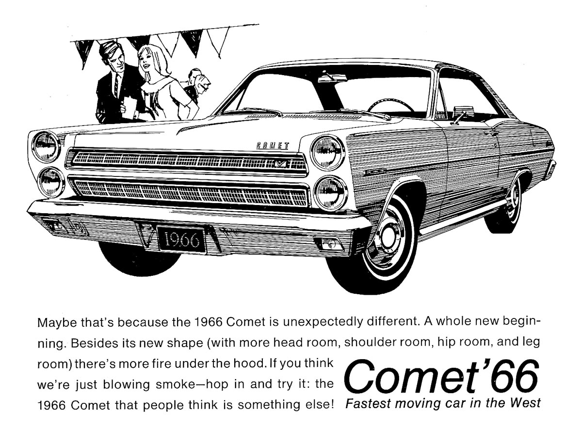
A Mercury Comet B&W, minus the halftone on the car, follows those.
Finally, two ads involving the American Motors Pacer...
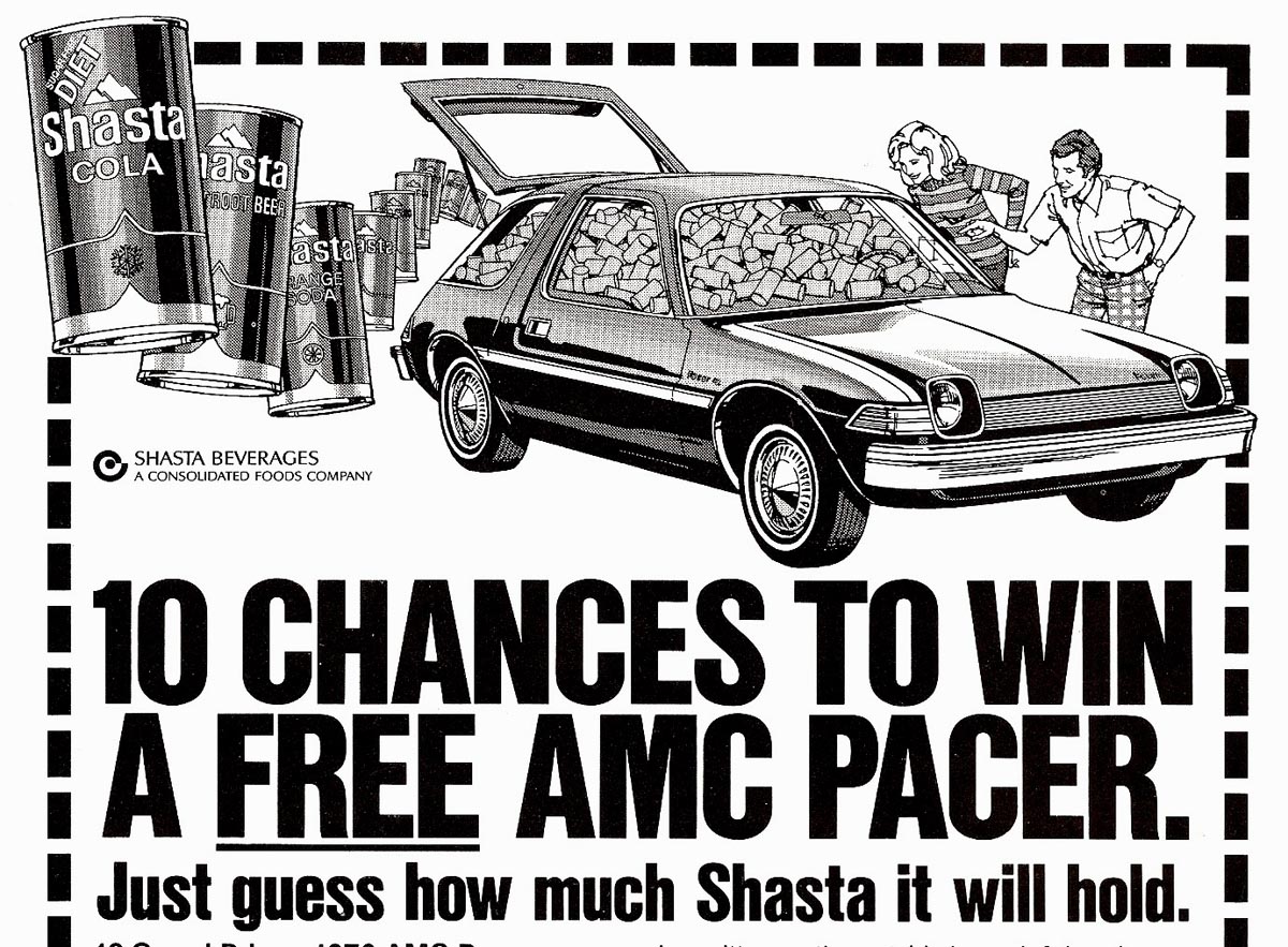
...the first a joint promotion with Shasta soft drinks, and the second, a Pacer ad for distribution in the Netherlands. As I recall, the Pacer didn't last long in the market...

...one more misguided effort in auto manufacturing history. Both ads were combos of a film pos and gouache halftone.
* Charlie Allen's Flickr set.

6 comments:
haha! Pacer and Shasta - a winning combination!
These are really great - you're car detail blended with sketchy figures is always amazing. Just out of curiosity, what size did you normally work in before these went to print?
Thanks, Matt. The rule of thumb on B&W line work was usually 1/2 up from reproduced size.....especially early on when there was more pen and ink cross hatch texture. Later when using a bolder line and a nibbed pen point, twice up worked well for reduction. On color work twice up was the usual working size. I never liked the 'mechanical pens', though some artists did fine stuff with those.
That old & ancient Oldsmobile looks real merry.
What a fine design and colour. Also the background's a perfect fit.
"Come away with me, Lucille"...don't know that song, though. But I do like blues. "Lucille"...B.B.King used to call his guitar like that...
Trouble is, Rich, you're just not old enough! Even I wasn't around in 1905....but do recall the song earlier in my time....as said, on some Olds commercials. Now Olds is kaput....and evidently a few more GM marques. Who knows, in these times....GM could be headed for extinction!
Hi Charlie
Love your work. I'm putting out
a music album and we would like to use the dodge charger illustration as a basis for the front cover. Could we have your permission? Unfortunately we have no budget. Sorry! It's a small independent release.
cheers
rob
I think that thanks for the valuabe information and insights you have so provided here.
auto detailing
Post a Comment