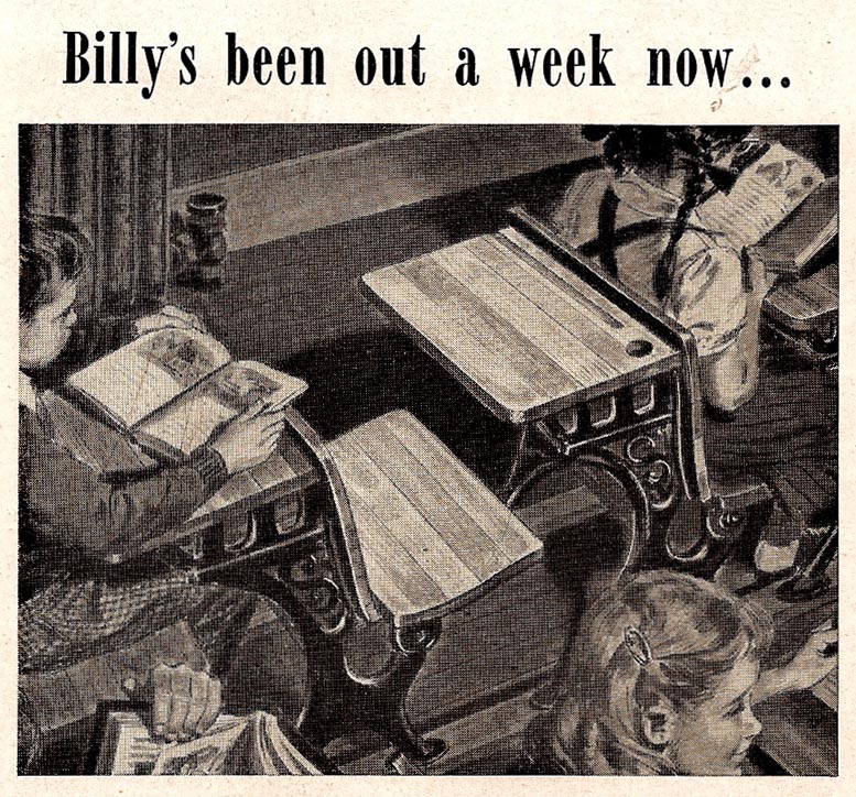
...including the hole in the desk for ink (ours were fitted with ink wells) and the steam radiator. I took photo reference for this at a nearby San Francisco French Catholic school. The rows of cast iron desks were identical to those in my youth!
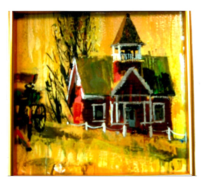
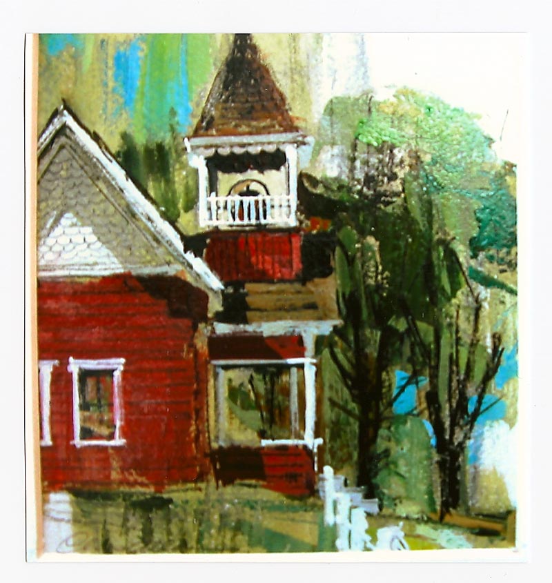
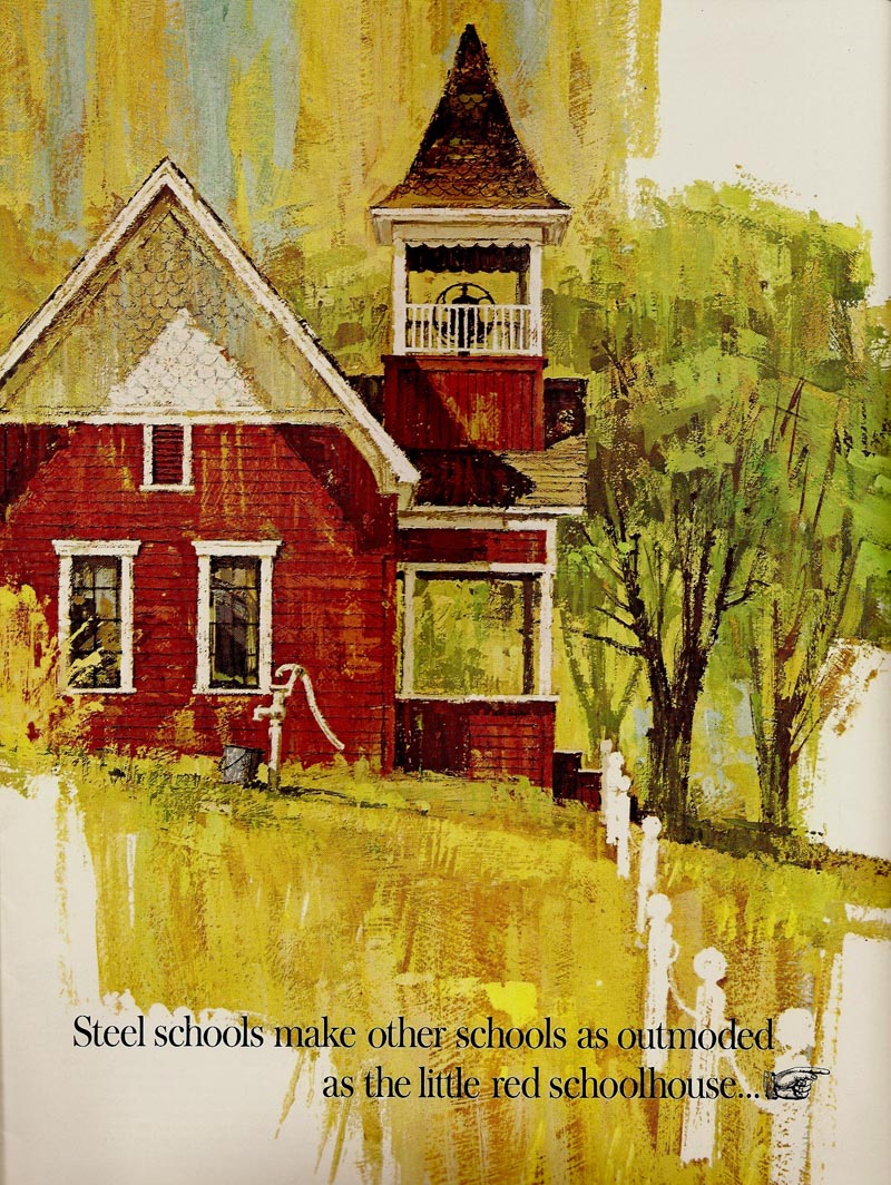
The CAWS will again post a US Steel brochure cover, early or mid 60's....the 'little red schoolhouse'. The inside illustrations have not been shown. First, though, two small comps from a former BBD&O art director friend from those days....very fuzzy photos that he sent recently.
At least viewers can get an idea of the thinking before beginning.
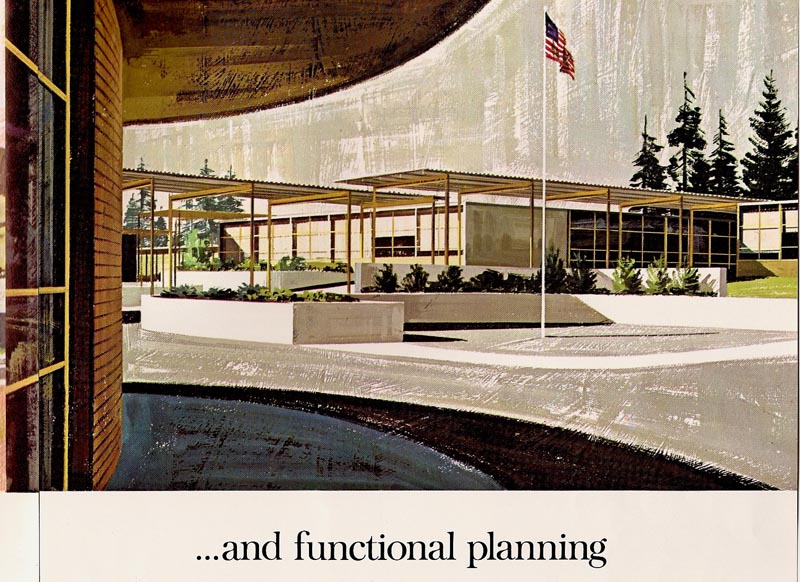
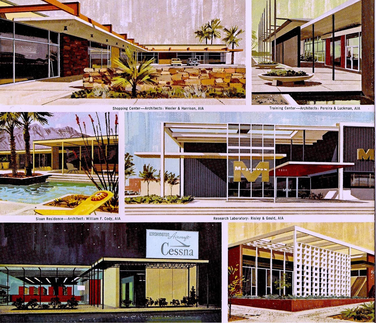
As always, it was a push to get the cover, inside illustrations, and back cover work done in the time allowed. A loose technique (always OK with me), and no figures included, were part of the decisions when job approval came in....just show the steel buildings, please! These were done in gouache on gessoed illustration board.
Not in regard to schools, but more building subjects follow.
Architectural rendering was not a field I sought.

A couple of those for architects were done, and I hated the time and the effort to translate from plans, and relatively low reward compared to advertising.
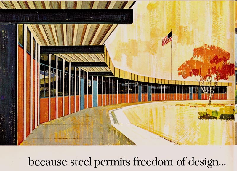
There were enough building subjects from advertisers as it was. I'll post a few examples.
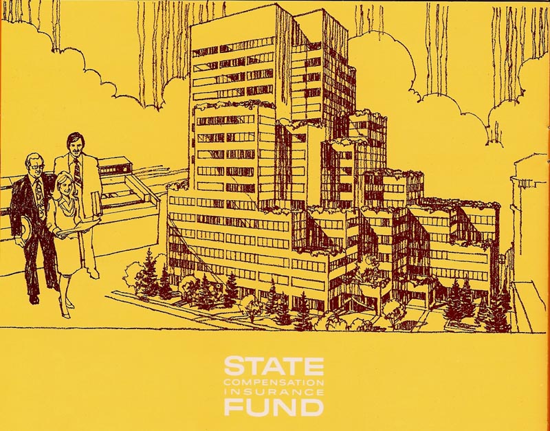
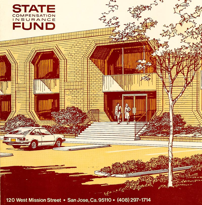
From a State Fund brochure, a two color drawing in charcoal pencil.
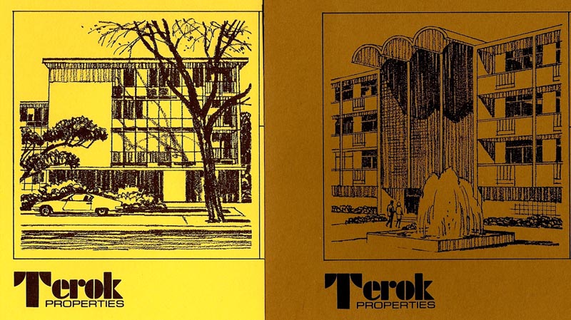
Then a typical attempt to make the hum-drum look presentable....from a property management company, Terok (bottom line, paying client)...
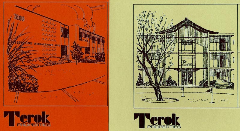
... four of a bunch of ad mailers.
Then, for State Fund again, two of many brochure covers showing branch offices around the state.
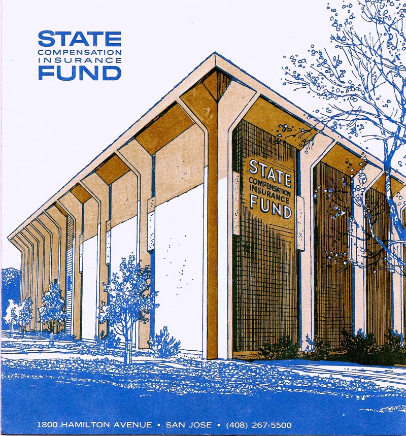
Dull stuff!
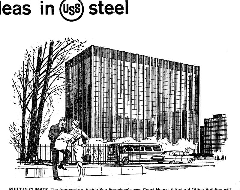
Finally a couple of early US Steel B&W line newspaper line spots, before the 'lady of steel' arrived on the scene. Again, buildings were featured.

* Charlie Allen's Flickr set.

10 comments:
Are you kidding me?!
These may not have been your favorite, and with low reward, but are fantastic! I love this kind of architectural illustration, and you've done a fantastic job here - and your looser schoolhouse renderings are exceptional as well! I could sit staring at these all day.
Additionally, that first illo reminds me of my grandfather telling us how he used to dip his [future wife's] pigtails into his inkwell. Great angle there - thanks for sharing these!
might've been dull subjects, but the illustrations are exactly the opposite of dull!
very rich post, this one, and all examples of properly done work, which now seems very scarce. lot to learn, as always, thank you.
Loved to look at these architectural ones too.
It's all so finely balanced out.
Matt brought back memories. To a second grade boy, girl's long braids and ink wells were made for each other. I tried it once....and got away with it....but risky business!
The architecturals look great to me because they don't have that "digital" look so common these days. Boy am I tired of that. Thanks for the refreshments! I use software for parts of my artwork, but the last thing I want is for it to look unnatural.
The colors of course are fantastic, but the looser technique and rich dry brush texture really make these paintings sing. The originals must be stunning in person. Thanks for sharing!
I know schools were tough in those days Charlie, but surely you mean "Corporal" punishment
ROGER....You're right. No electric chairs...I believe the method used in those times. Exaggeration seems to be in my DNA. My mother was from the South....it was a way of life with her!
Don't know which is worse: "corporate punishment" or "capital punishment"
More great work.Elegant and seemingly effortless, the mark of a true professional.A dry subject matter is made exciting by the panache of the illustrator.Stylewise I'm reminded of Schridde's work for Motorola,would that have been a point of reference?
Honestly, if you'd said you were an architectural specialist, I don't think anyone would doubt it.
Great work.
Post a Comment