First....a B&W line illustration....a 'glass top' look at a GAP store, one scan enlarged.
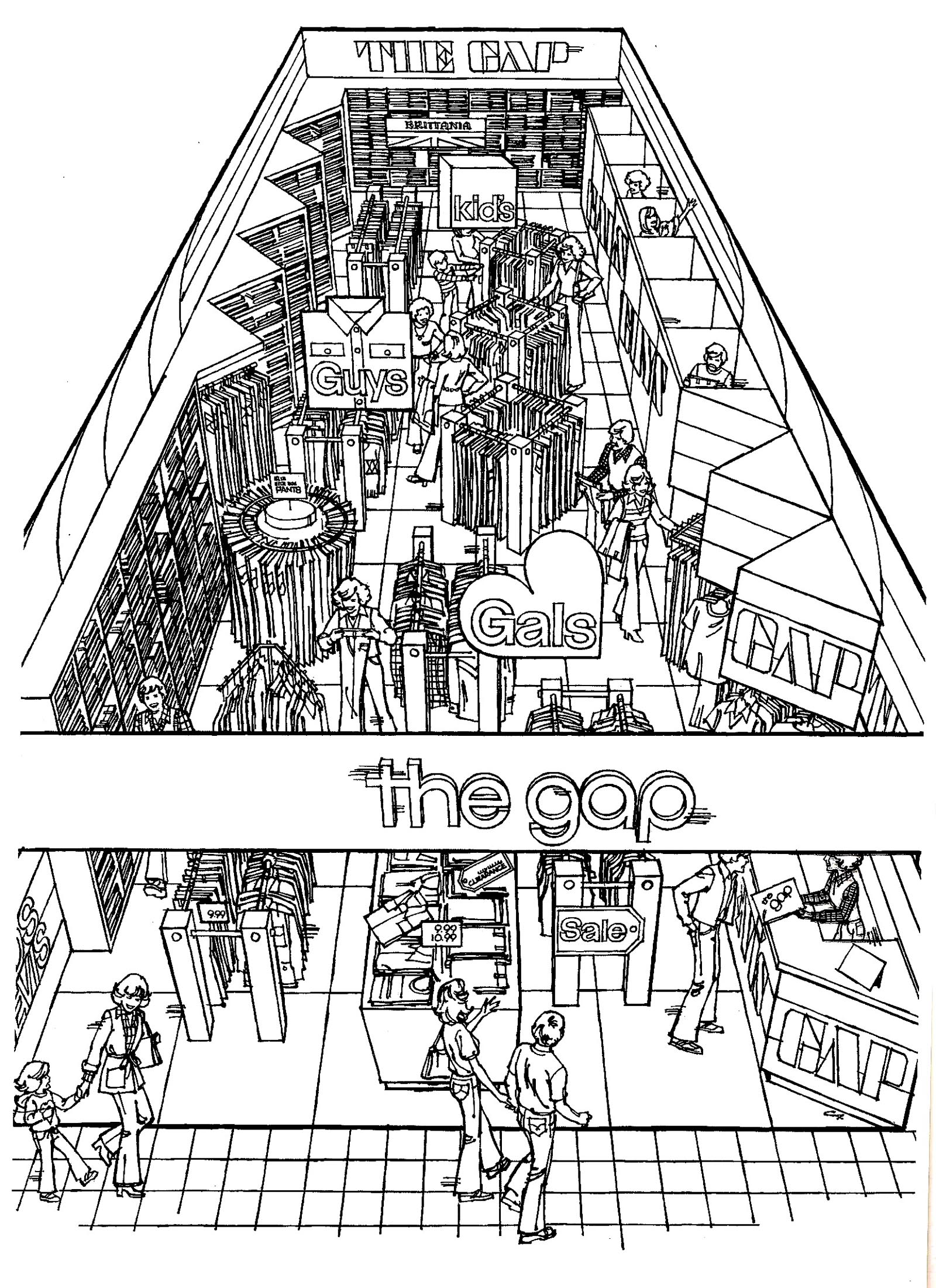
Late 60's or early 70's....and not sure where it was used. I believe the GAP retail chain was started and headquartered in the S.F. bay area....and this was the only ad I recall doing for the company.

The next six are B&W spots from one full-page newspaper ad for Northstar, a Tahoe vacation and ski resort.
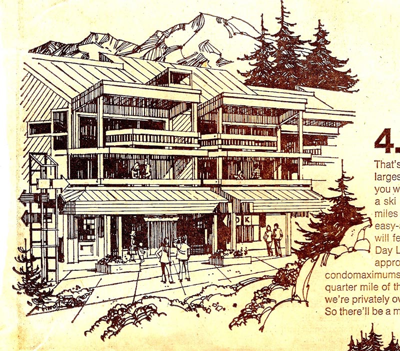
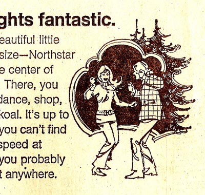
As on many old examples here, these were scanned from a clip or newspaper proof....and the results are a bit shabby.

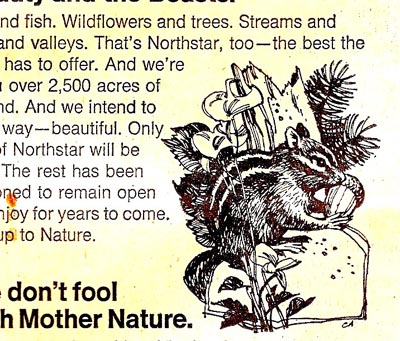
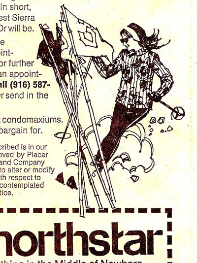
I liked what was then the 'new look' on the small illustrations, however.

Following is a B&W 1974 calendar for a Marin County country store....'Old Brown's'. It was printed in sepia inks on a beige stock. Not included, the months and days were in two rows below the illustration. Actually, I 'piggybacked' on a comp done by Steve Hall who was too busy at the time on other work. Much younger than I, Steve excelled at more decorative illustration....and what I call the 'mod look'. With a few changes, I pretty much followed his concept.

Last, three scans from a B&W brochure done for a Bay Area entrepreneur....his product called the Sitzski.

As a recreational skier, and a skiing family as our daughters were growing up, I suspected the Sitzski was a 'loser' when I worked on the ad!

One of the few jobs in my career on which we were 'stiffed' when his operation was declared bankrupt.
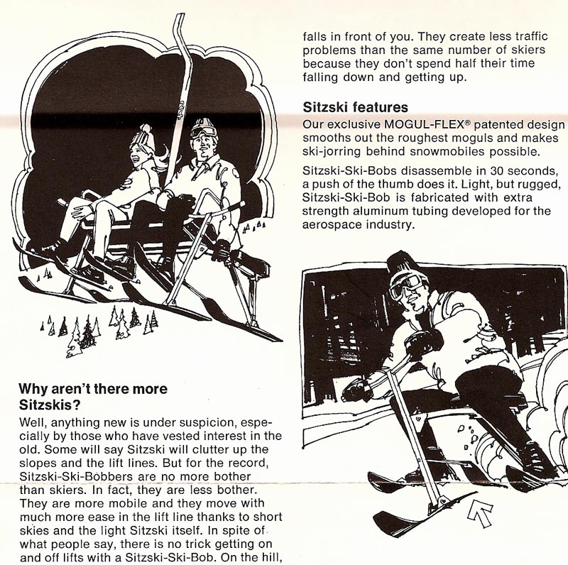
In spite of the no pay, however, I liked the B&W approach on these....and they were fun to work on.
* Charlie Allen's Flickr set

2 comments:
god these are fantastic!
ah, and the lessons of being stiffed - I just went through that, and never again...
They should have been called "shitskis"
Post a Comment