
'I WAS WALKING ALONG, MINDING MY BUSINESS....
WHEN OUT OF AN ORANGE COLORED SKY....WHAM! BAM! ALAKAZAM!
Wait a second....we've used that song! But....that's pretty much the way it happened. Well....no orange colored sky. It was 1981 and business was just so-so, A few lower paying jobs from Gallo, Del Monte, the same old stuff. Ad agencies were shrinking, or gone....newer agencies specializing in TV replaced them....magazines and newspaper ads mostly gone. TV had won the budget battle. The 70's had been a decade of political turmoil, gas lines, hyper inflation....a time when the phrase 'cash is trash' became popular. In spite of double digit interest rates, people were investing in 'limited partnerships', farm and orchard land, other strange odds and ends, and....'collectibles'. One example of this fad became limited edition prints....a 'manufactured collectible'. The business still exists to some extent, though with a fraction of the popularity of the 80's. The CAWS will describe just a bit of the arcane world of limited edition Duck Stamp Prints this week. Two or three more blogs would still not cover the history and lore of that 'collectible' print phase in our time.

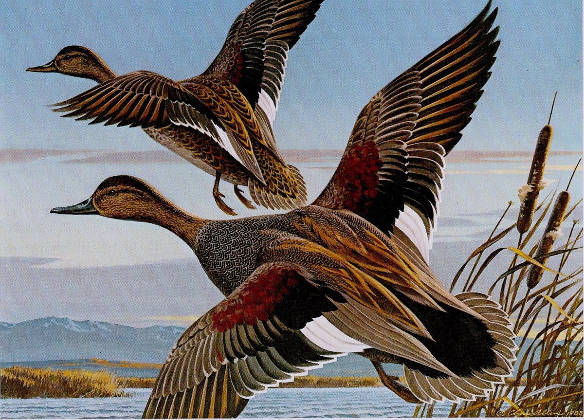
Going back to the title....I was walking by a small frame and print store in nearby Walnut Creek when I noticed a nicely framed and matted 6 1/2 x 9 inch print for sale in the window. The illustration was of a pair of pintail ducks in flight....and a small matted window below the print contained a stamp. I had enjoyed duck hunting a few times each year in the Sacramento Valley during my 40's. At that time for hunters, a Federal duck stamp was required and a California hunting license. I walked in and asked about the print....found out the stamp was a California duck stamp, required of hunters since the mid 70's. Also, that the print was a signed and numbered limited edition print....a larger replica of the stamp....and was the result of a once a year design competition sponsored by the Calif. Dept. of Fish and Game. I sent off for the rules and entry forms....and in 1982 entered the required small 5 x 7 inch design in the competition. Subject, a pair of Green Wing Teal. Although the ad illustration business was highly competitive, this was the first judged competition I had entered in over 30 years of illustration. About 95 designs were entered....and mine was the winner. California was the first state to require a hunters stamp....Nevada and others soon followed. I then discovered Nevada held a competition very similar to California's. A month after the California win, I entered the Nevada contest (no names permitted on the entries)....and from about 150 entries, I won again.

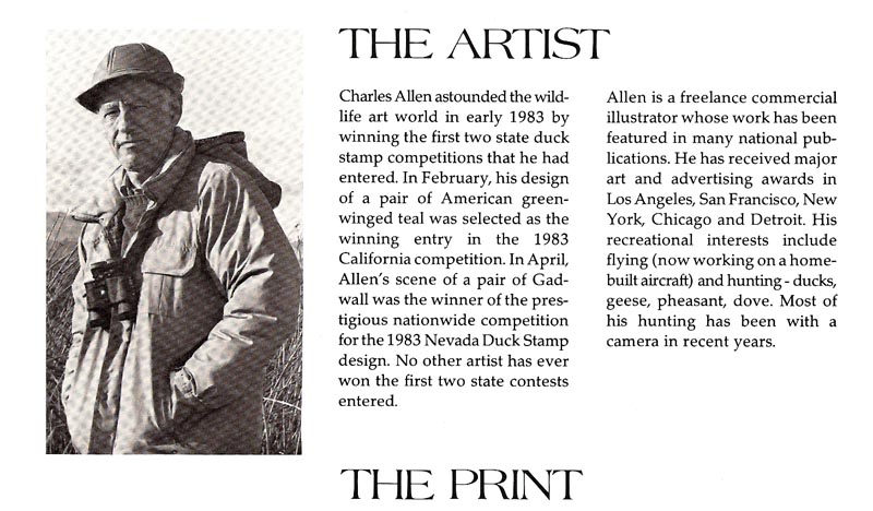
The CAWS will post a scan of the California 6 1/2 x 9 inch print of Green Wing Teal....and then a scan of the similar size Nevada print of a pair of Gadwall Ducks. Briefly, I learned that I knew very little about the various ducks I had hunted, plucked, and eaten during my hunting years! I also learned that the judges were primarily Fish and Game people, duck hunters, environmental officials, an ornithologist, and one (I believe) college art professor. Later on, with a few artist friends, we called them 'feather counters'. Whatever....I found it was an entirely different ball game from advertising illustration. 1982 was still very early in the duck stamp business....mine was the third or fourth in the California yearly series, and the second year in the Nevada series. I'll post a descriptive blurb from the print cover. The prints, cover, ads, etc. were all published by a small midwest publisher, Voyager Art. The midwest, the center of the huge Mississippi River flyway of migratory waterfowl, was and still is, the center of Duck Stamp related art, and of many wildlife related artists and subjects.

The CAWS will press 'doggedly' on next week with the second chapter of the 1980's duck stamp phase....at least as it related to, by then, an aging career in illustration.

* Charlie Allen's Flickr set.

6 comments:
"Feather counters"..ha ha ha...as the English language is not my native one, i knew only the term "beancounters" before.
You were the winner of those contests and won...
No wonder, Wow!
Nice photo of yours here. They call you Charles there. It fits you as well. The winner who got the crown. Would any Britains talk about "Prince Charlie"?
Love the stories behind these projects. Great illustrations.So Charlie, is there anything you can't illustrate? Chet used to tell a story about Bruce Bomberger doing a illustration of a boxing match...with no reference materials. Did you ever undertake anything like that?
Charlie, great illustrations as usual. It doesn't surprise me you were the winner of both prestigious contests.. I was told that they were looking for technical accuracy, as well as artistic merit, and that eliminated a lot of artists, I suspect. Your work is always technically accurate and skillfully designed and rendered (even the pencil roughs are well drawn), which was obviously the complete package they were looking for.. a belated congratulations! I'm sure you were the envy of all those that entered.
Tom Watson
Thanks, per usual, for the comments....always interesting. Bruce, don't recall the BB boxing match story. At one 'up time,' I did a B&W halftone of a boxing match....used Jim Hasse and Sig Beartown for models, Hasse as referee, Sig as a fight fan near the ring. OK, but not great. Like so much work, missing now....no idea where or when. Rich, I think I've heard the term 'Prince Charlie'....maybe just over here. I'll no doubt expound next week about the 'risky business' of art competitions. Way too long odds for the time and effort put in! I think I was mainly lucky!
Nice Post! Your blog comment is very amazing.
goose hunting in Colorado
This is an interesting and unique story.
Post a Comment