
Back in the 1920's I can recall my grandparents farm home a few miles south of Fresno. In the evening my grandmother would hold a match to gas lights that hung from the ceiling. Also remember my grandfather yelling into the mouthpiece of a wooden box wall phone, with a crank on the side. And, yep, it was a three party line!

The 1950's and 60's were 'modern times' when I illustrated about two dozen 'Telephone News' mailers which were sent out with monthly bills. Modern times are relative, however! Today's fiber-optic 'information highway', wireless cell phone mania, as well as digital camera and computer combos were unheard of in those days.

BBD&O and Pac Tel were very good clients then, providing both newspaper ads and 'Telephone News' assignments. They had interest and variety....a real plus for me. Pac Tel or BBD&O came up with photos of cable trucks, tractors, hardware, etc., but the figures and compositions were left to the artist.
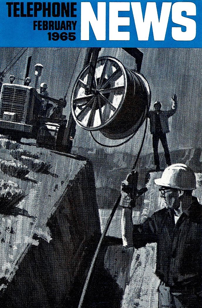
As I recall, some of the duotones were painted that way, on others the second color was added by the lithographer using the B&W halftone original. At 3 1/2 x 6 inches, I usually worked 'twice up', or roughly 7 x 10 inches. But...enough shop talk....the illustrations are pretty much self explanatory.

* Charlie Allen's Flickr set.

5 comments:
These small brochure illustrations show Charlie's mastery of communicating a complex story in a small space. His composition and use of darks and lights are fantastic.
As illustration fans know, many of these pieces of art were often tossed after publication. I am fortunate to have one of these illustrations that was saved. It depicts a lighthouse in a storm, and in my opinion is a masterpiece in storytelling at a small size. Remember these printed a 3.5 x 6.
I've placed it on my website if you're interested.
http://phcreative.com/lighthouse.jpg
Bruce Hettema
What a treat to see these little gems after all these years. I agree with Bruce, Charlie's compositions and strong use of values, are extraordinary. IMO, these illos and the light house illo, as well as Charlie's other ad illos, demonstrate that Charlie Allen could have successfully specialized in story illustration for the major magazines in the 50's. Technically they are top quality, but just as important, he captures the mood and spirit of the event... a quality not found in all good technicians. The combination is what makes a superior illustration.
Tom Watson
Just love to look at these illustrations!
Hardware and ingredients were supplied by the advertising company as we read here.
But what the cook made out of them!
So telling, and tone values are just perfect and compositions exquisite; a titbit.
That top piece is DRAMA!
Love the way the boats lurching in opposite directions really gives the feel of the churning sea. The off-kilter boat contrasted with the perfectly straight, steady box which holds the title makes it all the more dramatic. Also, the rain going in an opposite diagonal direction of the big boat makes the sense of action all the more undeniable. Great.
Beautiful work. I can't wait to go through your archives.
Post a Comment