
As one of the old school, and digitally disadvantaged, I have no idea if the word 'comp' is used in today's advertising and media world. In my thirty or more years illustrating, 'comp' or 'comped' were everyday terms for a sketch in B&W or color shown to an agency or client for approval before finished art was begun. 'Storyboards', or comps before TV commercials are produced, were around back in the 70's. I did a few, and Leif tells me they're still in demand....only in computer form instead of markers.

This week's CAWS will show some random comps with a general date.....and more will follow in the weeks to come. Illustrators agreed that their comps were often better, and certainly had more vigor, than a more precise, tightened up, finish. The client would probably not agree! Oddly, in my work, the more important jobs....billboards, most Chevvy ads, Kaiser Aluminum ads, a few others....were comped by the art director, and client approved, before coming over to me. On many 'lesser ' ads, the artist had to provide comps before a finish was ordered.
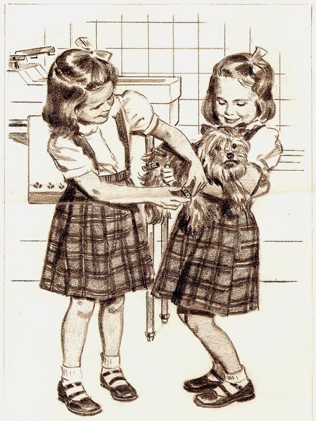
Below, a 2B pencil comp on bond pad for Hexol, a home and bath disinfectant....in the early 50's.
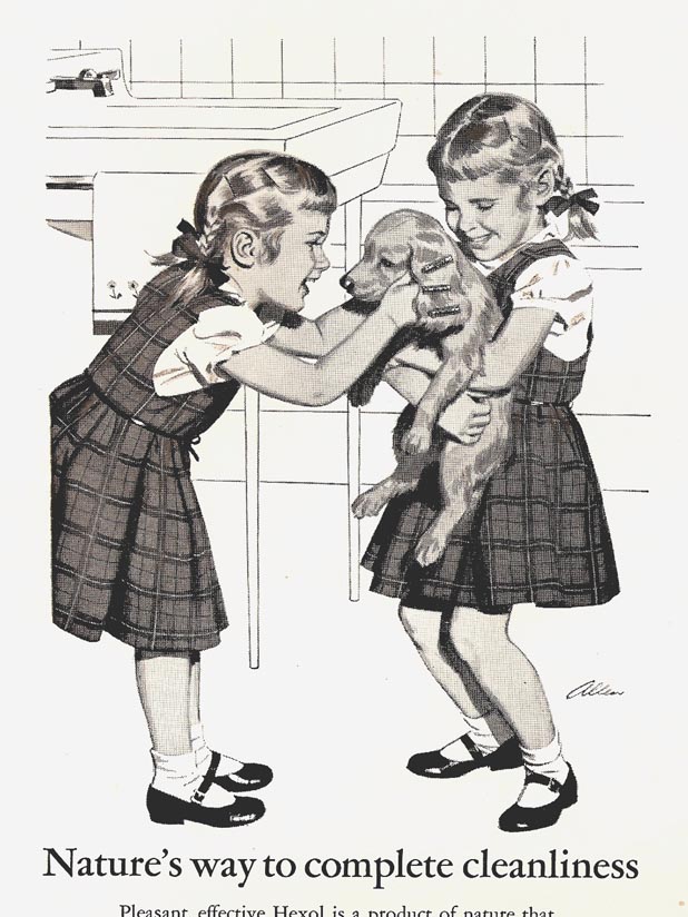
A finished ad, done in ink wash, follows. For some reason the Hexol folks were hooked on the twins idea. No problem....it still just required one model, my daughter, or maybe one of her friends!
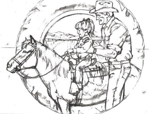
Next, the charcoal pencil sketch of pony, tyke, and dad, for State Fund done in the 70's. Why the tractor tire? I have no idea....and can't recall if it became a finished ad.
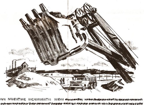
Then two more charcoal pencil comps for US Steel B&W ads. As with the two at the top of this post... 1960's vintage.
Finally, a charcoal pencil montage, a popular fad in the 70's. It was for a State Fund Ag insurance ad, usually published in farm journals.

Some of those, which we'll see later on, were cleaned up and used as finished art.
* See these images at full size in Charlie Allen's Flickr set.

4 comments:
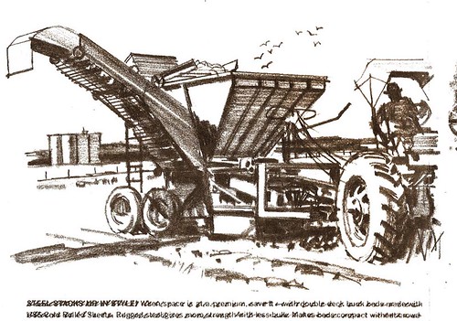
Great stuff again Charlie. Yes, they are still called comps. It's a term I don't think shall pass. As to the tractor sketch, your grey cells are foggy. You did that for P&H in the 90's. It was part of a series that ran in an Ag publication that was printed on newsprint causing the blacks to go too heavy. We had used another illustrator on the first ad, but his work reproduced poorly. Charlie understood the need to do a high key approach, that allowed for the poor reproduction, and it came out great. You can see the final at (http://www.phcreative.com/ourpast1990s8.html)
Bruce Hettema, P&H Creative Group
HEY BRUCE...Youre right....the little grey cells are getting foggier all the time! At least I remembered it was for P&H. Had no idea I did anything in the 90's for you guys. Also can't recall how the montage comp (guy with avocado) was used. Maybe you can help on that....I have a couple more of those, but no finished stuff.
I still use COMP on my layouts today. Though I notice it seems to bleed between Comprehensive and Composite (Photoshop) in meaning today.
By the way, I love to see gesture used in sketches. Few still understand subtlety is sometimes better than detail early on.
Thannks for writing
Post a Comment