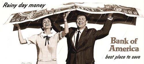
Above, a Bank of America billboard, 'Rainy Day Money'....and today we probably still need it!
When the 'big change' happened in the late 60's, it happened suddenly. Billboards WERE an eyesore....cluttering up streets, buildings, and highways in the open countryside. It was time for them to go. Once again, my mantra, 'change is the constant'....but the change greatly affected illustrators, and certainly affected my sources of work and income. Well....cest la vie!

* Seen before: the 'windshield wipers' poster above (on which my neighbors were the models). One earlier comment on Flickr had said they looked like the same guy....but actually, only one repeat! Which two? Answer at the bottom....
Below, a faded color print (and my only record) of probably my favorite poster from the late 50's. The grandmother's dress was originally blue-violet....now, flesh tones are faded, heater and other colors gone, although the drawing and values still hold up fairly well.
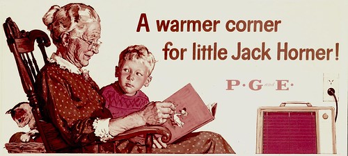
This PG&E board received the 2nd 'Max Schmidt' annual award for best poster in the western states that I had won. The earlier winner was another PG&E poster, again with an electric heater, with red-orange Dayglo fluorescent ink silkscreened in the center....amazingly real in appearance.
Also included is an 8 x 10 inch B&W copy print of a 1960's 'Burgie' billboard.

Definitely not a Whitcomb or Whitmore romantic story illustrator....but I'm still pleased with the gouache handling on this poster.
Finally, the 'toothache mastiff' once again, which shows the approximate colors. This and the 'windshield wipers' poster near the top were 'taxi boards'....24 x 36 inch Chevron posters mounted on the backs of San Francisco Yellow Cab taxis...

...more on those later.
* See these images at full size in Charlie Allen's Flickr set.
* A: The two attendants in the middle!

4 comments:
I'd love to see great art like you did then on billboards and posters today!
Wouldn't seem like advertising but outdoor art for all to see.
-Bill*
AMAZING. Mr. Allen I think you are an exceptional illustrator and I am thankful to G-d that site's like yours and flickr are up so that we all can share in the work of our great American Illustrators.
Keep the artwork coming; it makes my day.
"The more it changes, the more it remains the same"
The Bank of America billboard...he he he...taking shelter under that giant $...you're just up-to-date again, Charlie.
The Toothache Mastiff in color vision: Well, already in b&w it was a delight. Thanks for adding this one!
Very nice bllog you have here
Post a Comment