Certainly the advertising illustration business had it's share....from nearly endless tight deadlines, odd, impossible, or inappropriate ideas on illustration subjects, 'changes' that made little sense to the ad....whatever! Of course, the eternal wrestle with the technical was present....finding adequate reference or models, boards and paper, pens and inks, brushes and paints, odiferous markers, and 'Murphy' was never asleep! The usual problems of making it all work.
The CAWS will return to the Kaiser Aluminum ads of the 50's this week. First, the aluminum clad fire fighter, one more example of Kaiser's relaxed attitude on products.
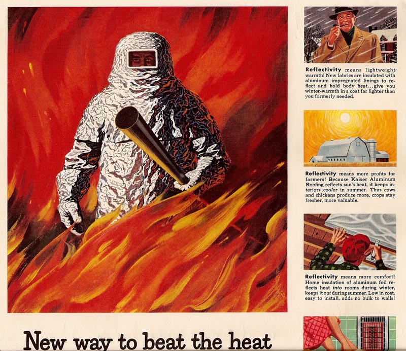
They liked drama in these national magazine ads....and fire was an attention getter. The agency, Foote/Cone, or Kaiser, provided a photo of an asbestus type fire suit, a square windowed head hood, and a large CO2 nozzle....very much like the illustration depicted. When I inquired, 'where is the aluminum?'....the answer came back....'just make it look like heavy aluminum foil'! I believe this was my second Kaiser national ad....the first being the youngster holding aloft the aluminum stroller.
Next, the unlikely aluminum skillet held over a roaring open fire....but, what the heck....it's dramatic and gets attention. It's advertising!
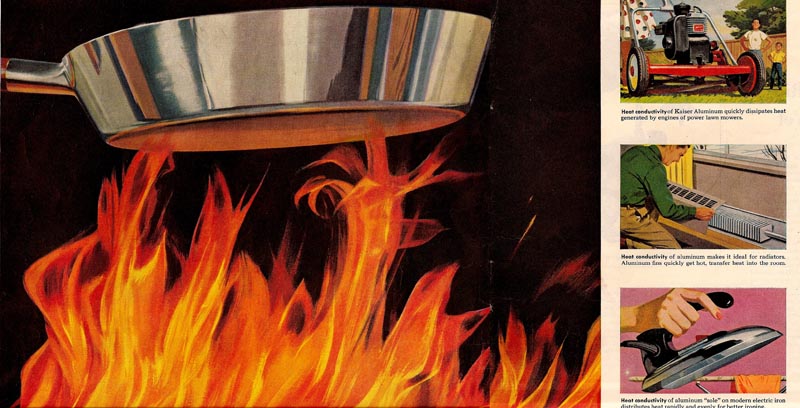
The ad was a double page spread in SE Post and several other magazines. Regarding the right side, with some of the spots: note the mom is using the power mower! The one shown was our first Briggs and Stratton gasoline powered mower.
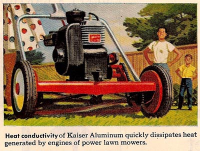
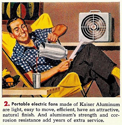
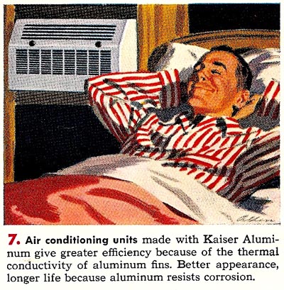
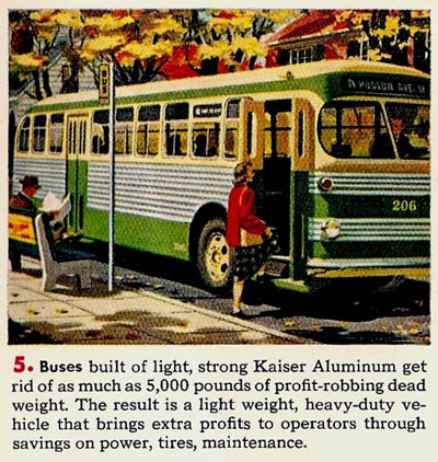
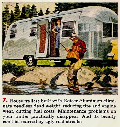
And finally, a couple of Kaiser ads featuring just the spot illustrations....again, back in the 50's.



Next week, a bit of Christmas cheer....from the ad world!
* Charlie Allen's Flickr set.
3 comments:
Great stuff Charlie....I keep saying you've been holding out on me!
The small spots are fantastic. Remember these are only 2 to 3 inch square, but they all read so well.
Bruce Hettema, P&H Creative Group
Charlie, You sure can render those products, especially the reflective surfaces... and fire, which is always tricky... overdone and it's too busy, under done and it doesn't quite read. No pun intended ;-) You had that knack to make hard subjects look easy. And they have visual consistentancy that unifies them... no rendering looks out of character. Not an easy thing to accomplish, especially with revisions and time restraints.
Tom Watson
...Never had it so good!...
The man with the red-striped pyjama relaxing at the airconditioner...he looks as happy as the man with the beer.
Which man with a beer?
The man enjoying it on your very first post here.
Cheers Charlie!
Post a Comment