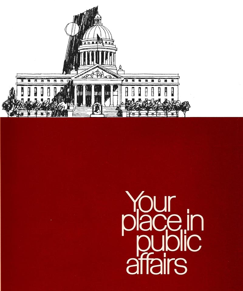
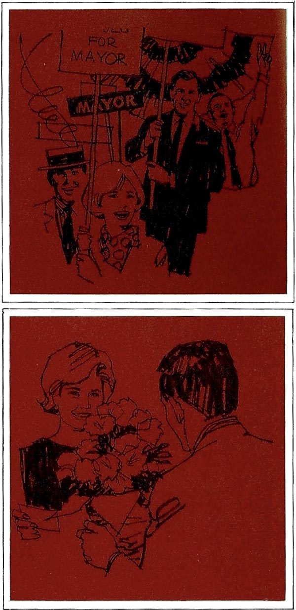
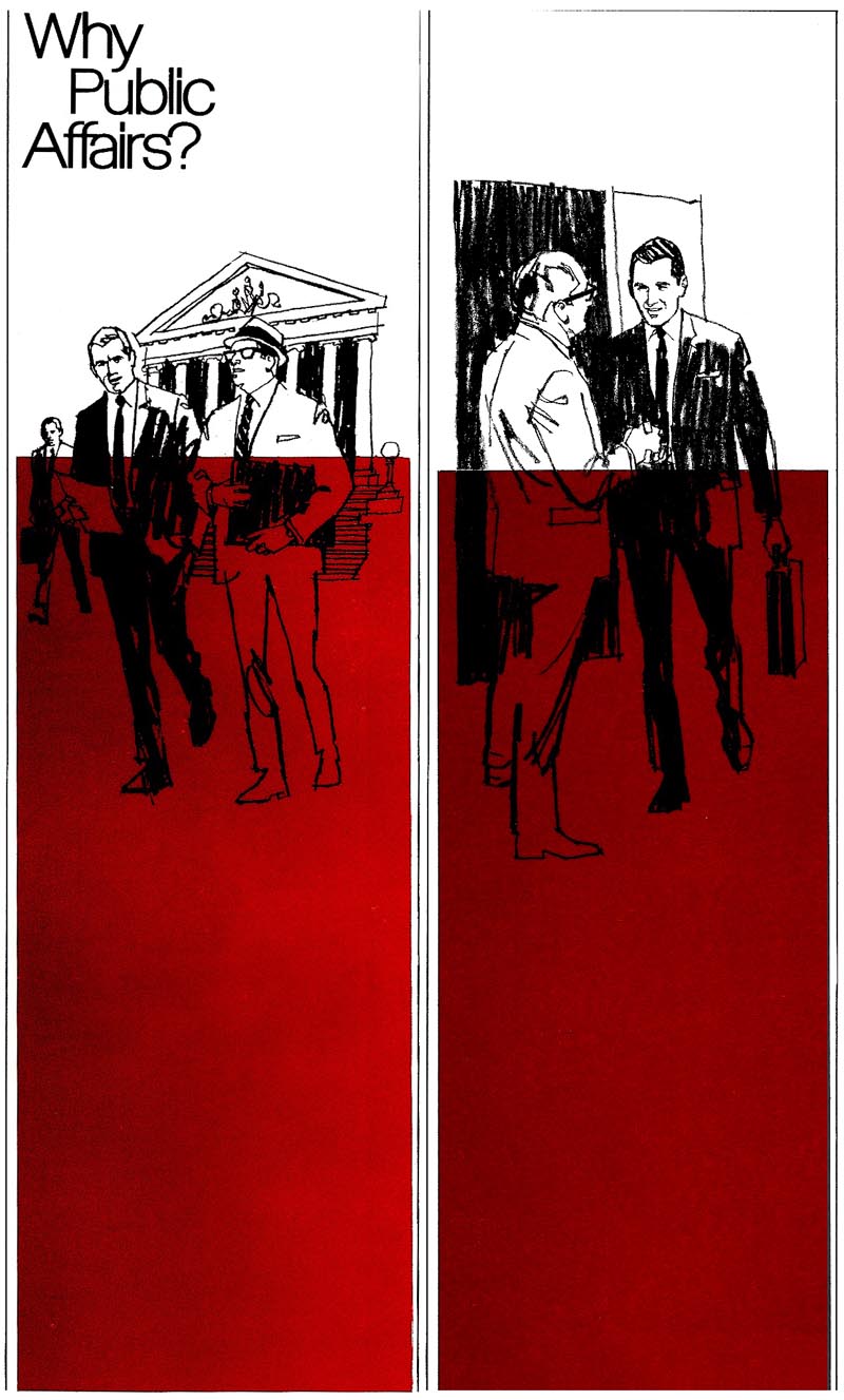
First, the Pac Tel brochure cover, then an inside pair, and then the vertical half page examples seen in comps last week.
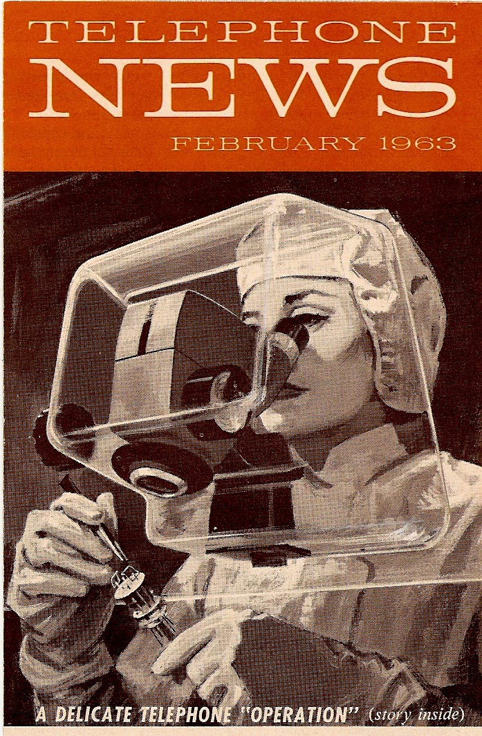
Following that...three of the 'Telephone News' mailers that haven't been shown on CAWS...that I recall. If it seems we're stuck in red inks this week....just coincidence....not my 'favorite color'. Which reminds me of an amusing and typically acerbic talk one evening in the 60's by Robert Fawcett before a group of San Francisco artists. His anecdote....when invited to lunch by an art director and the client, head of a large corporation, the client asked Fawcett to name his favorite color. Fawcett, irked by the banal question, replied, 'I play no favorites!'
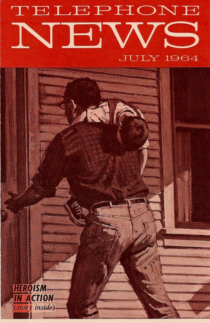
The telephone mailers had a variety of subjects....always enjoyable for me.
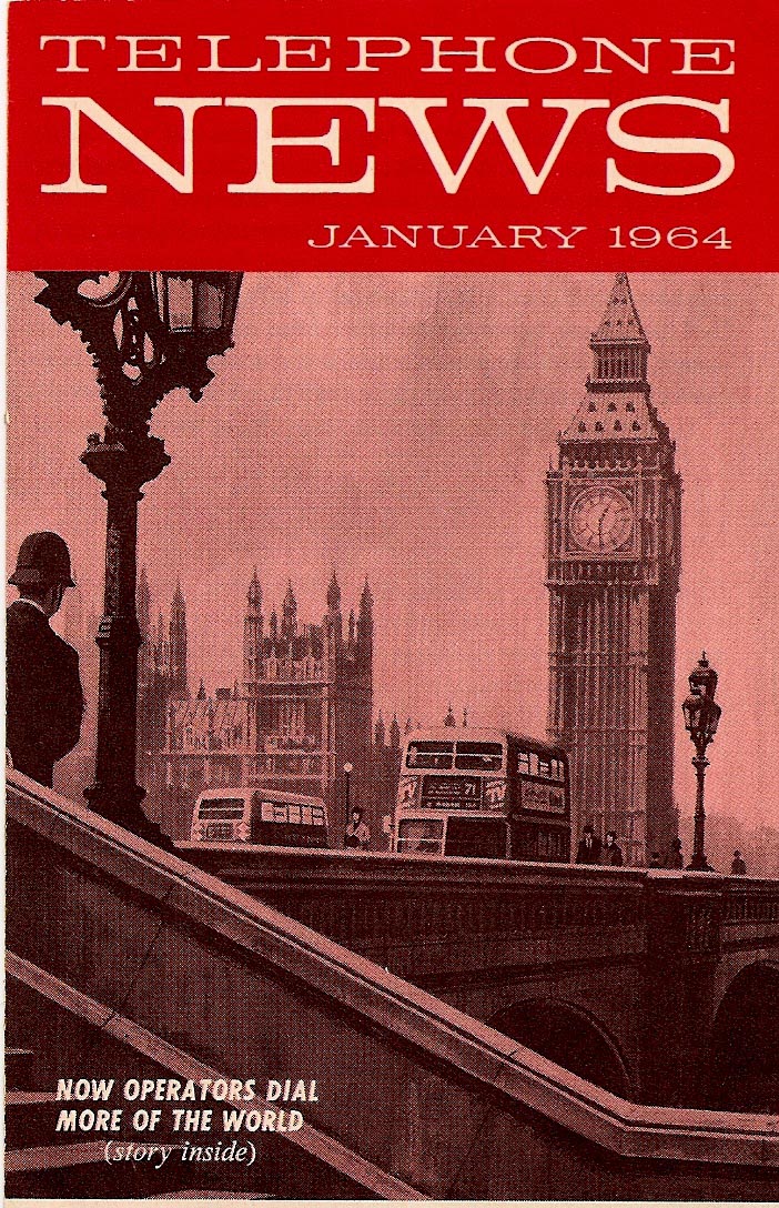
They were done in gouache or Perma Greys, the second color added mechanically with a lighter screen of the original halftone illustration.
Finally, in the olden days before computer conferencing, a couple of newspaper B&W line plus halftone Pac Tel jobs from about 1960. The executive holding the phone was a church friend....and the other three gentlemen were my neighbors....all good sports.

Difficult to get them over at the same time, so they posed separately. For those days, and for newspapers, the line film pos and halftone underneath made for a good clear technique for an ad.
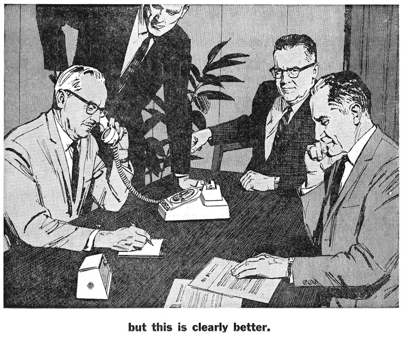
It would be again today....if illustrative figure ads were even used!
* Charlie Allen's Flickr set.

2 comments:
Do my (web) eyes deceive me or is that Rubylith on "The President's Letter"? Takes me back to think about that... then I end up thinking of the ruling pen and have to shudder uncontrollably.
Ruby Lith....knew her well. Does have that objectionable look....but the printed color was more a brick red. Scans seem to intensify colors.
Post a Comment