Most men grew long sideburns and longer hair. Most wore hip hugging, polyester bell bottom pants. Young women (my daughters included) wore mini skirts that nearly achieved the unachievable. Vietnam, major demonstrations, Watergate, long gas lines, closed gas stations, stagflation....a rebellious time. In my world, montages and busy acrylic textures became the style in illustration.

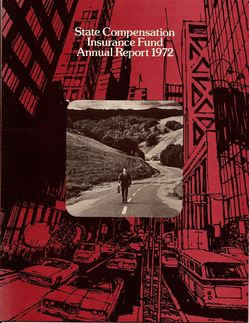
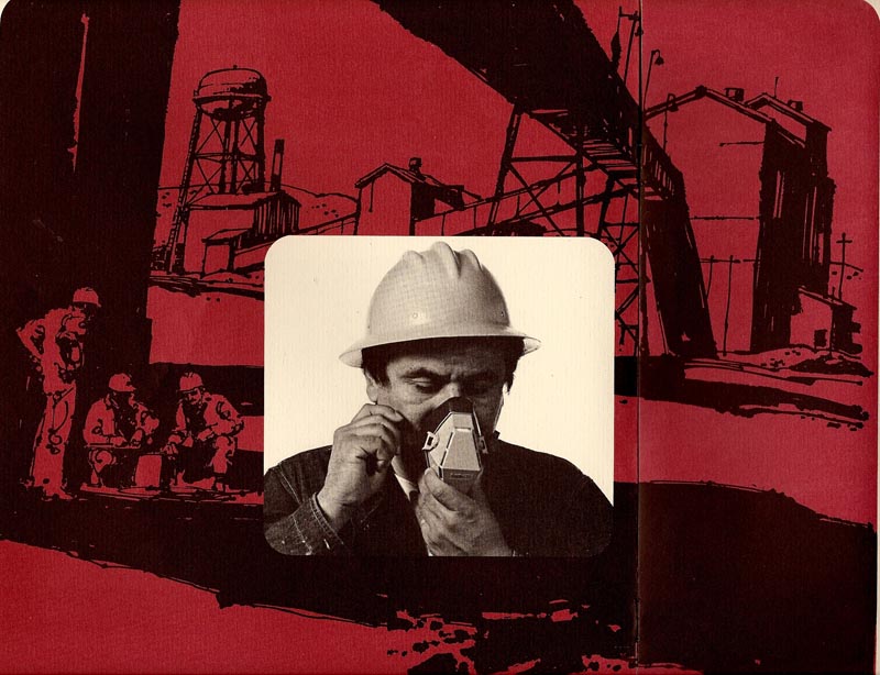
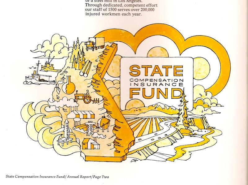
One of the most loyal clients for P&H, and for me, was the California State Insurance Fund, the big provider of workman's comp, required for every worker in the state. Over the years, I illustrated dozens of brochures and pamphlets....and on some, got adventurous. We'll start with a two color brochure....four scans

The line work was done with a fiber tip pen on newsprint....hence the 'blotter' look. Again, enjoyed the changes....although art prices were not keeping up with inflation. Come to think....have they ever?
In the late 40's and during the 50's, P&H was at 425 Bush St. in San Francisco, near the financial, corporate, and advertising center of town. Pat Patterson and Haines Hall owned the five story building. P&H occupied the so called 'penthouse', a one-half sixth floor addition. A small but modern elevator serviced the floors up to the fifth floor. The single sliding door held a 9x12 inch framed plexiglass panel....and P&H artists were 'encouraged' to take weekly turns to promote the P&H art service. On this occasion it held a colorful abstract, I think of food, by one of our bunch. One noon on the fifth floor, the elevator filled with three or four from P&H, a couple of secretaries and two or three from the architectural firm on the fifth. Last on, facing the door and the panel, was a tall black bike delivery courier....frequent visitors to 425 Bush St. Elevator etiquette prevailed....conversations stopped, people looked ahead or at the ceiling...a bit too close for personal contact. Just before the door opened at the first floor, the delivery guy broke the silence. In a deep voice he announced, 'AHTY SMAHTY!'. Needless to say, he got a big laugh. Our family has used the expression ever since.
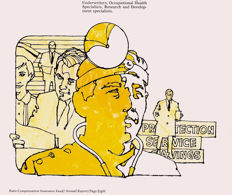
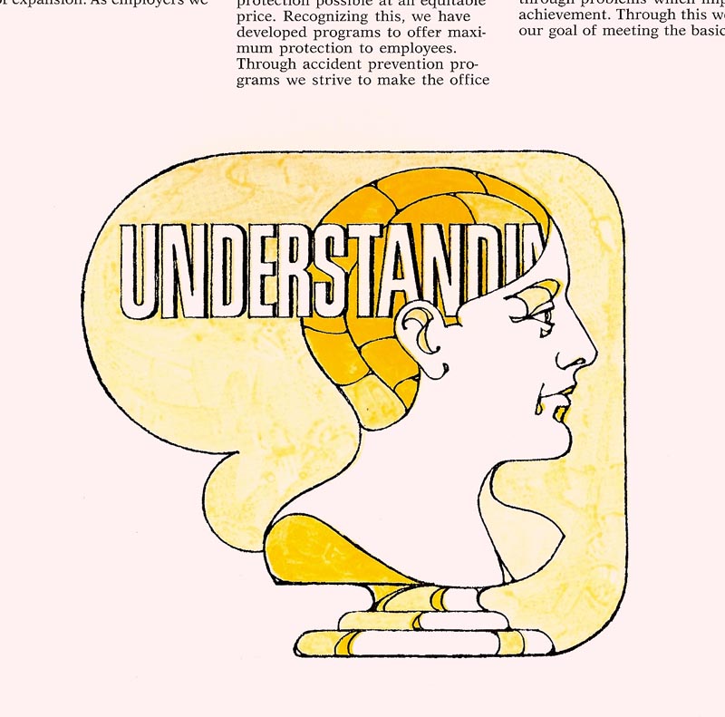
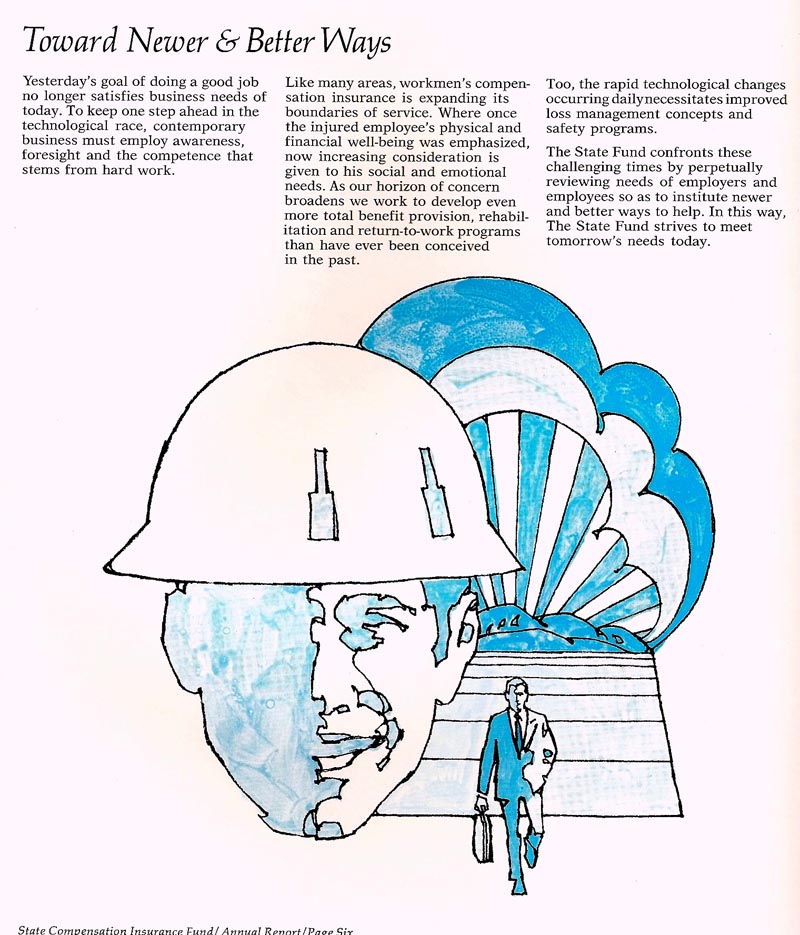
Another State Fund brochure follows....four scans...
One of the most loyal clients for P&H, and for me, was the California State Insurance Fund, the big provider of workman's comp, required for every worker in the state. Over the years, I illustrated dozens of brochures and pamphlets....and on some, got adventurous. We'll start with a two color brochure....four scans...
...and a definite style departure for me.
Line art, film positives over the second color....which on these was done in greys mixed with acrylic medium.
The system seemed to work. I felt out of my 'comfort zone' on these...but as usual, had fun trying something new.

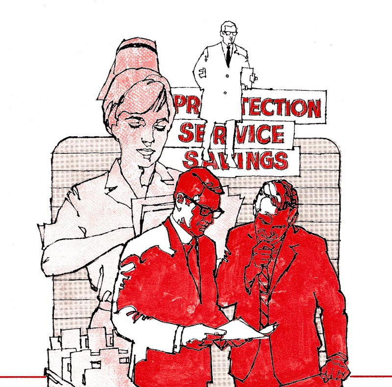
Another medical montage in the same style, this one in red ink, came from a separate pamphlet.
* Charlie Allen's Flickr set.

No comments:
Post a Comment