The general theme on CAWS has been to show somewhat related ads and series. However, in my time, jobs and assignments never came in that way. In any given week or month work could involve B&W line art, ink wash, gouache in color or in greys, marker or charcoal pencil comps... almost back to back. Also it would include a variety of subjects from a variety of agencies and clients. All in all, it kept things interesting. On this, we'll show a variety of B&W's, some including halftone.
The first two are from a full page newspaper ad by the Port of San Francisco, done about 1970. Line film positives plus halftone.
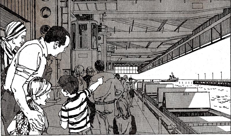

Then, again in the early 70's, a B&W line illustration for the Bank of California....'entering California, Oregon, and Washington'.
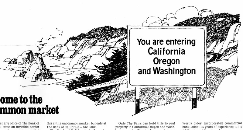
Another for Bank of California showing off their new building in Portland, Oregon.
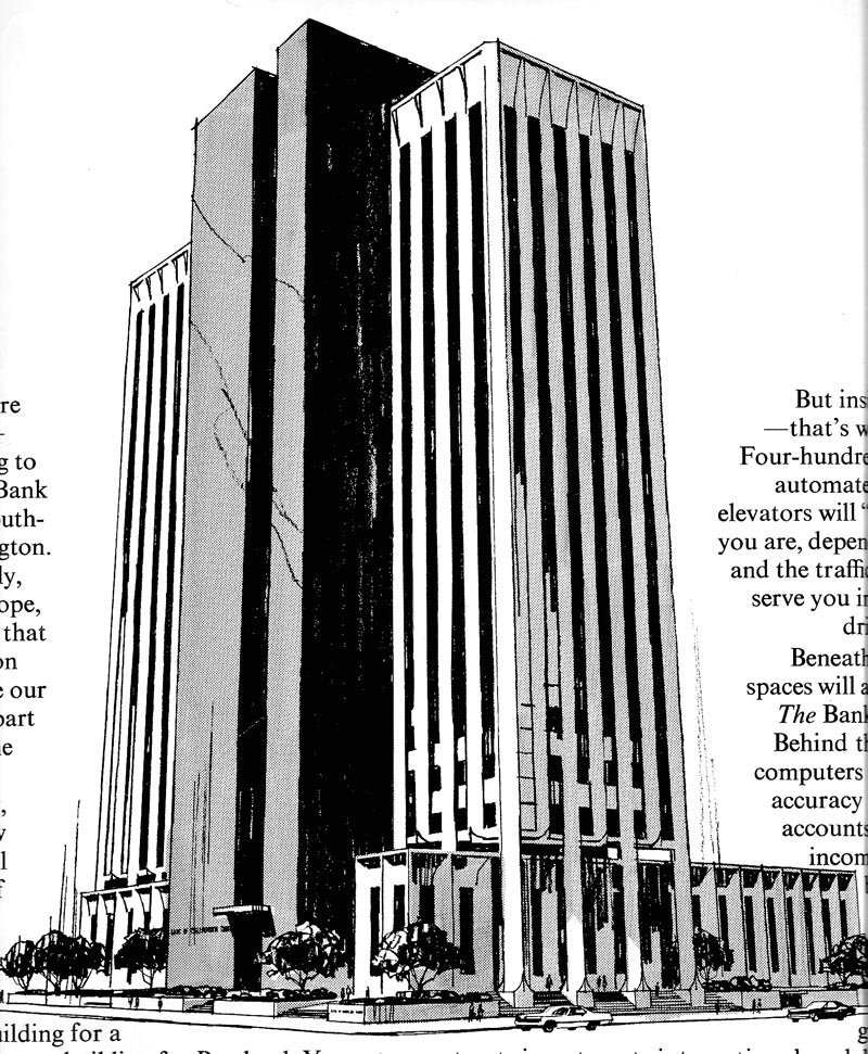
Following that, a change up....food B&W's. The first, an ad for Farrell's, a restaurant chain in northern California. B&W line technique presents a real challenge....trying to make food look appetizing. Hopefully a bit later, will show a color menu cover done for Farrell's.

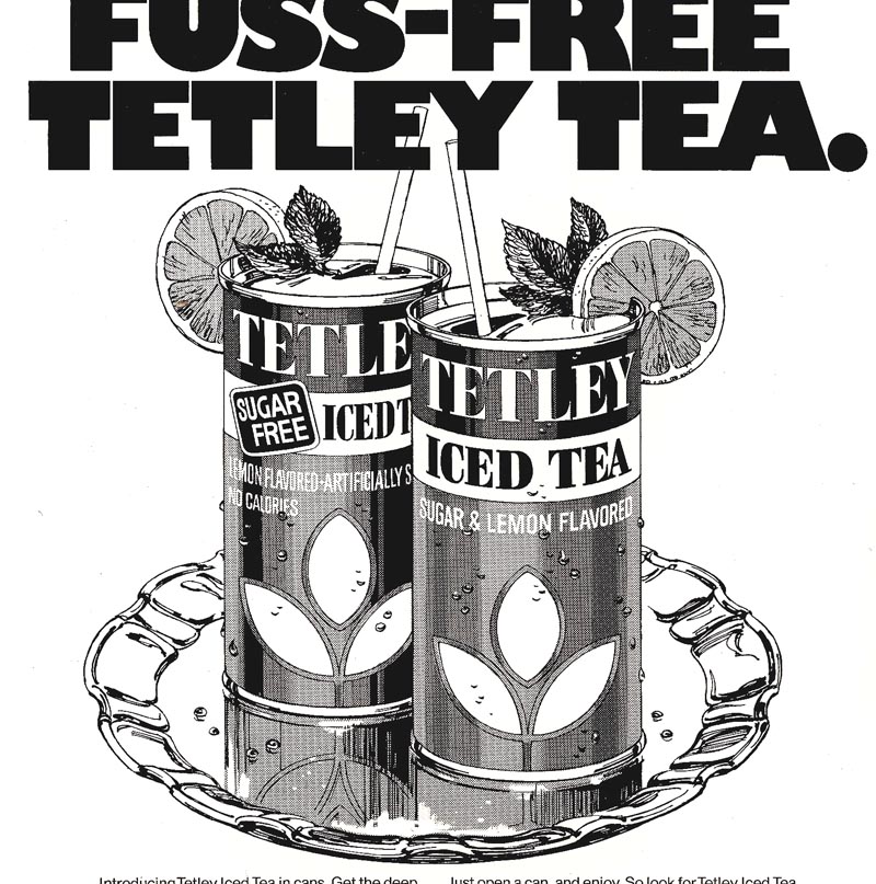
Then a Tetley Tea B&W...film pos with halftone. Almost as much a lettering exercise as line illustration.
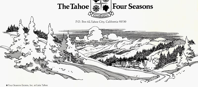
Finally, a fanciful B&W for the Four Seasons Hotel....from a large newspaper advertisement. Both Tahoe and Reno were and are major resort and hotel locations....and on occasion were good clients. A lot of promotion in California cities was needed to keep them busy year around.
Very last....two catalog poster illustrations of six items for sale....there were dozens on the poster. When times were slow....and it seemed to happen more often in the 70's....it was 'this brush for hire'....even catalog work!
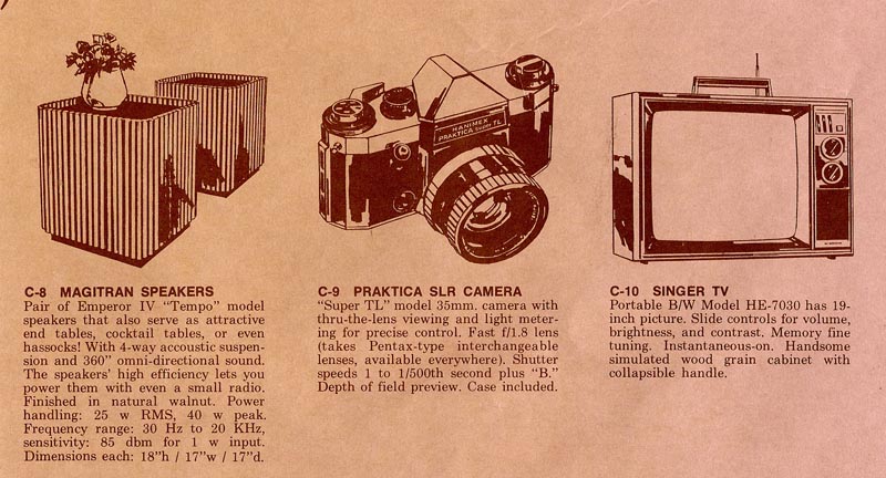
These were done with charcoal pencil on smooth hot press illustration board....or small brush and ink....or possibly both.
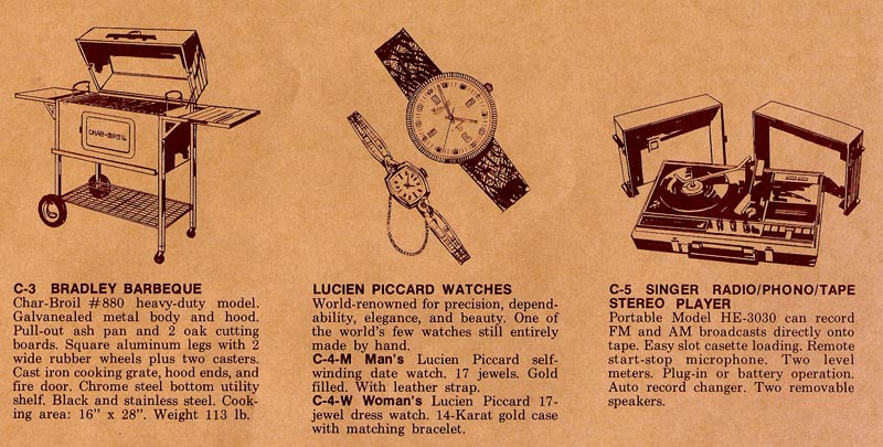
Hard to remember!
* Charlie Allen's Flickr set.

3 comments:
How colorful black & white can be.
I would have thought food ads would hardly do without color. But that B&W burger plate makes my mouth water...yum...yum.
Yea, no title tune this week! It may be funny, but I always come to think you would have been THE MAN to illustrate Frank Sinatra's album covers.
"It ain't worth a thing if it hasn't got that swing"
Yours would have swung.
RICH....Thanks....I'm a great admirer of Sinatra. Would have loved to do an album. But, Hollywood stuff....and I found albums didn't pay all that much. Prices were based on distribution size....and ads had a much wider audience than, say, albums. I'm waiting for someone to spot funny faces, animals even, on the right and left sides of the snowbound pine trees in the Tahoe Four Seasons B&W ad. As a kid I found faces in linoleum patterns. Question: are the tree faces accident...or intentional? Ha!
Great blog charlie!!!, love your work. Im a graphic designer from costa rica let me you your blog is great to read.
Post a Comment