Last time we looked, fifty two weeks added up to a year. This is CAWS #52... hard to believe! When started, I had no idea posting scans of ads done over the years would last (drag on?) this long. For better or worse, and before we sail off into the sunset, a few more to go. Metaphorically, it's probably late afternoon. The anniversary might just call for lifting a glass of the 'bubbly'....if so....cheers! Actually preferred would be a chilly Sierra Pale Ale or a Moose Head....to honor our Canadian contingent. And, as we 'clear the decks', age doesn't imply better examples of ads and work done over a long career....but maybe some just a bit different.
The CAWS has some comps left over....and maybe this is as good a time as any to show them. Boring maybe....but the early thinking process is essential, and in hindsight, interesting to the illustrator who starts with a drawing pad only. First, for Aerojet General over in Sacramento, maker of booster rockets and other esoteric space stuff....a pencil comp, I think for an annual report. No finish on that....but I recall doing one finish for them....no record of it now. I went over there a couple of times, but a long drive and difficult contact.

Next, for a Master Nurseryman's Association....a small agency our client...
...two comps for B&W trade ads....the second one used.
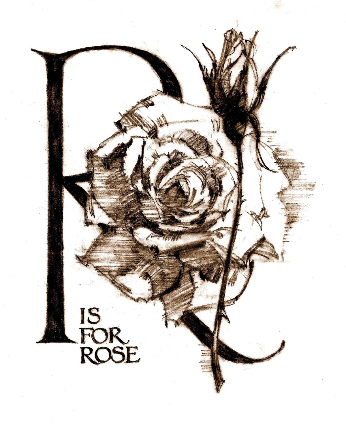
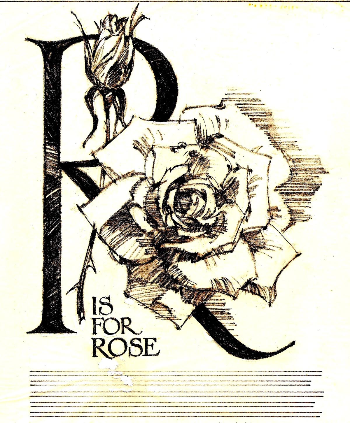
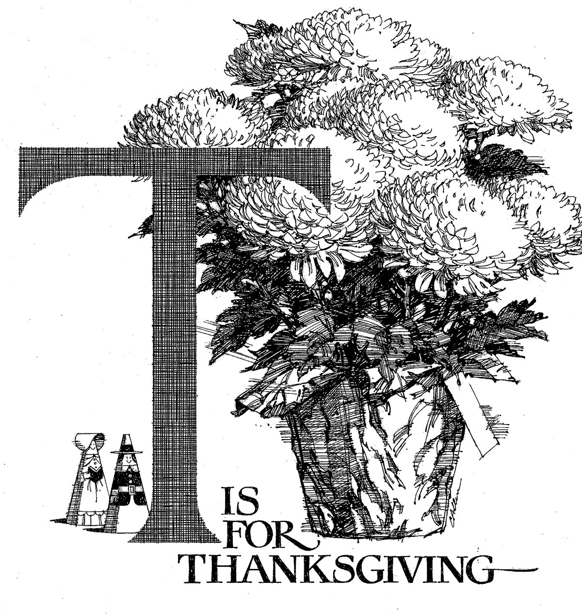
A finished proof lacking on the 'R is for Rose' sketch....but the next scan, 'T is for Thanksgiving', is a line B&W proof in that series.
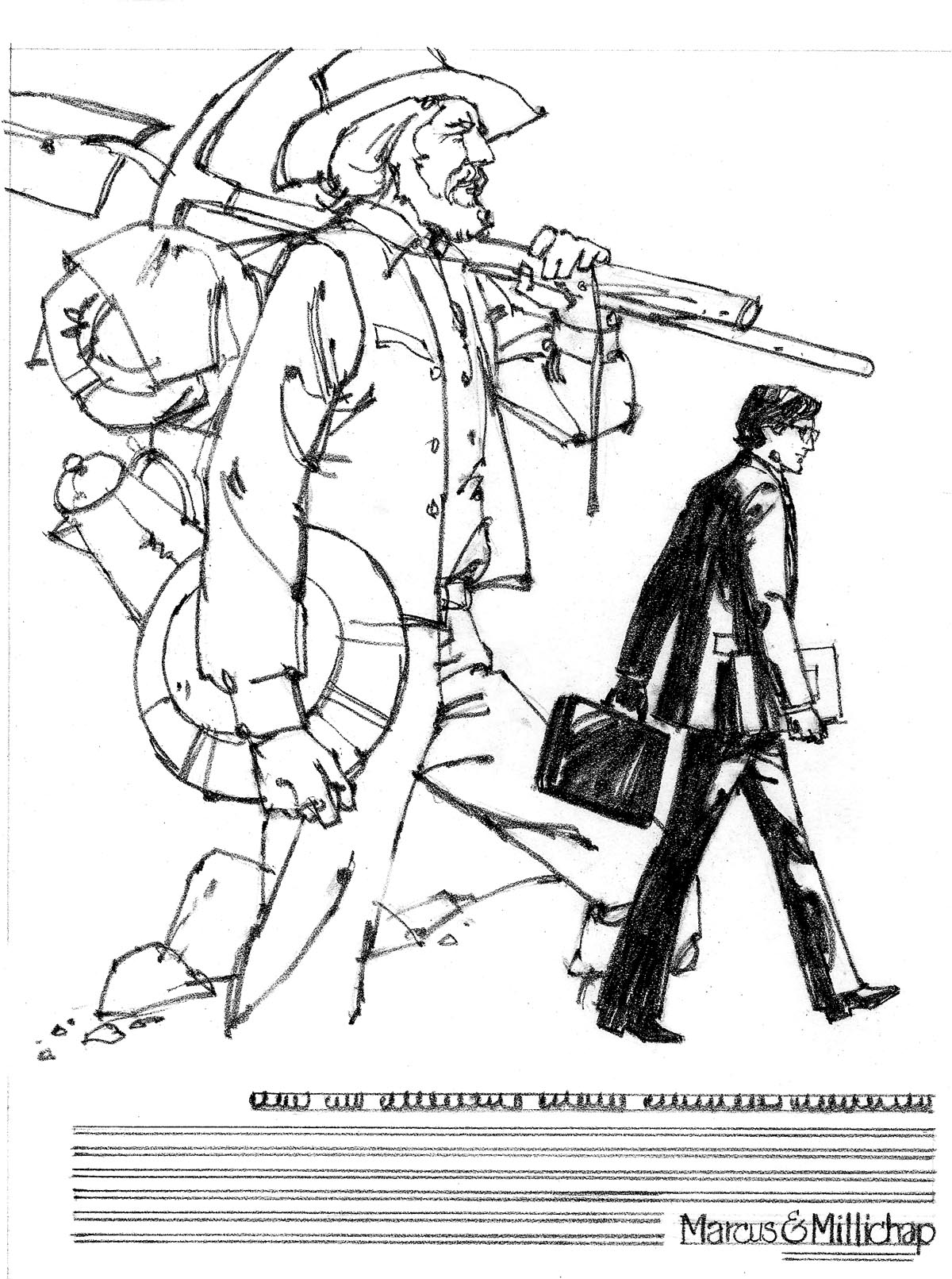
Next on the list, a comp for Marcus Millichap, a south bay commercial real estate company. A group of ads done for them in the 70's will be posted soon. The 'gold miner' theme was one they used several times.
Following those....a bunch of marker comps for State Fund for one of their many brochures.
Again, lacking a finished example.

The last of those showing typical agency penciled notes....and the emphasis, so PC and sensitive at the time, on clearly including racial minorities.

We'll show three small sections of a large pencil comp for a poster for Ortho Chemical, McCann Erickson the client.
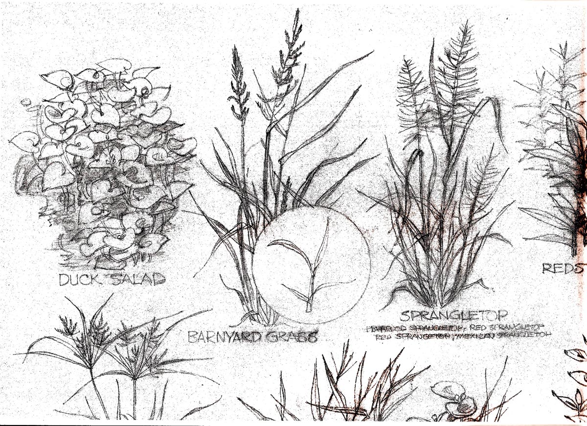
The product, a chemical treatment or spray for invasive pond weeds. Very much like a botanical drawing assignment...
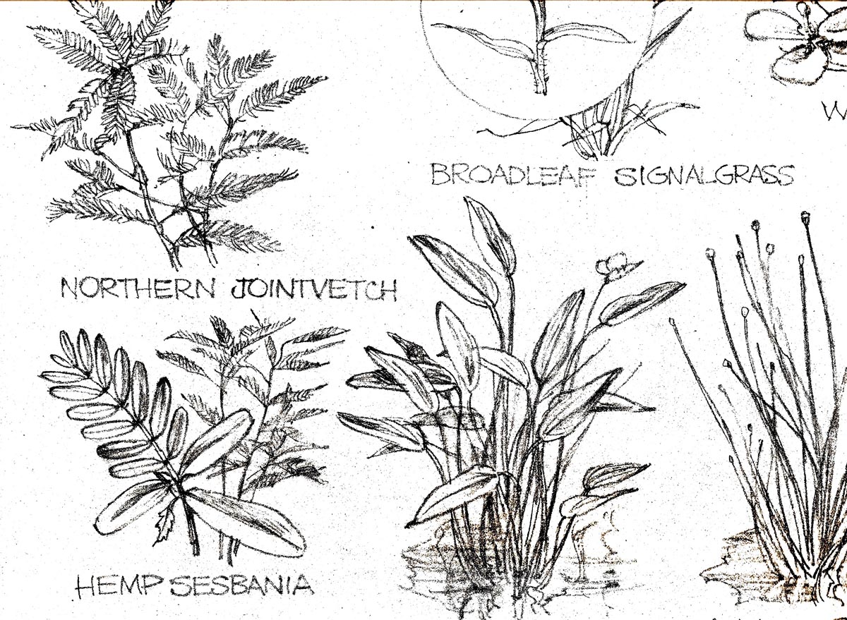
...and the only contribution by me was an attempt to create a good design on each group of weeds. I don't recall doing a finished illustration on this.
Finally, a group of awful B&W copies of color marker comps ...
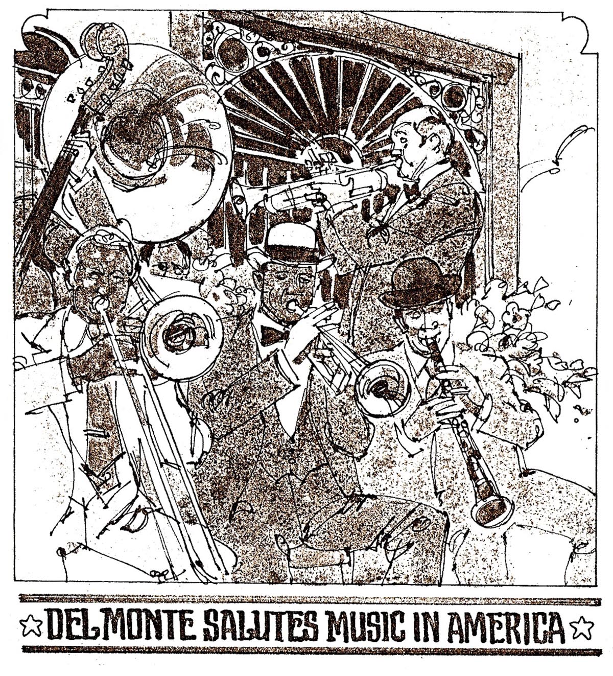
...for a point of sale Del Monte poster campaign.
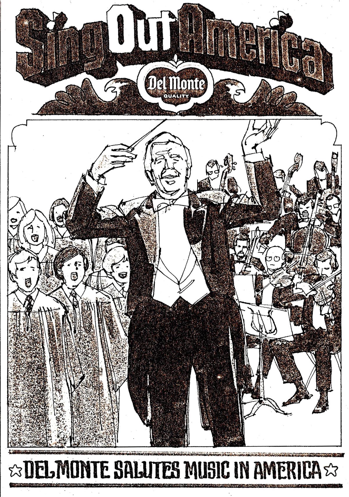
Eight or more in all, a ridiculous deadline, the theme, 'Music in America'...
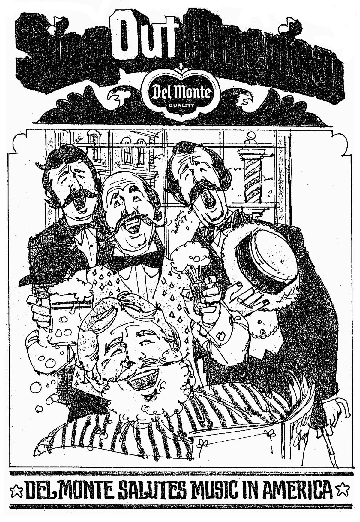
...all crunched out in two or three days.
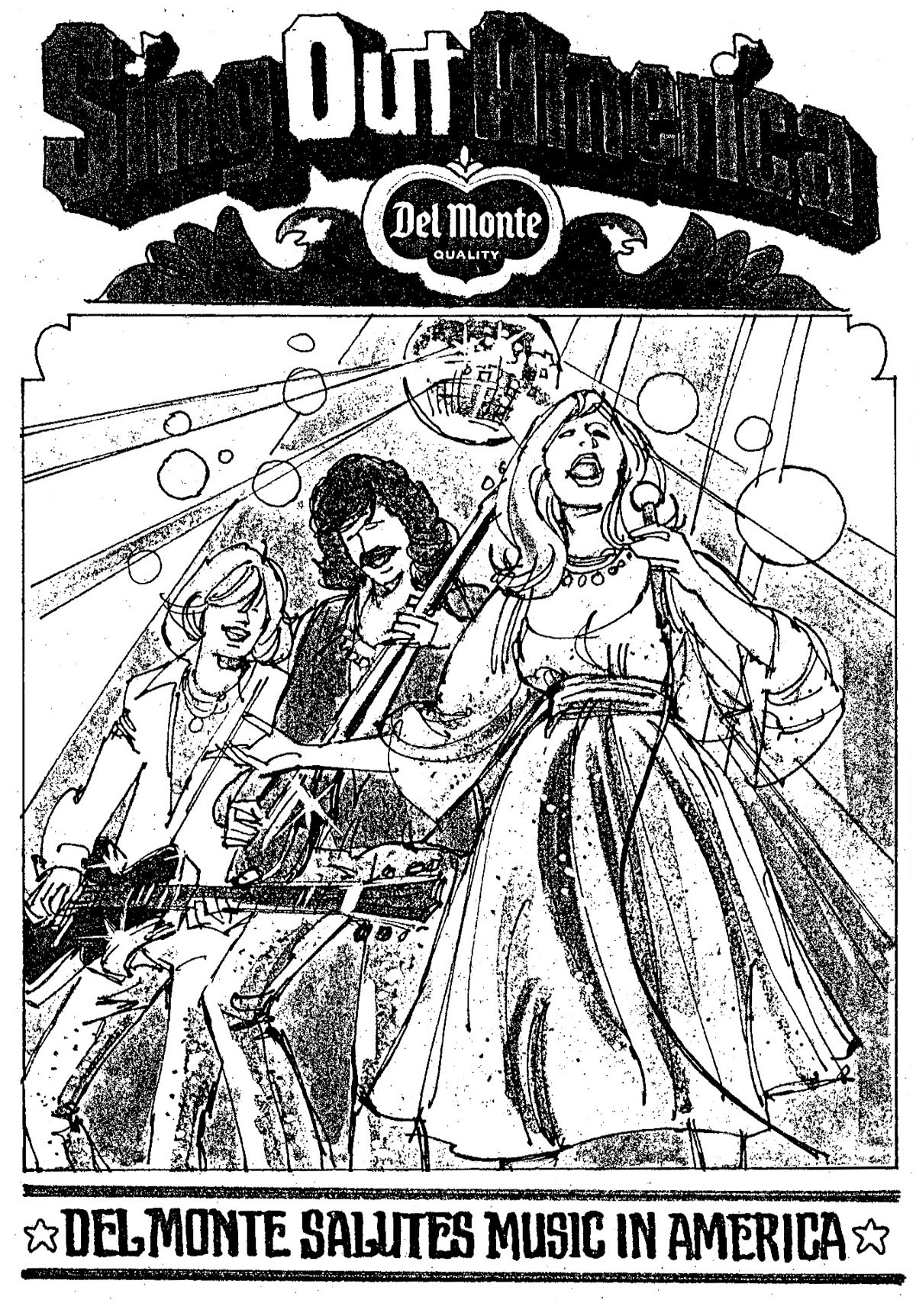
I did the storyboard-like cartoons, others put in the copy.

Again, time ran out for finished art and for production before the scheduled week of food store displays....so, no finished work.
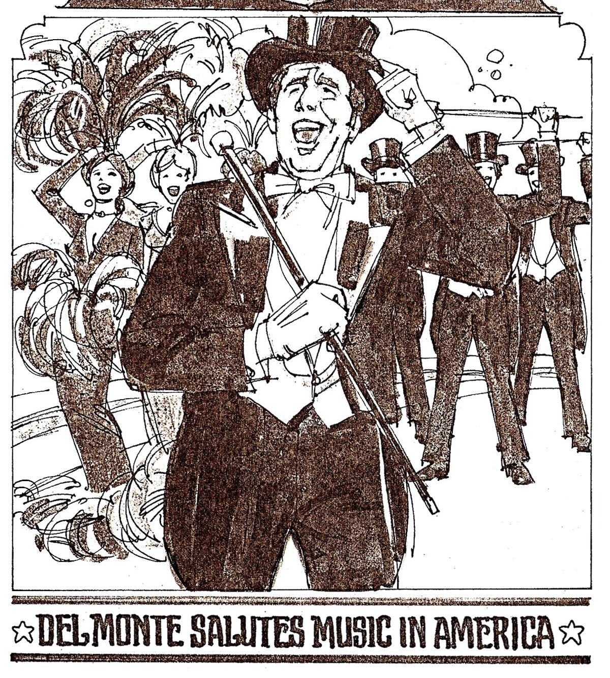
A big relief for this cat!
* If Leif has the time and patience....I'd like to paraphrase a couple of quotes by Edgar Whitney, former AD for McCann Erickson in N.Y.... and in later years the very colorful curmudgeon and summer water color class teacher in Maine. Actually a better communicator and teacher than his paintings indicated, he left behind an assortment of wise, pithy, funny, but right-on admonitions that his students and we can still enjoy. Just two here, paraphrased to apply to illustration as well as painting. First....'You get facts from nature and photographs....you should get art from illustrators!' And one of his pithier ones....'Beginning an illustration without doing a comp....is like going to the bathroom without first pulling your pants down!' I'll bet most of us have attempted the first one of those!
* Charlie Allen's Flickr set

9 comments:
Too bad the music around America didn't go to final. I bet they would have looked great. Congrats on a year of blogging.
Bruce
another fine post.
and yes, congrats on the blog - an endless stream of incredible work... and by "endless", I'm inferring a hope that there's at least another year ahead.
also, did you have a particular subject matter that you liked working on best? figurative, architectural, landscapes, nature, etc? I haven't had the time to read every post here yet, so you may have covered this already... but your lines are so solid with the the architectural stuff, and playful but sure with the more organic things, that I can't quite tell... either way it looks like you enjoy every piece.
Thanks, Bruce....and Matt. No, not an 'endless' stream for sure. And I might have inherited an engineering gene or two, and a looser playful gene from an aunt who illustrated her letters with funny cartoons. Whatever....I worked on a tight auto job one week, then some loose figure illustration the next. Enjoyed the change and not having to repeat the same type of work over and over. Cheers!
Hi Charlie,
Beautiful stuff, as always.It's really interesting seeing those great comps. Congratulations on one year of blogging. Dig around, you'll find some more stuff that's been hidden for years. I keep finding old proofs and other stuff that I forgot I had saved.
Harry
Thanks, Harry....You probably have more room than I....and I know you're better organized. I will show several more 'not so golden' oldies....a couple from art school even. The whole year has been...not a blast....but a fun project. And, I've been dragged, kicking and screaming, into a digital age that astounds my antiquated brain. Thanks to Leif, glad to be a tiny part of it.
Congrats on your first year of blogging Charlie.
Hopefully there are many more to come.
I've loved looking at the range of your work.
Despite any reservations you may have, I often prefer looking at the comps to seeing the finished work. For a start it's an aspect of the work we generally aren't privileged to observe, but it's also like looking at the nuts and bolts construction behind the finished product. Comps are so full of potential and generally completely unselfconscious in their execution.
Keep 'em coming!
So right, Roger. It was often said at P&H that comps looked better than the finishes. It seemed to apply to all of us.....for some reason we tend to tighten up and lose much of the energy and charm of the original. A note on TI's great blog this week on Fred Ludekins. An amazing dramatic illustrator, I think we can agree. Comparisons are never fair, though, and almost every Parker, Fawcett, Sickles, Whitcomb (yes) I'd see would just amaze me....and could easily lead to envy. But....we're all different....and see life through entirely different lenses. Fortunately I decided early....be yourself, for better or worse. You can't fake it for very long. And....last....vive la difference! Art is a show....an entertainment....and we need all the creativity and excellence that artists can provide.
Happy Anniversary Charlie,great work as usual.A plethora of styles held together by one essential ingredient, outstanding skill. I hope I speak for everyone when I ask you to continue your project for as long as possible as its both a joy to look at and downright educational! All the Best for the next year.
Del Monte rocks! Definitely.
I can only second Bruce Hettema.
Congrats
Rich
Post a Comment