Tuesday, June 30, 2009

OL' ROCKIN CHAIR'S GOT ME....'

A pop tune by Hoagy Carmichael back in the 30's, if memory serves.

Last time we looked, fifty two weeks added up to a year. This is CAWS #52... hard to believe! When started, I had no idea posting scans of ads done over the years would last (drag on?) this long. For better or worse, and before we sail off into the sunset, a few more to go. Metaphorically, it's probably late afternoon. The anniversary might just call for lifting a glass of the 'bubbly'....if so....cheers! Actually preferred would be a chilly Sierra Pale Ale or a Moose Head....to honor our Canadian contingent. And, as we 'clear the decks', age doesn't imply better examples of ads and work done over a long career....but maybe some just a bit different.

The CAWS has some comps left over....and maybe this is as good a time as any to show them. Boring maybe....but the early thinking process is essential, and in hindsight, interesting to the illustrator who starts with a drawing pad only. First, for Aerojet General over in Sacramento, maker of booster rockets and other esoteric space stuff....a pencil comp, I think for an annual report. No finish on that....but I recall doing one finish for them....no record of it now. I went over there a couple of times, but a long drive and difficult contact.


Next, for a Master Nurseryman's Association....a small agency our client...


...two comps for B&W trade ads....the second one used.


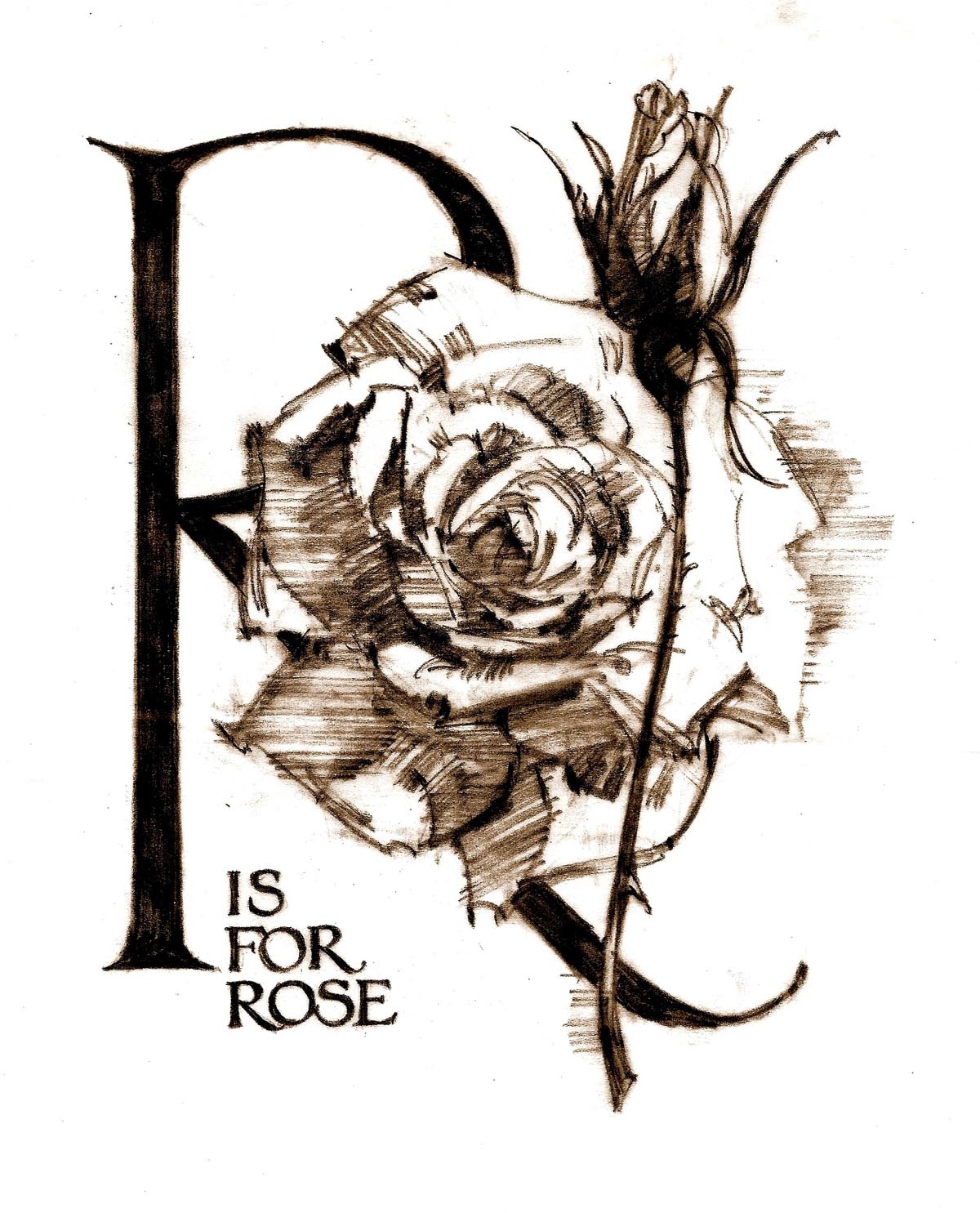
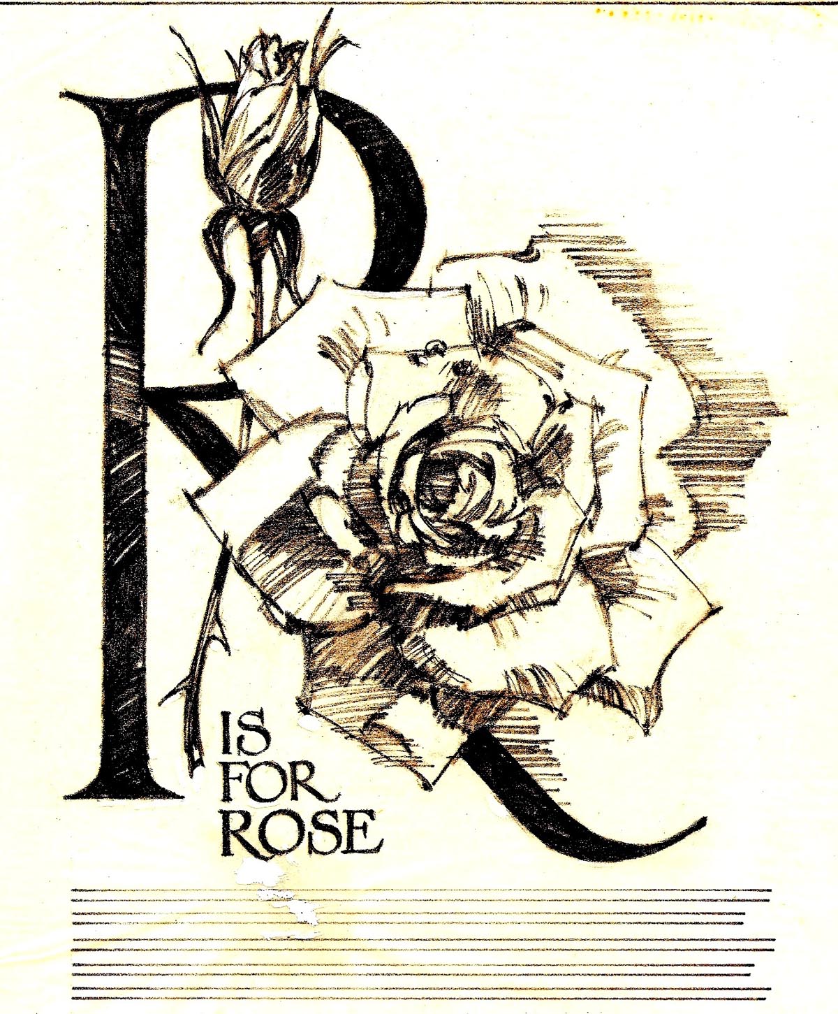
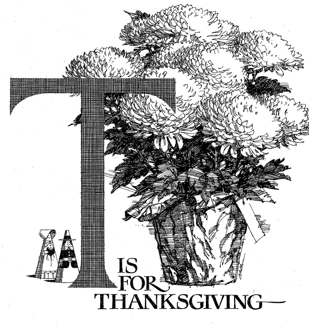
A finished proof lacking on the 'R is for Rose' sketch....but the next scan, 'T is for Thanksgiving', is a line B&W proof in that series.


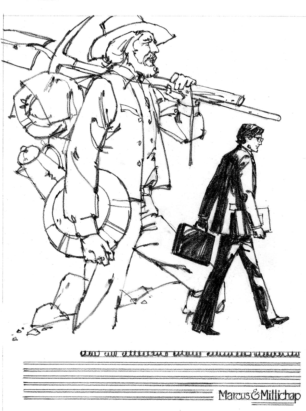
Next on the list, a comp for Marcus Millichap, a south bay commercial real estate company. A group of ads done for them in the 70's will be posted soon. The 'gold miner' theme was one they used several times.


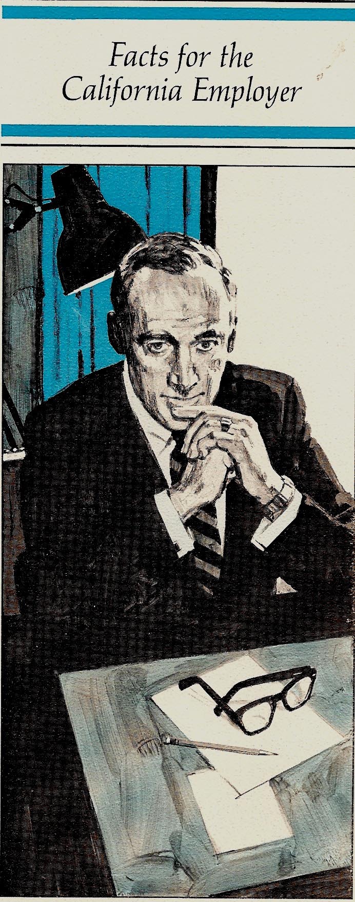
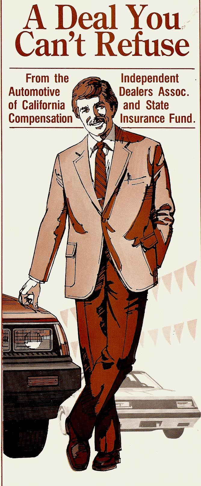
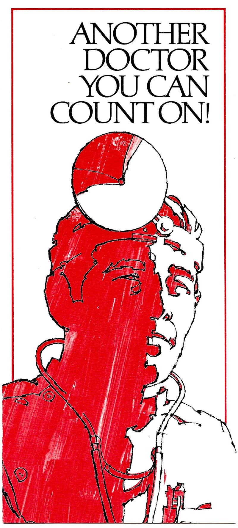
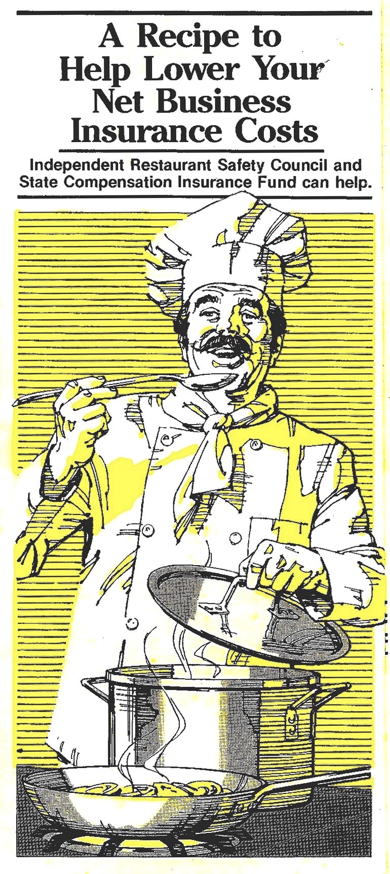
Following those....a bunch of marker comps for State Fund for one of their many brochures.


Again, lacking a finished example.


The last of those showing typical agency penciled notes....and the emphasis, so PC and sensitive at the time, on clearly including racial minorities.


We'll show three small sections of a large pencil comp for a poster for Ortho Chemical, McCann Erickson the client.


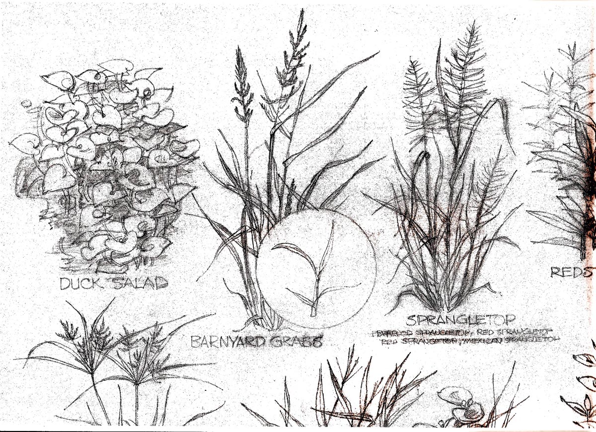
The product, a chemical treatment or spray for invasive pond weeds. Very much like a botanical drawing assignment...


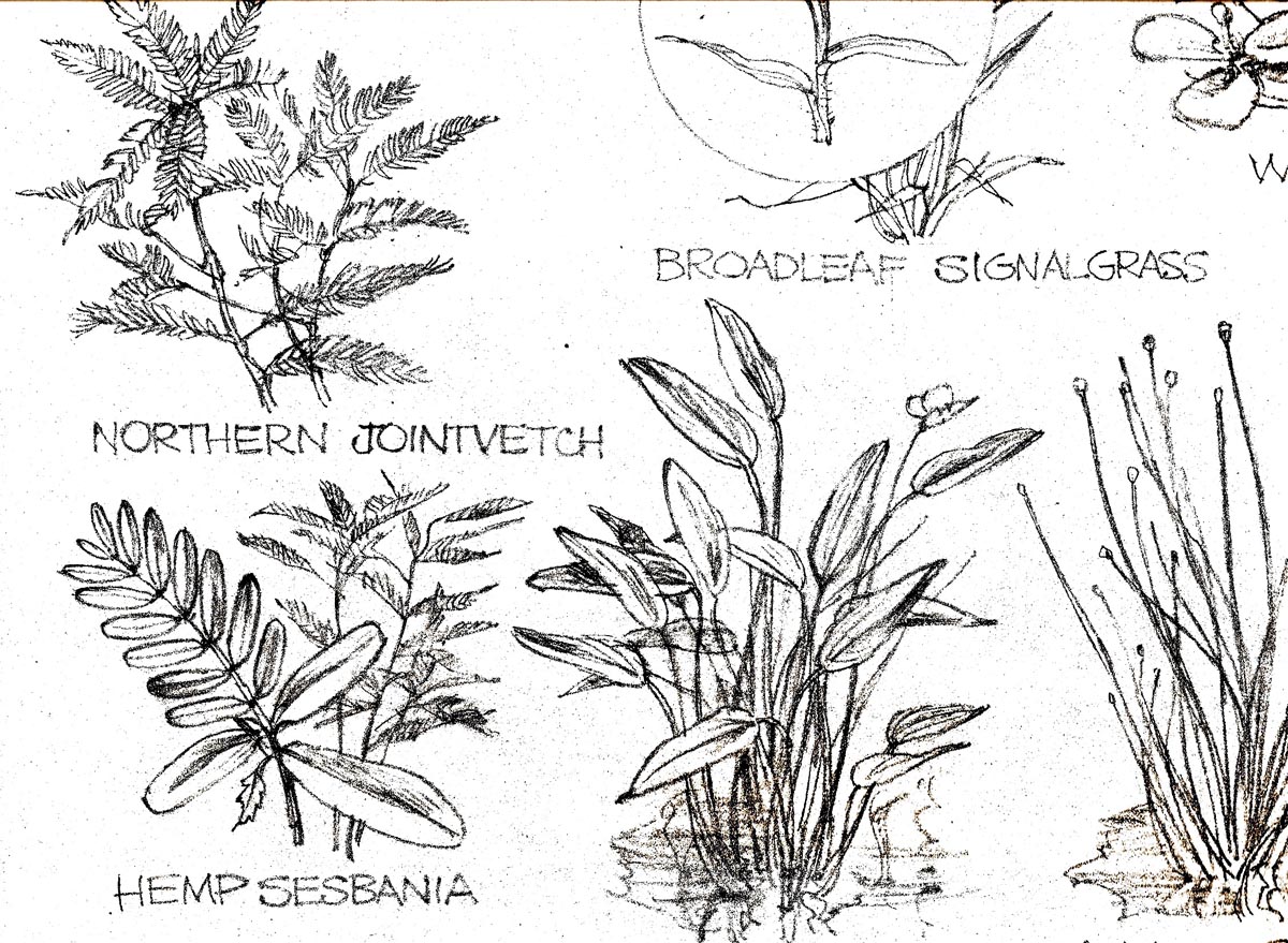
...and the only contribution by me was an attempt to create a good design on each group of weeds. I don't recall doing a finished illustration on this.


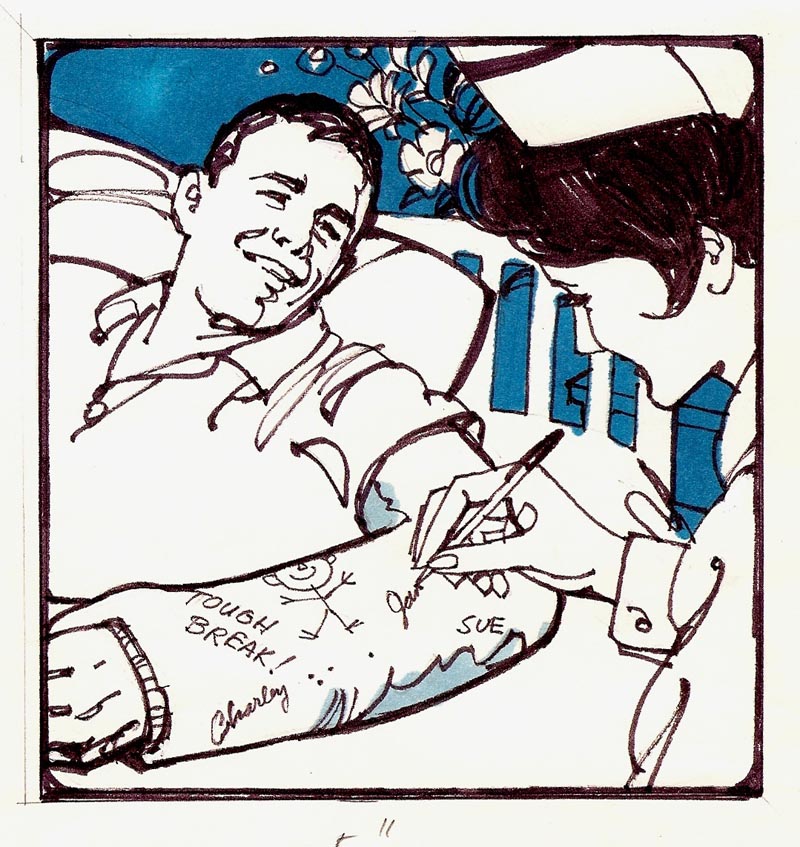
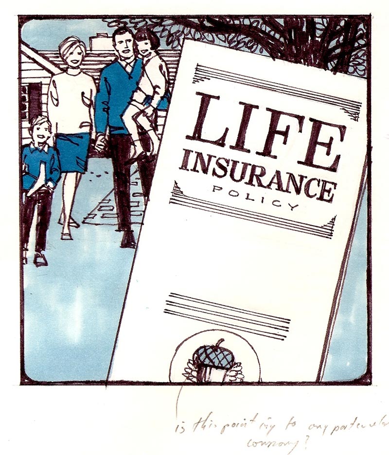
Finally, a group of awful B&W copies of color marker comps ...


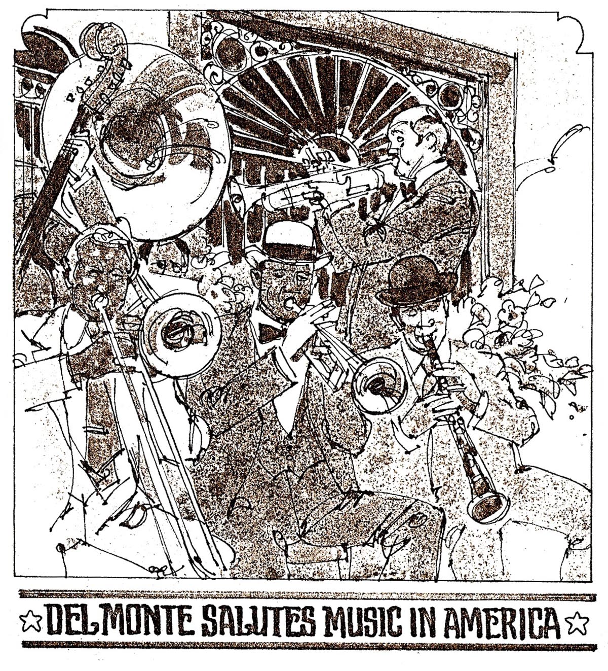
...for a point of sale Del Monte poster campaign.


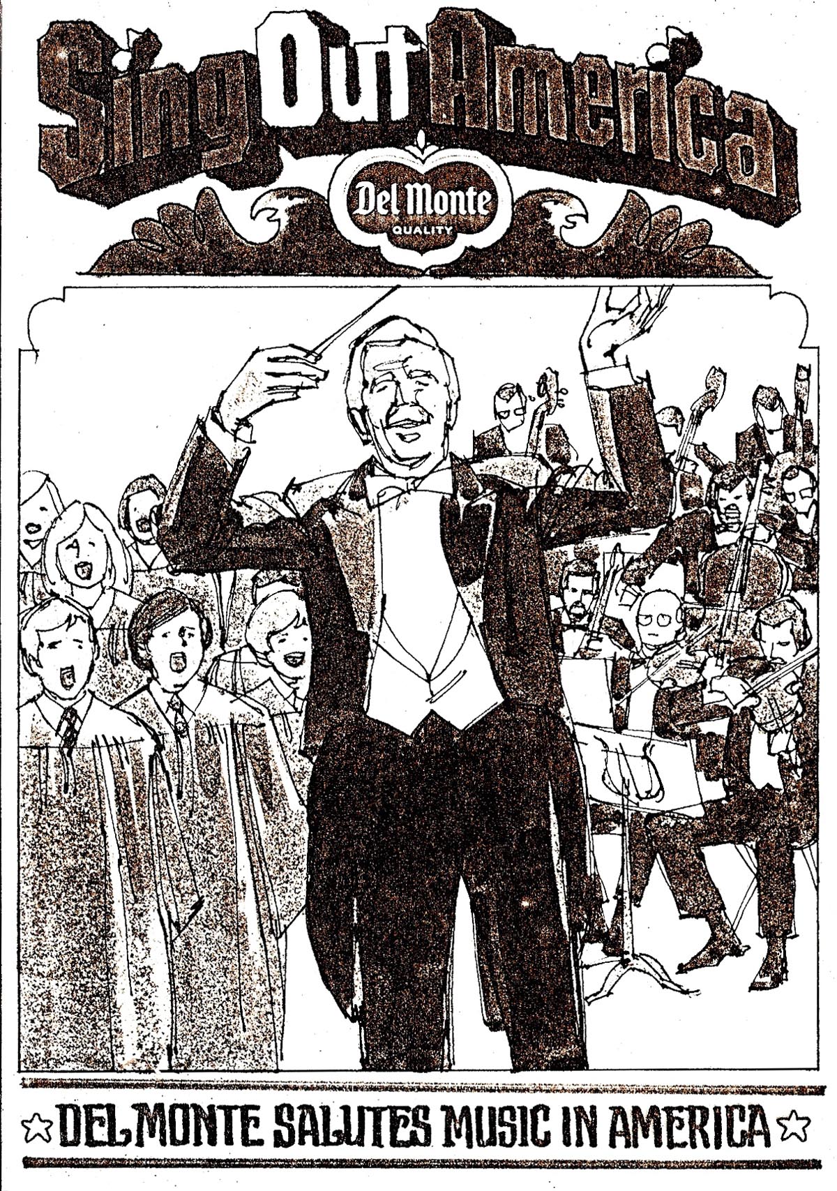
Eight or more in all, a ridiculous deadline, the theme, 'Music in America'...

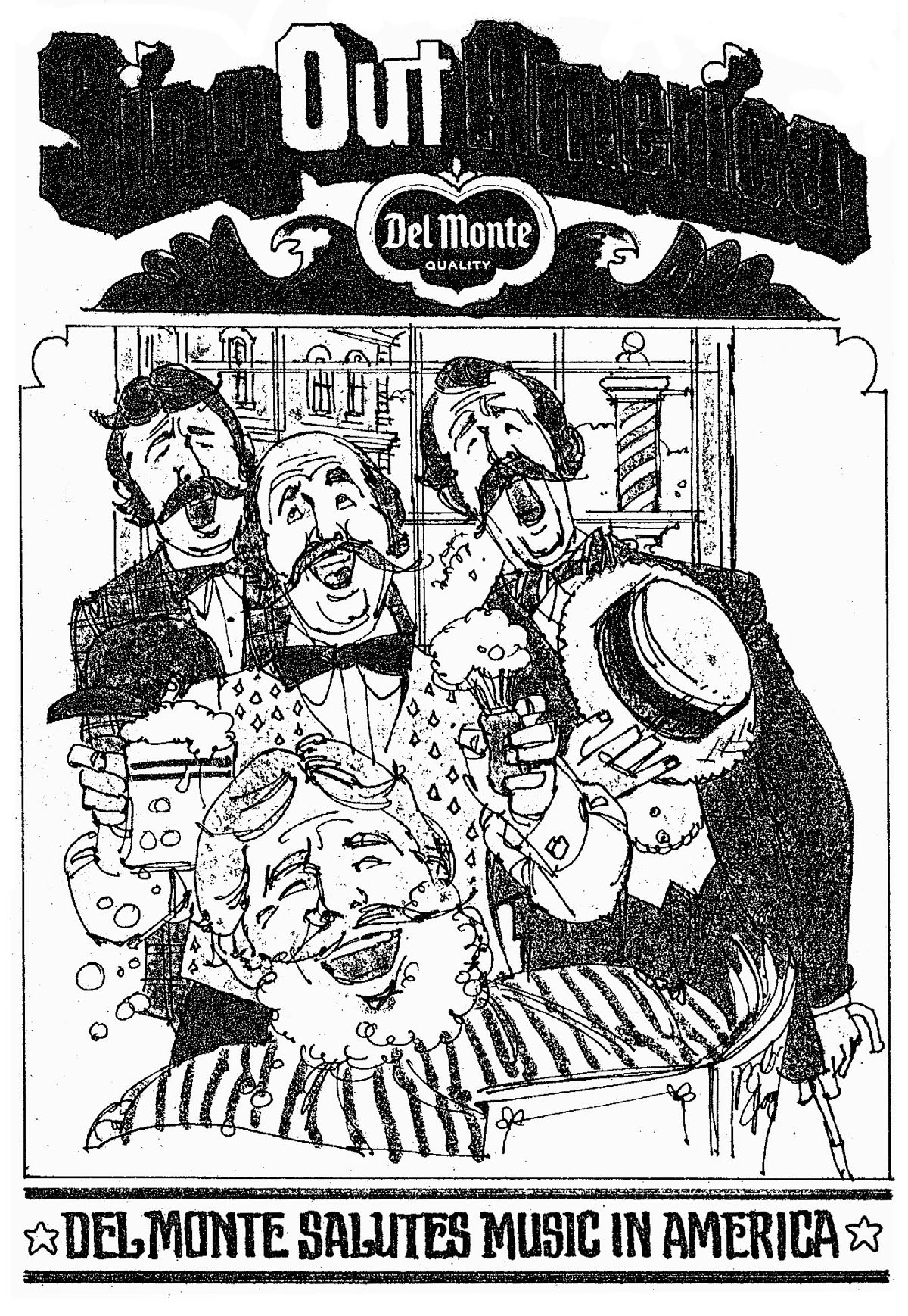
...all crunched out in two or three days.


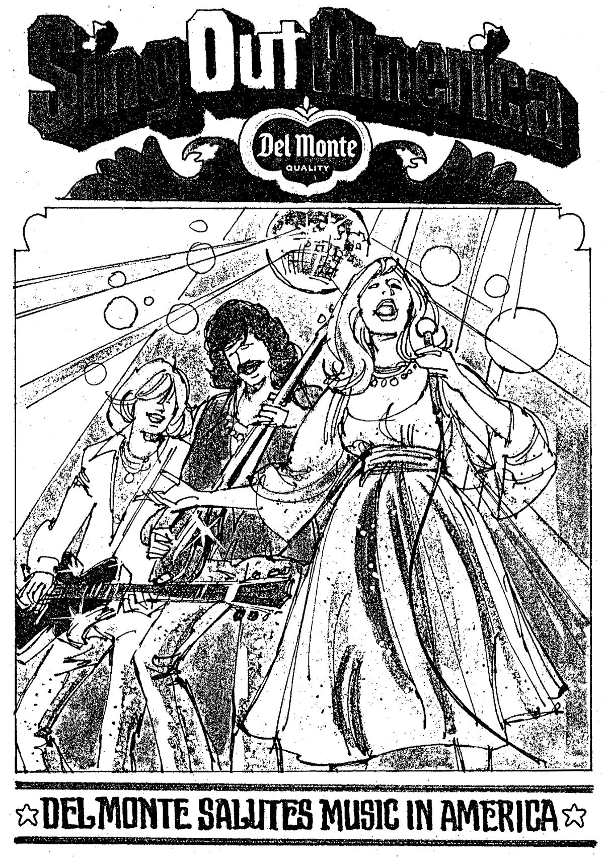
I did the storyboard-like cartoons, others put in the copy.


Again, time ran out for finished art and for production before the scheduled week of food store displays....so, no finished work.


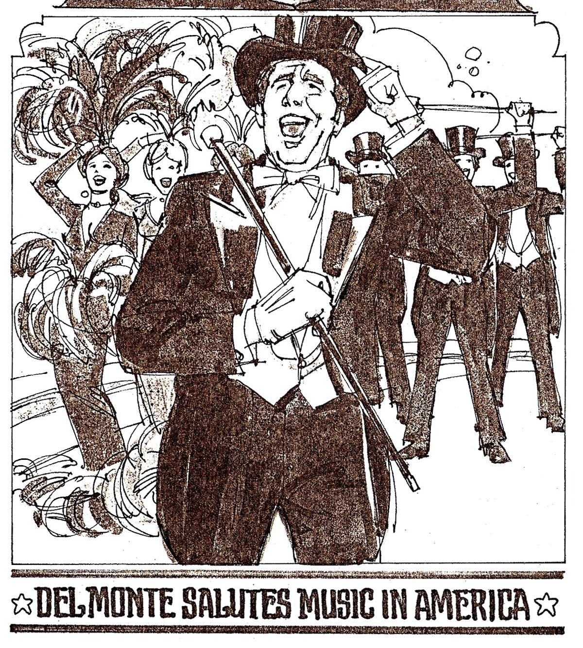
A big relief for this cat!

* If Leif has the time and patience....I'd like to paraphrase a couple of quotes by Edgar Whitney, former AD for McCann Erickson in N.Y.... and in later years the very colorful curmudgeon and summer water color class teacher in Maine. Actually a better communicator and teacher than his paintings indicated, he left behind an assortment of wise, pithy, funny, but right-on admonitions that his students and we can still enjoy. Just two here, paraphrased to apply to illustration as well as painting. First....'You get facts from nature and photographs....you should get art from illustrators!' And one of his pithier ones....'Beginning an illustration without doing a comp....is like going to the bathroom without first pulling your pants down!' I'll bet most of us have attempted the first one of those!

* Charlie Allen's Flickr set

Wednesday, June 24, 2009

KIND OF 'MOD'....

Mentioned many times here, change is always with us. Oddly, when we are younger, and in this case my middle working years, we're surprised when it happens and affects our lives. The 'Hippie Era' of the 60's and 70's, and its' many iterations, caught most of my generation by surprise. 'Kids....what's the matter with kids today!'....a song from the Broadway show, 'Bye, bye, Birdie', if I remember correctly. Like many, I did my best to ignore the changes....but the cultural effects penetrated the society and certainly the advertising business almost immediately. To look 'hip' and current, illustrators had to change with the times. From the more traditional approach in the first third of my career, the following are a few examples of B&W ads from the 60's and 70's....and my attempts to cope with the new 'mod' ad scene.

First....a B&W line illustration....a 'glass top' look at a GAP store, one scan enlarged.


Late 60's or early 70's....and not sure where it was used. I believe the GAP retail chain was started and headquartered in the S.F. bay area....and this was the only ad I recall doing for the company.


The next six are B&W spots from one full-page newspaper ad for Northstar, a Tahoe vacation and ski resort.


As on many old examples here, these were scanned from a clip or newspaper proof....and the results are a bit shabby.


I liked what was then the 'new look' on the small illustrations, however.


Following is a B&W 1974 calendar for a Marin County country store....'Old Brown's'. It was printed in sepia inks on a beige stock. Not included, the months and days were in two rows below the illustration. Actually, I 'piggybacked' on a comp done by Steve Hall who was too busy at the time on other work. Much younger than I, Steve excelled at more decorative illustration....and what I call the 'mod look'. With a few changes, I pretty much followed his concept.


Last, three scans from a B&W brochure done for a Bay Area entrepreneur....his product called the Sitzski.


As a recreational skier, and a skiing family as our daughters were growing up, I suspected the Sitzski was a 'loser' when I worked on the ad!


One of the few jobs in my career on which we were 'stiffed' when his operation was declared bankrupt.


In spite of the no pay, however, I liked the B&W approach on these....and they were fun to work on.

* Charlie Allen's Flickr set

Tuesday, June 16, 2009

CAWS #50: "Please take a brochure!"

This week's CAWS may be the ultimate boring blog!

Here it's a 'clear the decks' mode, however, and this group represents frequent ad assignments that helped out in slow times. Pamphlets and brochures....not sure of the difference, except that I think brochures were larger with several pages. For some reason, most pamphlets were 4 x 9 inches in size....as were fold out maps. There were variations on that, of course.....and I never inquired how or where they were used. Displayed in branch offices, probably, or on travel counters. Maybe business mailings. There were more, but these should be sufficient.

The first scan, an ad for American President Lines, was pamphlet sized, but was a large fold out....much like a map. I notice it was printed in 1954....and was probably the first of the shipboard travel scenes I illustrated.


This records pretty fair likenesses of several P&H stalwarts, who posed separately, as usual, in our photo studio. Behind the bathing suited young lady, from front to back on the left....Haines Hall, then one of our receptionists, Z. Alexander, head of the photo department, an unknown lady, and George Albertus, cartoonist/illustrator. The right hand servers were George Albertus in front, Sig Beartown, and Jack Painter. The model in the striped bathing suit was, no less....our 'Lady of Steel' hostess....portrayed later in in many US Steel ads. The next pamphlet, for a bay area restaurant supply company, a two color pen and ink line job.


After that, the next six or seven pamphlet illustrations were for State Fund....a frequent client for brochures and such.


Have no idea who posed for the chefs...


...and by this time in my work, as long as someone took the pose indicating the posture and gestures. I could usually 'wing it' on character types and outfits.


Following those, the next two designs....a pamphlet for Mills Hospital...


...and then a Chevron 4x9" fold out map, here cropped at the top.


Last, not a pamphlet, but a typical B&W plus halftone newspaper ad promoting free maps.


Like everything else, maps have zoomed up in price....nothing is free....and pump your own gas, please!

* Charlie Allen's Flickr set

Tuesday, June 9, 2009

GOLF TWO....PLAYING THROUGH

Still on last week's golf theme, the first scan is of the third PGA tournament cover I illustrated. Montages (a blog on the subject coming up) were the 'innovation du jour' in the 60's and 70's. The approach that I used on this cover had a lot going on within the Watson figure, and plenty of color. It needed a neutral background....I chose black to hold it all together.


Next is an inside illustration, a graphic of Ben Hogan combined with a view of the Colonial golf club in Texas....I think Hogan's home club. Again the concept was a result of teamwork with P&H designers.


Separately, but on golf, a brochure assignment that came in during the 70's, and again during the montage years. This was for a tour sponsored by TIA Airlines, primarily a specialty and vacation charter business.


The host was Paul Hahn, a professional golfer, entreprenuer, entertainer, and trick shot artist. These were ambitious times....and I wonder today how successful it was, and how many golfers joined the tour. Somehow, I don't think it would 'fly' today....but I've been wrong once or twice!


Done in line and two colors, using gouache mixed with acrylic medium on much of it.


Following are three spots done in charcoal pencil....the grey stock insert inside the brochure.


It was an expensive promotion, and as said, wonder how well it fared. I recall at that time feeling a bit 'burned out'....more interested in my homebuilt airplane project than illustration.


No doubt the project was a needed diversion after a lot of years of deadlines, and during some crowded 'pressure years'. Part of those concerns were the changing times....and that magazines and print ad budgets were rapidly losing out to TV broadcasting.


On an unrelated subject, and to pad the CAWS this week, we'll post a comp and finish reproduction of a Chevron product ad....not sure how the ad was used.


The comp was in marker and pencil, the finish done in gouache with an acrylic mix behind the products.


* Charlie Allen's Flickr set