... as well as a last look at a few early 50's and 60's black and white illustrations and spots.
We'll begin with a '49 small B&W for American President Lines, an early attempt at the 'S.F. style' of line illustration established by Ludekins, Galli, Bomberger, Haines Hall, Jim Hastings, Willard Cox, and others.

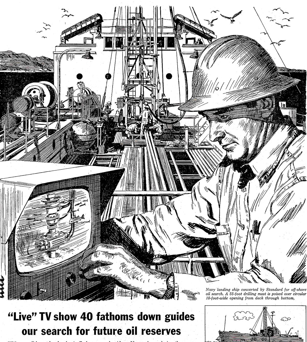
A Chevron (or still Standard Oil) newspaper B&W follows, another early 50's effort, and an attempt to 'paint' with line tones. Not good on this, a complicated subject. I was then, and am still, an admirer of Charles Dana Gibson....one of the truly great line illustrators way back at the turn of the century. He 'painted' halftones with pen and ink....remarkable. That gave way in our time to cleaner, simpler, line techniques...
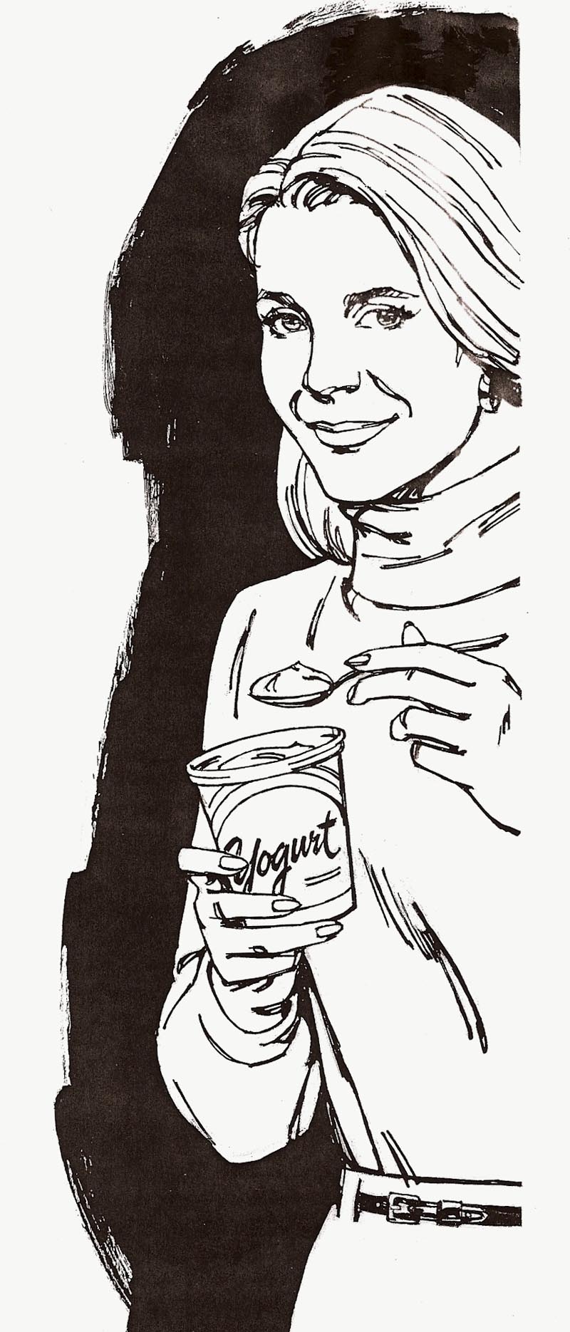
...as seen on the 'Yogurt' illustration that follows.
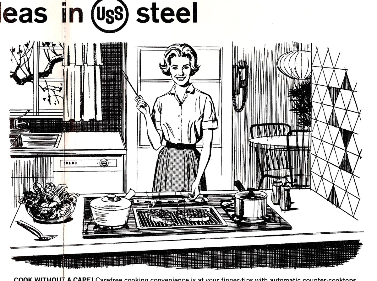
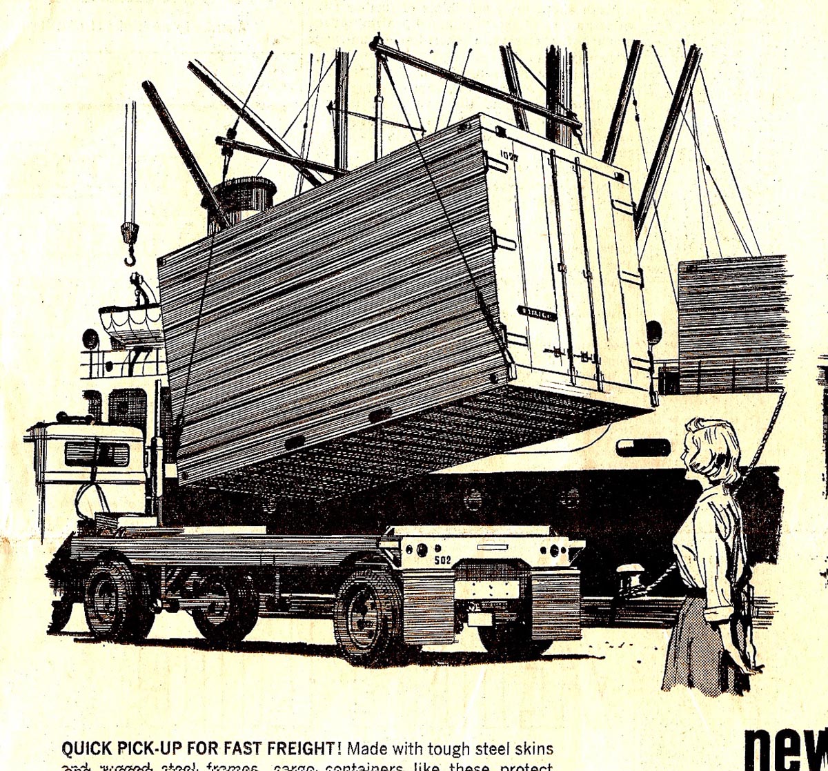
From this point on, US Steel B&W spots, many in the series seen earlier.
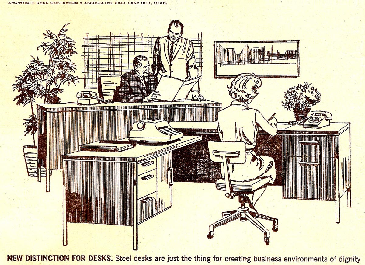
The first two were before the 'hostess' group...
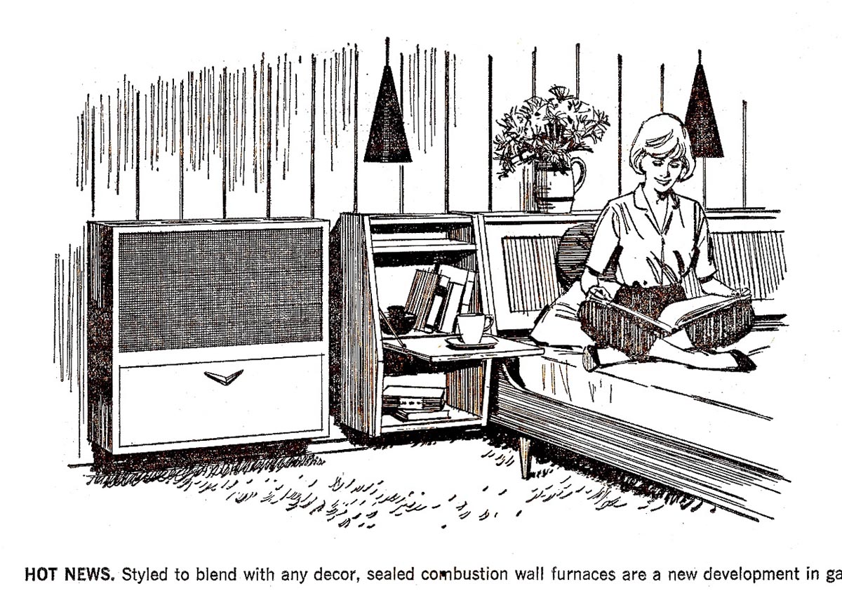
... the rest featuring our indomitable 'lady of steel'.
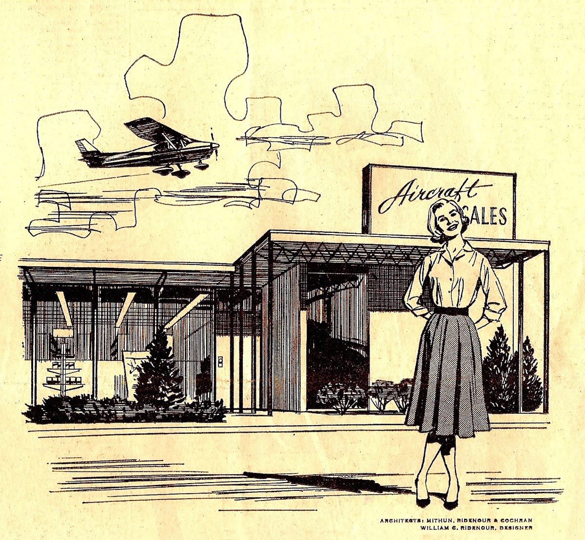
Turned out in ads that included four, dozens and dozens over the years...

...a long running ad series for me.

The last two or three show her 'bouffant' hair style, popular in the 60's.
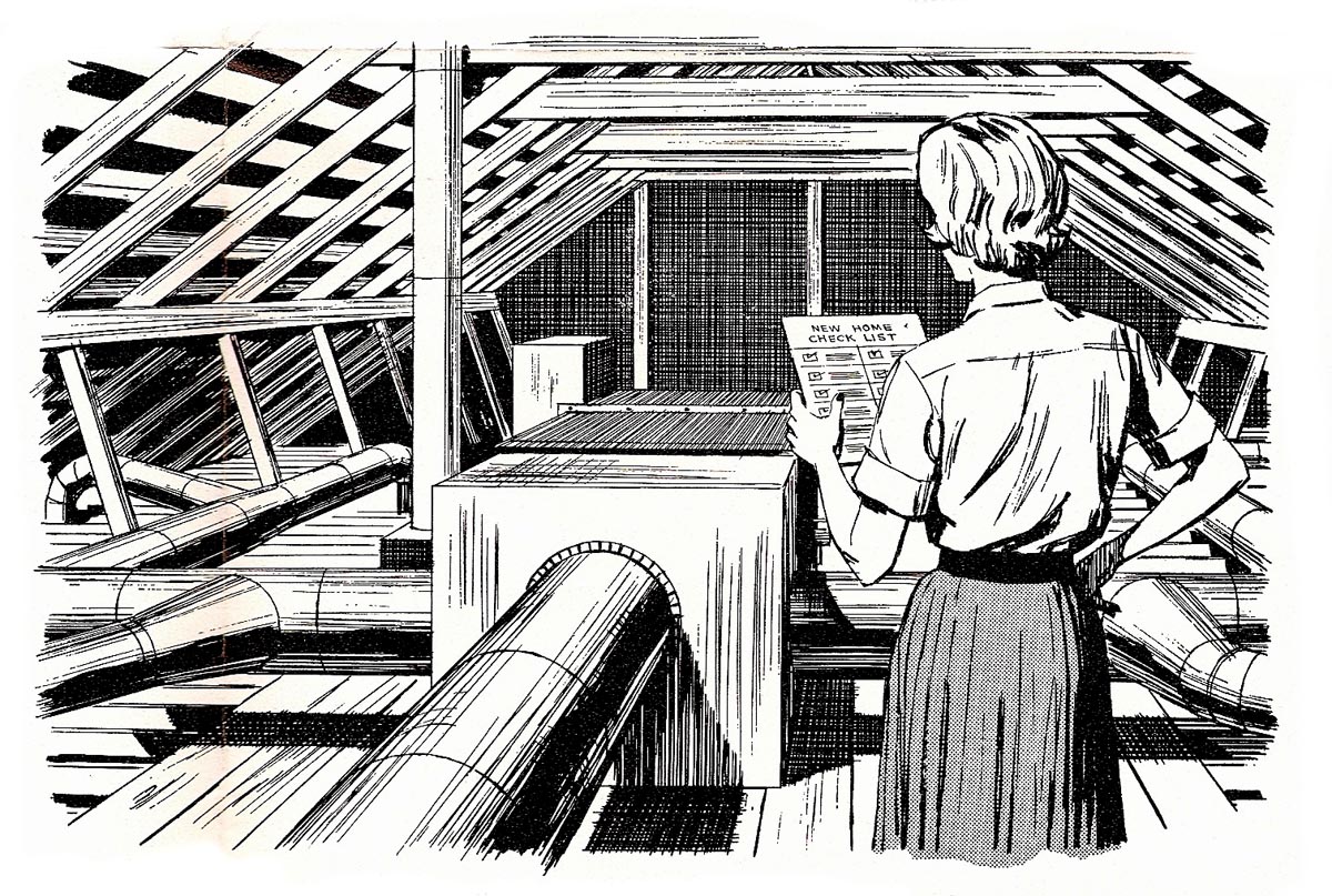
I've kidded about her role in these ads....but you can't blame the advertiser's concept.
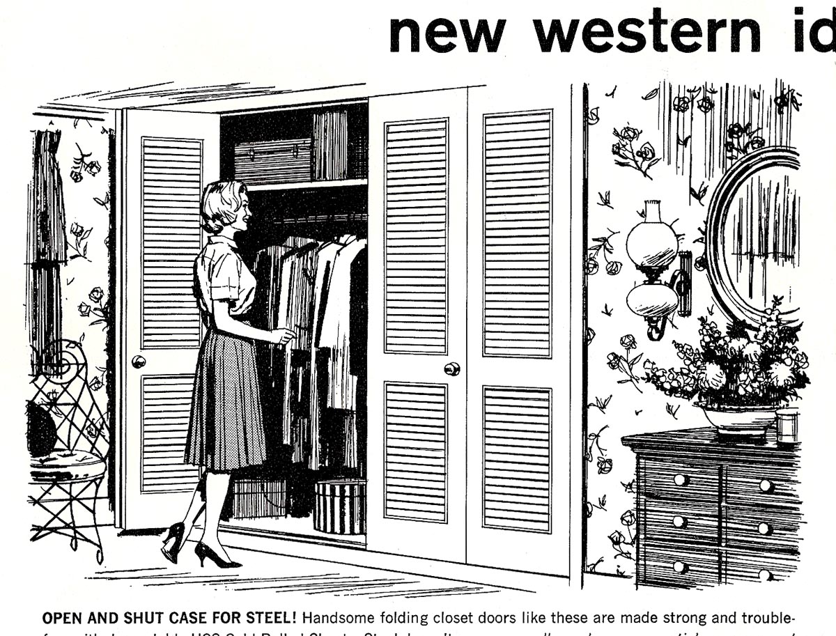
What better way to soften up and attract readers to 'cold' steel products?
The CAWS is nearing the end....and we've heard that song before! Next week a change of subjects, closer to....in fact in....the retirement stage.
* Charlie Allen's Flickr set

11 comments:
These are all great, Charlie. I really like the oil rig one. Great all around and a nice rendering of the shadow under the guys hat.
I was always a big fan of linework. My Mom introduced me to the quill at a very young age in the 70s. I've been enamored with it ever since. I even bought an Arthur Ignatius Keller piece for cheap because it was just so darn nice.
Sad how line art is practically obsolete in the advertising world. Only place you see it anymore is in comics...but then that ends up getting colored to death.
As always thanks for sharing.
=s=
Sorry to hear you are running out of work to show.Maybe you could shift the emphasis over to technical issues or examinations of illustrators whose work you admire-or even some step by steps! Long live CAWS!
Thanks, per always, for the comments. Shane, you're right. Illustrating with pen and ink is almost extinct. Cartoons, yes, but illustrations....forget it. Chad, if Leif permits and I think he will....the CAWS will continue on a less frequent basis....with artists I've admired over the years. Can't be called CAWS if it's occasional, can it? The problem is, most stuff, especially book publications, is copyrighted up the kazoo. Not a legal eagle, here, and don't know how much we can use. Certainly blogs are not for profit....but I'm in the dark.
I stumbled upon these via Francis Vallejo's blog, and am completely blown away! How did I not know about this before?
Your illustrations are absolutely breathtaking, and I will be scouring this blog for all it's worth.
Thanks for posting such great work,
Tanya
Tanya....thanks....your comments are breahtaking! A trifle late, but hopefully, the old blogs are still breathing.
It occured to me as well, dear Charlie: To have you analyzing and elaborating upon some of your favourite artists and illustrators. Well, that would be a most delightful feat.
Should this hope be strangled by copyright? I hope not!
Charlie, running behind this week, but those pen and ink drawings were done while I was an illustration student, and then later, just as I began to get my feet wet in the world of S.F. illustration. The fact is, I learned how to do those effective clouds in line only, from looking at your examples.. however, the rest was a mystery.
When I was about 13 years old, I won a national gold key award for two pen and ink drawings I did from historical photographs.. WW 2 scene and a portrait of Robert E. Lee. I was pretty proud of myself back then. Six years later, while in art school, I ran across your newspaper pen and ink work, and I immediately became "barefoot".. it blew my socks off! ;-) I could do a passable job on the figures with no backgrounds, but it was all that background information that started looking like a plate of spaghetti!.. the figures would get lost. It took me awhile to realize it can't all be mid and dark values.. the light value patterns give it separation and depth. It was a nightmare learning the process, and by the time I began to noticeably improve, it went out of favor.. no one was interested in the cross hatch pen and ink technique.. a dollar short and a day late! Ten years later an art director had me do a very tight literal tonal drawing in graphite for a Barclays Bank ad, and he shot it as a black and white horizontal line conversion. It reproduced perfectly in the newspapers, and ended up looking like a pretty convincing pen and ink drawing. Other art directors saw it in my portfolio, and I was assigned more work using that process. I called it "the poor man's pen and ink technique". ;-) But, Charlie your pen and inks were the real deal, and beautifully done.. and thanks for unknowingly passing on some pointers. Glad you will be making more appearances after CAWS.
Tom Watson
TOM.....You're right about line work going out of favor....sometime in the 70's and certainly by the 80's. It was considered dated....old hat. Thanks for the comments....always interesting. Funny thing when you're working....at least in this case. It was trying to please your own standards....and trying to do the best for the client. Forgotten was the effect it might have on others....even though it was advertising. It's a bit like having a good teacher. His words often have a lasting and a later impact....something he's not aware of at the time. Enough!
Thanks for sharing your work. Your use of pattern and ability to convey a great sense of depth perception in wonderful and engaging. Also, the rendering of modern furniture and architecture reminds me of an exciting and fruitful era in many design fields. I'm insipired, Thank you!
Is there anything in this world the Lady of Steel hasn't witnessed)-;?
With their professional tactics and exceptional assistance, Birds and Bucks Outdoors guarantees a successful Colorado goose hunting vacation.
Colorado goose hunting
Post a Comment