Tuesday, May 12, 2009

'FLYING OBJECTS....'

IFO's in this case....not UFO's! As were many kids back in the 1920's and 30's, my older brother and I were fascinated by airplanes. To further fuel the interest, Fresno's first municipal airport was constructed almost across the street from our home. We could hardly believe our 'good luck'! In a few years we moved, but for a long time we built model airplanes....he more seriously than I. My brother went on to become an engineer, and later spent a large part of his career in wind tunnel design on NASA projects. I enlisted in the AAF in WWll and became a pilot....mainly flying air-sea rescue in PBY's in the Pacific theatre of operations. Following the war I returned to school, a newspaper job, and my first interest and love....illustration.

The San Francisco Bay area was not a home for aircraft industries, as were Los Angeles and Seattle on the west coast. In advertising illustration, however, there were aviation subjects, and the CAWS has already posted a few airline ads. The first scan is from a newspaper B&W halftone ad for Chevron done in the 50's....I believe showing a Douglas DC-6, the popular airliner of the day.


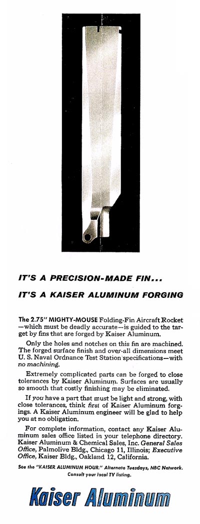
Next, a Kaiser Aluminum two color trade magazine ad showing missile fins formed by Kaiser.


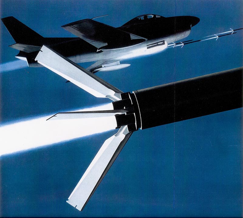
I think the fighter shown was called the Sabre-Jet, built by North American Aviation....operational in the 50's when the ad was done


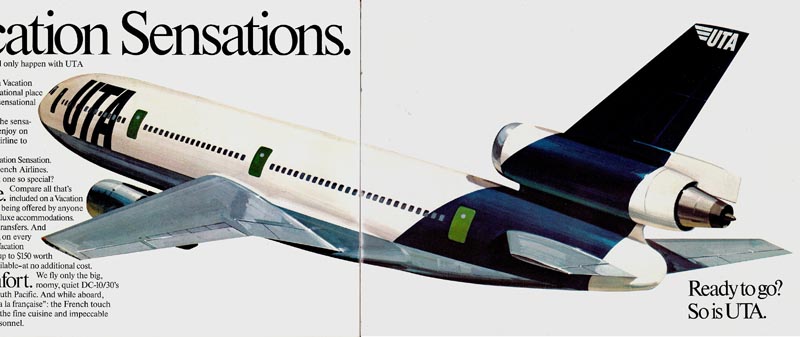
Following, for a travel brochure for UTA Airlines, a French vacation carrier in the South Pacific, two DC-10 renditions.


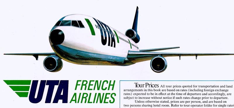
I liked the color scheme on their planes.


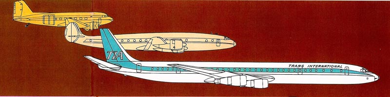
Two Trans International Airline brochure illustrations follow, in a flat color outlined technique....partly the design of the comp....but also due to the large size.


The side view of the DC-10 (above) was on a three page foldout....34 inches nose to tail.


Speaking of airlines....figures, not planes.... we'll include a B&W halftone ad for Pan Am back in the mid 50's. This may have been shown earlier on a CAWS....not sure.


Then a scan of a small comp done in my first year at P&H, just to keep busy. Just two years after military service, the scene was fresh in mind. Our PBY missions often orbited a Navy sub sharing rescue duty, a few miles offshore the targets on Formosa (Taiwan). This shows a TBF instead of a PBY, but the sub was accurate.


Of personal interest and history I'll include a plastic model of my plane....'taking off' over nearby Mt. Diablo. Please excuse the hasty and shabby retouch of the photo-lamp stand holding it up!


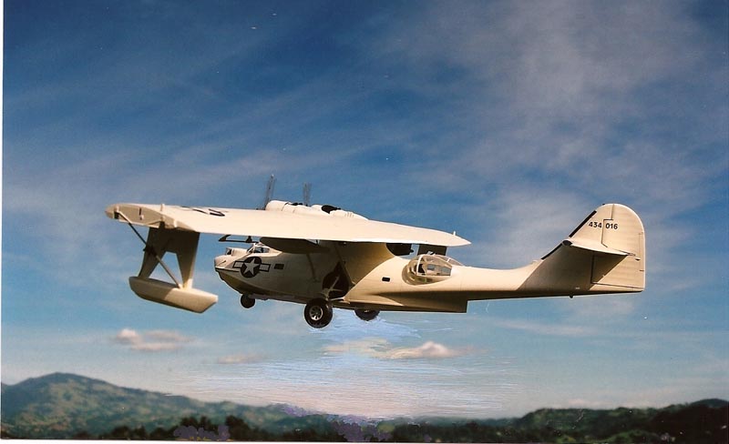
Then the real thing....a photo taken from my plane of a squadron mate on a low level search over the trackless miles of the South China Sea in 1945.


His tail and call number 015, just a digit from mine at 016.

* Charlie Allen's Flickr set.

Wednesday, May 6, 2009

'COME AWAY WITH ME, LUCILLE...

... IN MY MERRY OLDSMOBILE....'

Over the years an oft performed tune in shows, vaudeville, and in Oldsmobile commercials, I believe....written by Gus Edwards way back in 1905. I've never illustrated an Oldsmobile ad, but happen to have illustrated a 1905 'Franklin Gentleman's Roadster'....pretty much the vintage looks of those very early automobiles. This scan is from one of the several antique auto prints that I completed and produced back in the very busy 1970's.


We'll post the others on a later blog. This week, however, the subject will be car ads....for clients other than Chevrolet. In the west and San Francisco, most auto advertising clients represented the western U.S., or northern California dealership organizations, plus a few for overseas ad distribution.

We'll begin with a couple of bright two color newspaper ads for Dodge, done in the 60's.


Film positives, plus halftone, plus a color plate. Viewers can't help but notice the $3500 price tag for a full size 1968 Dodge Charger....a glaring example of what real inflation is all about!


Next, a Mercury B&W line illustration. A rather 'odd duck', as I recall, with the auto art done in Detroit and stripped in with my figure art. I did several of those....with results that always seemed 'out of sync'.


Following....a B&W photo of a color Simca illustration....including the agency's favorite symbol for the French made car, a grey poodle. Tom Hall, the second partner in Patterson and Hall, was the male model.


Then three small Simca B&W ads in line and halftone for newspapers.


A Mercury Comet B&W, minus the halftone on the car, follows those.


Finally, two ads involving the American Motors Pacer...


...the first a joint promotion with Shasta soft drinks, and the second, a Pacer ad for distribution in the Netherlands. As I recall, the Pacer didn't last long in the market...


...one more misguided effort in auto manufacturing history. Both ads were combos of a film pos and gouache halftone.

* Charlie Allen's Flickr set.

Tuesday, April 28, 2009

THE EXTINCT BILLBOARD....

Among the myriad changes ('Change is the Constant') since the 1950's when these Chevron billboards were done, none has been as sudden and as environmentally altering as the disappearance of countless billboards and prominent signs in our towns and on the highways.


It happened in the 60's, if memory serves. Streets were cluttered with billboards on the sides of buildings, on top of buildings, behind service stations. Tall signs and logos of all kinds topped restaurants, service stations, and dozens of businesses. All of that changed in a very short space of time.


The nation seemed suddenly aware of visual and esthetic pollution. The rapid ascent of television and finally the computer....and the demise of most magazines (now even newspapers) including much of the print media....has been more culturally transforming, but over a longer period of time.


All, of course, in the times of my working life and career.


This week the CAWS will show Chevron posters from old files and not already posted here on taxi boards. Patterson and Hall photographed all of the outgoing billboards....I suppose knowing that ad proofs would not be available to keep on file and to show clients. These were black and white photos....color prints were not only expensive but not reliable.


Color copiers had not been invented. I have photo copies of most of the posters I illustrated....not all. There are a few more posters for other clients that we'll post later on CAWS.


As said before, here in the west billboards were a desirable job to receive....both the pay and the display value were better than on most ads.


Another advantage, Chevron billboards were replaced at regular intervals...I believe at about one month. At the time, and resisting change, I hoped they would go on 'forever'. Even then, though, we had a sense that billboards were a threatened species!


These posters don't need too much explanation....pretty typical billboard advertising of the day. On most, a rather tight gouache technique in keeping with 1950's illustration styles. The loose techniques of the 60's hadn't arrived.


Modeling for these were a fellow P&H illustrator, a neighbor and young son, a friend in San Francisco, and professional models.

* Charlie Allen's Flickr set.

Thursday, April 23, 2009

'HOW YA GONNA KEEP 'EM DOWN ON THE FARM

AFTER THEY'VE SEEN PAR-EEE....'

A post WWl tin-pan alley tune....even older than I ! About 1919 or 1920, I believe. Predictive, however. Agriculture is still the largest economic factor in California....but fewer and fewer farmers and workers participate and manage farming these days. Corporate farming is pretty much in charge....and has a powerful influence in state government on California's always critical water policy and other political decisions.

Farming subjects were fairly regular assignments from a variety of agencies and accounts....Del Monte, US Steel, Kaiser Aluminum, State Fund, Ortho Chemicals, California wineries....those were the main ones I can think of. We'll begin with a couple of pencil comps for McCann Erickson and the Ortho Chemical division of Chevron.


I'm lacking a proof, but the ag plane comp did have a color illustration.


The three in color were for farm magazines....and so typical of ad designs for that purpose. The slanted cropping, the inset of the insect, (I didn't illustrate the bugs!), the whole concept.


The lima bean, green bean ad with the split location background....again not an ad layout you'd see in most publications.


For what it's worth, the tobacco farmer holding a tray of seedlings is a fair facsimile of 'your friendly illustrator' in a tractor hat, at that age. Have never planted tobacco, however!


Following, a couple of charcoal pencil montages for State fund farm ads.


Can't remember whether the finished illustrations were in ink or this form.


Next, three US Steel B&W spots for their series showing uses of steel on farm machines.


Then the Shock Wave Shaker, a two color brochure. I recall driving up to the Sacramento Valley where it was built to take pictures.


Walnuts and almonds are major crops in California....and the trees are shaken for the fall harvest.

Finally, two State Insurance Fund newsprint farm journal ads in B&W.


Charcoal pencil on rough board....no doubt for speed...


...and in the 70's, a technique that fit the subject.

* Charlie Allen's Flickr set.

Monday, April 13, 2009

'GALLO....ONE MORE TIME'

The Gallo Champagne scan shown below was on CAWS near the start, and I think a faded scan is still on the Flickr set. We'll update....but as with most scans, original value and color subtleties are changed. In the early 70's, as I remember, Julius Spector called with a plea....'Cholly, you've got to come over....we have a problem!' For an important (to the Gallo brothers) Champagne poster, he had commissioned a Los Angeles artist whose work he thought resembled Van Gogh. I drove over, and sure enough, the illustration in oils was amateurish....poor figures, values....even the always important wine bottle was badly executed. Julius wanted me to do it over, in a 'Van Gogh' style....deadline one week. I said it would have to be in gouache and handled loosely....my version of impressionism. Back home, I took a poloroid shot of myself for the vintner, gessoed some illustration board, and used the 'palette knife' method described earlier....several sizes of cut illustration board, dipped in gouache, and scraped on.


I met the deadline....Julius Spector was relieved....the Gallo brothers were pleased....and they wanted the next poster depicting their wine chemists done in the same style.


Maybe a good time to describe the Gallo winery. Easy to spot from the air, it looked a bit like a small refinery. Dozens of tall tanks, controlled and insulated to keep wines cool in the 100+ degree summer temperatures. A huge headquarters building, large lawns with flocks of guinea hens, many separate outlying buildings. It included a large, modern lab building, with a staff of chemists researching wine varieties, blends, production, new wines, and other grape products. Gallo provided photo reference for the three wine chemists in scan # 2. I arranged the composition....wine bottles front and center, of course....and placed the figures, portraits actually, behind.

A colorful Carlo Rossi vineyard poster follows.


Then a race car illustration....a section of a large display poster featuring Mario Andretti with an endorsement for Gallo Vermouth wines.


After that, another partial section of a Sangria Wine poster. I liked the simple, bold color and line technique. A litho reproduction, it looked a bit like a silk screen job.


Then, with a tie-in with a TV commercial, the Boone's Farm grandma with her needlepoint creation of the label. Painting the needlepoint was an interesting challenge, as I recall.


The next three scans (there might have been a fourth) were small cocktail table cards designed to stand up.


Featuring various drink concoctions using E&J Brandy.


Not outstanding, but I liked the renditions of the brandy drinks on these.


That's about it for Gallo....I did others, but too boring or banal! Next week, we'll head out to the farm.

* Charlie Allen's Flickr set.