Sunday, August 24, 2008

'Hello, Central.....give me a line!'


Back in the 1920's I can recall my grandparents farm home a few miles south of Fresno. In the evening my grandmother would hold a match to gas lights that hung from the ceiling. Also remember my grandfather yelling into the mouthpiece of a wooden box wall phone, with a crank on the side. And, yep, it was a three party line!


The 1950's and 60's were 'modern times' when I illustrated about two dozen 'Telephone News' mailers which were sent out with monthly bills. Modern times are relative, however! Today's fiber-optic 'information highway', wireless cell phone mania, as well as digital camera and computer combos were unheard of in those days.


BBD&O and Pac Tel were very good clients then, providing both newspaper ads and 'Telephone News' assignments. They had interest and variety....a real plus for me. Pac Tel or BBD&O came up with photos of cable trucks, tractors, hardware, etc., but the figures and compositions were left to the artist.
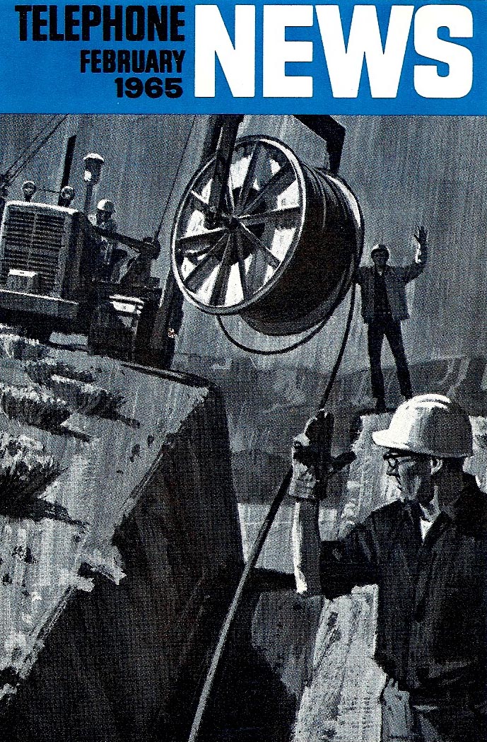

As I recall, some of the duotones were painted that way, on others the second color was added by the lithographer using the B&W halftone original. At 3 1/2 x 6 inches, I usually worked 'twice up', or roughly 7 x 10 inches. But...enough shop talk....the illustrations are pretty much self explanatory.


* Charlie Allen's Flickr set.

Tuesday, August 19, 2008

"Logic and advertising... never equal disciplines."

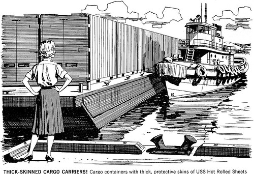
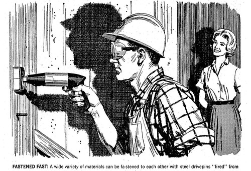
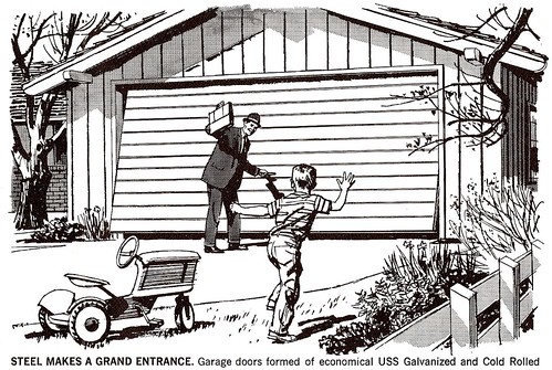
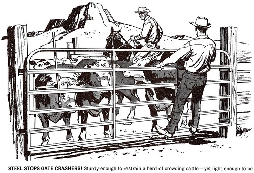
This week the CAWS will revisit our 'lady of steel' hostess....appropriately attired, as always, for field, farm, factory, or shipping dock in blouse, skirt, and high heels!


Amusing maybe....but today's ads can be even crazier. Logic and advertising were never equal disciplines.


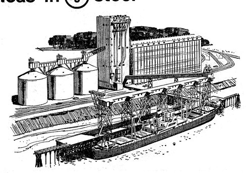
In the 50's and 60's I illustrated at least two dozen B&W US Steel ads....and that times four B&W individual spots totals a lot of illustration from one client. Many were hurried by deadlines, and not very good. But....considering the complexity of many of the subjects, some still hold up pretty well.


The three below were done before our hostess appeared. Some were printed as a mailer or brochure on quality paper. Others have been scanned from newsprint clips and show their age. Leif asked for a 'heads up' when I posed (usually a Polaroid shot) on ads. The first and last of these qualify. Of course, I always improved the model!


It will be interesting to see if these, and other ads, are too repetitive.


Roughly a dozen large corporations or companies provided most of the lllustration work in San Francisco.


Themes and assignments, such as these ads, were repetitive. To the illustrator, however, each was a new challenge and a new subject....hopefully, still of some interest!

*Take a closer look at the details in these illustrations by clicking the "All Sizes" tab above each image in Charlie Allen's Flickr set.

Thursday, August 14, 2008

Smile! You're on CAWS 7!

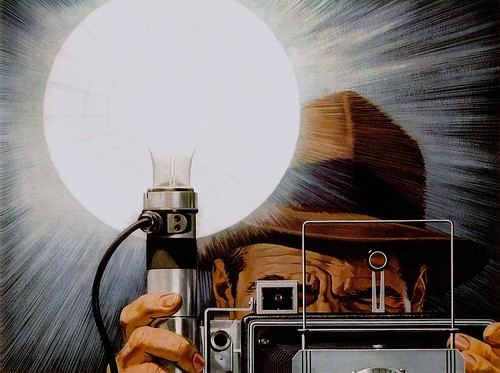
A press photographer with snap brim fedora, wielding a big 4x5 Speed Graphic camera plus flash gun, was the norm back in the 50's. In their zeal to further the civilian use of aluminum following WW ll, and advertising nationally, Kaiser Aluminum based in Oakland, was considered by agencies and by illustrators a real 'plum' account on which to work.


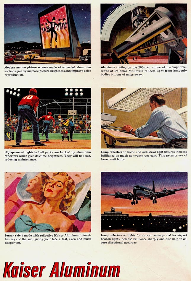
They seemed to me remarkably relaxed about product details....as on this flash reflector...which I believe was chromed brass or steel. Aluminum was used primarily on small consumer flash cameras. The above illustration was the left page of a double page spread in Saturday Evening Post, Newsweek, Time, etc. As shown below, the right page contained six 'spots', as we termed them, depicting aluminum uses. The scenes and product details were very much left to the artist to create.


The improbable youngster, below, hoisting an aluminum stroller, was my third 'breakthrough' job in the first two years in San Francisco.


Thanks to the dedicated and enthusiastic salesmanship of Chet Patterson, this was my first national magazine color ad assignment. Once again, Chet persuaded Don Sternloff at Foote, Cone & Belding to try his 'new guy'. It was done in 1950, and, once again, I sweated this one out!

* For the full size versions of these scans go the Charlie Allen's Flickr set.
Tuesday, August 5, 2008

"Hands, those essential tools..."

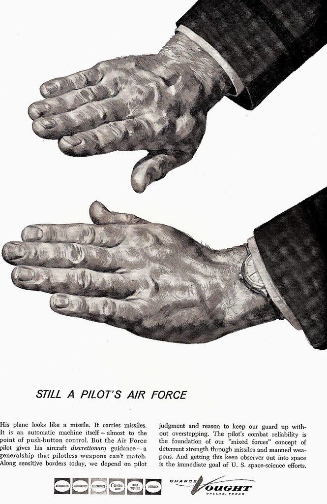
Several weeks back the subject of hands came up, and it aroused a few slumbering grey cells. Hands, those essential tools for work and every day living and so vital in human communication, have been subjects for artists, photographers, and advertisers for a long time.


Handshakes, high fives, thumbs up, V for victory signs, hands of strength, of beauty....the list goes on and on....both positive and negative. Can't forget the exuberant fist pump by Tiger Woods on sinking a 40 foot winning putt! Not that dramatic, but over the years I had drawn hands many times. Following are a few examples exhumed from an old proof drawer.


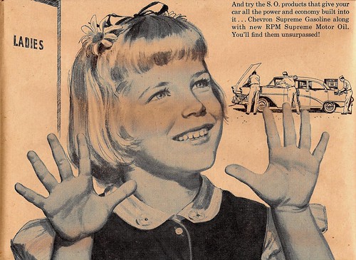
In the example below, middle daughter, Mary Jane, posed for a Standard/Chevron ad in 1957. Back in the 'good old days' when full service, clean restrooms, and leaded high octane were promoted heavily. Oh yes....gas was about 29 cents per gallon!


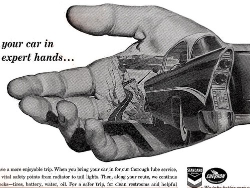
Next, a generic car in 'good hands' for the same folks.


Both were Higgins Ink wash illustrations. The hands for the Pac Tel and Vought Aircraft ads (at top) were done with Perma-Grey gouache paints....better and easier to use than Windsor Newton greys. Finally, a 1950's Kaiser Aluminum ad, done in Windsor Newton Designers Gouache, the usual color medium in those days. Added note, aeronautique: Not sure who 'owned' the big fist in the sky, traveling at about 50 0 knots....we'll call it 'The Force'.


In static testing the force is usually down on a wing. However in flight, the force (and failure mode) is UP. On the next flight, check your jet's wing flexing 3 or 4 feet up in flight. After the AD's concept layout had been through several meetings with Kaiser ad and engineering honchos, mine was not to reason why....just do the illustration....or else!

* Note: After many months, I checked in to Leif's CA Flickr Set last week. It's awesome in size, and still growing! Thanks (I think) to Leif for storing all that ancient stuff. Awesome, too, knowing every flaw....but thinking back, it was always thus. Deadlines provided a necessary but an irrevocable discipline. Good or bad, the jobs went out for all the world to see. I also want to thank the viewers for the interesting comments....and the jokesters are a hoot! Rich and others offer more credit than deserved....and for Picture Book and r8r... gas refrigerators were quiet (no motor), and some foods are noisy!

Wednesday, July 30, 2008

Focusing on Food Ads

Despite the almost endless natural and unnatural afflictions that occur in California.....fires, winter floods, chronic water shortages, occasional major earthquakes, over-crowded cities and freeways....this state was, and still is, a mega agricultural and food producer. The CAWS will focus on food ads this week....not for the last time!


San Francisco had it's share of large food and beverage corporations, and their ad agencies. I'll start with Safeway, the giant food retailer, based across the bay in Oakland.

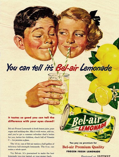
Safeway has, and had, a bunch of 'house brands'....and this example below was one of the 'Bel Aire' frozen foods ads from the mid 50's. Working from the ad agency's rough layout, I asked the age of the kids sipping lemonade. The Safeway ad manager over in Oakland said...'about 13'. Luckily, my wife taught a junior high Sunday school class....and she recruited two charming 13 year-olds to model. I took the photos separately...easier to pose and better lighting.


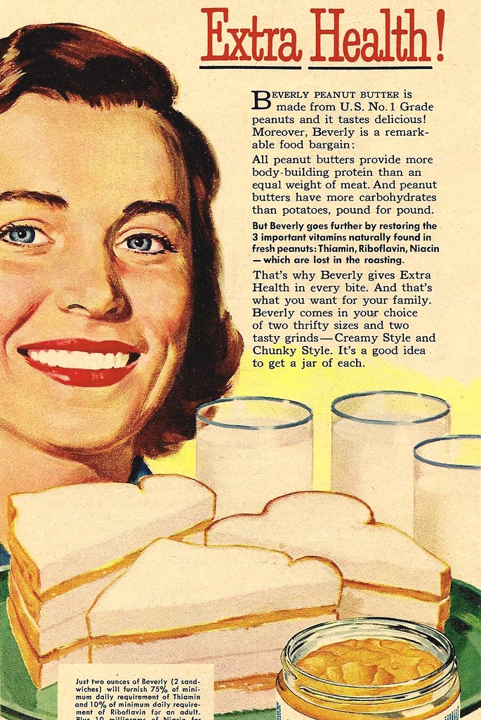
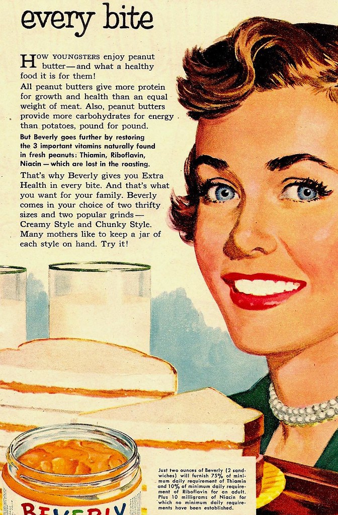
When the job was delivered, the Safeway ad manager complained that the kids were 'too old!' When all the facts were relayed....now, get ready for a 'small world' classic....it turned out he belonged to the same large suburban church that we did....and, he was the current head of the Sunday school department! Suddenly, the illustration got a whole lot better! Another sign of approval.....I received several more Safeway ads that year....examples, the two 'peanut butter moms' included at top and below.


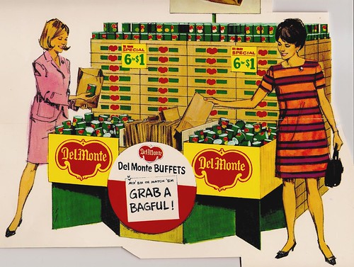
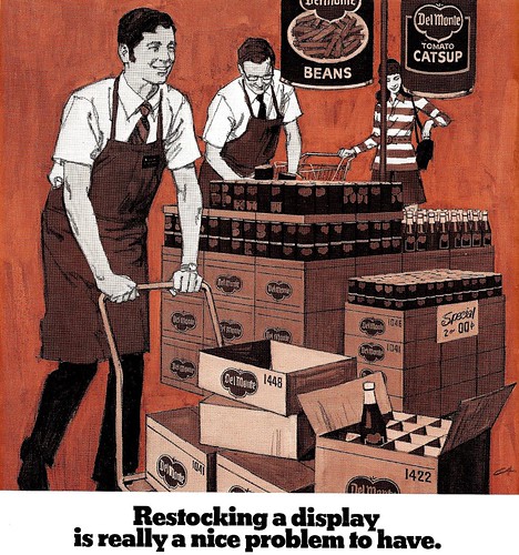
Del Monte was one of the major food producers located in San Francisco....and a prolific ad producer as well.


Most were 'trade ads', not all that popular with the illustrators. Main reason, most portrayed scads of Del Monte cans and their infamous logo....called 'the Bug'. A couple of examples here....the cans and the box ends and all the lettering involved the Bug, and had to be illustrated.


Not my favorite way to spend a work day!

Be sure to check out the large size versions of these pieces in Charlie Allen's Flickr set.
Tuesday, July 22, 2008

Back in Black... and White

We're back to black and white line ads on the CAWS....real color next week. B&W line illustration was truly the staple ad assignment in the 40's and 50's in San Francisco, with B&W halftone a distant second. The 60's and 70's saw more use of full color and duotone reproduction....and both drawing and painting styles had changed by then.


B&W illustration in daily and weekly periodicals dates back before the turn of the 20th century with such outstanding talents as Charles Dana Gibson, James Montgomery Flagg, Howard Pyle, and many more. I was very lucky to get in on the last years of brush and ink and pen and ink use in advertising art. And, as said before, San Francisco was the epicenter of both the style and the demand....by a bunch of agencies and corporations.


Also, S.F. produced a talented group of illustrators who used and mastered the technique. B&W illustration was not taught at the art schools....it had zero recognition during my one year at the Art Center School in L.A. I had done dozens of small B&W line ads at the Thomas Ad Agency in Fresno and during my year at the Fresno Bee newspaper....so, had a bit of a head start when I got to San Francisco.


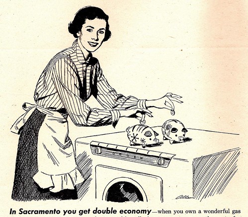
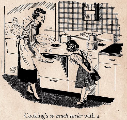
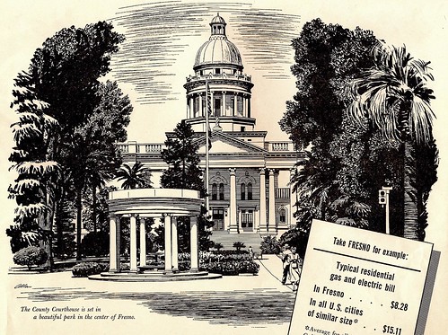
Four scans on this....from monthly PG&E consumer ads in the early 50's, promoting power use and new appliances. (Notice the power prices on a couple of these....WOW!) I enjoyed doing the Fresno Court House scene....almost knew the trees from memory!


Last scan....in case of doubt about the effectiveness and strength of B&W advertising.....here's....


* To see the full size versions of these illustrations got to Charlie Allen's Flickr set.

Monday, July 14, 2008

Illustration & Cartooning: "Joined at the hip"

The CAWS will detour a bit... and hop-scotch over a few decades. Maybe a sort of 'the head of a pin' discussion... that I've had with Leif in recent months. Subject, illustration vs. cartooning.


My feeling, they're joined at the hip, or very close relatives. Both use exaggeration, distortion, humor, drama, emotion....the gamut of real life experiences, in a graphic form. The interpretations of these are endlessly varied, as are the creative artists who produce them. Cartoonists use realism, and illustrators use cartooning. Hal Foster and Milton Caniff were really B&W illustrators. Norman Rockwell often cartooned his figures on a Post cover. Think back to the marvelous characters created by N.C. Wyeth in 'Treasure Island'. He created them from his skill and imagination. Were they illustration, or were they cartooned....or both?


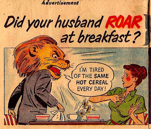
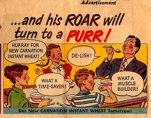
Fortunately, I could swing both ways, although San Francisco was not not a large source for cartooning. I'll include four scans on this... the first a comic section ad for Carnation (above), done in the 50's. Drawing, no models.

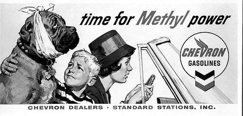
The second, a 1960's Chevron billboard...


...I used models, including the Mastiff, on all three....but the expressions were cartooned. The third was a Gallo P.O.S. store poster from the 70's...


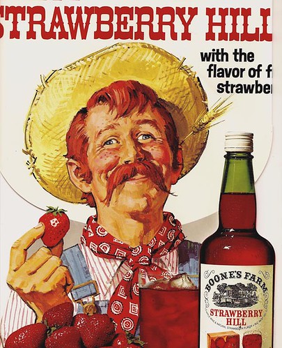
...no model for the hayseed character. I'll call it illustrative cartooning.

The last were a couple of safety poster comps, done in the 70's, for a mid-west client. They were silk screened in three colors and illuminated, for factory locations.


Notice the client changed my captions... but the designs were OK. Cartoons or illustrations?

* Check out Charlie's Flickr set for the full size versions of these (and many other) illustrations.