BUT IF I DO....I DON'T FOLLOW THROUGH
'CAUSE MY HEART BELONGS TO DADDY!'
Song and lyrics by the famous composer, Cole Porter, first performed on Broadway by Mary Martin back in 1938....way back when lyrics were clever, coherent, and had a sense of humor. Golf is the subject this week, however, not music. Chet Patterson, who headed up P&H, was athletic and always an enthusiastic golfer. With a low handicap, he was match play champ at Meadow Wood, his Marin County golf club, as well as a winner in other tournaments. I think his competitive WWll fighter pilot 'nerves of steel' served him well in golf. Chet had friends and contacts with the PGA, and for about four years in the 70's, P&H produced a tournament golf magazine for several major PGA events. Published by the PGA, these had well written articles and ads, very much like consumer golf magazines. I illustrated the covers in 1975, '77 and '78....not sure what occurred in 1976. This week's CAWS will post a couple of the cover illustrations and a few inside illustrations. I always welcomed a change, and these came as near editorial illustration as I ventured. Will again mention the excellent page designs and teamwork with P&H artists....in this case, mainly Jack Martin, but others as well. Next week another CAWS on golf....a few still to go.
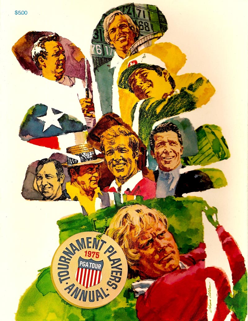
As said, the 70's were a time of change in illustratiom. There seemed to be no hard and fast techniques or styles....and most of these were my adaptations to that era. First, the 1975 Players Tournament cover. The original had Jack Nicklaus's hands above his shoulder, the golf club slanting down behind, making for a strong design element and action. For some reason I was told to remove the hands and club. I did....the paycheck mattered! I still have the original art....have meant to repaint the hands and club, but have never gotten around to it. The golfers were rendered in pastel pencil and gouache. In order from the top, Miller, Palmer, Trevino, Weiskopf, Player, Snead, Geiberger, and Nicklaus.
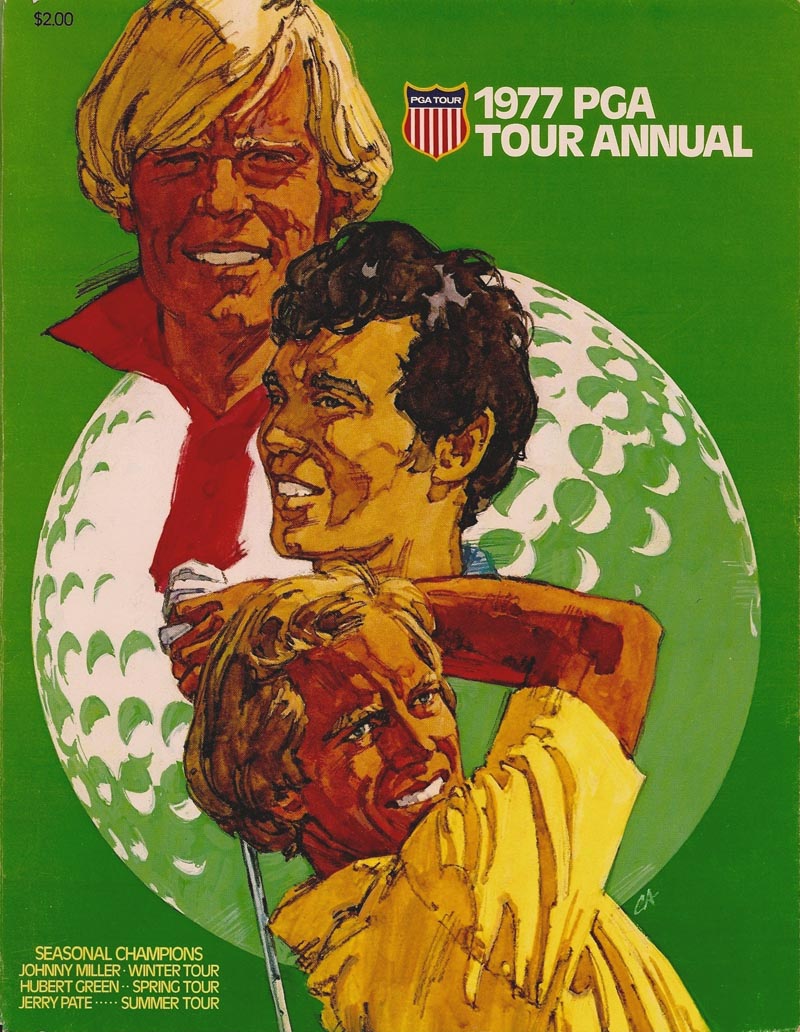
Next, the '77 cover featuring Johnny Miller, Hubert Green, and Jerry Pate. For better or worse, the cover designs were mine.
Then for an inside article, two of Lee Trevino.
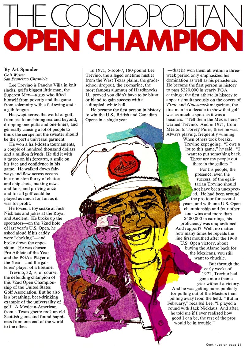
In an attempt to compliment his Mexican heritage and colorful career, these were collages using bright tissue paper over charcoal pencil.
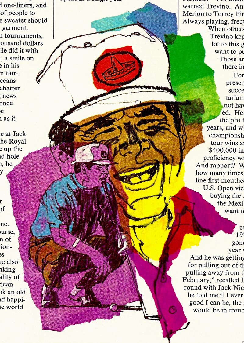
In an attempt to compliment his Mexican heritage and colorful career, these were collages using bright tissue paper over charcoal pencil.

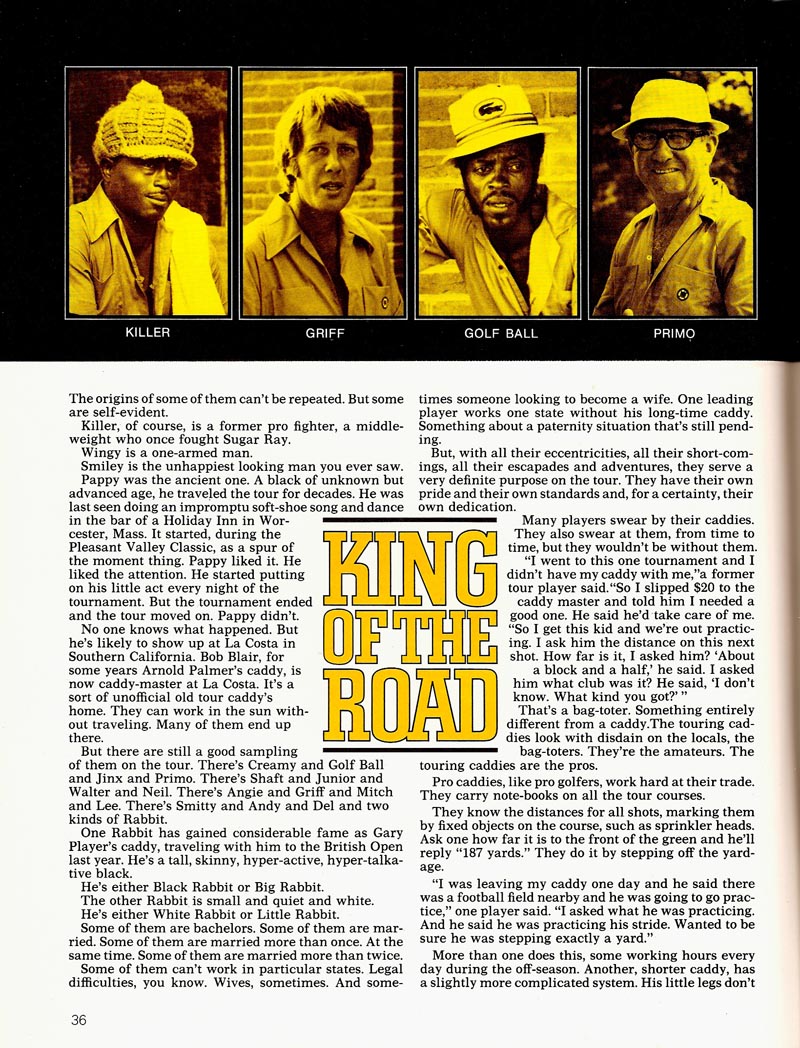
Next from an article on professional caddies, a line and gouache rendition of a caddy...

...and following, the next page showing photos of a few of them.
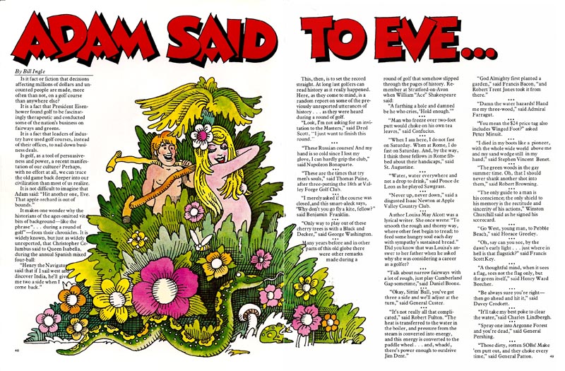
After that, not my work, but a page by one of our decorative artists (can't recall who)....showing a nice variety of editorial illustration.
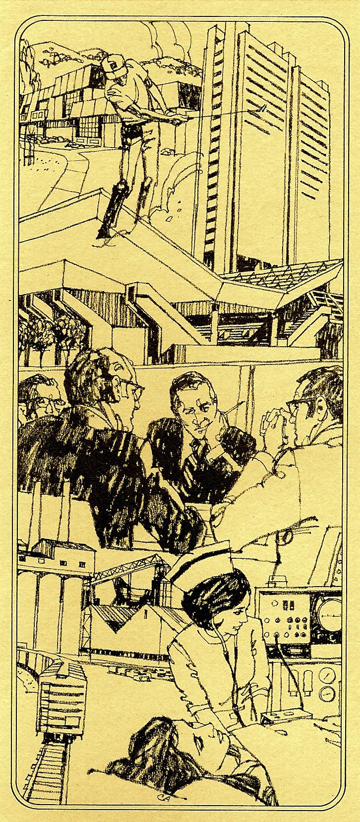
Finally, and admittedly doing a stretch on this blog, a four by nine inch pamphlet for an S.F. mutual fund. A charcoal pencil montage. It does have a golfer in it!
* Charlie Allen's Flickr set