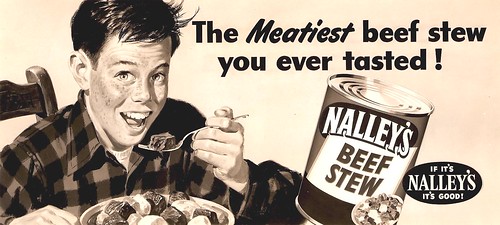
Won't continue with billboards....or with the early sequence of illustration jobs....but the first several years were important in establishing a name and reputation, both in San Francisco and even in the East.
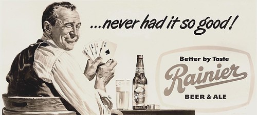
Again, on these, I sweated them out....but finally after several were accomplished, a billboard became like any important job that came in. Every one, in fact, was a challenge, but unless too pushed by deadlines, rewarding and enjoyable.
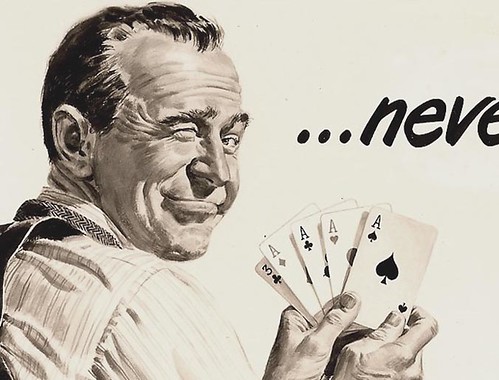
The model for the poker player was our excellent lettering artist (lettered most of my billboards) and all around 'everyman' model. Jim Hasse, by name....he was the dad on the phone (and on the hook!), for the heating oil B&W ad.
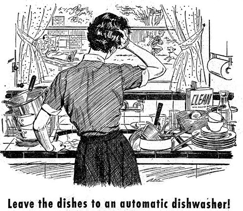
Will include an early PG&E line ad with this....the beginning of a long series for that company....way back when the power companies, unlike today, were selling mighty hard on power use, new appliances, the 'good life' for young post-war families!
*You can see full size versions of all these illustrations (and many more) in Charlie Allen's Flickr set.
8 comments:
Beautiful and clean technique.
Thanks for your art work and stories.
I'M VERY GLAD TO SEE YOU BLOG.
I sure wish they kept color copies of these billboards, but they still look great in B/W. That's the sign of a good illustration when it reproduces just as well in B/W.
Keep it up Charlie
Bruce
Great job on Jim the Poker player's face (as well as the rest of the work).
Charlie, I always wondered what scale is billboard art generally painted and how detail-minded should an artist be. Does an artist render every eyelash knowing their illustration is going to be printed 25 feet tall, or do they paint it the same scale as if it were to be, say, a double page illustration? I guess knowing how large the original art is for that poker player would answer that. And was your paint medium oil?
Thanks again for sharing.
I'm really going to love these posts, Charlie! Great to see your work reproduced...
Let's see if this works. Can the blogger comment on his own blog? Digitally disadvantaged here! Wanted to answer Les Toil's questions on billboards. They were always painted at the same size...12 x 24 inches. I always used gouache, a little colored pencil if necessary. First penciled in, then a partial india ink line to hold the drawing when washes of paint went on. Les hit on my first board fears...every goof will be magnified exponentially for the whole world to see! Not the case tho. Billboards are rarely viewed up close, and the effect is diminished detail, not more. More goofs are seen on a magazine page ad than on billboards. Last...I want to thank all the viewers who have commented....what a discerning and intelligent group! Really, it's great that folks appreciate old illustration. Chas.
Very cool! I really enjoy that Rainier beer billboard. That look on guy's face is fantastic.
The "enjoyable challenge" radiates somehow for these billboards and as well from all those other samples of yours truly.
Just hope this blogboard's going to be another enjoyable challenge for you - because then we all will be able to enjoy your further illustrated stories...
truly amazing! your talent is timeless!!
xo hillary @anxiousalphabet
Post a Comment