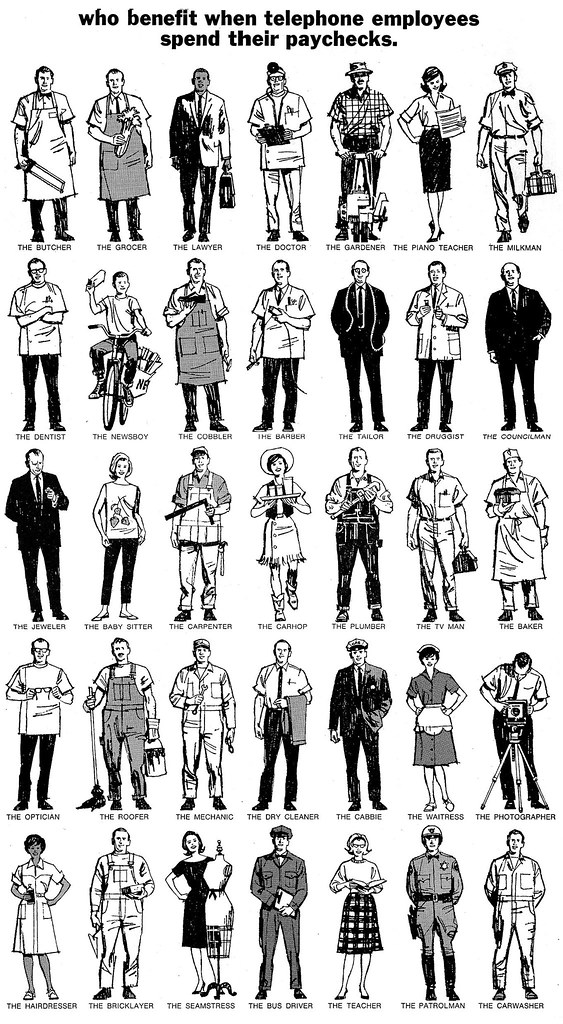
Five rows, seven standing figures in each row, 35 in all. Deadline....one week, including a film pos over board with grey haltones where needed. I planned at least 7 figures or more per day, plus a half day for the film pos and halftone.
(To see the full size version of this sheet click here)

Main dilemma....how to depict all those occupations in small standing figures? As it turned out, not as boring or as difficult as feared....
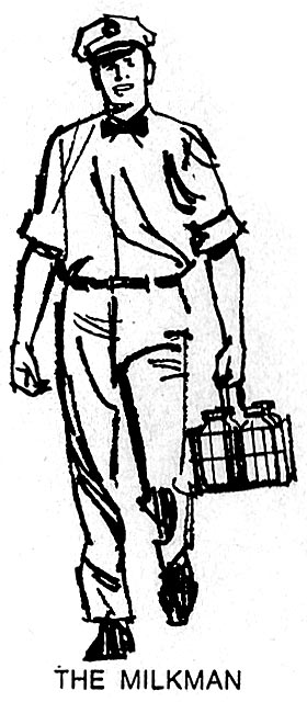
a sort of cartoon/illustration approach. The scans are from a newspaper clip....so...in three parts, at roughly the drawing size, about 5 inches high.
For speed, I used a nylon or fiber tipped marker pen....Pentel or Scripto, as I recall. They were difficult to retouch with white....markers do bleed....but not a big problem. Easier to start a new figure than repair large goofs!
Also, two more ads using the same pens. The first a Calaveras Cement B&W,
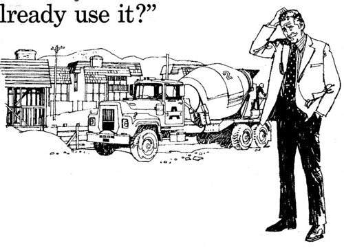
... and the second, a promotion for Northface, an eastbay outdoor clothing and equipment maker.
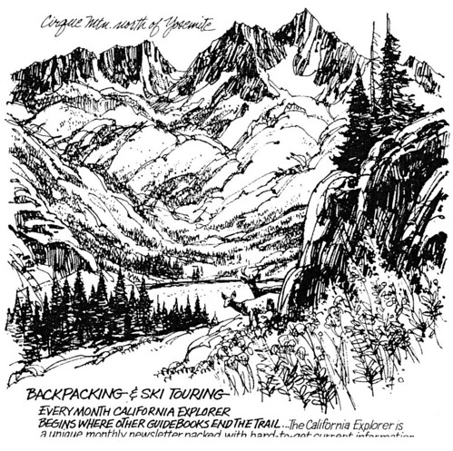
The request was to have it look like an on site sketch....so, pretty loose.
* Thanks for kind help from Tom Watson, who has a better recall of the 60's and 70's than I.... just a brief review of Hal Riney's career. He was an inventive AD at BBD&O when I did several jobs for him....and later became the agency's creative director. In the 1970's he started his own ad agency, and, adapting to the changing times and media, created a series of outstanding TV and radio commercials for major national clients. Some were General Motors Saturn division, Lipton Teas, the 'Morning in America' commercials for Ronald Reagan's re-election campaign, E & J Brandy, Bartles and Jaymes Wine Coolers, and many others. He often performed his own 'voice-overs' on commercials....with a quiet, folksy, nostalgic style that was in complete contrast to the hard sell voices usually heard in advertising. Riney died this year...but his amusing, kinder-gentler Americana themes and style will be missed greatly.
4 comments:
this kind of straight to the point, solid work really is something to admire. no gimmicks, no flare, no fancy tricks- just the important stuff.
each post really is a great learning experience, and a delight for the eyes- thank you!
best regards,
tonci
Charlie, this page is simply stunning! I wonder how could you draw so fast and so well all of these different characters, giving them such naturalness. Each profession is perfectly focused with few elements and the right choice of faces and attitudes. Congratulations, and thanks for sharing, this blog is gold for every illustration fan. Thanks to Leif to host the hi-res images also!
Row by row: WOW! Kind of perfect perfection. Black & white can be so colourful and a marker pen so dynamic in the hands of a master...and again, looking at details - all those hands...
"Easier to start a new figure than repair large goofs!"
You hit the mark with that, Charlie, that's to the point! I shall remember it, when next wasting time in correcting, correcting...and not only getting nothing better, but something worse....
Love the "loose" mountainscape, with that foreground.
Someone mentioned occupations....how some have disappeared. True...who's seen a newsboy on a bicycle lately? Or a milkman....not around here! A councilman is now a city or county supervisor...who's never been seen. Cobblers....I guess a few exist. New professions would include the 'half-caf latte server'....maybe a bank teller, or automatic teller....maybe a financial advisor (not too popular right now!). Everybody else is in a cubicle behind a computer. Occupations, anyone? We'd probably have to include that guy on the phone over in Bangledor.
Post a Comment