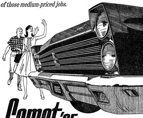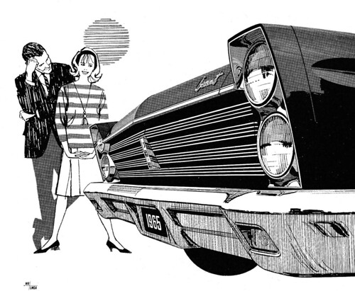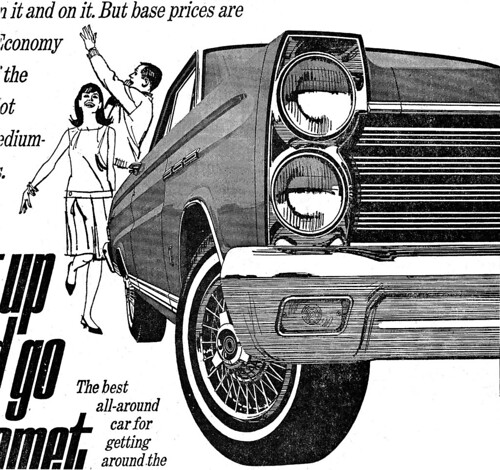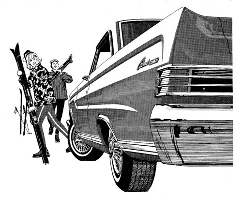
From the long distance of time and today, ten or fifteen years way back can seem compressed... not all that long. However, the early 1950's to the mid-1960's was a very long time in the advertising and illustration environment.

In a decade, the nation had changed from a print media and a reading public to a television viewing culture. News and entertainment were quickly moving from newspapers and magazines into television... and of course advertising budgets both led - and followed - all the way.

In my specialized world, the traditional literal illustration and ad assignments were changing into more designed, simpler images... and thanks to eastern artist like Briggs, Fuchs, Peak and others, more action figures were in demand.

Per usual, it was adapt... or else!

This week's CAWS shows a Mercury-Comet B&W series, done in the mid-60's. Kenyon-Eckhardt in S.F. was the ad agency for the Mercury account for the states west of the Mississippi, a frequent division in sales and advertising. I can't recall the art director, but he was good. The method usually was a line film positive over a halftone rendering of the car.

This last example is a grey marker comp, typical of the comps I sent over for AD and client approval. Not sure if this one went to 'finish'... don't have a clip or proof of it.
These were enjoyable assignments... and again, a change from the usual car ads.
* Charlie Allen's Flickr set.

2 comments:
amazing blog, i do like the perspective of those ads. and the art too. i find more inspiration in old school illustration that in todays art.
keep the good work!
fernando
www.vfernando.com
I like those grills and the way you patterned them out!
Great car presentation! Daring and impressive with all that foreshortening and perspective. Those mid sixties car designs were made for illustrators, it seems to me, compared with the streamlined products of nowadays.
In nowaday's ads they would probably have to look shorter and economical - a piggybank on wheels...
Post a Comment