
In this case, the 'big apple' was the Washington State Apple Commission, which promoted and sponsored the large variety of apples and pears grown in the Pacific Northwest....advertised, distributed, and sold around the country.

The ad agency, I can't recall now.....BBD&O, Foote, Cone & Belding, McCann Erickson? Not sure, but certainly loyal clients for Patterson & Hall, and for me. The assignments were mainly 'point of sale' posters, banners (they were hung on wires), and displays. They were widely used in supermarkets in those days.
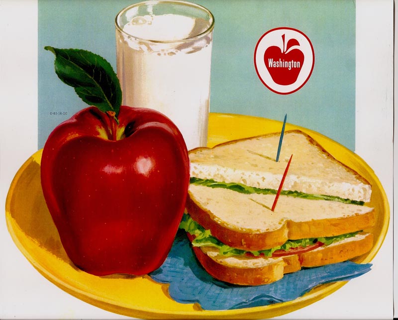
'Point of sale' displays and ads have largely disappeared from food and produce sections in modern times....giving way to the esthetic, environmental, less commercial, and I should add, more expensive produce sections installed in supermarkets these days.
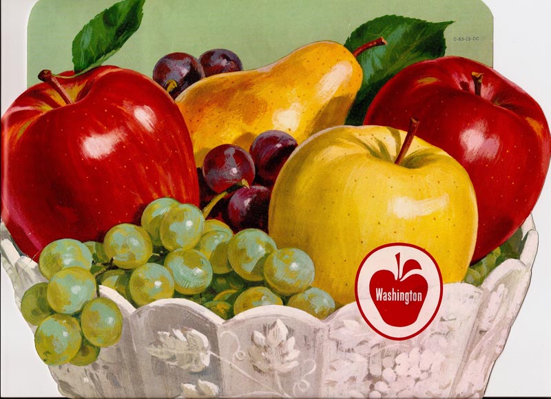
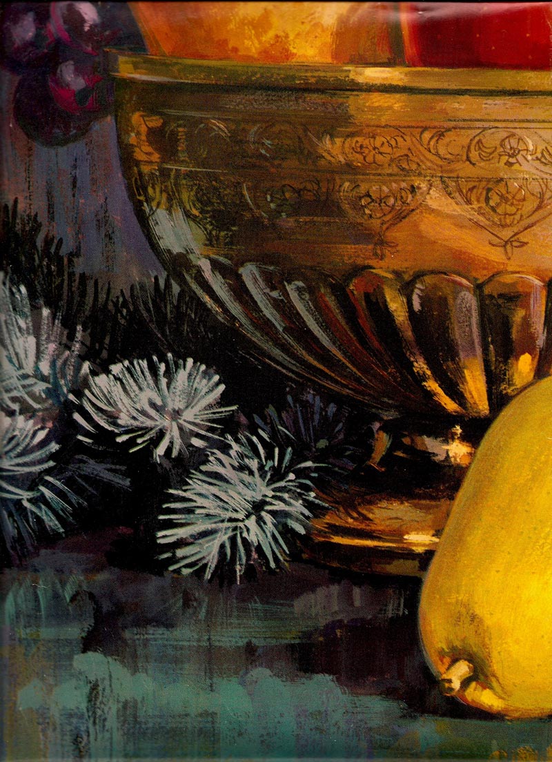
This week's CAWS will show a few banner examples, plus a few close up sections (out takes?) from a large, and now timely, Christmas poster.
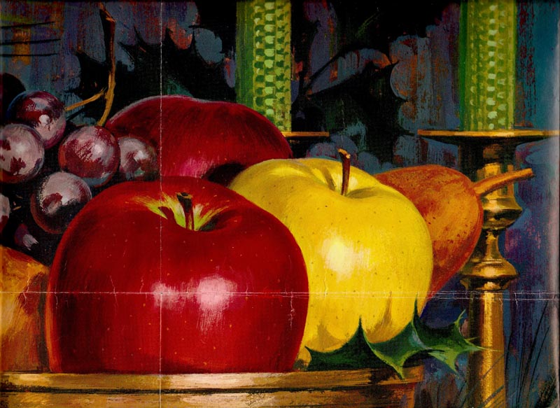
These were straight arrow, literal but bright, renderings of the product.
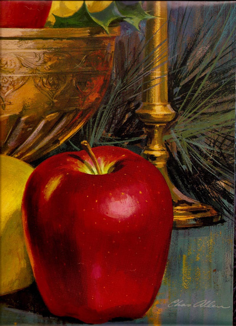
All were done in gouache, before acrylics. The full poster, too large to photo and scan in my usual method, was not that great. But I liked the color and loose technique in general.
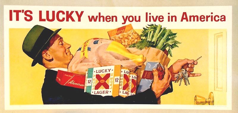
Last, still on food, 'one more time!', a rescan of the familiar Lucky Lager Thanksgiving poster....showing it did have both color and value.
* Charlie Allen's Flickr set.
4 comments:
yam, yam! … very beautiful, charlie!
in my opinion, especially foodillustrations are realy difficult. exceptionally if they later must work as big p-o-s-materials. how big was the original art and how many time did you need for one? … how was the procedere with the art-director? … you know: sketches/how many corrections average … and all these without a fax or e-mail?
than an other question please:
in these "ole" times, did you worked mainly as an freelancer illustrator, or was it also usual to work
under a "hire" in an agency?
further, where are all these artworks be created? do you have some photos of your studio (moods of you desktop, drawingboard etc.) and if they are some, do you allow us to see them?
thank you and sorry for my pitiful english, chris!
nice greets from germany, meanwhile under snow!
joe
Man you sure can paint a great apple! One of the things that separates really talented artists like yourself from some of the current crop of illustrators is the ability to transform mundane setting and objects into really nice illustrations. Love the kid with the head set on in bed too, great stuff.
Thanks for the close ups too, I second the studio photo, would be great to see your tools of the trade ;)
Happy Holidays!
Appreciate the comments, as always. I wouldn't let my dog see my studio right now! Built in 1955, the room has north light, shares the roof with the garage and a utility room, all of 10 x 12 feet in size! To be used for occasional breaks from SF, it became my full time work place, saving two or more hours of commute time. Not a large easel painter, ala Rockwell and others, all I really needed was a drawing board, taboret, a couple of steel filing cabinets, large shallow shelves, and a counter top. That and a long wall mounted book case was enough....all in 10 x 12! Problem...still...not enough storage. Tools? Many brushes, gouache and acrylics, a water jar. pencils and markers....the usual. At this late date....loaded with 'stuff'. To Annonymous, P&H was an 'art service' in San Francisco providing all kinds of advertising art, photography, photstat copying, repro type setting for ads, etc. Work was 100% from P&H for the first 10 years or so, gradually about 2/3 from P&H, 1/3 freelance on my own. Hope this helps!
ah, ok!
http://phcreative.com/ourpast1950s.html
thanks charlie!
joe … the anonymous
Post a Comment