In the interests of change and diversity after several weeks of Chevy ads, the CAWS will return to comps....and, for better or worse, there will be more later on. Comps, as said before, can be just about any kind of presentation before finished art was ordered. They could be as simple as a rough pencil sketch, or a tight rendition in paint, marker, or charcoal pencil. Comps, to me, are interesting....more vitality, energy....often showing more of the creative side of illustration. Finished art usually showed a more technical demonstration of the illustrator's ability to get the job done. Wish I had saved some art director comps from which I worked. Mostly rough, due to time constraints, and to having to churn out so many before the client gave an 'OK'. That actually helped us.....almost anything the illustrator did was an improvement! Once an AD comp came to the illustrator, or a requested comp was provided to the agency (about half the time), there was financial commitment involved....even if the comp was not approved for final art. On occasion, my comps were used as final art. One major national corporation (who will remain nameless) ran my comps on their barbeque briquet packaging for years....having paid only the much lower comp price. Time and cost made it not worth litigation.
Let's get to the comps....and diversity....something I enjoyed over the years. First, a Del Monte children's coloring page, an old fashioned country scene....a point of sale offer.
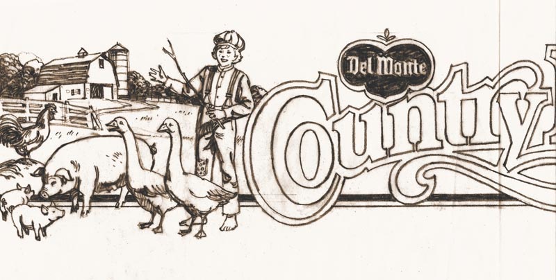
Not too successful as I recall, but anything to get shopping mothers involved. The comps first...
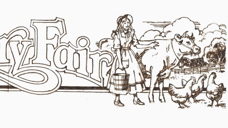
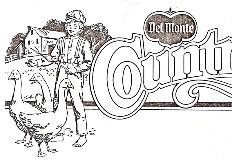
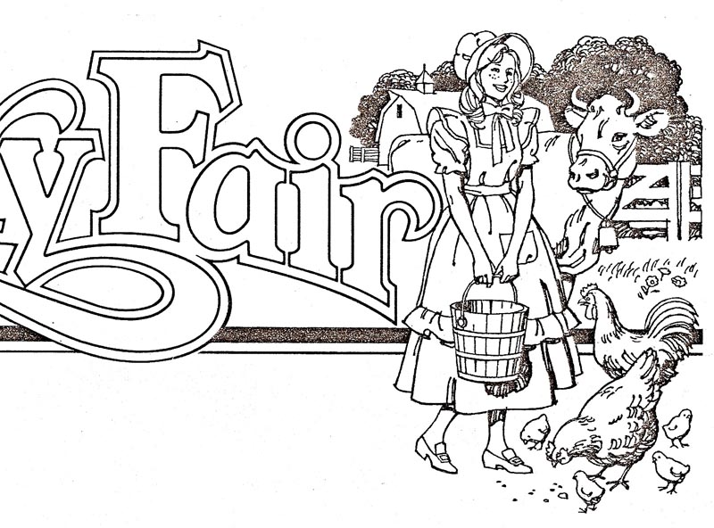
...then a finished version....from a weak copy, my only record.
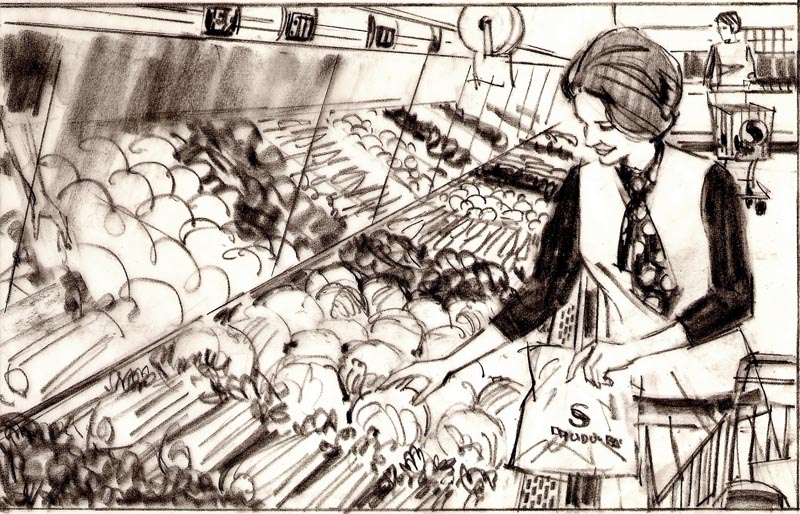
Next, a loose comp of a shopper for a Safeway promotion.
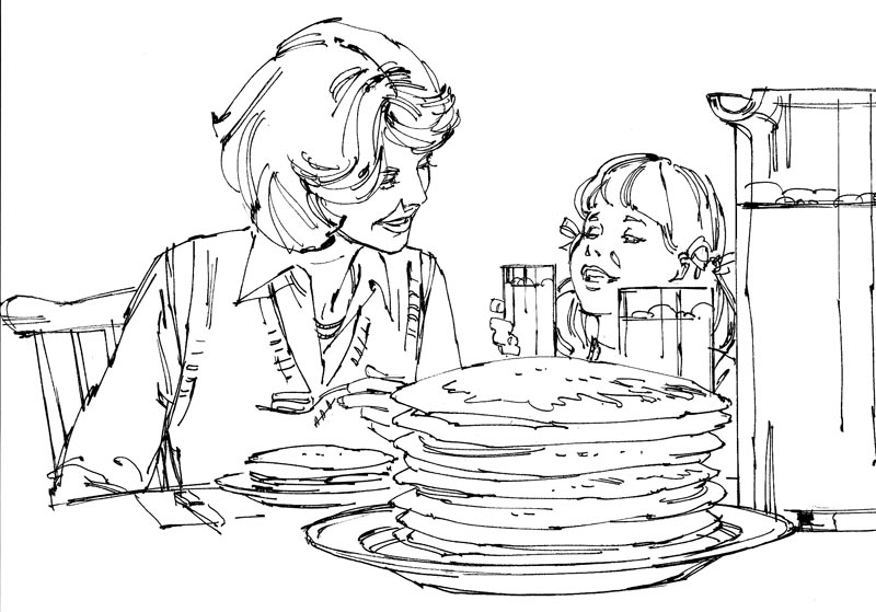
Then, a line marker drawing for a story board....minus the usual marker color....can't remember the product. Pancakes, juice....or? Done in the late 60's I believe.
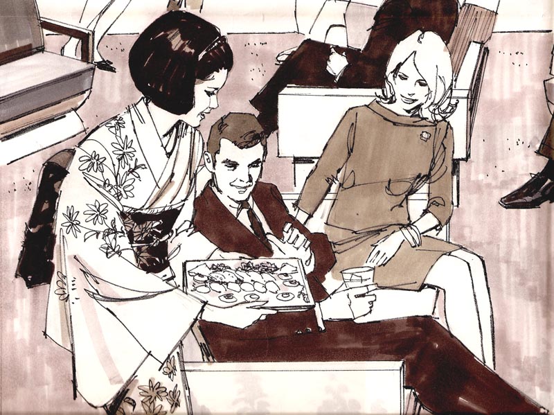
For Japan Airlines....several grey marker comps, again in the late 60's or early 70's. I can't recall the intended use....but finished art was never done.
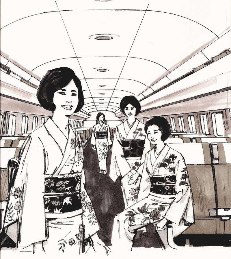
The large one, shown in sections, was at least full page newspaper in size.

They provided reference on the background decor and stewardess costumes....but the figures were just sketched....very generic.
Almost like mannikins....same age, handsome, no charachter....but after, all it was a comp!
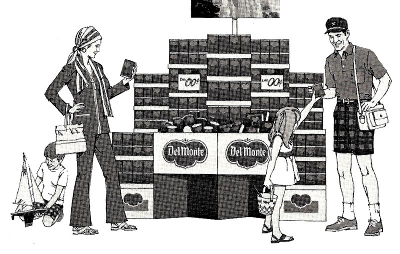
Following....not a comp....but a typical Del Monte B&W plus halftone trade magazine illustration of a vacationing shopping family.
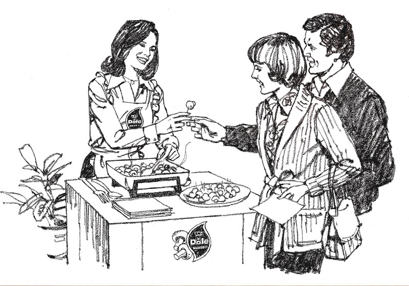
Finally, a charcoal pencil comp for Dole fresh mushrooms....and again, can't remember where this ad appeared.
*
Charlie Allen's Flickr set.

11 comments:
Great insight into the process. Thanks Charlie
Bruce,
Thank you.
I love what you're doing, Charlie. Please, don't stop!
Great to see.
Great stuff, Charlie.
My favourite is the Safeway frame. Done in pencil, yes?
"...in the standard jazz combo, the pianist or guitarist typically COMPS during the horn and bass solos by improvising chords and improvised countermelodies"....
Looking at your illustrations is like listening to good music.
Love to see stuff like this. I think a lot of non illustrators have no idea how much stuff gets worked on that never sees the light of day ;)
What kinds of reference did you typically use at this stage? Did you shoot photos of people or use magazine pics etc?
Again, interesting and logical questions....what a group! To Mark....the Safeway was charcoal pencil on tracing tissue. We created dozens of tissues 'getting it right', and that was a quick way to do it. Rich hit a 'chord'....I still like music from my era...big band, jazz (not too far out), the old tunes that had a melody and understandable lyrics. Also up-beat country. Never 'progressed' to rap, rock, heavy metallic, etc. To Michael....until this year I hadn't looked at most of this stuff for many years, especially old comps....and now find it amazing that I cranked it all out! Early on, 50's & 60's, I took poloroid shots, or had professional models and photos for billboards, etc. for almost all jobs. In the late 60's and 70's had greater drawing skills and just winged it most of the time. For reference on women's clothing (not my expertise) I used magazines or anything current ....plenty of that around. Men were easy...suits, ties, or casual stuff. Like any profession, you get very skilled as practice and the years go by. Hope this helps!
Nice sketches, i love the rawness in them.
-trey b.
Congrats for your artblog Mr.Allen, I'm a big fan of yours.
Mr. Allen,
Hope you don't mind--I'm going to nick your Japan Airlines art for a piece on Japan Airlines. Holla at me if you like me to take it down, sir!
Peace out!
Norman
http://www.anamericanlion.com/
Post a Comment