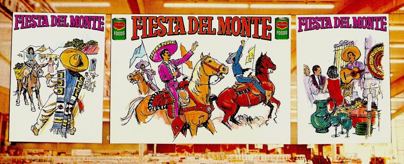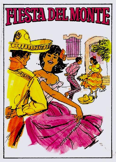
As I focus on these old proofs, memories come back. I recall being tired when these came in.

I preferred jobs that came along singly....one at a time, please! It was easier to concentrate on the problems of one illustration. When a series came in....six or eight in this case....the pressure level increased.

The solution had to be fitting the illustration style and technique to the deadline....and to the Del Monte budget requirements....always on the low side. I opted for a loose line technique on rough illustration board and film positives over bright colors

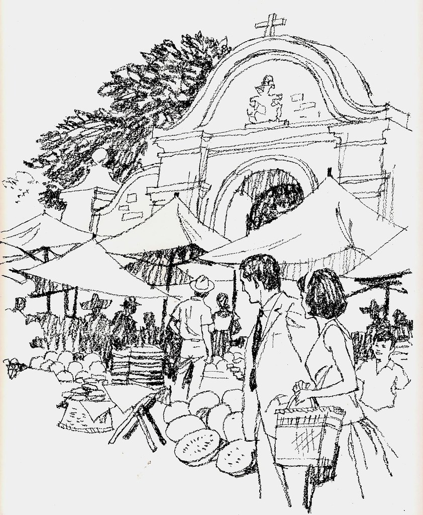
The choice would both save time and compliment the Mexican theme and attention value needed on store posters. Also it lessened dependance on good, specific, reference or models. These were charcoal pencil on cold press Whatman board for the line....gouache behind the film positives.

Most of these scans are from a printed promotion piece for grocers showing the posters installed in a store. Hence the red edged backgrounds.

One of the B&W's, minus color, is included as an example.

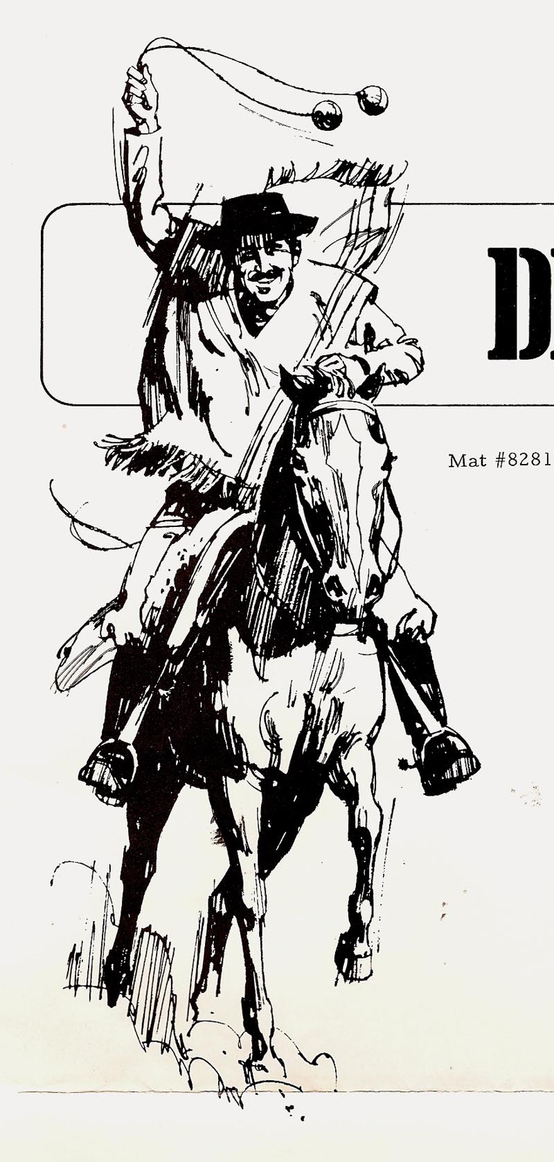
A couple of B&W ink renditions of Mexican and American cowboys follow that were used in newspaper 'Viva Fiesta' promotions.


Two more scans....unrelated to 'Fiesta'.... but horse related. These were B&W illustrations, part of the Elanco/Graslan ads shown much earlier on CAWS. The first is from a brochure and the second, a film pos B&W minus the color background. Missing is a finished proof....as are many ads done over the years.


For now, adios amigos!
* Charlie Allen's Flickr set.

5 comments:
Really vibrant work, as always, Charlie! I'm curious about one thing, tho - how'd you register the colour under the film positives? I recall back in the eighties when I was doing painted comics that was always a problem, until someone finally figured out how to make bluelines like they did in France, eh? Cheers!
Beautiful work Charlie. Sort of a Bob Peak feel. I like the loose line work. Charlie, you can do it all!
Excellent work Charlie, and an accomplished writer too! I love hearing your tales and stories behind the work. Thanks for sharing!
As always, thanks. On film positives, Ken, I always penned four cross-hairs, one on each side of the B&W. The film pos could stretch or shrink when being made. When those were traced for the color rendering, it became a very accurate register. Sometimes the engraver would goof....but it worked pretty well. One thing the blog does....forces me to remember things not thought about for years....so, enjoying the writing.
Aloha!...still your Hawaiian episode keeps on ringing in my mind.
But now it's "Hola Amigos!"
Well, for me, there's just music in your illustrative work. Here now the horns and chants of a Mexican fiesta. The design? Or is it the colors? Those blues and oranges, the intense violets and yellows?
Whatever it may be - it keeps on ringing in my ears. It`s not only my eyes - there must be something common to my senses.
Probably I lack commonsense. And I just love those horses of course.
Post a Comment