First in line are five spots for Bank of California...
...don't recall the agency, but a good client.
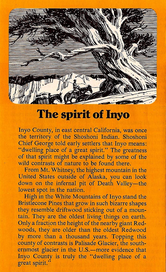
Printed images were about two by three inches.

The last of these (below) was from a photostat, the method of reproduction quality copies in those days. They were used, but don't have ad proofs.
The next two were from the back of 'Telephone News' mailers....some of the cover illustrations were posted earlier on CAWS.
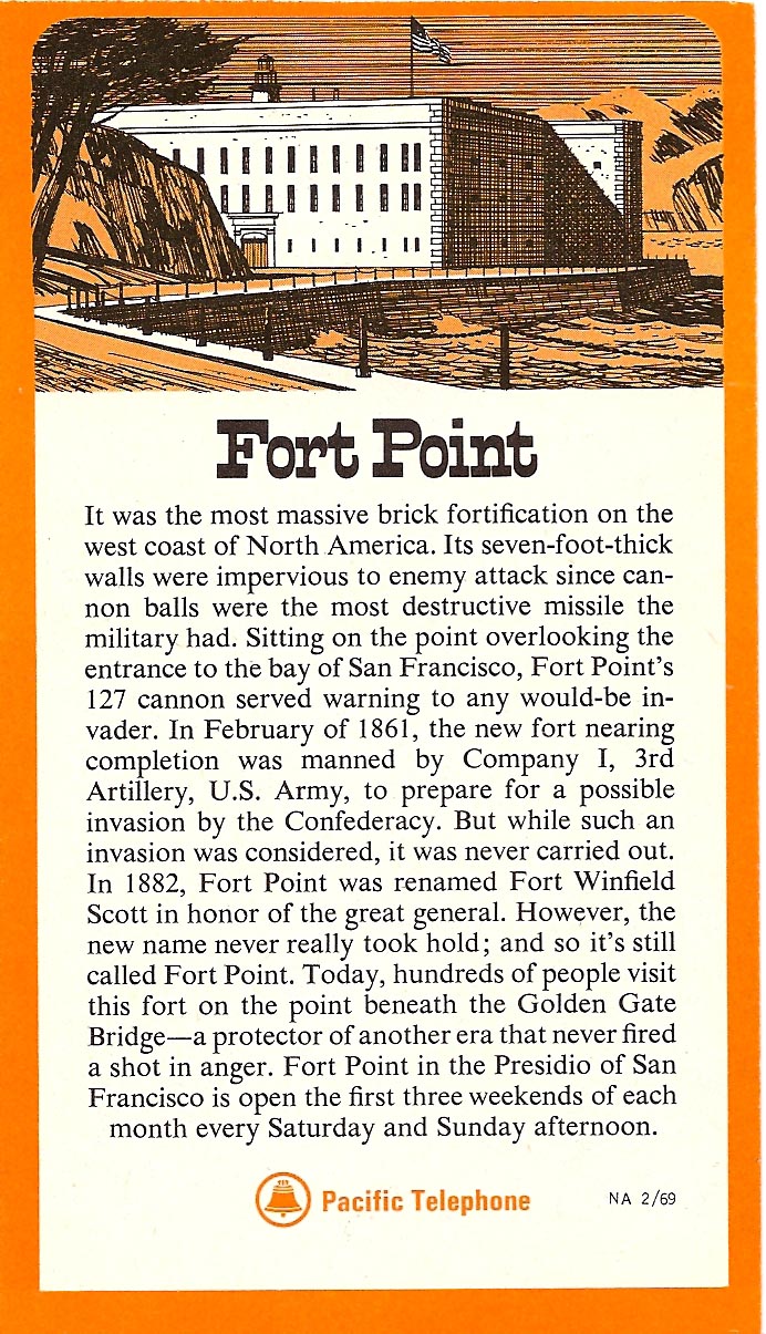
The 'Fort Point' spot needed some sea gulls, or something for action. Very static, and probably done in a hurry.
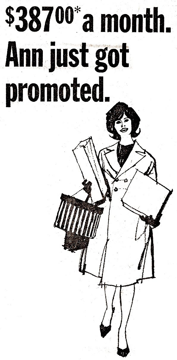
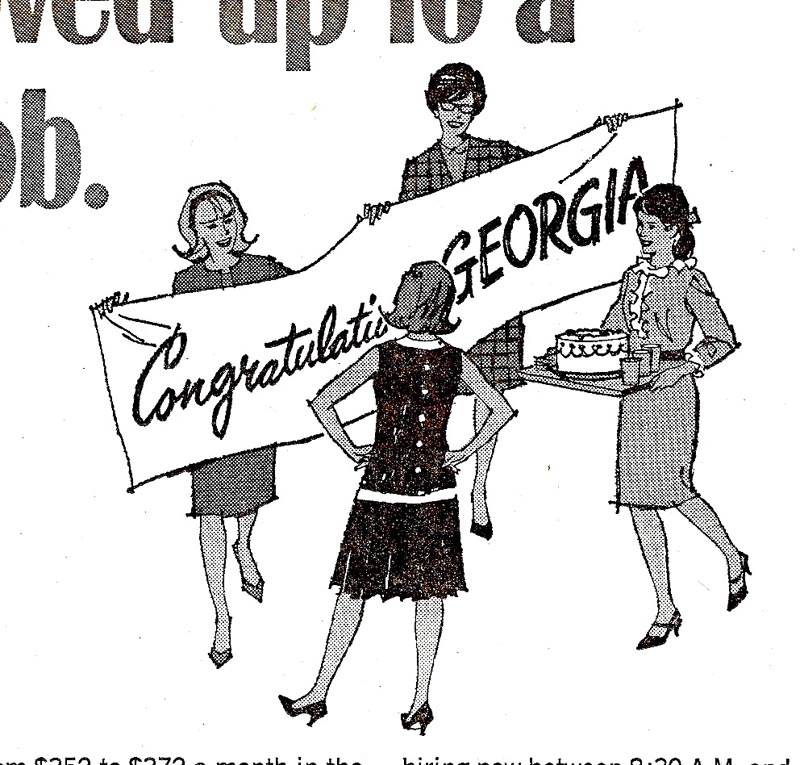
Following are four spots, again for Pac Tel, promoting the 'outstanding' job opportunities at the company.
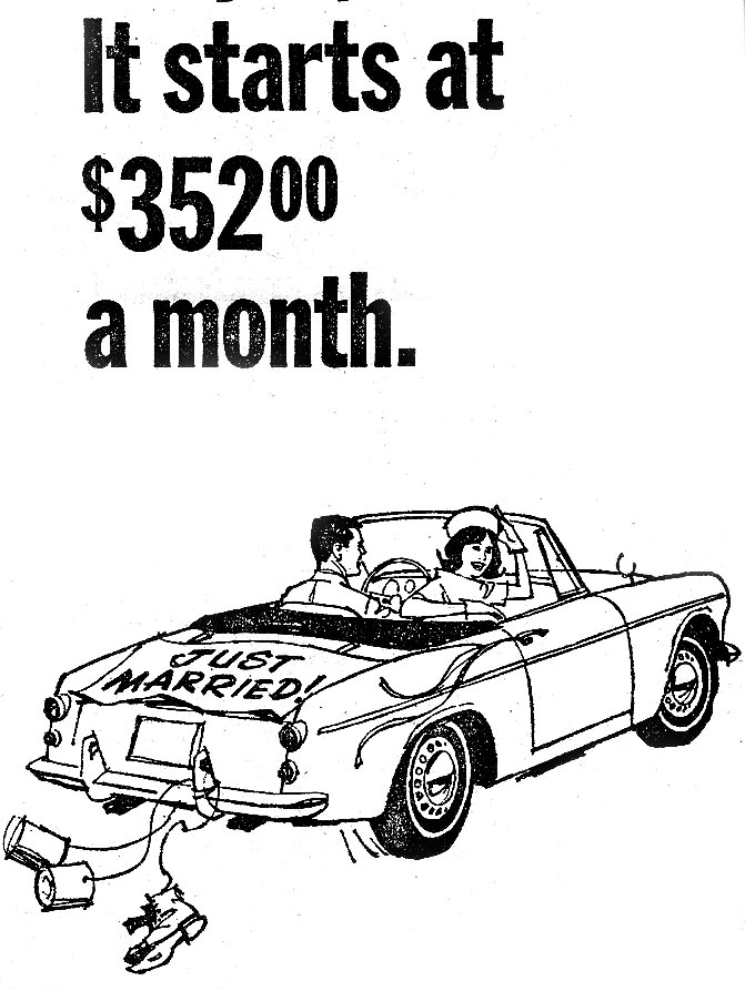
As pointed out many times here, check the inflation rate since that time.
Hold your hats....it's going to happen again!

Then a B&W spot for Castle and Cooke bananas...

...and an Ortho Chemical job. I seem to recall the headline was done first and my illustration matched the perspective.

Finally, a scan from the original illustration, a line and wash B&W. I remember a couple more of these, done in the 70's...

...but haven't the foggiest notion who the client was. For now....enough spots!
* Charlie Allen's Flickr set

5 comments:
Hello Mr. Allen,
Just wanted to say I LOVE the line art spots. It would be great if you showed a tutorial on how you did this line techbique. The train spot is absolutely fantastic.
Jerry
Delightful line art.
Seeing these spot drawings, Charlie, have you ever done stamps?
Thanks, per always. Rich, have done four state duck stamps. Those were competitions and I'll post a CAWS on the 'duck phase' pretty soon. Came along in my 60's, and as I was phasing out of the biz. Jerry, on a 'tutorial'.....I should write a book about learning to draw, schools, etc. In a nutshell....it's observing and absorbing what you see, constantly assessing your work, and practice, practice, practice!
The 'tutorial' question deserves a more specific answer, Jerry. On the four Telephone salary promotion spots....all were done with a favorite pen at the time, a fiber tipped marker (Pentel?). They bled, so hard to retouch. The young shopping lady, the four girls with a cake, the newly weds and sports car, were pretty much 'no reference' spots. I used current fashion mags for ladies clothing. First sketched on tissue, refined, and rendered. Admit to a small B&W photo reference on the couple kissing....I think the youngster and sitting up pooch added. Earlier on, the small 'Palace Hotel' spot....a difficult subject. The AD wanted to show a carriage driving into the hotel, as was the custom (can you imagine the odeur in the hotel?). Also costumes of the day....and the inside of the hotel in the background. A big order in a 2 x 3 inch spot! I think it came off.
Hi Mr. Allen,
Thanks for sharing that extra informative answer. Can't wait to see your next post:)
Post a Comment