THE HUNTER CROUCHES IN HIS BLIND
'NEATH CAMOUFLAGE OF EVERY KIND
AND CONJURES UP A QUACKING NOISE
TO LEND ALLURE TO HIS DECOYS....
THIS GROWN UP MAN, WITH LUCK AND PLUCK,
IS HOPING TO OUTWIT A DUCK.
OGDEN NASH
Thanks and credits to Ogden Nash for the poetic witticism. When I was young my parents had friends who were ardent duck hunters. An often used joke when they served a fancy duck dinner was that it was a hundred dollar a plate meal. Like many hobbies and sports, duck hunting was, and is, a pricey avocation.
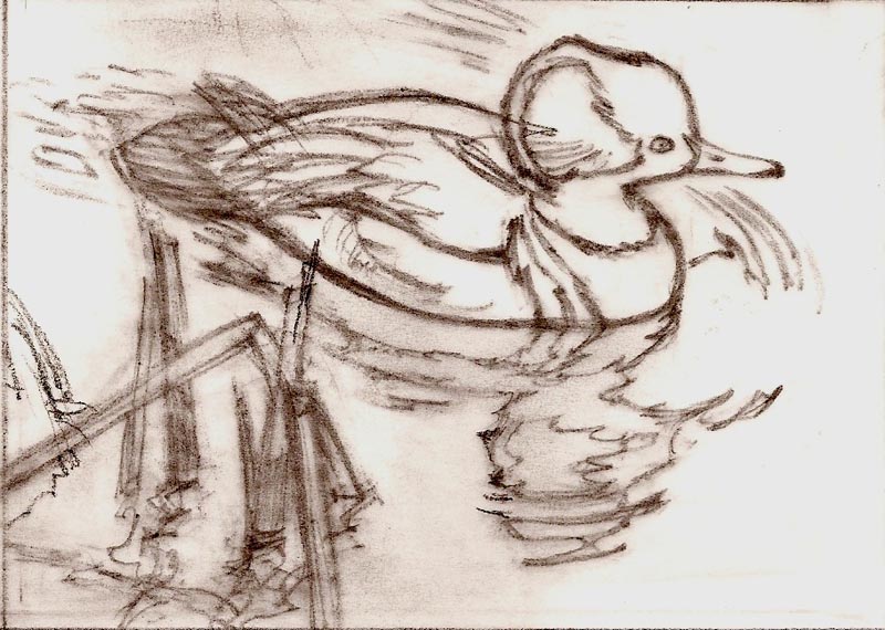
On this second blog regarding duck stamps and art....one aside on an aspect of duck flight. The interest or allure of bird hunting is the timing and challenge of hitting a fast moving target in the air. Ducks are the 'fighter planes' of the bird world. Fast formation flying and maneuvering....exciting to witness. If it seems odd in a drawing to see a duck in a steep bank with its head in an upright position....it's an accurate portrayal. Their heads and eyes are constantly turning and looking.
California's Stamp competition was limited to California artists, being the more populous state. Nevada's competition was open to artists anywhere in the U.S. More collectors bought prints and stamps sold on the first year....consequently Nevada sold over 1800 prints in 1982. My print followed in 1983, and the state requested I publish the same number of prints so collectors could duplicate their '82 print number....considered valuable in a collection. We cooperated, and sold less than half the total. In California we published over 900 '83 prints, and sold about 3/4. Merely one of the many complications and vagaries of this 'new' business.

I had to sign and number in pencil under the image on all of the editions, whether sold or not. Sounds easy....but the process, including writer's cramp, went on for a couple of weeks. There were other duties connected....forms and print covers to number, packaging and shipping groups of prints to the publisher and some to individuals. Additionally, drawing and painting dozens of pencil and color remarques for the collectors requesting those, and lots of phone calls to the publisher and retail dealers in and out of state. Busy times! The whole process lasted well into the second year....and I was still illustrating one or two commercial jobs each month. As said, being in the thick of the Duck Stamp Print fad was a learning and a worthwhile venture.
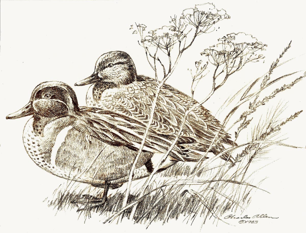
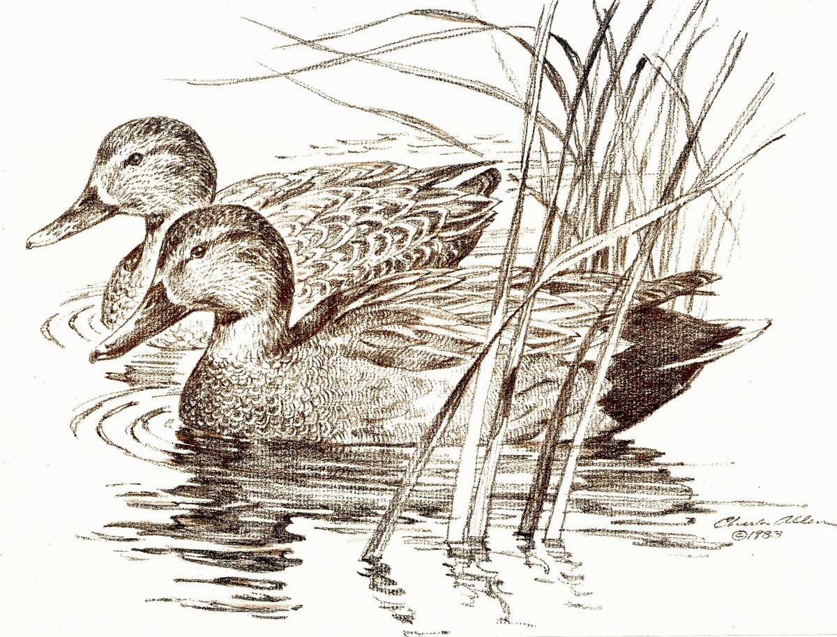
The first two scans posted were pencil sketches reproduced on the cover jackets of the California and Nevada prints. This week another wordy CAWS....but it's a large subject to cover. Later on I won two more Duck Stamp competitions....the 1992 Colorado Duck Stamp,

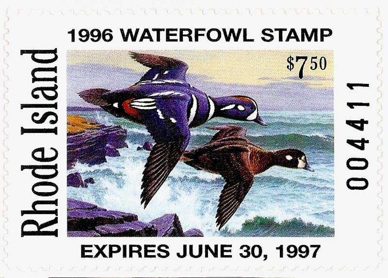
and the 1996 Rhode Island stamp...
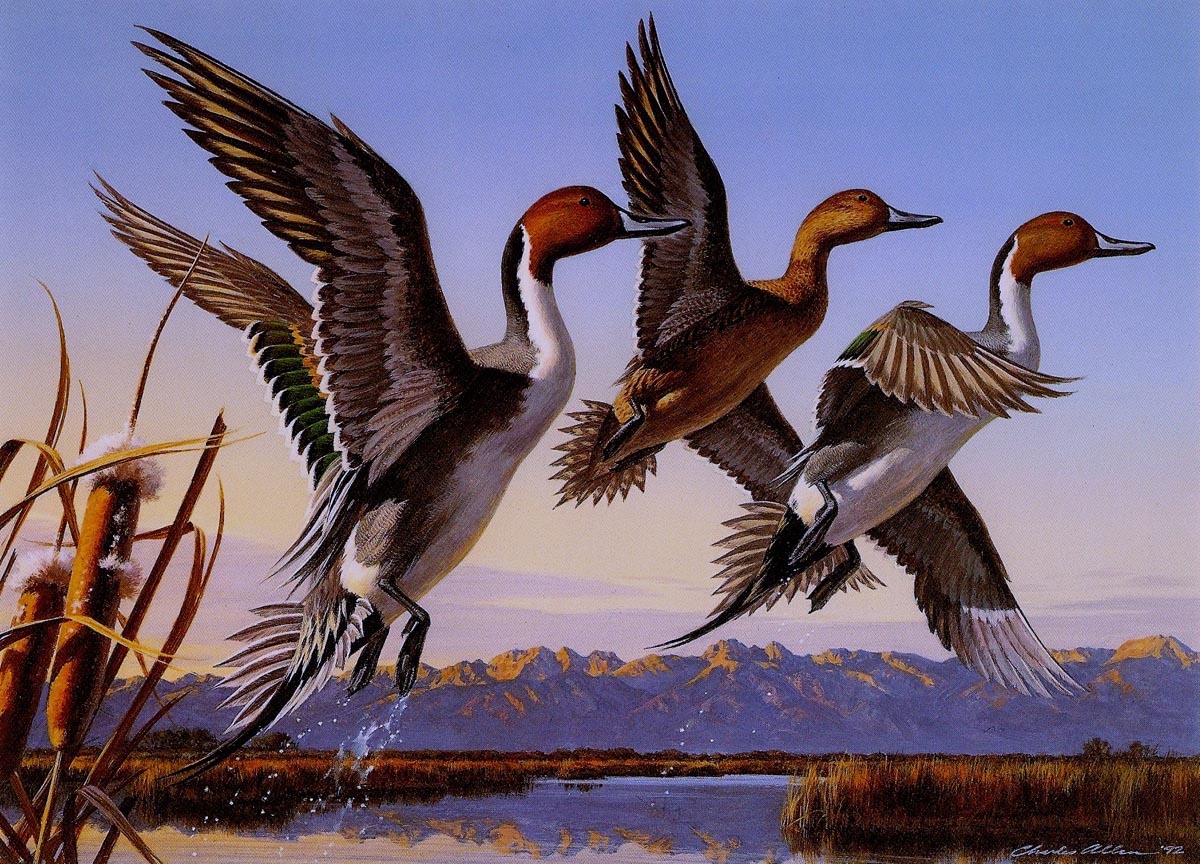
... at the age of 74! A bit more on those next week....but by then the business had changed drastically. Next week, we'll mention the differences and show a few collateral paintings and other examples of the duck stamp phase in this long lasting career. For now, we'll post the '92 Colorado print of Pintail ducks,
... and the Rhode Island print of a pair of Harlequin ducks over the New England coast.

With dogged determination,
... the CAWS will post one more blog of the duck stamp era including comps and commissioned examples.
* Charlie Allen's Flickr set.

8 comments:
Enjoy not only all the graphic qualities of your designs, but also your colors!
About the "graphic quality", looking at your flying ducks: I find there some fascinating and well conceived "negative spaces" all around. Did you plan them? Or are they happening "just like that"?
The hues of those winter time background skies are so faithfully and subtly rendered.
Your line drawing is as good as your coloring.
Long time ago there had been a war of line against color. Ingres put down Delacroix for lack of perfect line and Delacroix was sneering at Ingre's poor color schemes. Those times are gone, and the war is over.
RICH....I'll be totally honest. I have never been a fan, or known much about, negative spaces. My theory has always been....if the artist creates a good, interesting, design and composition, the negative spaces will take care of themselves. If they do not, surely the artist would, and should, take notice and correct it. About skies....an interesting observation. Landscape painting involves skies....and the importance of that, whether a large area or small in a painting, cannot and should not be neglected. Again, thanks.
I love your work! And I love your daughter, who is an awesome clay instructor!
Great illustrations! Thanks for posting all these. I'll be spending some time here, poking through these posts!
Great job. Very nice work.
keep it.Thanks
I adore your advice on Colorado geese hunting! The strategies and local advice are excellent. Looking forward to implementing them!
Colorado goose hunting
Duck hunting in Colorado was an incredible experience! Your team is really knowledgeable. eager to return for the upcoming season.duck hunt Colorado
"Great post, Charlie! Really enjoyed your perspective—thanks for sharing!"
<a href="https://digitalfloats.com/graphic-design-course-in-
hyderabad/">Untitled Post : Charlie Allen's Blog;/a>
https://digitalfloats.com/graphic-design-course-in-hyderabad/
Post a Comment