First....and back by popular demand....for a one week appearance only!! Ladeeez and Germs.....the one, the only, the incomparable....Lady of Steeeeel!! Right here! This illustration was a for a mid winter full page newspaper ad for Harrahs (as I recall) at Tahoe....and probably Las Vegas as well.
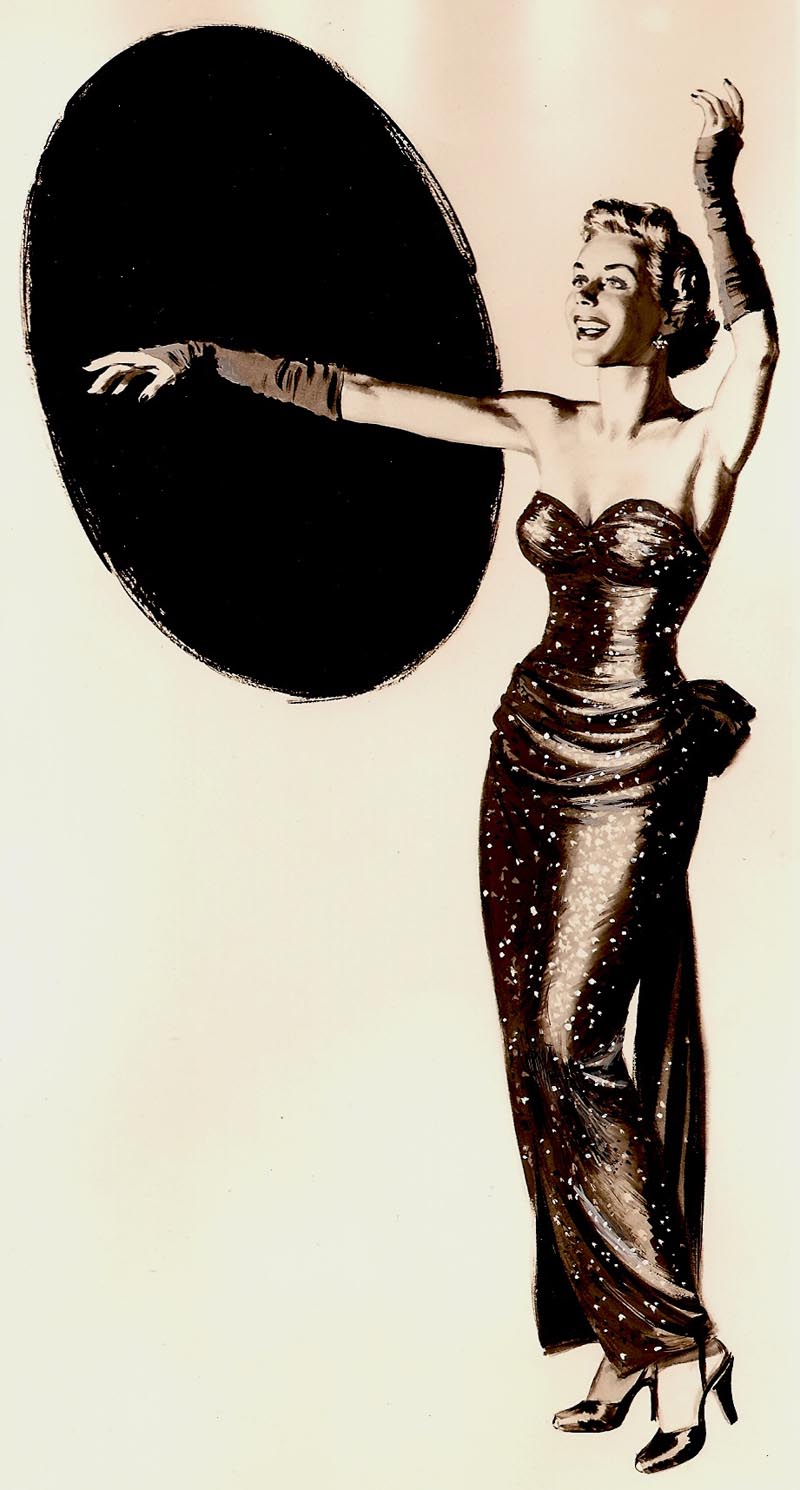
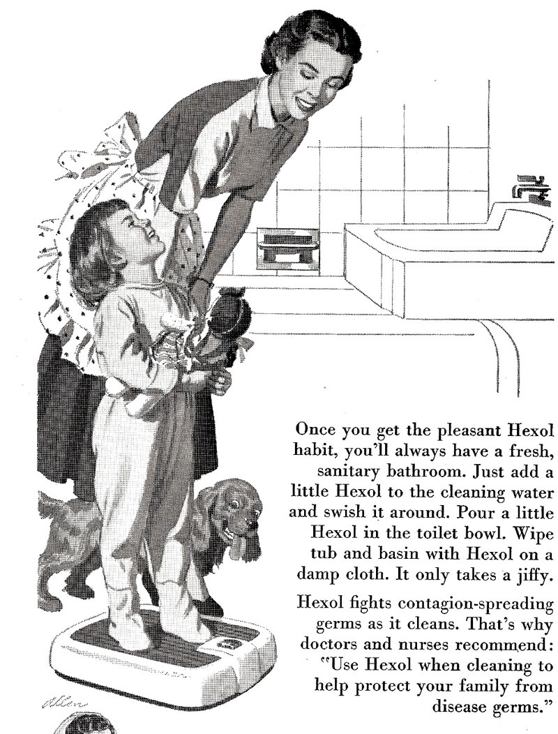
Our favorite model (never will remember her name) was a sweetie and good sport....not at all the show biz type! The costume, pinned in back came from a theatre supply. She wore it well, and posed like the pro she was. Next an early 50's Hexol ad. My oldest daughter and my wife, changed on this to a brunette, were the models.
A varied assortmennt this week....the next scan a newspaper halftone for a PG&E ad. Our neighbor was the model....another cheerful guy, he came over to my 'garage photo studio' where I set up the old Speed Graphic. He posed for several Chevron ads as well.

Following are two trade ads for Potlatch, a large western lumber and wood products company. They should be clear and accurate....but often the digital world and halftone screens don't 'get along'....strange patterns develop.

Both the PG&E and Potlatch illustrations were done with Perma- Grey gouache. I preferred those to Windsor Newton greys.

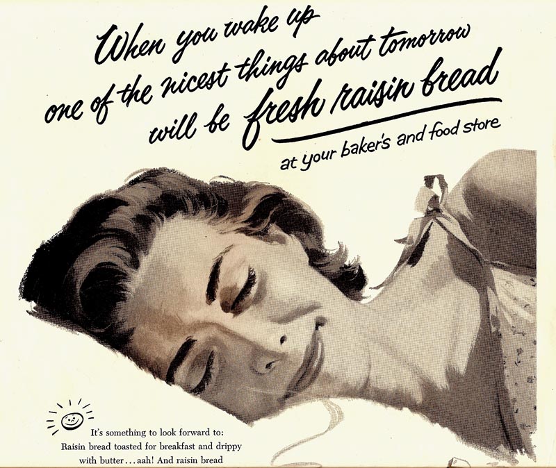
Next in line, a Raisin (Sunmaid?) promotion, I think for magazines....the sleeping mom. A different model used on this....and I kind of liked the result.
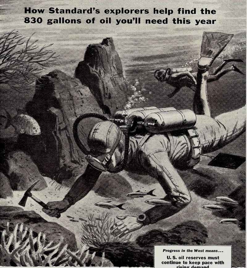
An old Chevron or Standard Oil newspaper ad, the scuba divers, follows. Done in the early 50's in Higgins Ink washes.
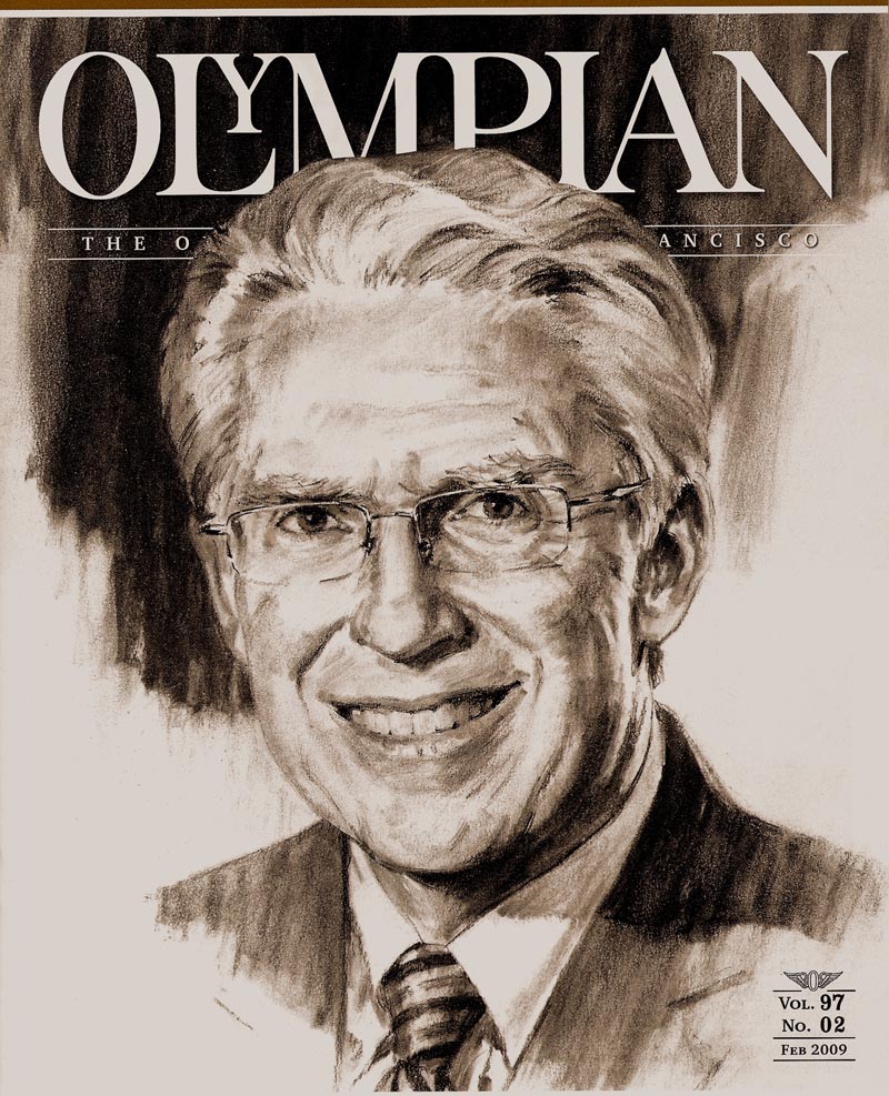
The 'new' scan, as promoted, is an Olympic Club charcoal portrait sketch done this year in January. Very occasionally, I get back on the board....at least for short stints.
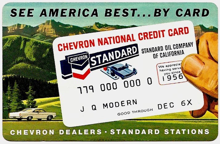
Finally, to break the all grey pattern, and because they don't fit a group, a credit card sized ad for Chevron...
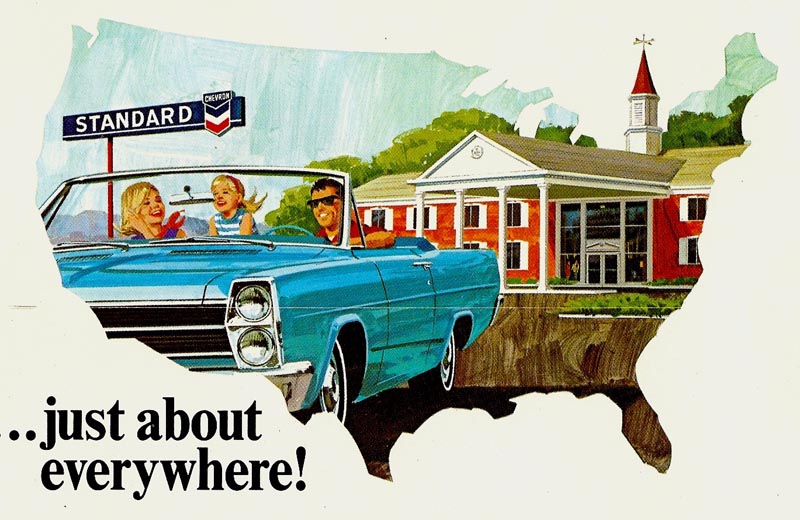
... and another early and fast effort, both for mailers with bills.
* Charlie Allen's Flickr set

4 comments:
I really enjoyed looking through your blog. It's packed with beautiful work, your drawings are so appealing and I admire your style very much.
It's also intersting to see how things have changed in the comp bussiness over the years. Sadly, not always for the better it seems!
Here she is again! How glamorous the lady of steel, displaying some perfect halftones.
"a tree can be"
...on this one I like the way the knee and those fair trousers blend with the background's snow-white mountain range. Whatever you do, Charlie, you are composin'.
And that Olympian shows all that skill. Keep on boardin'....
Thanks Maritze and Rich....always interested in the observations. On composition, Rich, not sure how much is planning....or just instinct. On that illustration, everything carries the eye to the left and up. The knee, the mountains, even the shadow under the figure. But each is 'stopped' by a sharp value change. The knee ends, the mountain has a strong shadow, the shadow is stopped by the little tree. I think this doesn't happen so much by planning....as in a math equation....as by a sense of necessity when sketching it out. Hey....enough theory! Thanks again.
Interesting explanation. It keeps me mulling if what you term "instinct" may also be called "intuition"...
Post a Comment