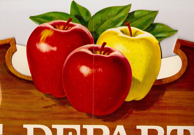
Not in any sequence on these, part of a Washington Apple store banner....the fruit against a 'carved' wood sign board.
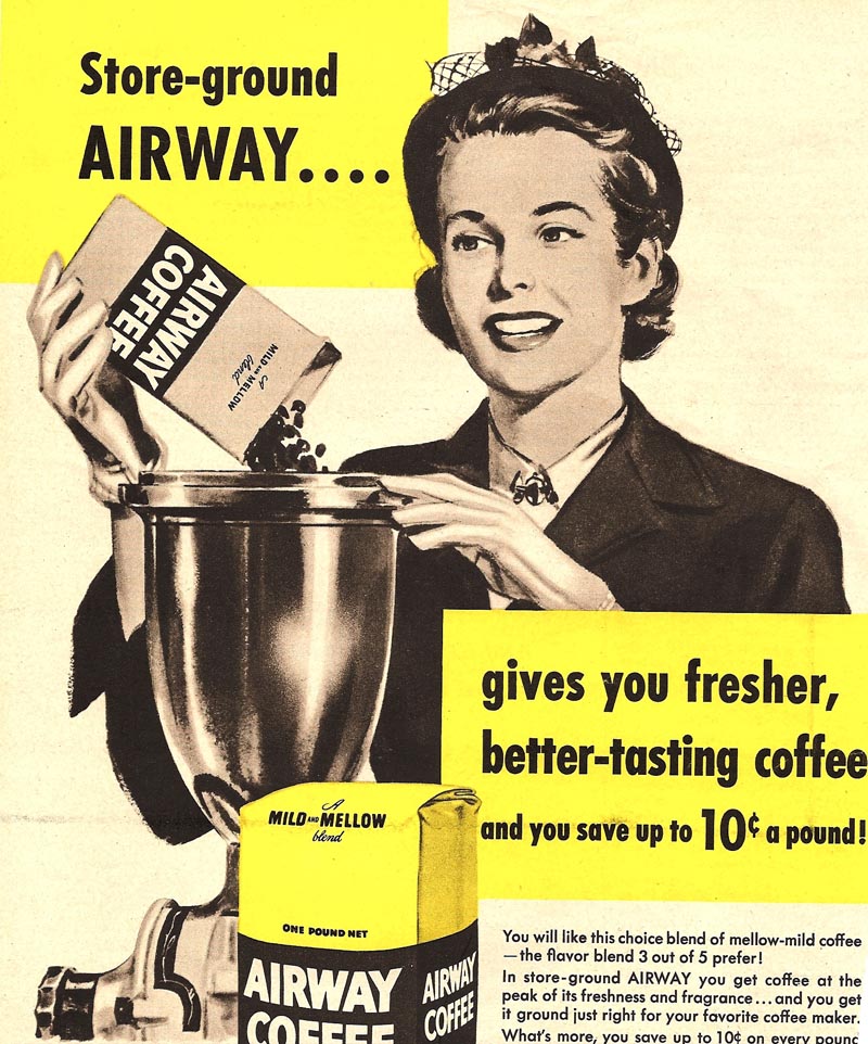
Then a Safeway house-brand coffee halftone of a lady shopper, from 1951, and hopefully not a repeat.
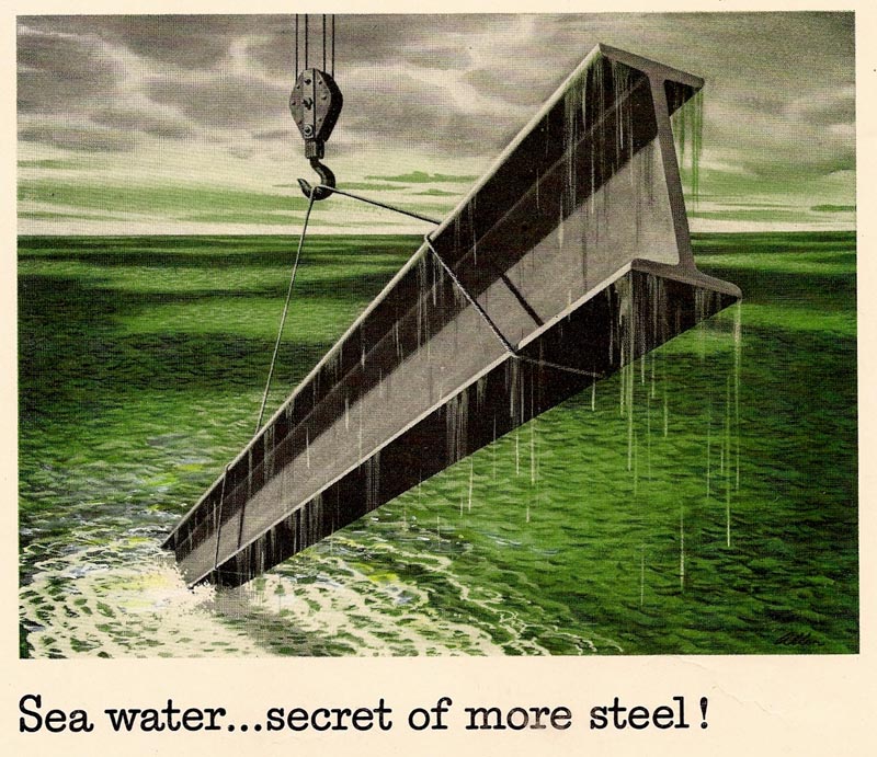
A Kaiser Chemical green and black duotone illustration for a trade ad....an early 50's gouache rendition. Kaiser had a steel manufacturing division....in addition to Aluminum, auto manufacturing, refractory products, as well as other enterprises.
And while Kaiser Chemical is the subject, another gouache duotone illustration for the refractory part of the business....proof dated on this, 1952.
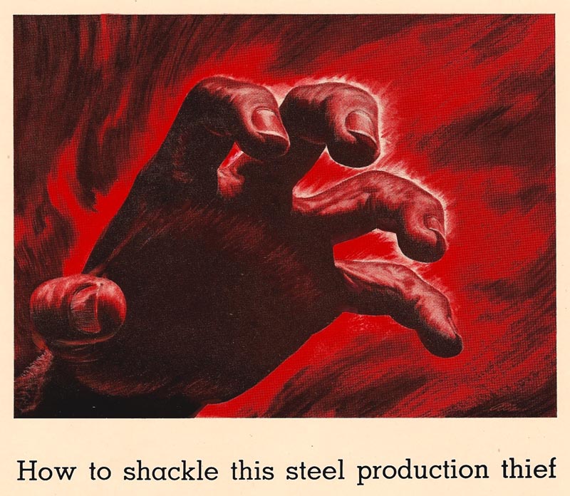
A tad 'menacing' would be apt....but anything to get attention!
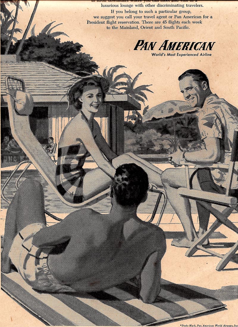
Next, two halftone ads for Pan American....for Hawaiian newspapers in '56. A couple of others in this series have been posted...
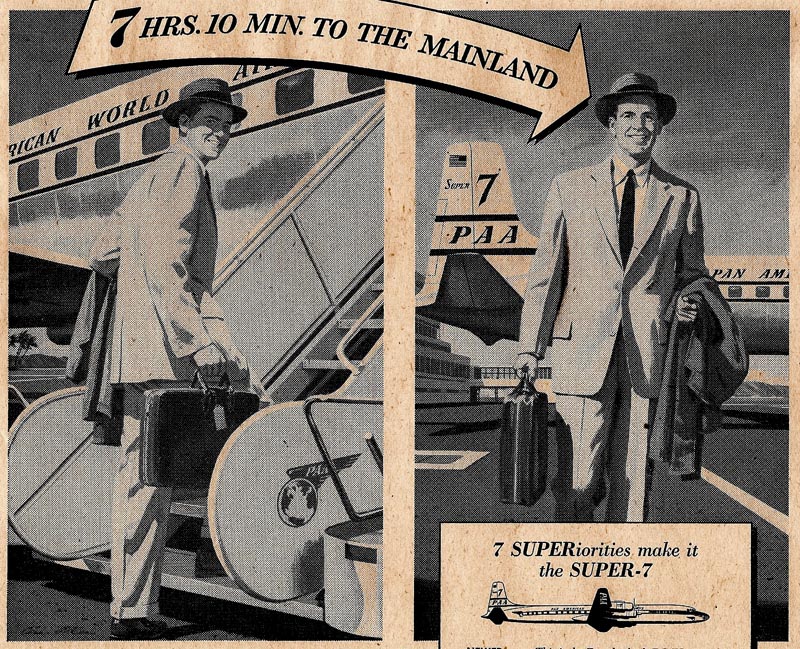
...and done in the 'square' style mentioned a week or two back.
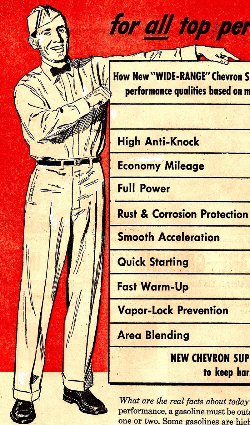
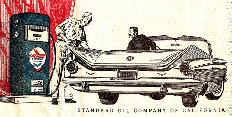
Following, four B&W line ads for Chevron....again from the 1950's.
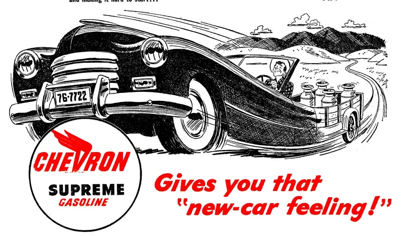
The first two are both semi cartoon illustrations, and both part of larger newspaper ads.

The second two are also partial ads....in the more literal line style I normally used.
It is obvious today, the 1950's was a time of great variety, and of plentiful ad assignments....a condition and state of business that we didn't really appreciate enough at the time.
No one had an idea that major changes in print media were coming in the next 10 to 15 years.
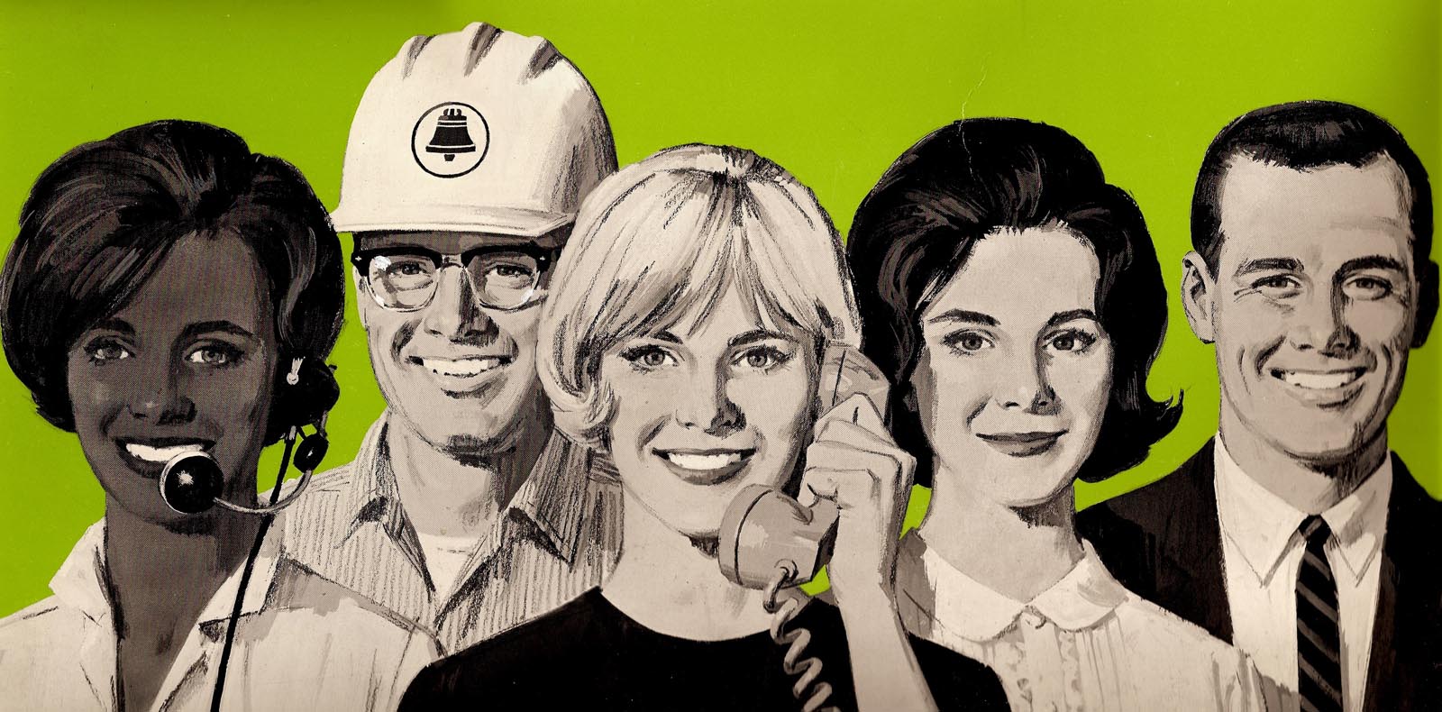
A Pac Bell employment poster follows....about 15 x 20 inches in size....and the scan is from the poster. This came along in the early 60's and demonstrates a difference in approach. These heads were what I'd call 'generic'....nice looking young people drawn without photo reference. In the 50's, model shots would have been taken. However, not needed or wanted by me or by the client in the 60's. I'm pretty sure this was the ad that caused the dispute mentioned earlier on CAWS....about the AD, or client, who wanted an ever darker skin color on the girl on the left. Different times, indeed.
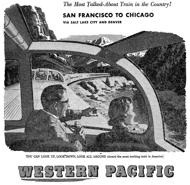
Finally, a Western Pacific train ad from the early 50's....a very poor scan from an old news clip.
Then a simplified Burgie head logo for shipping boxes. Done in three flat colors, as I recall, due to a silk screen or basic printing process for boxes.
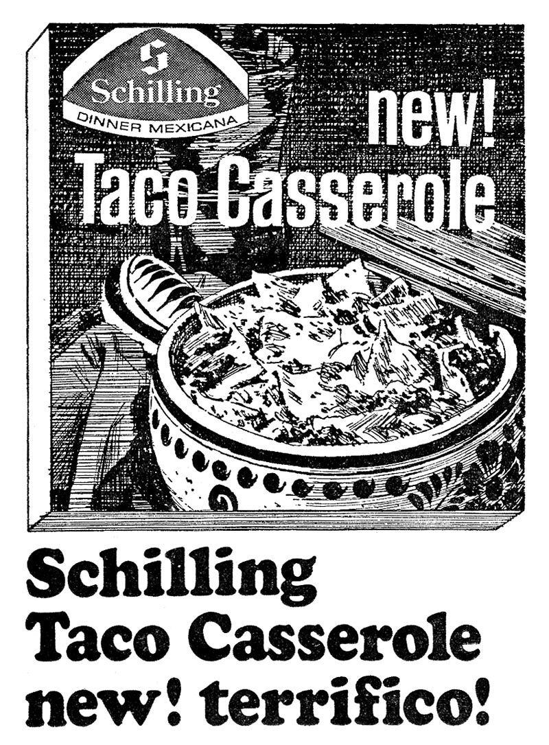
Last, for Schilling seasoning products, a B&W line illustration of a Mexican casserole. Line art to illustrate food....and trying to keep the subject appetizing....was a difficult assignment.
Dan Romano in San Francisco was probably the best illustrator in that field.
* Charlie Allen's Flickr set.

4 comments:
Really dig that Burgie head logo, and the last shot - always love the line art.
Fine work all around, as usual.
The usual high quality! That steel bar has a monumental impact.
Very interesting remark about line art to illustrate food. With a less gifted illustrator that taco casserole might have looked like a wpb. (waste paper basket)
A wide variety of subject matter,all adeptly rendered.Did you, like Al Dorne etc, maintain a big reference file to handle all these different types of subject?
KENTWYN....Thanks for the comment. I always kept an ever growing clip file. Finally took up most of two, four drawer steel cabinets. Also was lucky to have access to Patterson and Hall's clip files. It saved a lot of time chasing off for info, or taking more photos. Variety was the name of the game in the west. The more things you could do, the more jobs became available.
Post a Comment