We'll start with blue, at least partially so. A full page late 50's Burgie ad in the SE Post....and one that I've avoided. Not my favorite illustration....both subject and handling. A photo op at the Sausalito marina was arranged by BBD&O....photo subject, someone's boat, as shown. The AD also wanted included the background homes, hillsides, etc. An illustration that just never came off....as much my fault as the concept.

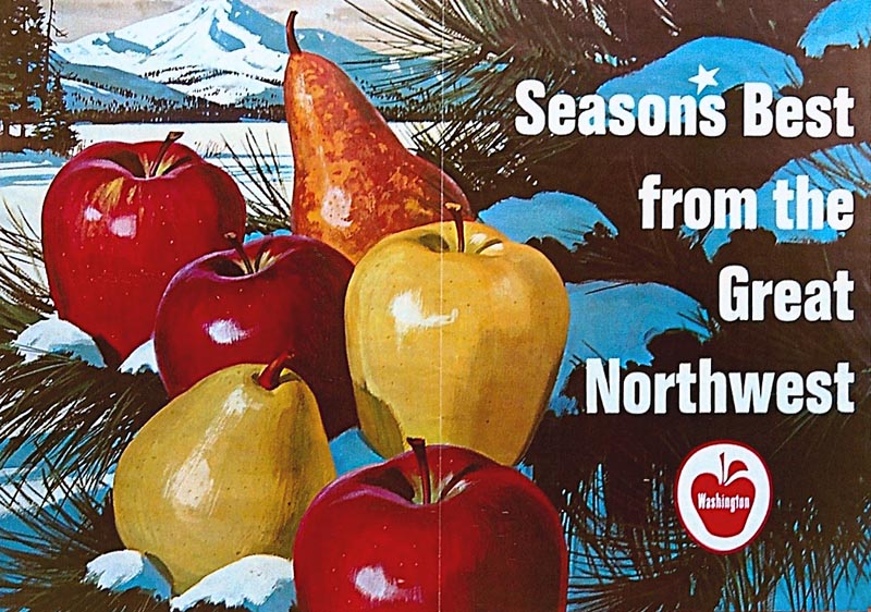
A Washington State Apple POS poster follows. Large, 20 x 30 inches, and here, a patio photo of it....so not a good scan. At full size and in the store, it was not as hard edged appearing as on the scan.
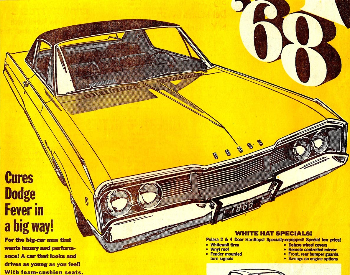
Next, one more Dodge two color newspaper ad....a 1968 Dodge Polara. I still think the series of four illustrations were bright, effective ads.
A few B&W illustrations follow. The first, a news ad for the Villages, a large south bay home and golf course development encouraging seniors and retirees.

Then a newspaper ad for Hill's Brothers Coffee, from the 50's. A good friend posed for the postman. He was actually with the FBI....and was warned to NOT pose for any more ads!

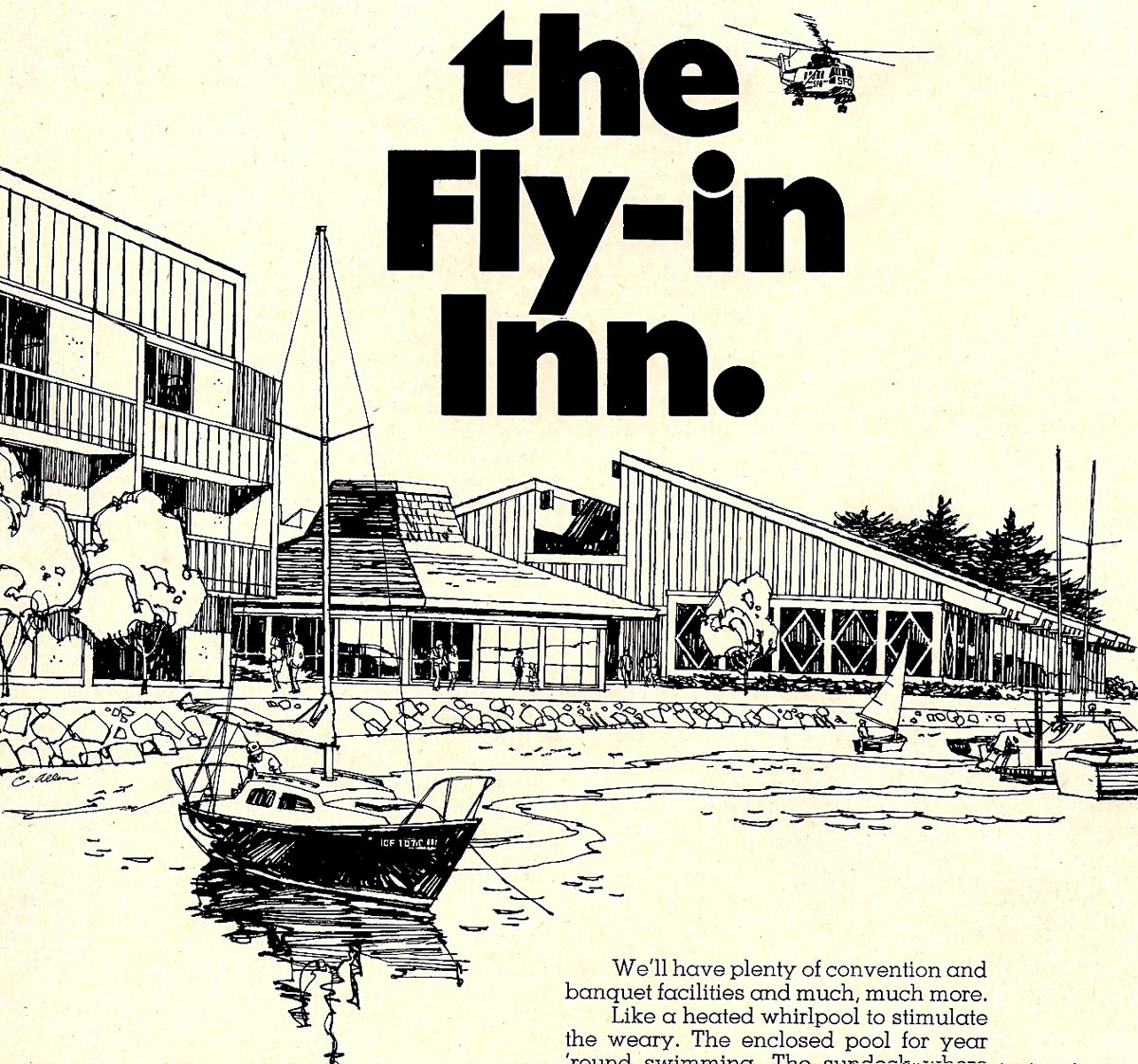
A simple line ad for an east bay Marriot Hotel is next in line...
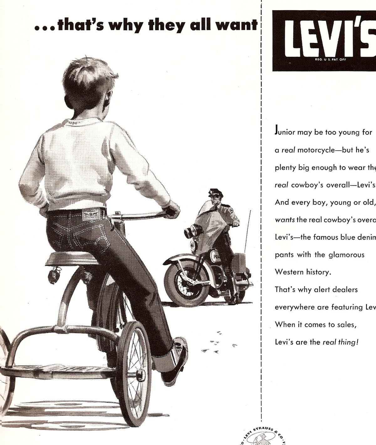
...and then a very early '49 or '50 ad for Levis for boys. The 'stove pipe' look on the pants was, I'm sure, established by Bruce Bomberger on a fine series of Levis billboards....and the client liked the look. This was an early attempt for me to break into the 'better' ads.
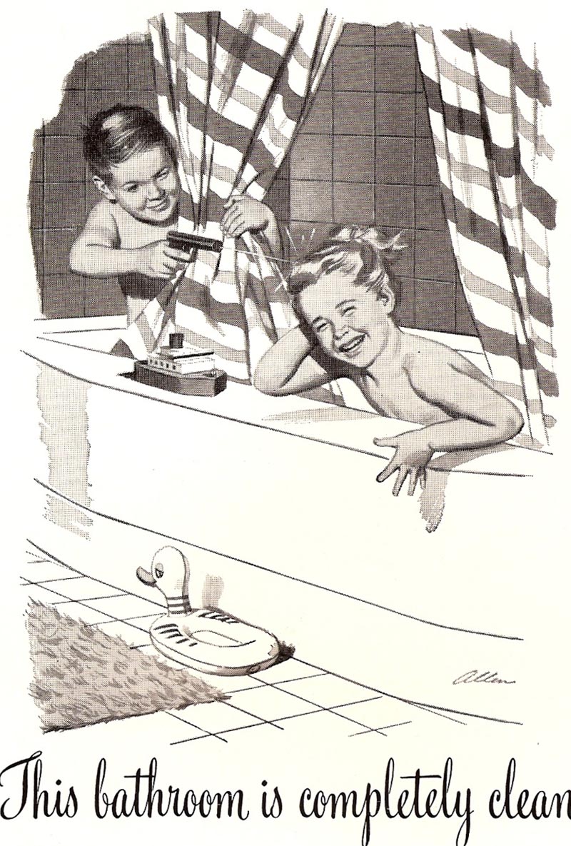
Last of the B&W's an early Hexol ad....several have been posted before. Yes, back in the days when boys and girls were bathed together in the same tub!
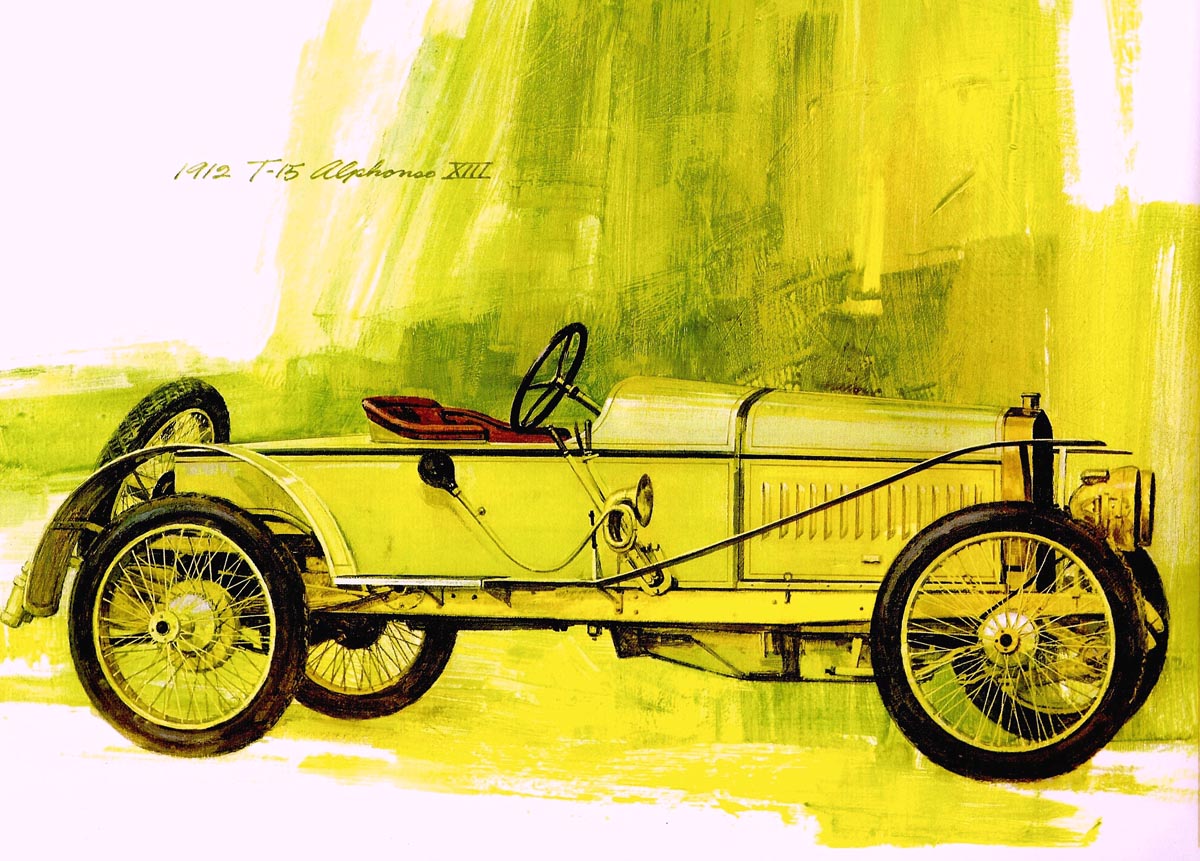
Finally, three more of the early 70's antique autos...
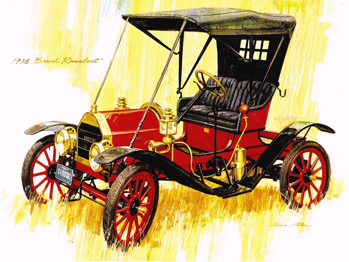
...the first two from prints...
... and the third from a reduced copy of a fairly large original. It portrays a 1929 Kissel convertible, complete with 'his and hers' golf bags attached....from the 'roaring twenties'.
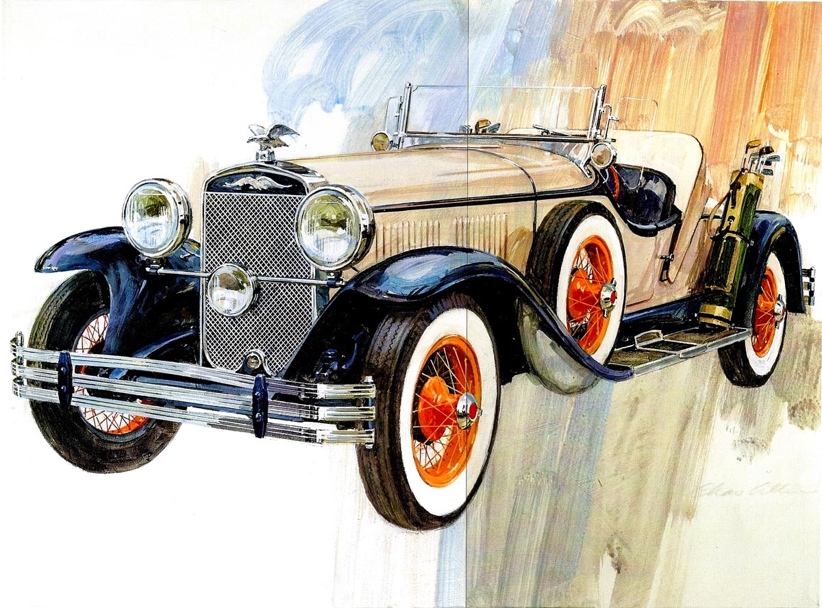
Not sure if this was really finished....but close enough.
* Charlie Allen's Flickr set.

5 comments:
Charlie, the Burgie ad illustration reminds me a little of the Galli, Bomberger look.. using primarily yellows with accents of blues and greens. Anyway, it reads well, and as usual, very professional looking. When you did cars in ads, did you have shots in your file, or take photos of cars in just right position, or did you have to do some reconstructing the angles and perspective? Figures, I could draw a lot faster than cars or backgrounds of buildings, or a room full of furniture, or complicated machinery, etc. Working out the perspective accurately for a literal illustration was usually a chore, and rarely given enough time.. it was also tedious for me! You make it look easy, never a bobble.
Tom Watson
TOM....As always, right on. I disliked front grills and wheels on cars. They HAD to be right, or the illustration was a flop. Very tedious. Also disliked indoor and outdoor perspective jobs with furniture or architectural details....again tedious. Artists like Fawcett seemed to thrive on that sort of thing. I took shots locally on most Chevy ads. Also on Mercury cars at a Concord dealership. Can't remember on those Dodges....but being single cars, photo distortion was welcome. Not so welcome when a car had to fit into a scene with roads, people, buildings, etc.
How I like to look at that Burgie ad! So many different objects and items depicted there; furthermore everything with same sharpness of focus, the distant and the near.
To achieve such a completely uncluttered impression in spite of all these - that's your secret, Charlie.
WOW! I love your work. I look forward to looking through all your posts! I love THE OWL covers you posted when you were Art Director. Thank you so much! Very cool blog.
gr8 blog & gr8 posts !!
Post a Comment