Chevrolet, through our relationship with Campbell Ewald in Detroit, was one, if not 'the', most important client that P&H and I had in the 50's and early 60's. Important, because all of their ads were national in distribution....and because the pay was better than on local or regional accounts. A long and complicated history, but to cut to the chase, Jim Hastings, a talented San Francisco artist, ad designer, art director, et al, became the head art director for Campbell Ewald in Detroit, and head of the Chevrolet account. He liked and favored west coast illustrators....Fred Ludekins, Stan Galli, Bruce Bomberger, Gordon Brusstar, Dan Romano....and....Charlie Allen. I was included a bit early....in the early 50's....really before I had enough experience. It was sink or swim....and I did some of both....on very complicated assignments. Even in the 50's there was overnight air delivery....so working long distance was practical.
We'll begin with scans of line art. Most of the dozens of ads I did for Chevy were large newspaper B&W ads...and most were line film positives over a halftone rendering on the car. I've found that line art and textures don't scan well....especially when a full page ad has been reduced to a smaller copy. Therefore, click on each image shown in this post to see a much larger version.
Hastings, and other AD's at C.E., promoted large ads with ambitious, dramatic compositions that were often difficult to render in pen, brush, and ink line art.

Above, a classic Jim Hastings concept....strong values, an implausible location with a wild-west stagecoach chase, a 1958 convertible plus movie directors, speeding along in a dry wash. I doubt if either of us had a clue how Hollywood would film such....certainly not with film crews perched on top of steep rocks, a director yelling with a megaphone from the car! Hey...it's advertising! This scan was from a glossy photostat, minus the halftone on the car, so the same as the film pos. In hindsight, wish I had asked for glossy proofs of these ads....but life was moving fast in those days...it didn't seem that important.

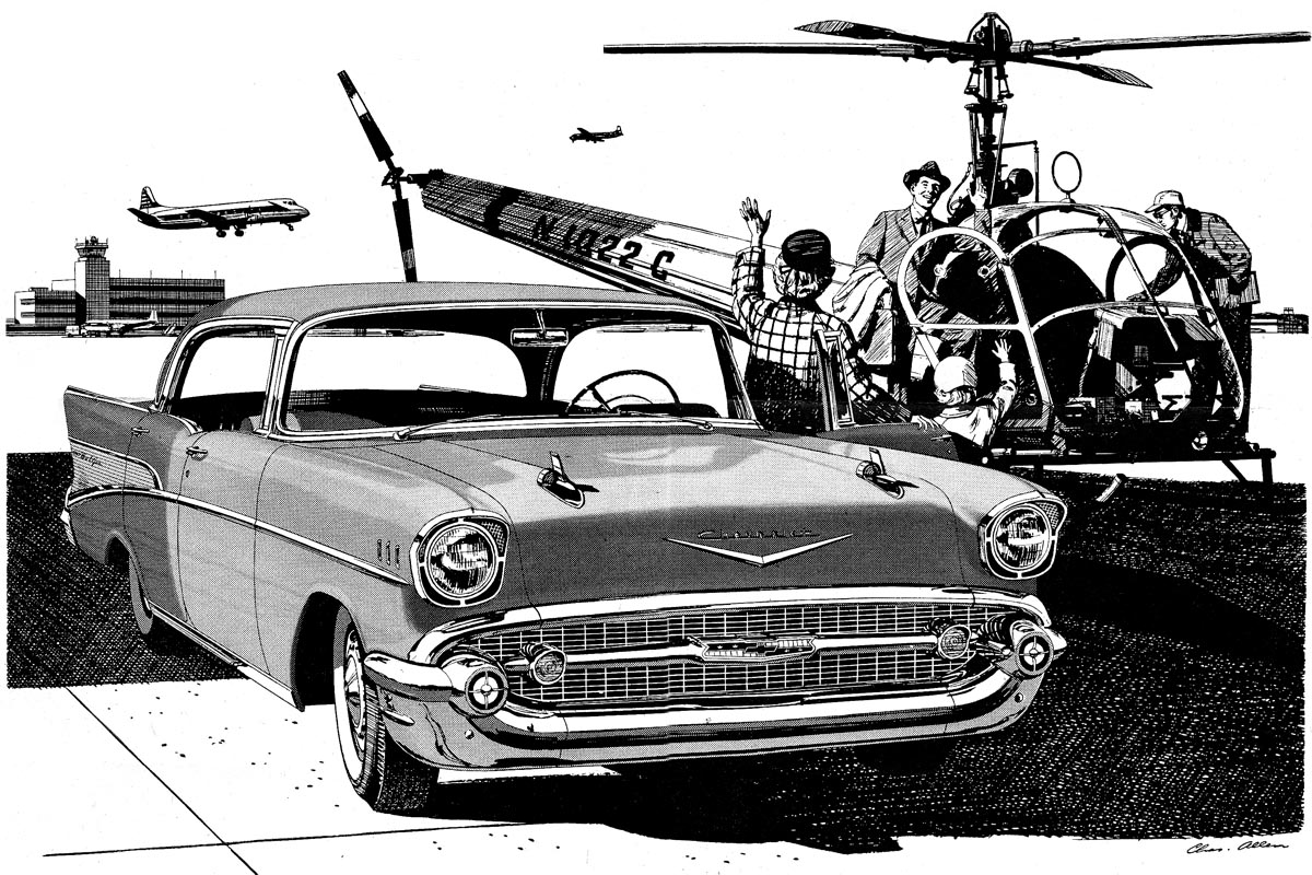
Next, again, strong values on a helicopter 'commuter dad' scene. Pretty sure it was a '57 Chevrolet. The cars had to be drawn as accurately and as 'sexy' as possible to please the Chevy people. In those days civilian helicopters were new. This was a Hiller (as I recall) that I photographed at Crissy Field, a small former military base on the S.F. Marina.
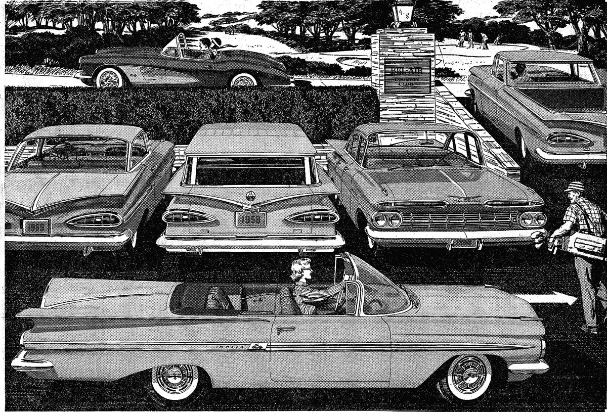
Below... a typical pencil comp that I did of a golf club scene....with multiple cars. I liked it, and Jim Hastings liked it, but Chevrolet wanted more cars showing.

The next scan was the result....a boring composition....but lots of Chevy's in the parking lot!

Finally, most of a full page B&W of a 1959 Chevy and family at a train crossing. Detroit was truly into the 'big, gaudy, fin stage' in car design by this time!

Next week....more B&W's and other types of Chevy ads.
* Charlie Allen's Flickr set.

10 comments:
Great post, I really enjoy reading about the old auto indusry!
Fantastic Charlie. I'm lucky to have one of Charlie's original Chevy ads hanging above my desk. You look closely at the line work, and it's immaculate...no white out..just a sure hand. Keep em' coming, and I especially enjoy your comments.
Bruce Hettema, P&H Creative Group
Terrific work Charlie, you always did a masterful job on these ads. The ad with the six cars must have really been a tough one to do. I do remember some of these from when I worked at CECO, Jim Hastings used to proudly show them to me.
wow, charlie! …
just for a better understanding; could you please tell me (us) the average size of the original artwork (for example, the size of the wild-west-chevy)?
and, how many hours did you drawed for it?
thanks … can´t wait for you next blog!
joe
To Joe Annonymous (kidding)...good question on size. I tried to work B&W's at one half up from published size. The reduction helped clean up rough spots. My Mac has a nice large screen...about 10 1/2" by 17". Leif has kindly provided two enlargements on this blog. The largest on the wild west scene measures about 10" by 16" on my Mac....and is about the size of the original illustration. On full page Chevy ads, it was a problem working some at that size....especially in pen and ink.
thanks charlie,
and do you remember how many time you worked on this "wild-west-scene"? … the lineart is amazing!
nice greets from those anonymous-kid called joe
What a magnificent array of cars and trees! A pity they didn't choose that one for the ad. But luckily they all reappear here in these blogs by you and Leif. So a public of connoisseurs can again marvel at artworks like that.
Somehow, most of today's ads look pretty boring in comparison. And those chevys really do have tail wings, and an elegance which pretty much contrasts with the rotary wing designs of those times:-)
Masterful is right. They're so much fun to look at, which can obscure the discipline and chops. Great balance between all three. Thanks so much for posting all of this stuff. Object lessons for everyone in the biz.
Loved that jingle! "See the USA, in your Chevrolet, America's inviting you to call, See the USA in your Chevrolet, America's the greatest land of all."
Birds & Bucks Outdoors delivers every time! Amazing guides, breathtaking scenery, and abundant geese.
goose hunting in Colorado
Post a Comment