Here it's a 'clear the decks' mode, however, and this group represents frequent ad assignments that helped out in slow times. Pamphlets and brochures....not sure of the difference, except that I think brochures were larger with several pages. For some reason, most pamphlets were 4 x 9 inches in size....as were fold out maps. There were variations on that, of course.....and I never inquired how or where they were used. Displayed in branch offices, probably, or on travel counters. Maybe business mailings. There were more, but these should be sufficient.
The first scan, an ad for American President Lines, was pamphlet sized, but was a large fold out....much like a map. I notice it was printed in 1954....and was probably the first of the shipboard travel scenes I illustrated.
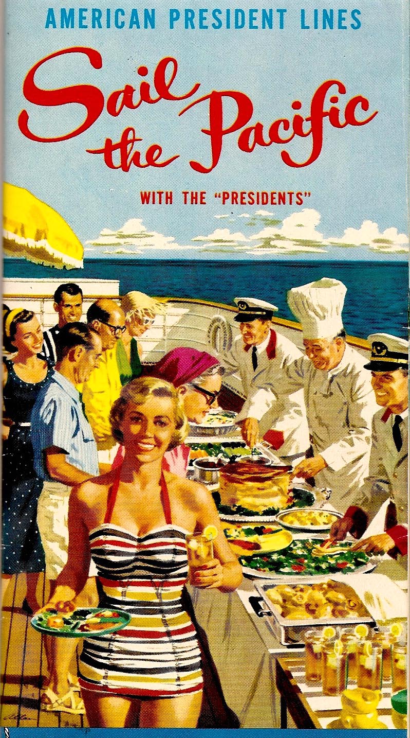
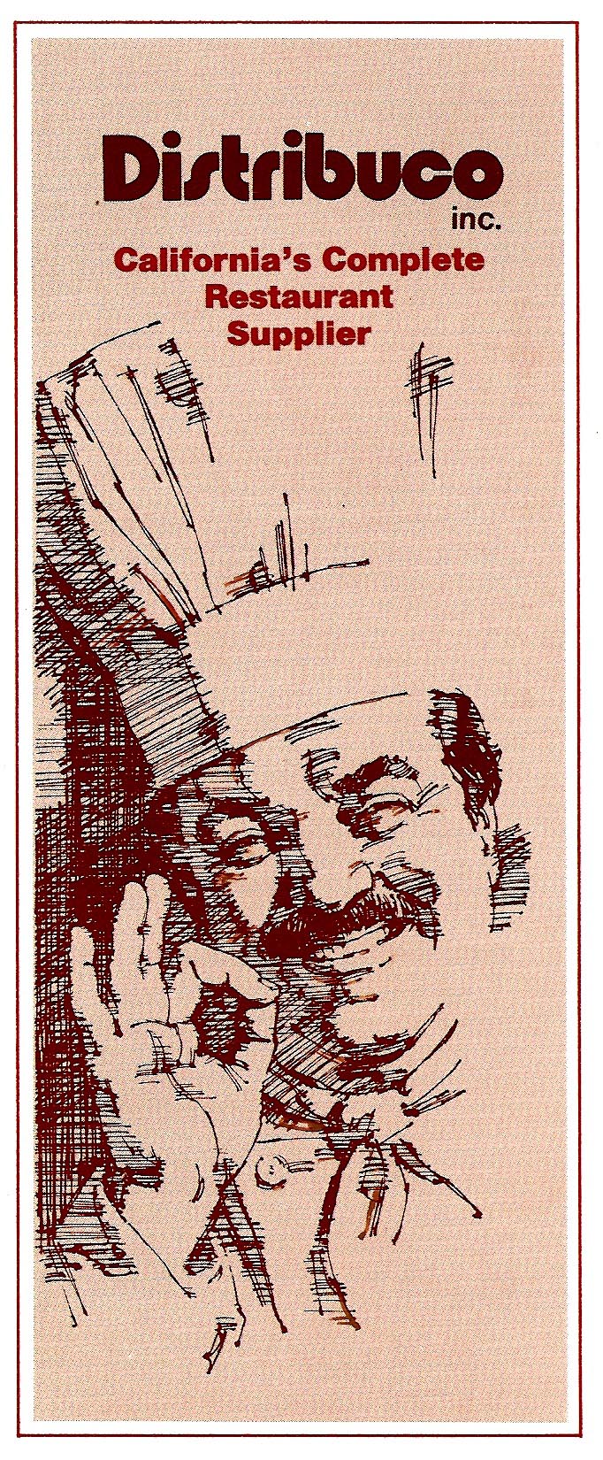
This records pretty fair likenesses of several P&H stalwarts, who posed separately, as usual, in our photo studio. Behind the bathing suited young lady, from front to back on the left....Haines Hall, then one of our receptionists, Z. Alexander, head of the photo department, an unknown lady, and George Albertus, cartoonist/illustrator. The right hand servers were George Albertus in front, Sig Beartown, and Jack Painter. The model in the striped bathing suit was, no less....our 'Lady of Steel' hostess....portrayed later in in many US Steel ads. The next pamphlet, for a bay area restaurant supply company, a two color pen and ink line job.
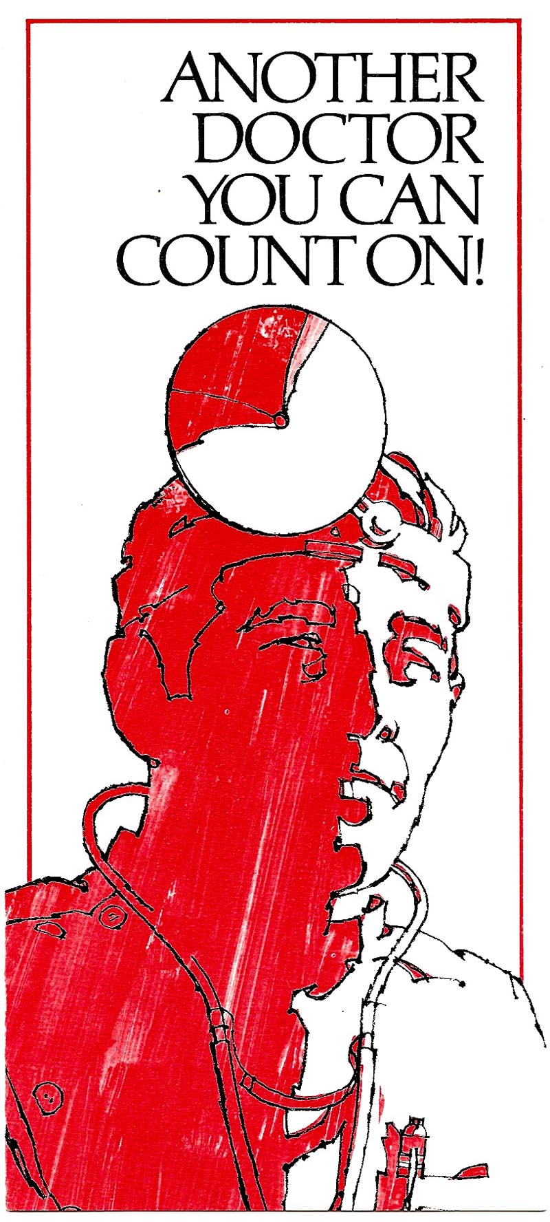
After that, the next six or seven pamphlet illustrations were for State Fund....a frequent client for brochures and such.
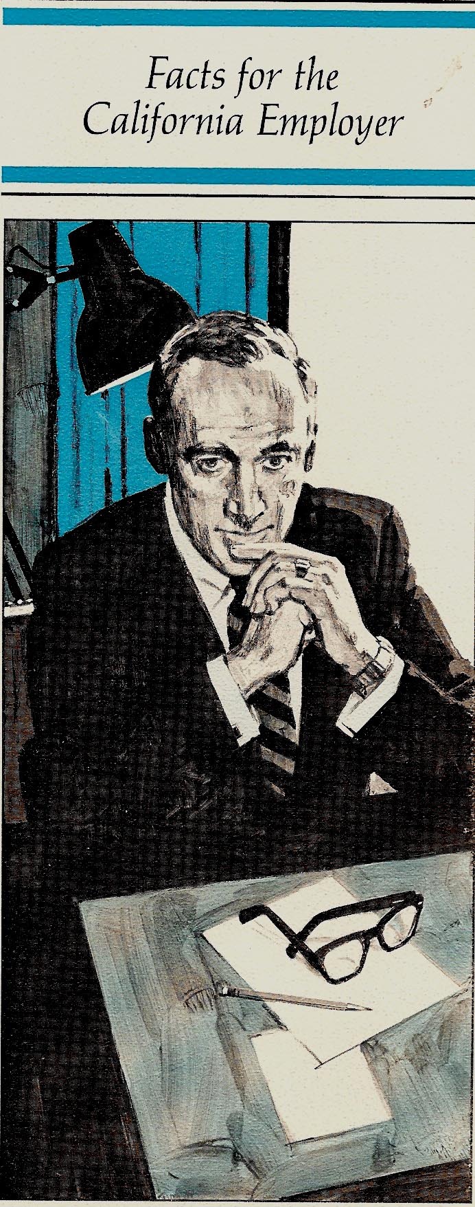

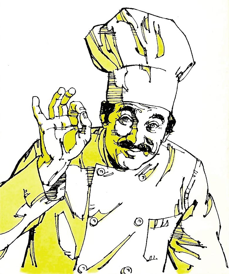
Have no idea who posed for the chefs...
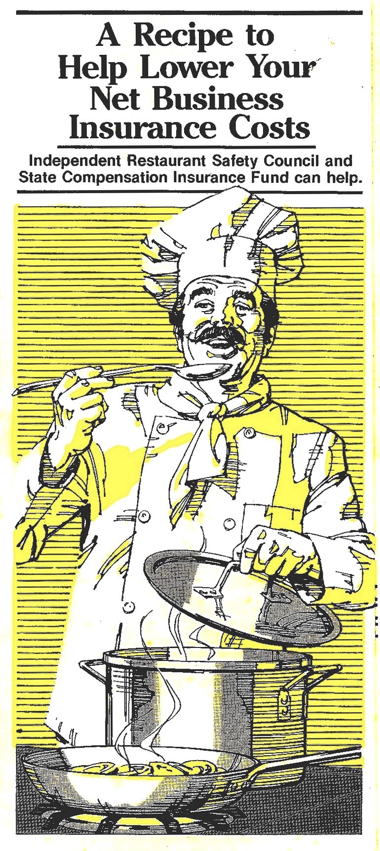
...and by this time in my work, as long as someone took the pose indicating the posture and gestures. I could usually 'wing it' on character types and outfits.
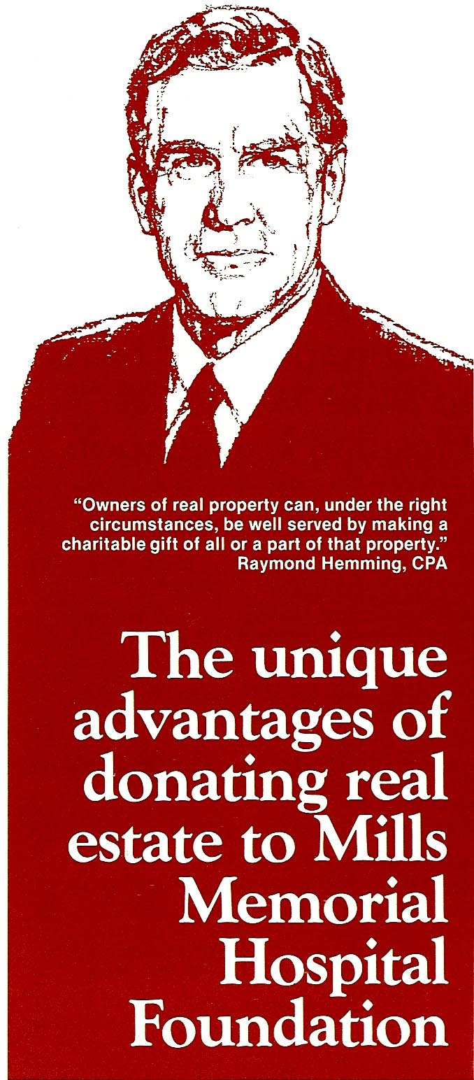
Following those, the next two designs....a pamphlet for Mills Hospital...

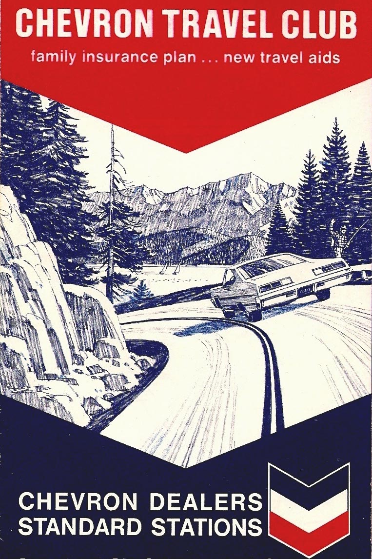
...and then a Chevron 4x9" fold out map, here cropped at the top.
Last, not a pamphlet, but a typical B&W plus halftone newspaper ad promoting free maps.
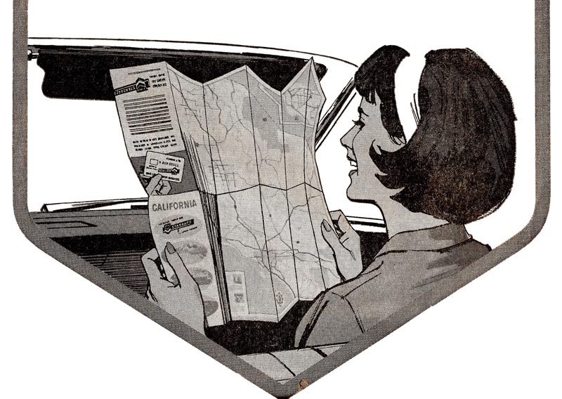
Like everything else, maps have zoomed up in price....nothing is free....and pump your own gas, please!
* Charlie Allen's Flickr set

3 comments:
your work is amazing!! if only the industry could be like this again!
thank you so much for sharing this.
Ultimately boring!...the understatement of the year!
Wow Charlie! Just love to come back and look at those illustrations again.
What I notice on that ship deck assembly is how well those folks are blended together. There's kind of a unifying touch which makes one think they had been portrayed as a group on the spot. Not at all drawn together from separate studio photo shots. Not everyone can do that...
Nice to meet the Iron Lady again. The swimming suit suits her well.
Now I'm no more sure if your tire drawing skills aren't even surpassed by your ability to render cocktails.
Anyway - some perfectly resolved crossword puzzles - and all the fun you had keeps on vibrating here.
Thanks, guys. You mentioned the assembly of people on ship deck, Rich. Main reason for separate shots....too hard to get a group together at one time. They were working, and we tried to take as little of their time as possible. Also, very hard to get proper lighting on a group photo, as opposed to individual shots. Several times I took photos on the ships when docked in S.F. In the illustrations I had to simplify and eliminate a lot of 'ship stuff'....the decks were cluttered with large vents, small vents, lockers, cables, all kinds of paraphernalia.
Post a Comment